Illustration 1 – Sketchbooks: An Introduction

Before beginning my new unit I wanted to respond to the rather large ‘introduction’ chapter at the start of it, as well as generally introduce myself, my goals, my thoughts, and where I’d like to end up when finishing this unit. I wish I’d done a similar thing for Key Steps in Illustration, as I know I surpassed many of my own goals and I’d love to be able to reference this.

I’m very excited to be starting this unit. Something in me has been itching to let go and be messy, experimental, and explorative in my work. I loved following briefs and I’m extremely happy with the work I produced in KSI, but after 15 months it began to feel too restrictive. I have craved the play alongside the more professional, finished work. I have already been thinking for months about what my goals in this unit are, what I want to explore more of, and how I want to explore it. Upon reading the introduction chapter, I took some notes on what they are.

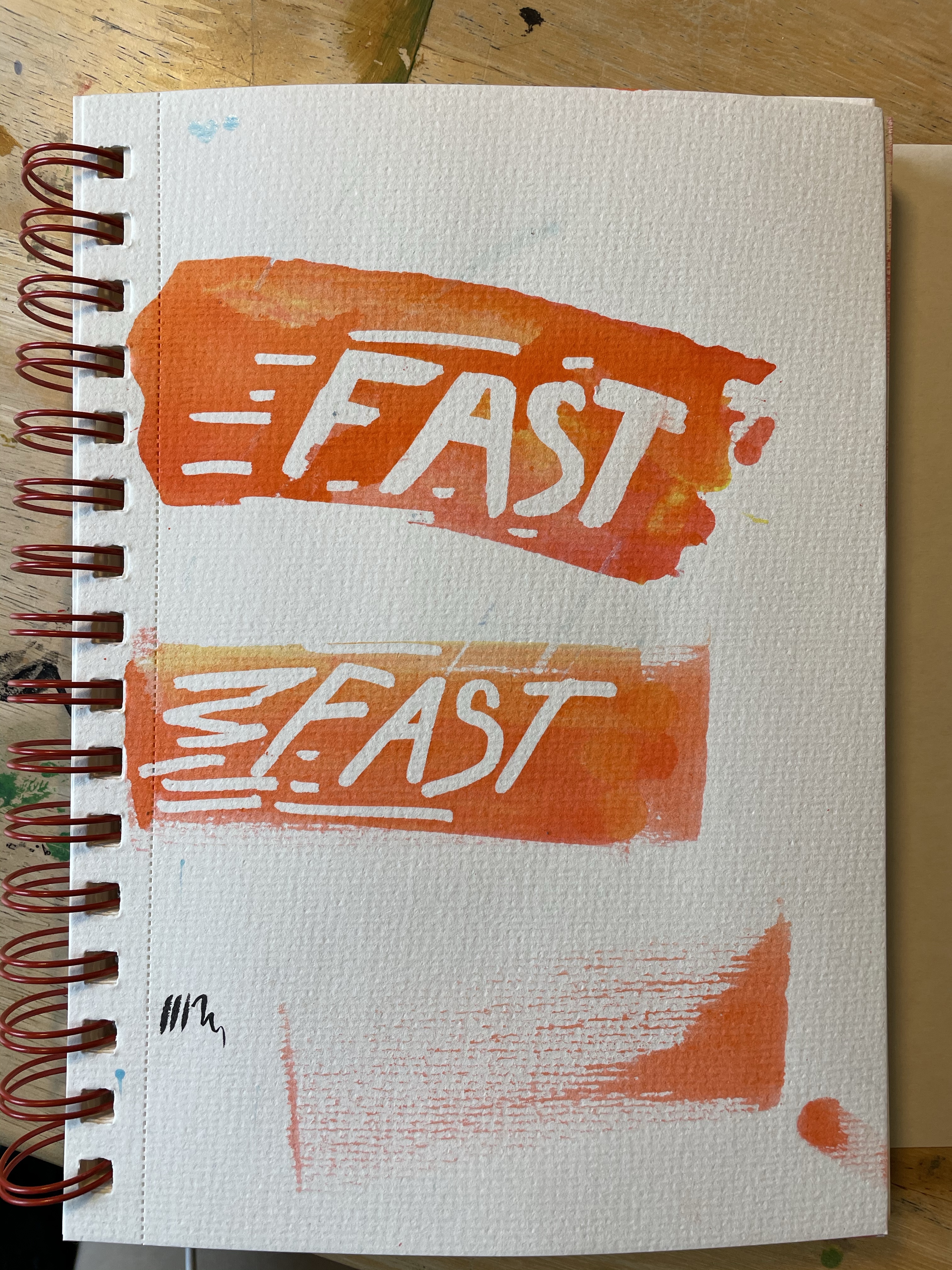
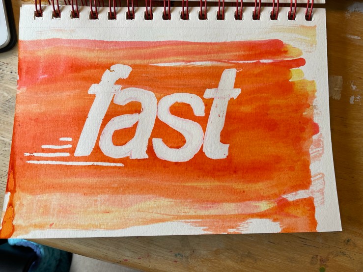
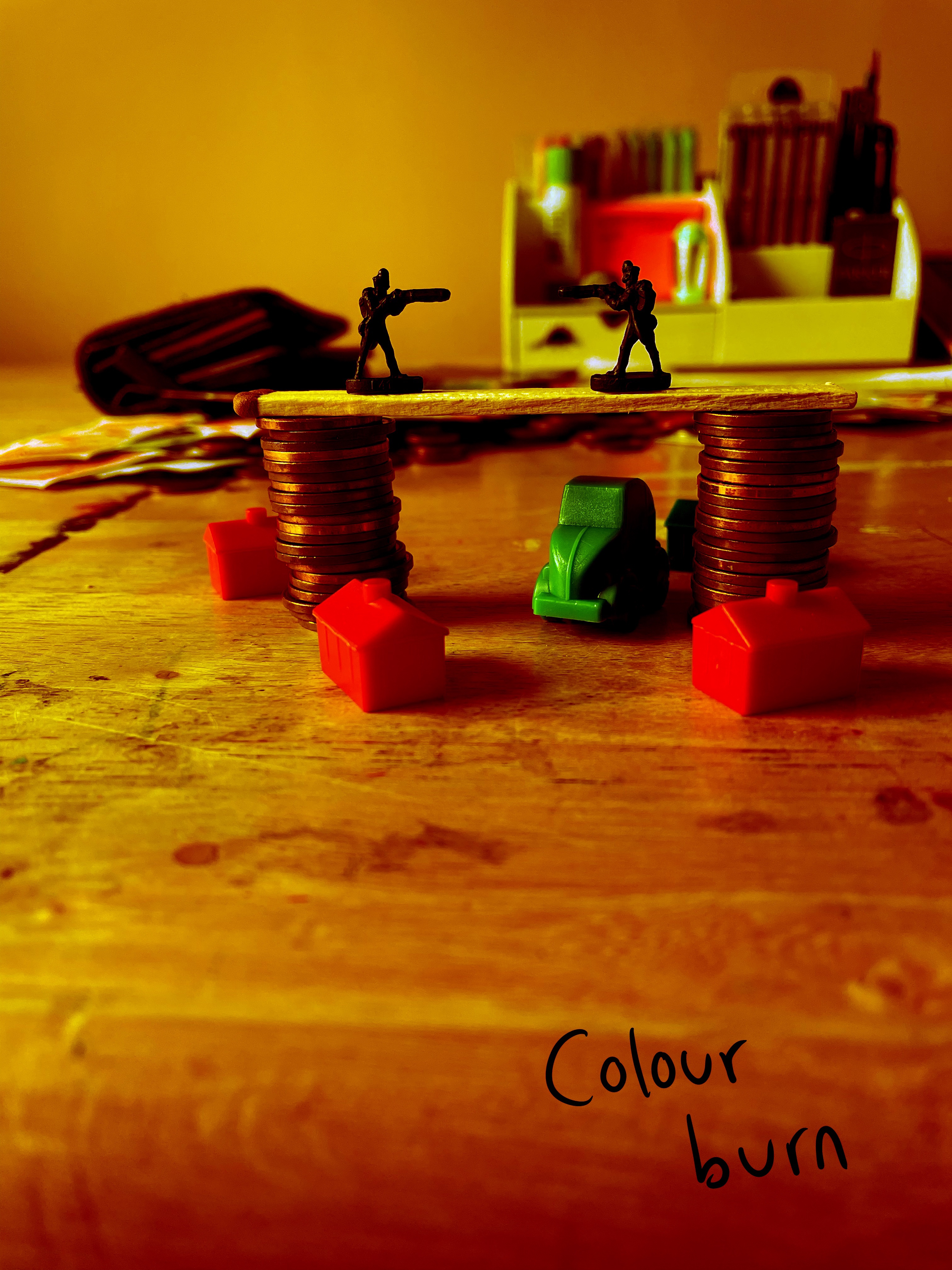
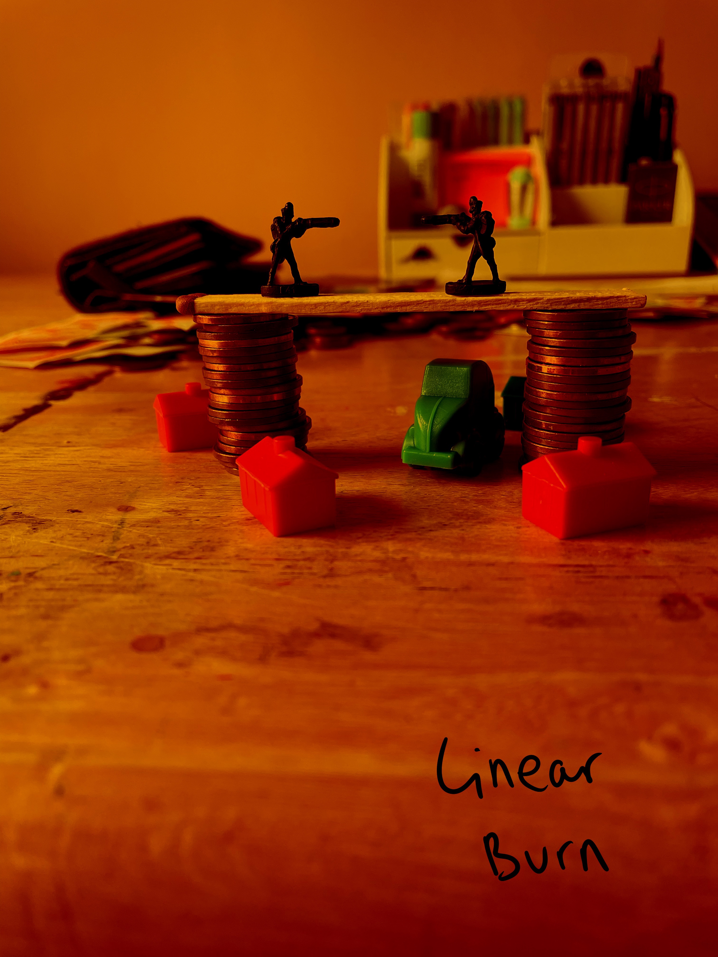
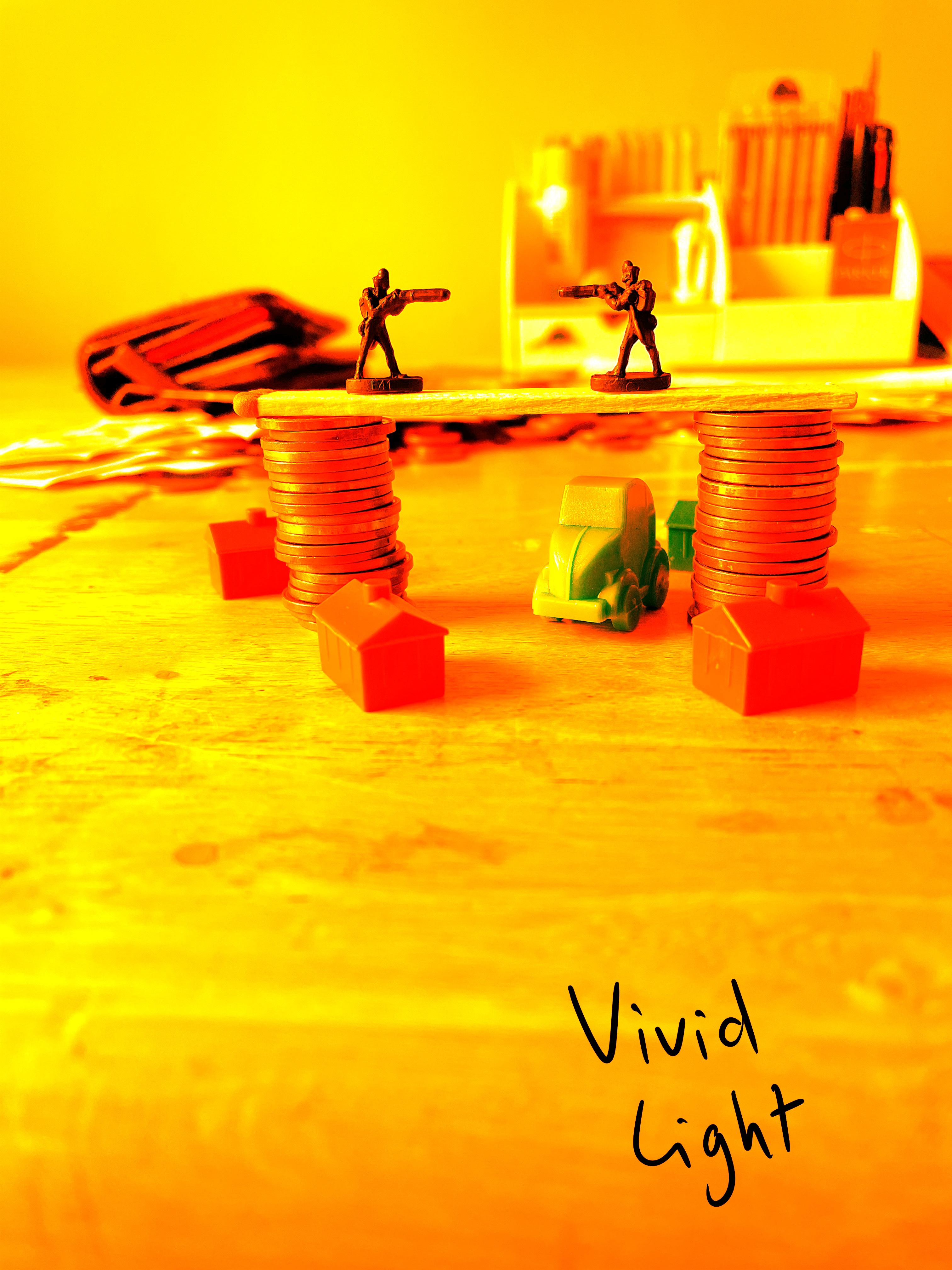
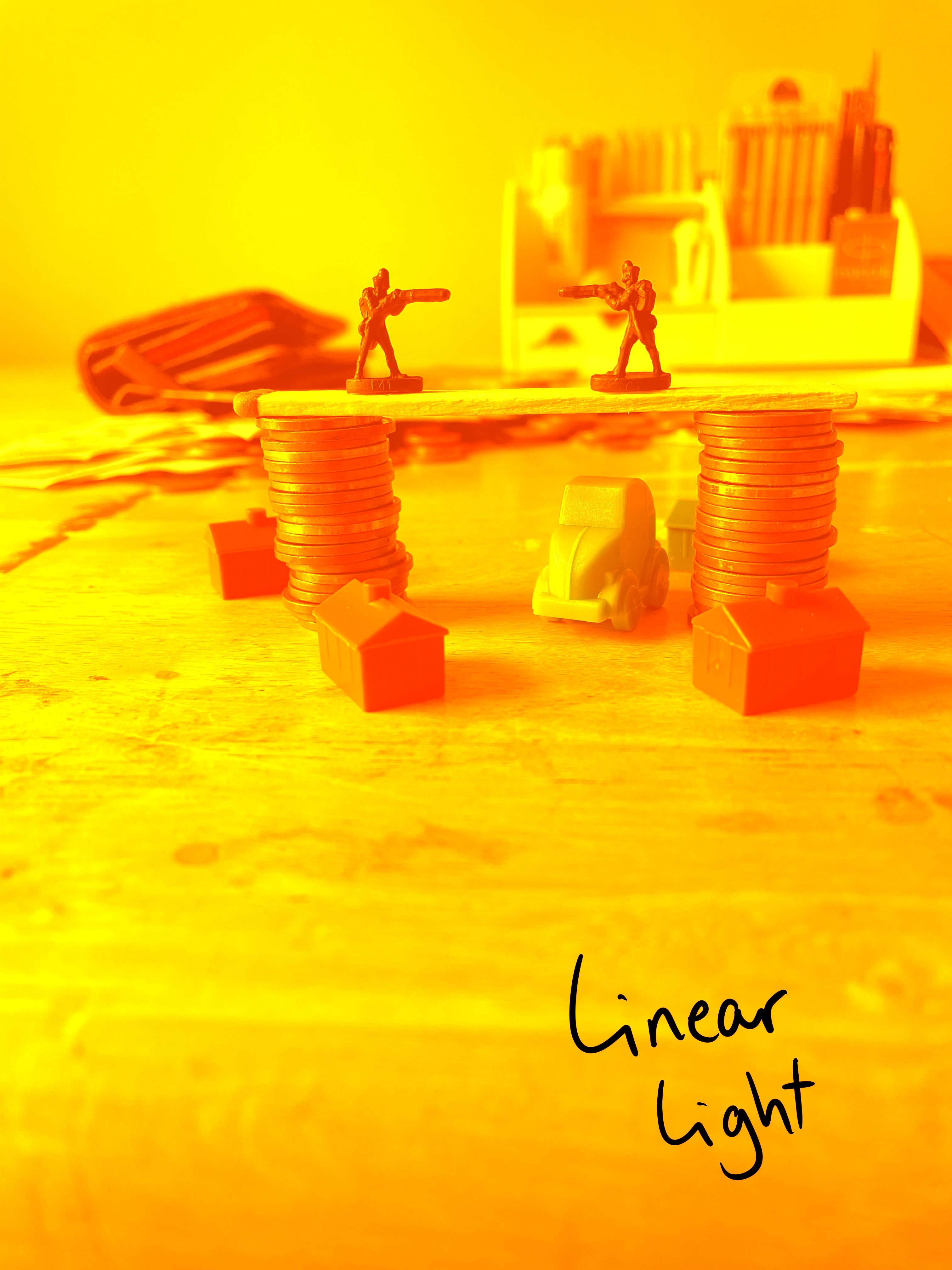
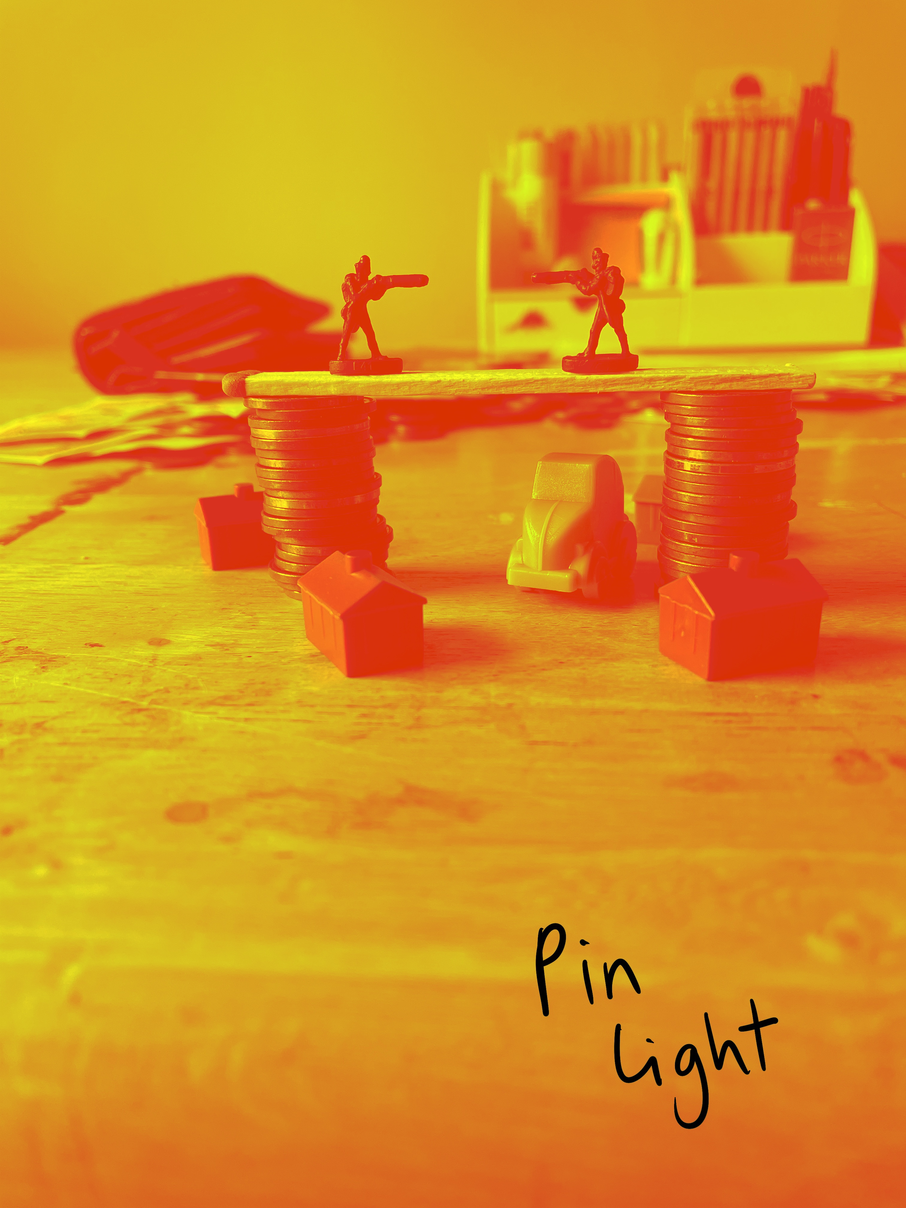
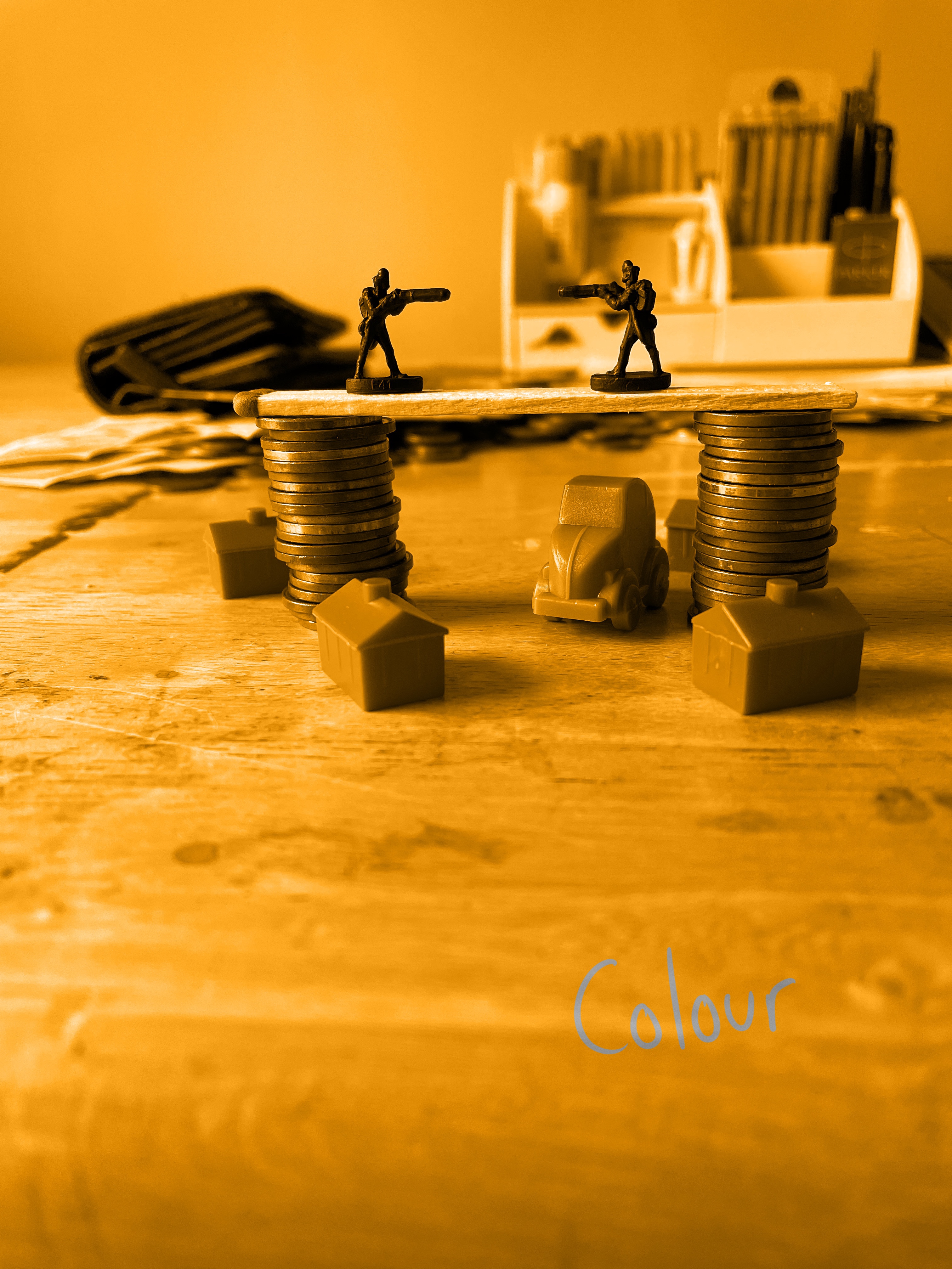
  • Colour. I love colour, and I loved working with limited and unique colour palettes throughout KSI. I want to further explore and understand this. What colours do I like? What palettes work, and what doesn’t? Where do I find inspiration for colour? How do I choose which colours to use? How do I move away from traditional colouring and add my own flair?
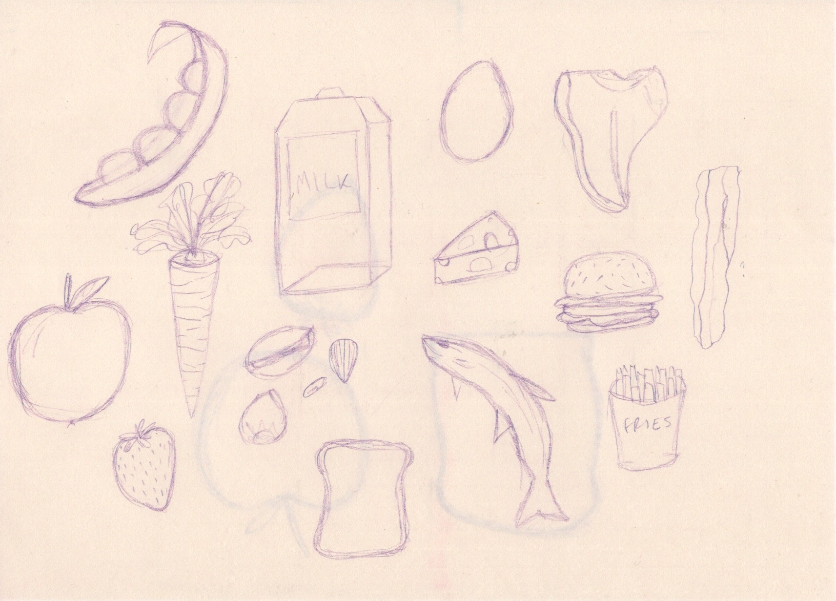
  • Materials. I want to have more variation in my mediums and a better understanding of the ones I enjoy using. I especially would like to use more ink, pastels, and coloured pencils. I would also really like to be creating a lot of mixed media work.
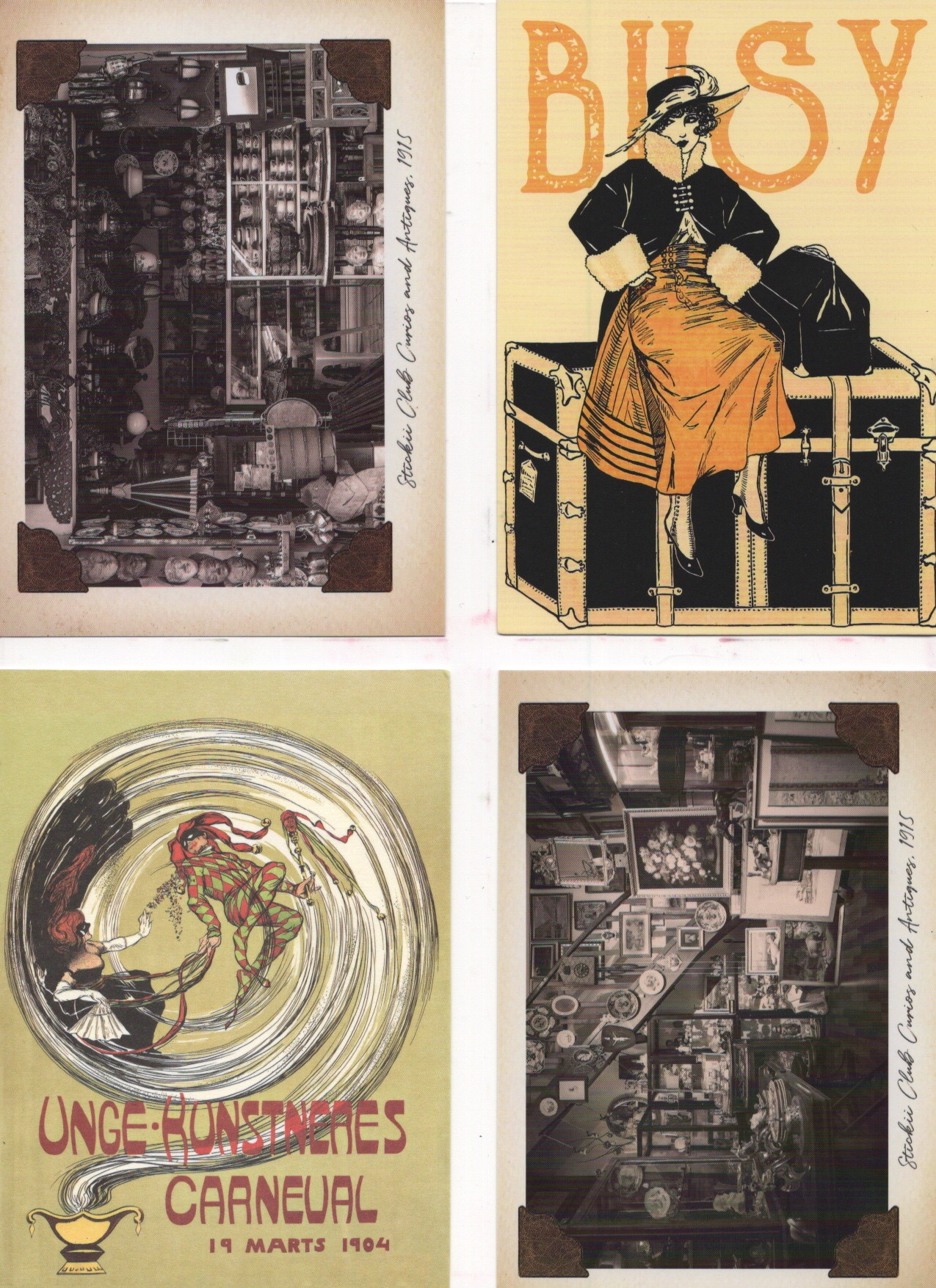
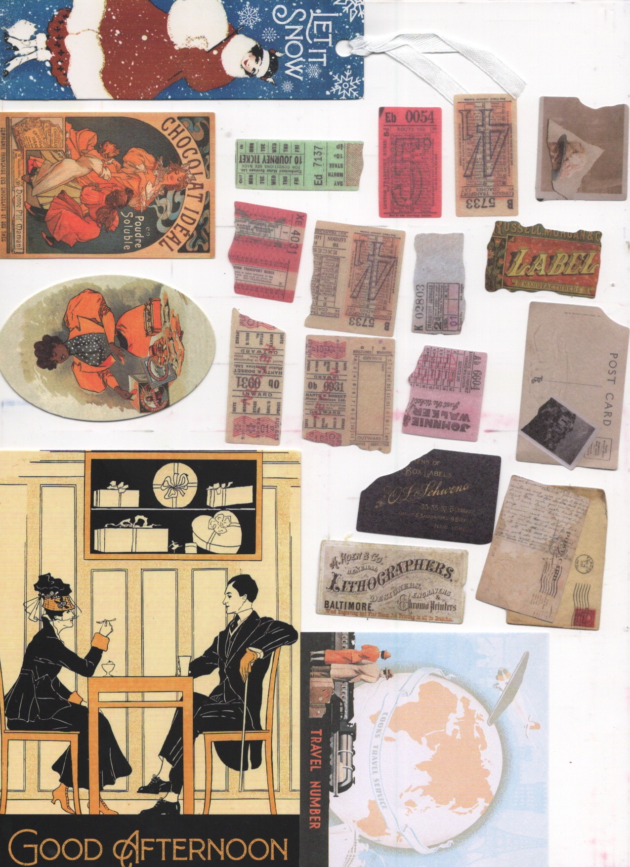
  • Photo montage and collage. This was an area I found myself repeatedly being drawn back to whilst researching for projects in KSI. I’d really like to figure out how to do this myself, and to combine it with the above two goals.
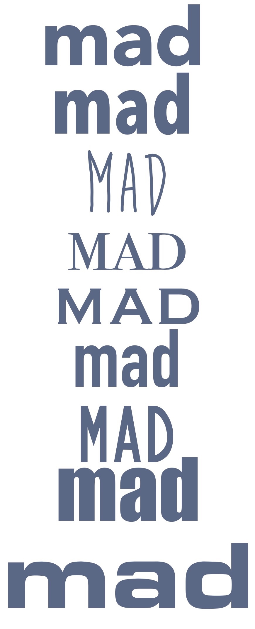
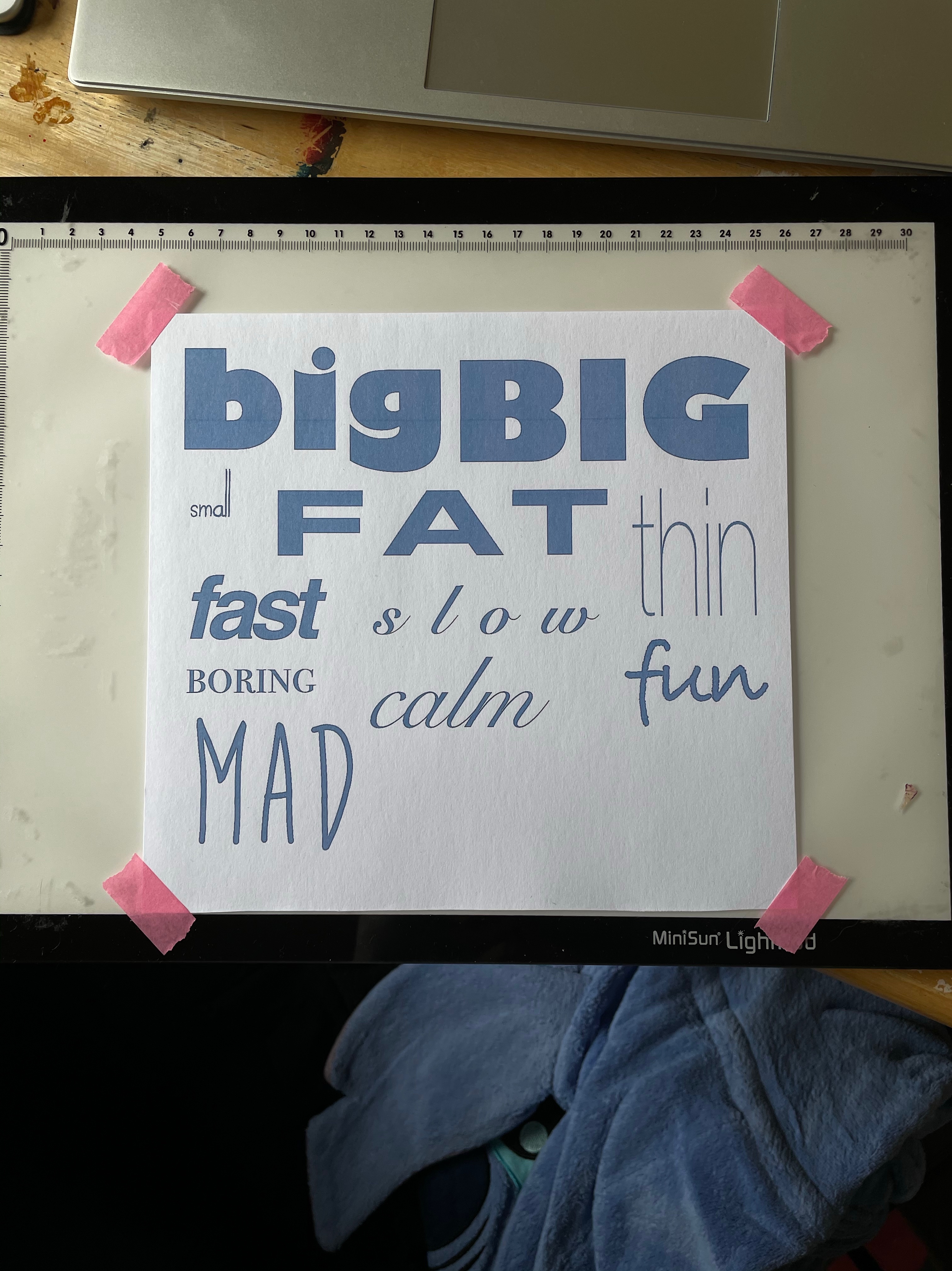
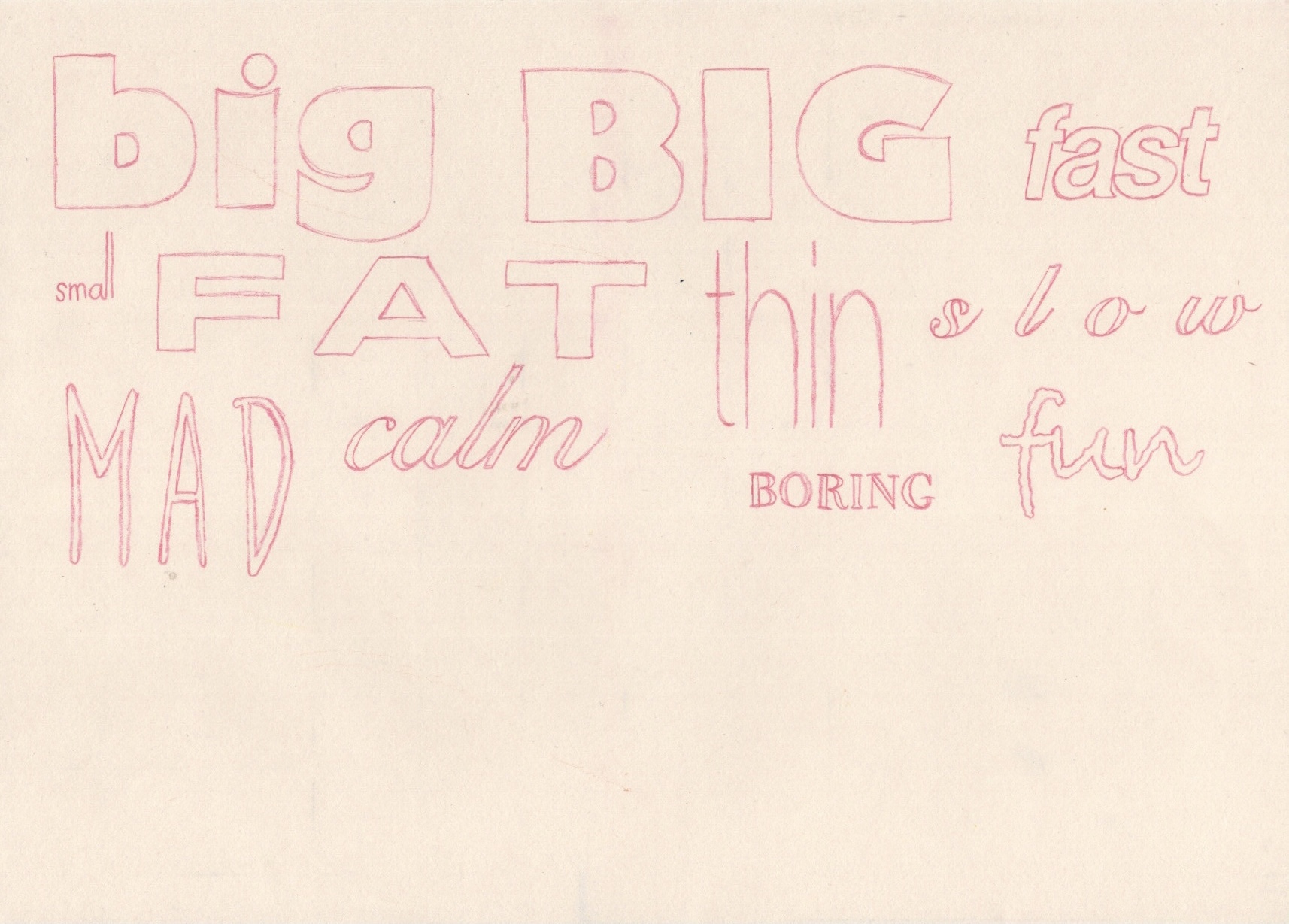
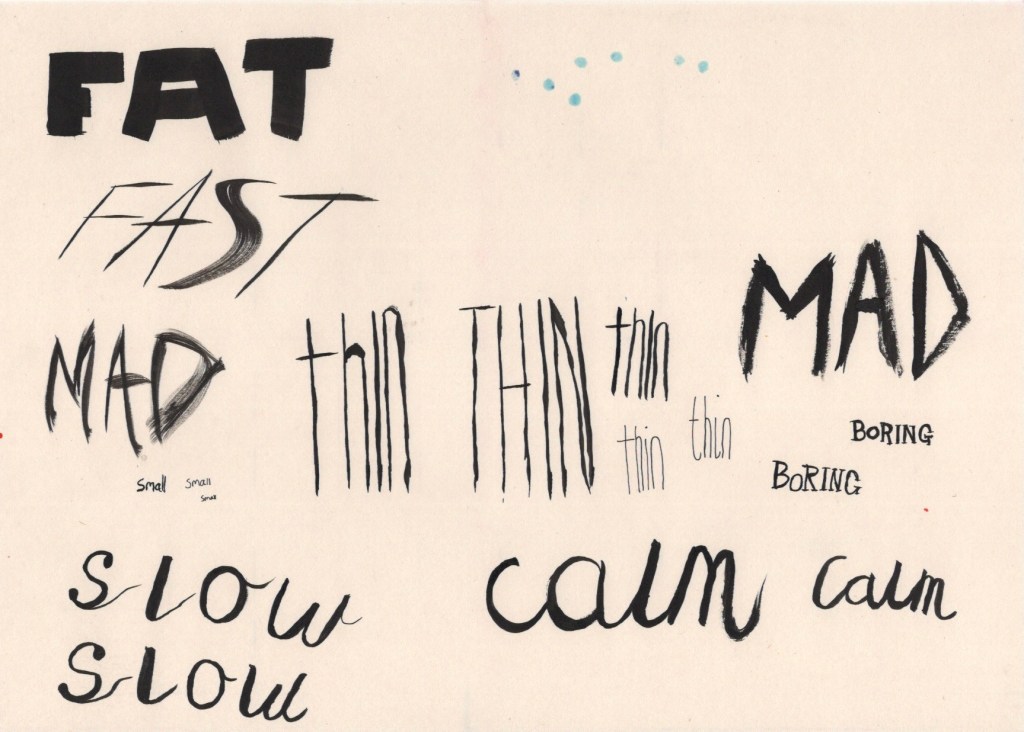
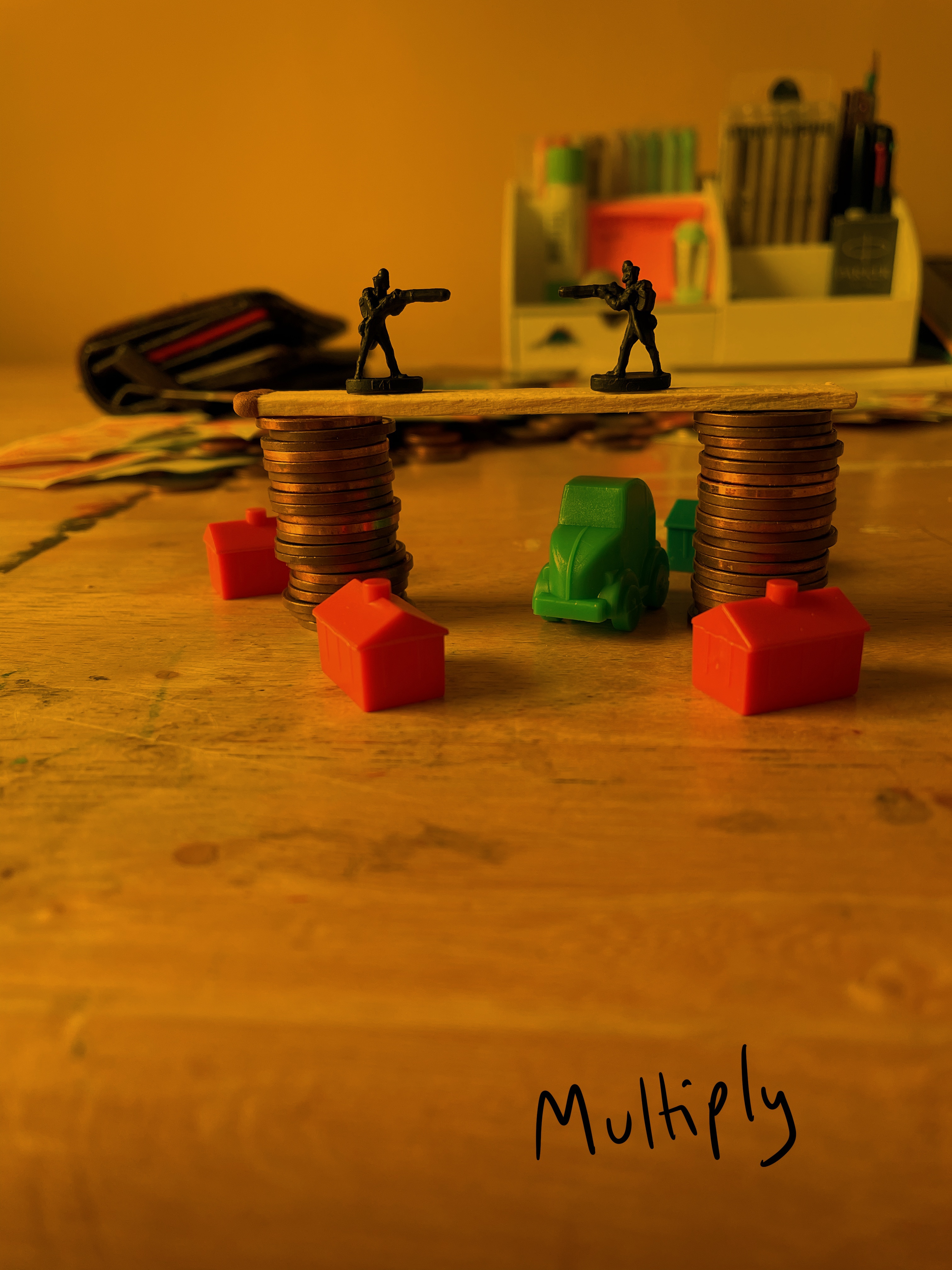
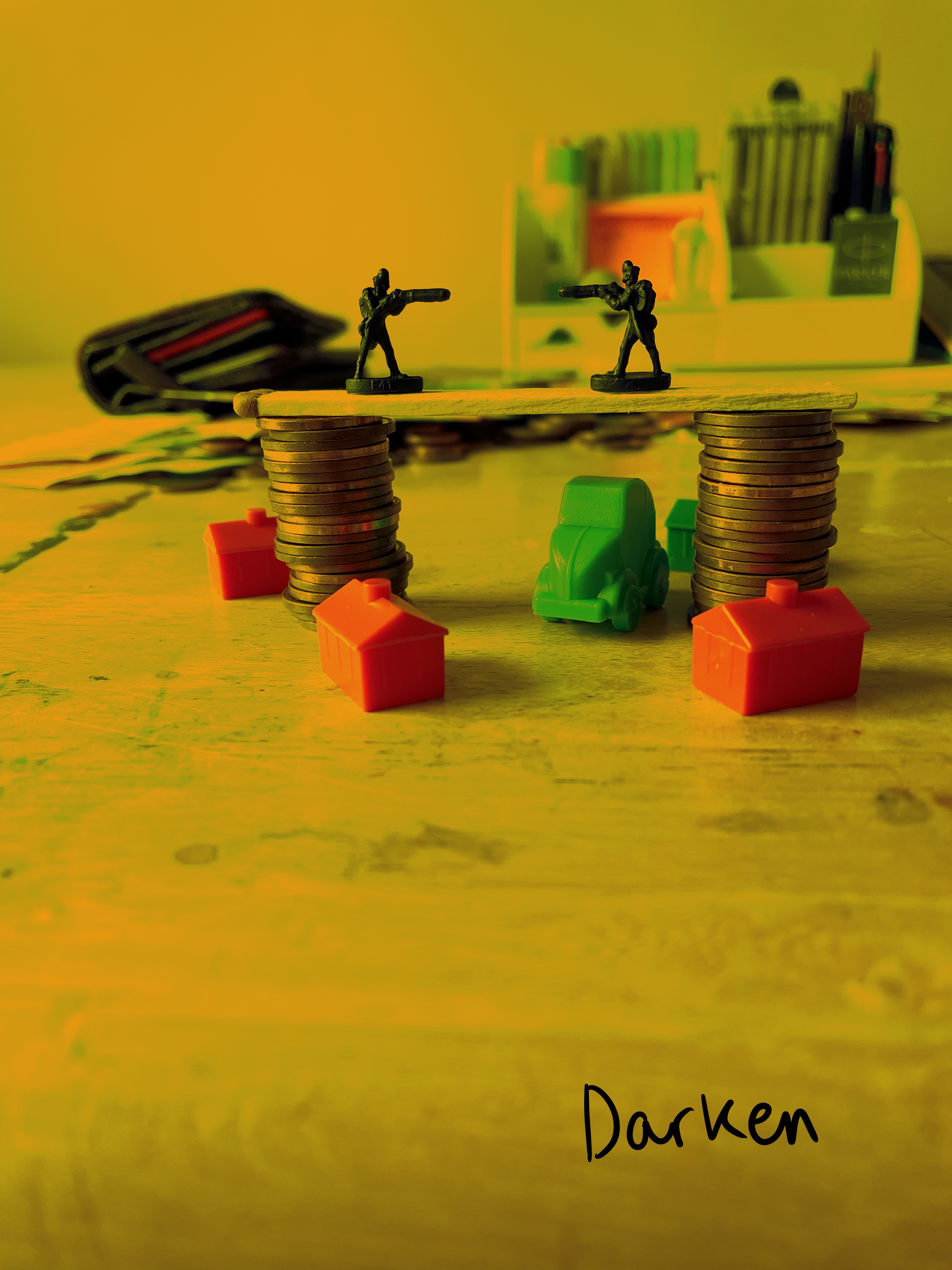
  • Experimental artwork. This sort of ties together all three of the areas I have mentioned already. I want to get more experimental, move more into abstract and modern art styles, and start questioning how I do everything I do. I want to push the boundaries of the art I already create and see what happens. I want to create pieces that look ‘ugly’ or ‘weird’ and learn from it.

Alongside the areas of artistic expresion I’d like to develop, there were some specific learning opportunities I’m keen on figuring out.

  • How do I respond to the things that inspire me? I’m constantly feeling inspired and find my mind brimming with ideas and concepts, but often I don’t actually know where to start or how to take from my inspiration.
  • How can I develop concepts without a brief? Key Steps in Illustration taught me a wonderful illustrative process, but I only have practice using this process when following a brief. I’m not sure how to mould and shape my process for my own ideas.
  • Where does my artwork sit contextually in the world? This is a thought I have been returning to a lot lately. I’m eager to know where I ‘belong’ as an artist.
  • Working through books that inspire me. I have three books currently that I’m eager to read and work alongside of. One is character design focused, one is sketching focused, and one is focused on using coloured india inks. This ties into the first point, but I also want to use these books to learn and explore areas I feel I am lacking in.

My goals, both in what I’d like to do artistically and what I’d like to learn from the course, seem perfectly fitted to this unit. I have been reading ahead and I think I’m on the right track. I hope that I can keep revisiting this log, and my goals, and questioning whether I’m pushing myself to explore those things. I feel like this unit gives me a solid year to ‘go crazy’ and push the limits in every way possible. Once I move on to future units, I hope to maintain my sketchbook practice, but I’m aware it’ll change somewhat to fit the briefs I will be following. If I can find a sweet spot – a place where I can be experimental and explorative whilst still meeting my briefs – that would be perfect!

Reading the introductions from the individual writers of the unit was really inspiring and helped me understand the course content so much more. I was especially inspired by something Beth Dawson said: ‘where these sketchbooks were left was the start of the visual story they told about where they had been or the journey they had been a part of, like confetti left over from an event marking something that’s passed’. I love this concept, and I feel it enormously. I have notebooks and sketchbooks and photo albums and memory boxes scattered throughout my house from my entire life. They are half full or unfinished and represent important moments and journeys I have embarked upon. I already resonate with the idea that the sketchbook as an object is something of importance.

India Ritchie discussed her preoccupation with the traces that we leave behind. This prompted me to think about the topics and thoughts that I am preoccupied with, the feelings I keep going back to that inspire me to create. I realised that I am preoccupied with the passage of time, with the significance of individual moments, and with how memories are formed and remembered. Last year I participated in a sketchbook circle with the OCA (which you can find here) and for my book I picked the theme ‘time’. Perhaps this is why Beth’s words resonated with me so well. The sketchbook as an object is a marker in your life, a companion for a specific time, it holds memories and thoughts and feelings that were perhaps fleeting and unique to the time they existed in.

I love watching sketchbook tours on YouTube. I often specifically will look for ‘bad’ sketchbook tours, or ones which are messy and unfinished. I’m not as big a fan of the overly perfect illustrative layouts that some artists produce, as I can’t relate with my own goals and work. One of the things that I find most enjoyable about these videos is that every artist recalls where they were, who they were with, and what they were doing when they sketched the page in question. They really are portals into the lives of others, and I love that.

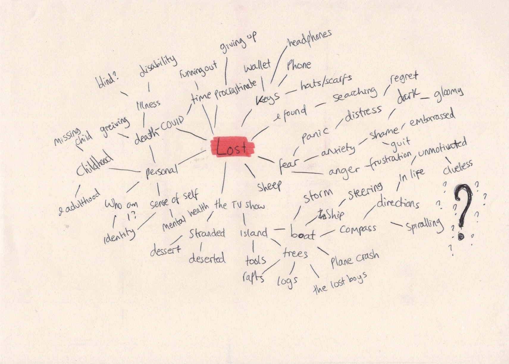
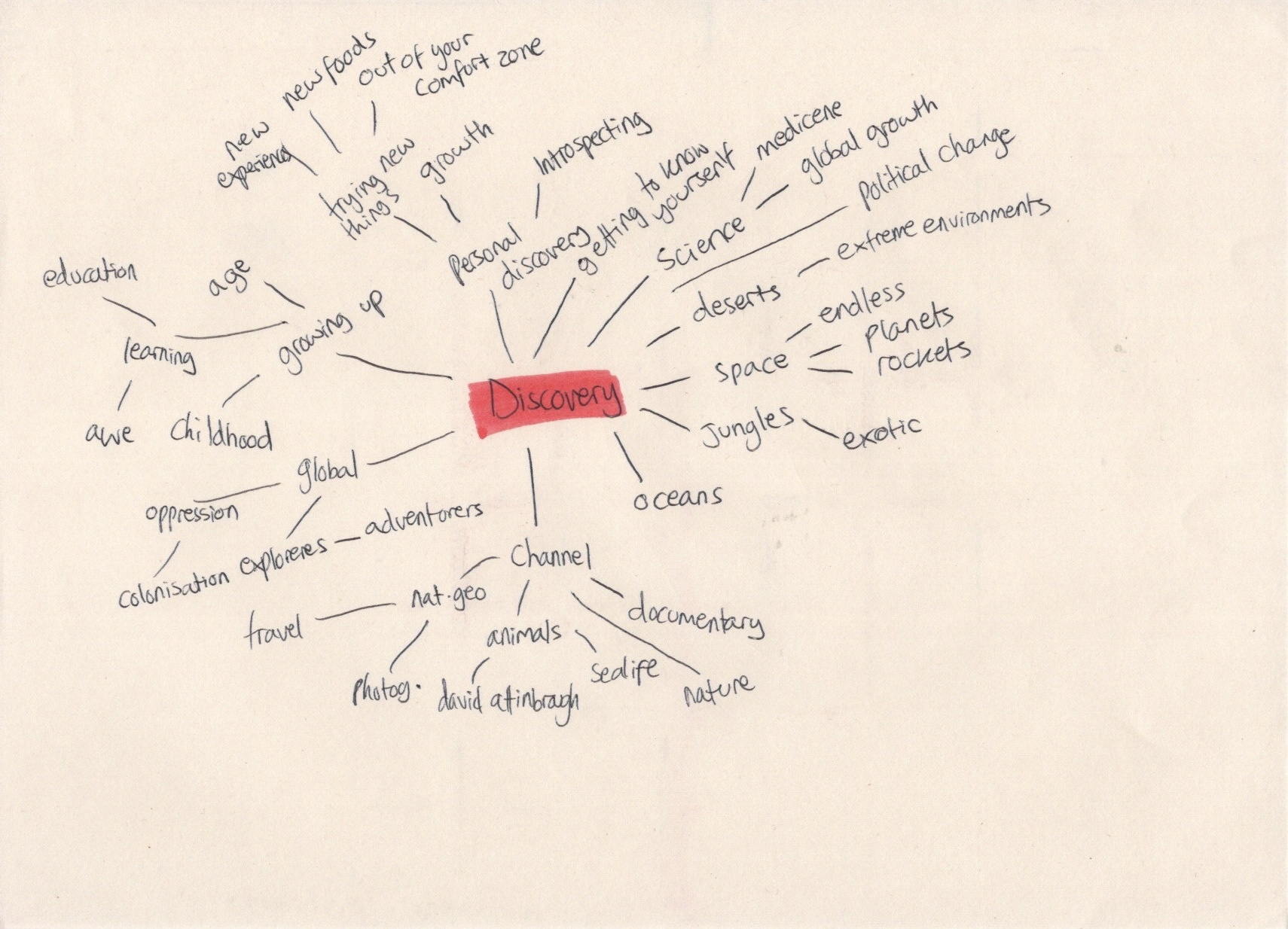
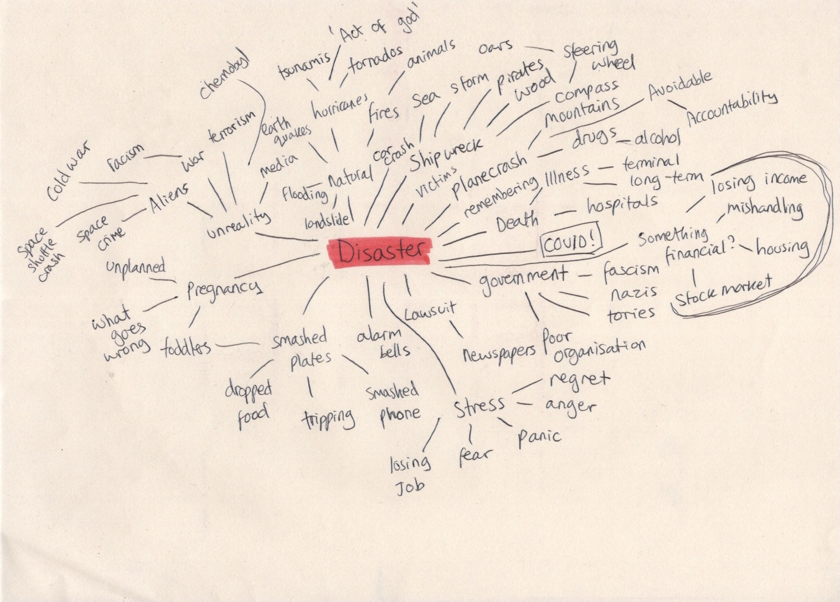
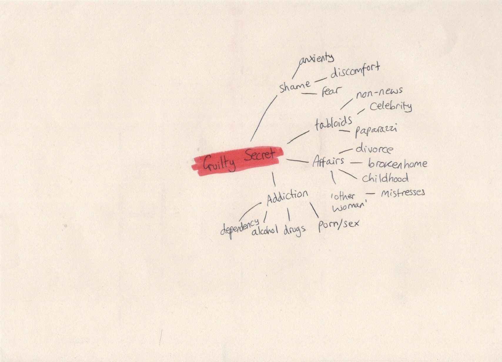
The introduction to the unit encourages you to start thinking about the concept of ‘the everyday’ in preparation for the content going forwards. This is quite easy for me, as I already conciously observe the everyday. I have a background in social anthropology and have found pleasure in being an observer of the ‘normal’ for many years. I also have experienced extreme ill health in my life, which, when chronic, really impacts your mental health. I learned a while ago that appreciating all of the little insignificant things that happen only improves my mental health. When COVID hit, I noticed a common feeling for others was missing those every day moments. I felt somewhat alienated, as I didn’t miss them. I already lived my life appreciating all the small things.

Because I am so familiar with my own everyday and I already focus on all of these moments, I began questioning how other people experience their everyday. Again, with an anthropological background, this isn’t a new thought for me – I have been travelling and living with families worldwide since the age of 16 in order to explore various cultures and ways of living. I wrote down some thoughts I wanted to explore further in my first assignment and throughout the unit.

  • What does ‘the everyday’ mean to me? Specifically, when I think about it deeply, not when I’m living it and noticing it.
  • What is my ‘dream’ everyday? How would I like my everyday to look if I could have it any way I wanted? How do my disabilities intertwine with this vision?
  • The phrase ‘one man’s trash is another man’s treasure’. One person may find their everyday extremely dull, mundane, and negative, but another may relish in the same position. How can this be explored visually?
  • Researching other people’s everyday, asking my friends and communities what their everyday looks like and what it means to them, and having 1-1 conversations with people about their lives.

These notes, especially when combined with the artistic goals I have for this unit, have given me a really good starting point. I’m already so engaged with the concept and with creating work for it. I feel pretty confident going forwards that I’ll not have any major ‘blanks’ when trying to make art, though, that’s optimistic.

Towards the end of the introduction chapter, I was asked to answer 4 questions:

  • Do you feel a bit anxious about starting your sketchbook?
  • Are you worried that you will have to show your work to your tutor and you don’t think it is ‘good enough’?
  • Are you concerned that you haven’t used a sketchbook ever, or for a while?
  • Are you confused because you don’t know the ‘right’ way to do a sketchbook?

My answer to all of these questions was ‘no’. A year ago, however, it probably would’ve been ‘yes’. Throughout Key Steps in Illustration I was pushed out of my comfort zone and challenged repeatedly. A key theme I faced was a struggle with my own perfectionism, which I felt I overcame triumphantly. I forced myself to be uncomfortable, especially in regards to sketchbooks, and to try to work in ways I never had before. Now, I’m confident in my work. I know that ‘bad’ isn’t really a thing. Art is art and how I create is how I create, and every experience I have creating leads to new opportunities. I feel I have already overcome the things I needed to in order to fully explore in this unit.

I am beginning this unit brimming with ideas, concepts, and positivity. I don’t expect I’ll keep that up – we all have peaks and dips – but I’m hoping I love this course as much as I’m anticipating. I’m really looking forward to exploring the things I have set out to achieve, and to get started on the projects in the unit.

Assignment 5: Seven Days

My final assignment for Key Steps in Illustration is finally here! The assignment is designed to be an opportunity to look back on the work I have created throughout the course, and to reflect on what I’ve enjoyed, the successes I’ve had, and the areas of illustration I’m most interested in. It gives me a chance to use all of the skills I have gained so far in creating something I’m truly passionate about. To quote the Key Steps in Illustration PDF: ‘you have the maximum capacity to show off your interests and talents’.

The title of the assignment is ‘Seven Days’. How I chose to interpret that could be objective or subjective, and I was asked to produce either seven separate, one large diagrammatic, or a continuous strip illustration. The media, methods, context, and intended audience were entirely up to me. I had to write myself a brief to follow that includes these things and that showcased my ‘interests and talents’ as said above. I also had to specify the final size and size I was working at. I had to submit all working stages from initial ideas to finalised artwork.

This was a huge task. Ordinarily, when I approach a project I begin by dissecting the brief and identifying what my first steps will be. I didn’t really have a brief here, so the first step was to figure out what I wanted to create. I began by writing the key points I needed to look at for my brief: reflecting on work I’ve enjoyed, successes I’ve had, identifying which areas of illustration I’m drawn to, and showing off my interests and talents. I didn’t know how to answer most of these questions, so I decided to look back over my learning log at the work created during the unit. I wrote down each of my favourite exercises/assignments and a few notes on why I enjoyed each one. Once I reached the end of my log, it became apparent that there were trends in what I enjoyed.

My favourite exercises and assignments were typically those that involved branding or marketing in some way, and often had vintage-inspired designs in them. I also enjoyed exploring new mediums, designing and using patterns, restrictive colour palettes, and abstract or fantastical content. I was surprised by this outcome,as it was clear my interests as an artist have shifted over the course of the year – but pleasantly so, as I feel I’m starting to find my footing and begin clearly identifying areas of interest and exploration. My favourite work completed during this unit are the pieces in Exercises 11 & 22. I wanted to understand why, and see how I could push this even further, so I started jotting down ideas.

My first research sheet

I liked the space theme, the mediums used, the styles mimicked, and most of all the whimsical and abstract content. I definitely wanted to explore some sort of obscure vintage designs in my brief, but I was stumped as to how. I have explored the 1950s in Exercise 7, and the 1960-70s in Assignment 3, which left me wanting to investigate a new era not yet looked into. I understood how post-WWII euphoria drove technology and colour into the everyday home, and the impact this had on both fashion and design, but I knew little about the pre-war era. I did some brief Googling of imagery from the 1920-30s and found I preferred the modernism of the 30s to the excess of the 1920s, but there was a lot of crossover and very little that was clear-cut between the two. I settled on ‘pre-war’ as a generalised era and moved on to identifying my audience and context.

I quite easily landed on my connection to the theme of ‘seven days’. With the concept of space at the forefront of my mind, I knew early on that I wanted to incorporate planets – specifically those that are the namesakes for the days of the week. Monday is named after the moon, once being known as ‘moon day’, Tuesday after Mars, Wednesday after Mercury, Thursday after Jupiter, Friday after Venus, Saturday after Saturn, and Sunday of course after the Sun. This connection is one I frequently think about, as it’s my method of remembering the Italian names for the days (lunedi, martedi, mercolodi, giovedi, venerdi, sabato, domenica). I next had to figure out how this planet concept, tied to my love of vintage styles and kooky content, would translate into a marketable product.

My first thought was the beauty industry. I’m unsure on how I landed there, but it seemed to work. Eyeshadow palettes, lipstick bottles, perfume lines… I wasn’t sure if it made sense. I thought about which areas I’d already created content for: bands, supermarkets, biscuits, book covers, museums… maybe I could do an informational diagrammatic illustration about the days of the week, and how they connect to the planets – but then how would I create something abstract? I left it alone to brew in my mind while I chatted about my ideas with some friends, trying to pry out some inspiration. Whilst responding to the question ‘But how would that work?’ when discussing my beauty industry ideas, a seemingly perfect concept hit me.

My scribbled idea concept

At 11pm, half asleep and midway through watching a film, I grabbed the nearest piece of paper to me and scribbled out my concept, plus taglines and names. I excitedly rambled to my housemate about how perfect this was and how I would truly be finishing the course with a bang, then groaned audibly the next day as I realised this torn and scribbled on piece of notebook paper would have to end up in my learning log. A lesson in always having a sketchbook to hand! My concept: a (then unspecified) perfume brand is releasing a new line of fragrances, one for each day of the week. They want labels for their seven bottles, each with an individual illustration, and one for the back.

The next day I set out to write my brief. I wasn’t sure how to approach this, as the briefs throughout the Key Steps in Illustration unit are very instructive – explaining exactly how to approach them – whereas client briefs in the real world are less so. I spent some time researching how to write briefs, and I looked at the student briefs available for this year’s D&AD awards. Looking at these, and the responses to them, was incredibly inspiring and motivating. I felt like my brief was realistic, but also that I could easily tackle one of the ones available on their website.

The majority of the articles I read on how to write a brief emphasised describing who you are as a client, what your company stands for, and how your moral code should be portrayed. This didn’t feel useful to me, as my brief didn’t need to be that in-depth. After a lot of digging around I came across this article on C’monde which, whilst still focused on detailing how your company functions as a client, had some really useful questions which I could use as a starting point. I began noting down answers to relevant questions on my research sheet, and found I needed to do a bit of research. The key thing I needed to know was what size my illustrations would be reproduced at.

I found a picture on Google Images from a company that sells custom perfume bottles, and used this as a guide. It took a lot of maths to figure out a proportional decrease in size for the 3 different bottles, but I got there in the end! I also decided to choose Chanel as my brand, without very much research, as I felt it was appropriate for the vintage style, and also for the target market and sex appeal. Once I had the details worked out, I wrote up my brief.

Perfume Bottle Design & Promotion

Chanel is releasing a new line of perfumes and requires an illustrator to design packaging (labels and boxes) and promotional material. We recognise that one fragrance simply isn’t enough for the busy day-to-day life of the modern woman, so we want to provide more choices to fit everyone’s schedule. The line will consist of seven different perfumes based on the seven days of the week, with the taglines ‘7 days, 7 scents’ and ‘which one are you?’ to be used in marketing campaigns, alongside the imagery created for the perfume bottle labels.

Our target market is 18-35 year old women and our goal is to make them feel glamorous, sexy, and powerful, every moment of every day. With the current revitalisation of the ‘roaring 20s’, we’d like the branding for this perfume line to be inspired by early 20th century vintage aesthetics. In fact, we’re even returning to our own roots and will be modelling the perfume bottles off of our classic 1920s look.

With the stress of the pandemic and current global climate, we want our customers to feel like our fragrances transport them into another world. A whimsical and abstract approach is desirable for this purpose. We want our customers to feel ownership and belonging with their chosen fragrance, but also remain open to the possibility of purchasing all seven – one new fragrance for each new escape.

What We Want
We need seven unique labels, one for each perfume bottle, and one label for the backs. The labels will be reproduced on three different bottle sizes: 100ml at 92x65mm, 50ml at 77x54mm, and 30ml at 69x49mm. The label illustrations will also be used in promotional materials and on the outer packaging for the perfumes. Please submit client visuals, completed illustrations, and at least one mock-up.

Once I had finished polishing off my brief, I was able to move on to my regular illustration processes.


I started by listing some key research points: perfume throughout history, pre-war styles and aesthetics, the history of Chanel, and figuring out how to connect it all together. I decided to begin by researching the design styles of the 1920s/30s, prompted by the arrival of my monthly sticker subscription pack from Stickii. I have been a long-time member of this subscription service, opting unsurprisingly for the ‘vintage’ pack. I use them every month in planners and my sketchbook, and I’m frequently inspired by the collections they put together. This month’s theme was ‘For science!’ and it featured two sheets of graphic illustrations of planets. I was so excited as it was exactly the sort of look I wanted my final pieces to have.

I have never before properly sifted through all of my stickers in order to use them as reference material, but I thought now was a better time than ever! I picked out all of the illustrations that inspired me or that I felt were connected to both the chosen era and the content I wanted to include in this piece. I scanned them all in to better look through them and in order to reference them with greater ease. Whilst using what resources I had to hand, I decided to look through The Pattern Sourcebook, a favourite reference book of mine, to see what jumped out. Unfortunately, not much from the era felt relevant or inspiring, so I left it alone.

By this point my research sheet was starting to overflow, so I started a new one. I then took to Pinterest to see what I could find. I wanted to look at actual imagery from the 20s-30s as well as modern takes on the era, and then any and every kind of whimsical and wacky illustrations in order to find inspiration. For my first Pinterest board – pre-war aesthetics – I had a lot of luck! I found plenty of examples of advertising and illustration in the era I was looking at. I then tried to look for modern takes on the era, but wasn’t finding much on Pinterest. Whilst researching, however, I realised that the term ‘Art Deco’ originated in the 1920s, so I began to look further into this movement.

I found that the Art Deco movement was characterised by modernist and geometric designs, focusing on luxurious materials and colours. The optimism that followed the ending of World War I led to a growing cultural taste for glamour, exuberance, and anything expensive. Interiors were draped with velvets and silks, and bold colours such as reds, golds, and blues were heavily featured (source). There was a fascination with ancient motifs, inspired by the discovery of Tutankhamun’s tomb, taking inspiration from ancient egypt as well as other early classical eras. This style was often then combined with the ongoing cubism movement. (source) Beauty, simple shapes, and extravagant detailing were central to Art Deco designs. Symmetrical, stylised, and streamlined drawings, commonly featuring references to nature and history, such as nude women, animals, plants, sun rays, or the aforementioned classical motifs. (source)

My second research sheet

The Britannica article led me to explore the work of Edward McKnight Kauffer, an American graphic designer who worked for most of his life in the UK. His simplified, bold drawings are perfect examples of graphic illustration in the context of the Art Deco movement. I wondered why I’d gone so long without seeing his work.

I was beginning to get a little overwhelmed at this point, as there was just so much that was inspiring me. I felt that I could sit for days and follow hundreds of trains of thoughts, researching everything I could get my hands on. I needed to centre myself and regain focus.I decided to draw a mindmap of sorts, showing what information I needed in order to complete my final illustration. This meant I could focus on what was important and relevant, rather than getting lost going down various avenues of interest.

Mind map of what I wanted to include in my final work

I find that most of my idea development happens when I’m disengaged from my work. I sit and mindlessly play games or scroll through social media, and my brain ruminates on whatever it wants, which often leads back to the current projects I’m working on. As much as you can try to plan to do research then generate ideas, the two often happen simultaneously. By the next morning, my mind was overflowing with possibilities for the content of my final illustrations. I began my day by writing out everything in my head in order to keep track of it. I wanted all 7 of the labels to have the same border, featuring typical Art Deco designs, the Chanel branding, and the name of the fragrance. Each would also feature the planet they are based upon in the centre of the design, framed by the border. Then, using the astrological meaning of each of the planets, I would add one or two other elements such as Egyptian staffs forming an ‘X’ behind the planet Mars, the astrological representative for anger, passion, and sex.

It was an underdeveloped idea, but it was an idea. More importantly, I was extremely excited about it. I referenced my sticker scans to get more inspiration for what sort of objects could be featured in the illustrations, and remembered I was going to create a Pinterest board filled with abstract inspiration. I loved looking for work to add to this board, and I find it so inspiring. I’m definitely going to build on it and take it forward in my degree as a reference board for the sort of work I want to be creating.

I was ready to jump straight into illustrating at this point, but I had one last research point which I wanted to briefly explore: the marketing of perfume and the history of Chanel as a brand. I began on the Chanel website, and learned to my surprise that the first Chanel fragrance was launched in 1921, popularising itself in the exact era I’m drawing inspiration from for this project. This felt like something I could have known sooner, but I was excited that it all seemed to fall into place. I also took some notes on how the website was designed and any elements I felt would be relevant when designing my labels. Next, I visited the Perfume Shop online store to look at how the perfume was marketed. The majority of labels were very simple, often just text. I found that the design elements of the perfume tended to be in the shape of the bottle and the outer packaging. I thought about whether there were any perfume brands I knew of that had similar labels to the ones I wanted to create, and after some research I found that the Lush brand perfumes hit the nail on the head.

My third research sheet

I was confident now that I could go ahead and begin exploring ideas. I wanted to start by creating a border and background for my designs, as they would be consistent throughout all 7 illustrations, and then from there I could begin figuring out the content. I opened a Procreate canvas at the largest print size – 92x65mm – then realised I had no idea how big this actually was in the real world. I wanted a reference for the 3 print sizes so I could envision them whilst illustrating my designs, in order to ensure nothing would be missed or under-developed. I cut out cardboard templates of the three sizes, and pondered how I would create something that worked on such different scales. I also decided to size up my canvas a little, by 2.5x the size of the 100ml bottle, as I find sizing down is easier than sizing up. Throughout my illustration process I continuously referenced the three templates I had created, and I found this step very useful.

Due to the size of the smallest bottle, I started questioning how much detail I could really include in the illustrations. I wanted these to be fabulous and whimsical pieces with a lot going on, but it wouldn’t be readable or recognisable at a small print size. I cautiously decided to continue on, following my original plan of creating a border first and then figuring out the designs later.

Cardboard cut outs of the final size of my illustrations

I started by sketching out the idea I had developed for my border over the many days of research. I then began blocking it out using a simple black monoline brush. I used the symmetry tool whilst doing this to ensure I was perfecting this key Art Deco component. When I got to drawing the round detailing on the corners, I realised my design needed to change. I couldn’t keep up that perfect, smooth, and symmetrical style I was going for. I browsed through some of the images that came up on Google when I searched ‘Art Deco borders’ and changed my design to be more in-line with the style. I really enjoyed this process.

Time lapse video of my design process for the border

Next, I moved on to the scroll I wanted for the text. I was feeling conflicted about this, as it wasn’t really in line with any of my research. To me, a grandiose banner of text is whimsical and has Alice in Wonderland type vibes, which fit my brief well, but it wasn’t the standard in the 20s and 30s. I canvassed the OCA Visual Communication Discord server group for help – asking that if an illustration is inspired by an era, does it have to be 100% historically accurate, or can it have other influences? The general consensus was that something simply being inspired by an era just has to take, well, inspiration from it, and it doesn’t need to totally replicate the style of time itself absolutely. When I explained my brief further, people even pointed out that taking inspiration from other influences would increase the abstract and whimsical feel of the piece, almost as if it can’t quite be placed in time.

I chose the scroll that I thought looked best and moved on to colouring. I also decided I wanted to use a textured canvas for the piece, like I did in Assignment 3. I referenced the tests I did during that assignment to pick which one I wanted, and settled on the vintage canvas. I chose a gold tone for the main frame of the canvas, and a warm dark grey for the background. I also found a PNG of the official Chanel logo to add to the top of the label. I decided to add bits of the banner wrapped around each side of the main frame to try to tie it in a bit better, which worked really well. I then moved onto text. Initially, I really wanted to design my own font for this, but given the amount of work I had set myself up to do I decided it would be wiser to pick one instead.

I went to 1001freefonts and typed in the word ‘mercury’ as it was sufficiently long enough to give me a good idea of how the fonts would look. I then downloaded 7 different fonts to choose from and play around with. Throughout my research I had encountered a great deal of text, so I didn’t feel the need to do further research and felt I had a good handle on it. I tested out the fonts and picked two favourites – one called Performer, and one called Chaman Elegant. I then moved on to shading and adding detail. When I got to using the font, I realised that neither of my choices really worked for this piece. They both felt really superimposed and unnatural. I tried out another one of the fonts, Sarkowik, and I felt it looked a lot better. I used the warp tool to make the text ‘flow’ with the banner, which was somewhat tricky, but led to great results. Once finished, I duplicated the canvas 6 times and added the text for the other labels.

I then moved on to planning my main illustrations. I had initially planned to thumbnail these, but I ended up sort of just going with the flow. I began by sketching out some rough ideas on paper before moving into Procreate. Originally I wanted to draw all 7 planets on the same canvas, so I could compare them and make sure they worked alongside each other. I duplicated one of the canvases before removing the text so I could see how they worked in context. I started with the Moon, as it represents Monday and therefore the ‘first’ in the set. I played around a little with shapes, shading, and styles, but couldn’t quite figure out how I wanted it to look. I then started experimenting with textures, hoping that this would inspire me. I managed to find a way to make the illustrations look screen printed, which was one of my goals, and I took some time away to try to clear my head.

Sketches for my final illustration designs

When I came back, I decided to start with Mars as I had a pretty clear idea for what I wanted to do. I started by drawing out the shapes of the objects I wanted to include. I then erased around each of the objects to make them stand out, following a similar technique as in Exercise 11. Once I was happy with how the design looked, I filled in the shape on a blank layer with a textured brush to create the screen printed effect. I then used a splatter brush to add stars in the background, and used a combination of the cloud brush and blending modes to create a smokey coloured background, inspired by the colour associated with the planet. I was extremely happy with how this looked. I felt like I’d found the perfect balance – it wasn’t too much, or too little, and would work at a wide range of sizes.

Time lapse video of my design process for ‘Mars’ – the same process was used for all 7 illustrations

I followed this same process for the rest of my designs, so I won’t include a time lapse video for all of them. Throughout my design process I continually referred to my already completed designs to ensure I wasn’t straying too far from how they looked, maintaining consistency whilst still producing different designs. My first three designs – Mars, the Moon, and Mercury  – all went incredibly well. The pattern behind the Moon was meant to look like water, and the objects in the Mercury piece relate to Mercury’s astrological association with travel. I then moved on to Jupiter and Venus, which I felt strayed a little from the three I had already produced. The book behind Jupiter refers to the philosophical relevance of the planet, but it feels like the piece is lacking a little. The hearts behind Venus are in keeping with the planet’s astrological associations, but I’m not sure if they work. I felt like I was losing my way a little bit and found myself frustrated.

When I moved onto Saturn, I really felt stumped. I didn’t know how to add to this piece in a way that kept it desirable to purchase. ‘Restriction, limitation, and self-control’ are not particularly positive traits. I started researching other historical meanings of Saturn and found that the Roman god of Saturn was the god of time. That’s when I got the idea for the hourglass. The keys on a chain are a nod to the restriction and limitation aspect, and the tight sharp border represents self-control. I feel this piece fits in perfectly, more so than the two I’d done previously. I then moved onto the Sun, which proved tricky too. I didn’t want to overwhelm the piece with too many elements, but I was running the risk of leaving it far too simple. I wanted to figure out how to match the simplicity of the Moon piece, while still incorporating the elements I wanted. I tried variations on sun rays and considered adding plants as a reference to the ‘life’ meaning found in astrology. I ended up leaving it in it’s simple form, as after a week of working on these pieces I was beginning to burn out and lose my creativity.

Mock-up showing the label in use

I’m not sure how to sum up this write-up. I took a day away from it all in the hopes a better conclusion would come to me, but I still feel stumped. Looking back on the work I have produced throughout this unit brings up a lot of feelings and thoughts. When I compare the work I produced/created for this assignment with the work from Assignment 1, I am astounded. In the past 14 months my skills as an illustrator have grown enormously, and the foundations for my practice have been laid out plain and simple. I am so excited about working now, I have let go of so many of the preconceived ideas I had about what makes art really art, and I have loosened up on my rigidity and expectations of myself. I don’t panic as much when I make mistakes, nor do I dread fulfilling briefs. In fact, I embrace them.

Having the opportunity to write my own brief was a wonderful learning experience. I definitely set the bar a little too high – not higher than what I’m capable of, just too much for the short time I had to complete it. I know now that I’d like to continue working in this way, considering audiences and doing thorough research before completing pieces, even if they’re just my own and for fun. Having a solid and planned out direction is enormously helpful. From the conception of my brief for this assignment, all the way throughout my full illustration process, I was excited. I feel like I can pinpoint my interests, style, and what it is I enjoy and want to explore further.

Finishing my first unit feels triumphant, and also a little sad. I am excited about moving on to my next unit and developing my sketchbook skills, but I will miss the experiences I have had throughout this unit. Seeing my own growth and creativity as an artist bloom has been wonderful. When I first began, I didn’t really view myself as an artist, nor did I feel art was a particularly big part of my life. I felt trapped by my own boundaries and expectations, and it made me scared to ever pursue anything. Now I couldn’t imagine spending my time doing anything else. This assignment has shown me that I’m capable of creating my own projects, following what I’m passionate about, and that I can function as an independent illustrator. That feels like a success.

Exercise 34: Working for Children

This exercise asked me to collect imagery made for children and group it into 5 age categories. I then had to take two of the age groups and select from a list a word for each group, brainstorming around the word and identifying themes, images, and ideas that relate to the age group. Once I had done this, I had to pick an animal that I felt was appropriate for the age group and create a simple image of the animal engaged in an activity that communicated my chosen word.

I once again approached this exercise using a research sheet, as I had found this very useful in the previous one. I began by writing a to-do list for the exercise and figuring out what I wanted to research. I have already spent quite a bit of time researching children’s illustration in previous exercises, so initially I went back over that and listed some artists I wanted to explore a little further. I also wanted to look at my Pinterest boards for previous exercises, and I re-read my post for Exercise 24, as this contained a wealth of useful research. After collecting imagery from my list of artists and making note of relevant information from my previous exercise, I visited the Waterstones website to delve even deeper.

My research sheet for this exercise

The children’s section of the Waterstones website is split up into different age categories, but they are slightly different to the categories provided in the exercise. Their categories are ‘Baby & Toddler’, 5-8 years old, 9-12 years old, and ‘Teenage/Young Adult’. It was still helpful, however, to go through each age group, as it gave me a much better idea of the sort of illustrations that appealed to different age ranges. I saved plenty of examples to go alongside the ones taken from previous exercises in order to organise them into the required age groups.

Pre-reader
Pre-school (3-5 years)
Early reader (5-7 years)
Established reader (7-9 years)
Older readers

Child psychology, development, and education are big interests of mine. For most of my life I have wanted to work with children in some form, especially younger children. I believe it’s vital that children have positive experiences in the first 7 years of their lives, as this is what becomes a foundation in their life-long development. Because of this, I absolutely love working for children as an artist. I love engaging in children’s media and art, as this inspires me and drives me to create my own, too. I also believe that as adults, we can hugely benefit from children’s media, and that the lines between ‘child’ and ‘adult’ when it comes to consuming media needn’t be as restrictive as they are. In fact, we could easily use the same approaches as we do in children’s illustration when communicating with adults.

Naturally, due to these interests, I was drawn to the younger age ranges when considering which to work for. I decided to choose one of the younger ages and one of the slightly older ones, to give myself a challenge and to widen my knowledge. I chose to further explore the ‘Preschool’ age range (3-5 years) and the ‘Established reader’ age range (7-9 years). I then considered which words I felt best fit these ranges. For preschoolers I felt ‘sad’, ‘growing’, and ‘family’ were good fits, and for the older age range I chose ‘wild’, ‘journey’, and ‘discovery’. Next, I looked at my two research boards for these age ranges, and compared them to my notes from Exercise 24. I found that the preschool board was pretty similar in style and design to my notes, the only difference being that there were more bold colours found throughout. My established reader board, however, was hugely different. This is exactly why I wanted to choose an older age range, as it’s something I’m totally unfamiliar with.

The illustrations on the established reader board featured text more centrally, and had less of a focus on the illustrations. It was clear from the usage of imagery that the text told a story and the illustrations illustrated, whereas in the younger age brackets the illustrations themselves were telling a story. The backgrounds in the book covers were more expansive and detailed, with more complex imagery and a lot less empty space. The colour palettes were wider and the shades much more intense, and they were found everywhere, often featuring across the entirety of the covers. There was a noticeable change in the emphasis in the imagery, moving from a more natural and realistic emphasis in the younger age categories to more out-there, wacky, surreal, and sci-fi type designs. The featured characters also underwent a clear change, and were more likely to be human instead of animal, with animals featuring more frequently as sidekicks rather than as main characters.

Going over these points helped me to narrow down which words I wanted to further explore: ‘wild’ for the established reader, and ‘sad’ for preschoolers. I decided to begin with ‘wild’ and started mindmapping my thoughts. It was really easy to brainstorm around this concept, especially with the age-range in mind, and I started coming up with ideas pretty quickly. It was hard to be focused on creating an animal character when I had just observed that the main characters for this age range seemed to more often be human, and this led to some issues with picking which animal I would use. I settled on a wolf, as I felt I could portray this in a human-like way with ease. My concept was that a young anthropomorphic wolf child would be standing in a forest, wearing scruffy torn clothes and holding some sort of carved stick while shouting ‘chaaaaarge!’, indicating some kind of imaginative play or game. The concept reminded me of my own brother at that age and the sort of media he would have been interested in, and I felt it was perfect.

Brainstorming around the word ‘wild’

I then moved on to the younger age group, and brainstormed around the word ‘sad’. This was a lot harder, as it’s more of an abstract concept than ‘wild’. It was especially hard to try to think of activities that represented the word ‘sad’, and how I could portray an animal doing them. I thought about the kinds of children’s books that may feature a sad animal, such as ones that teach children that sadness is a natural and okay emotion to feel. My first idea was a bear who was sad, taking a traditionally powerful and strong animal and portraying it as experiencing a ‘weak’ emotion in order to show kids that we all feel sad sometimes. From there, I Googled ‘animals that are symbols of happiness’ to see if there were any other animals that fit this criteria. I found an article about what messages are behind different animals, and almost immediately found the perfect idea.

Brainstorming around the word ‘sad’

The canary was the second animal on the list, and blue is a colour commonly related with sadness. Canaries are bright yellow, and I thought ‘what if there was a sad blue canary?’. This felt like the exact kind of content I would expect to see in a children’s book, and I was very excited to explore the idea further. I sketched out various canary shapes/poses using references found on Google Images, exploring how I wanted to portray the sadness through how the bird was posed. I also explored how simplified I wanted the shapes to be, and to what extent I would stylise the illustration.

Next, I decided to experiment with various mediums for this piece. As I have learned throughout my Key Steps research, children’s book illustrations are more likely to be done using traditional mediums rather than digital – or, when drawn digitally, imitating traditional mediums. Instead of creating the work digitally like I am usually drawn to doing, I decided to explore the various traditional options I had available. I first tried out some coloured pencils, then some watercolour, then I layered coloured pencil over watercolour. I also tried out some various fineliner widths, and experimented with using ink as a liner. I really liked the idea of using India inks to outline my piece, then going in with watercolour to colour it, and maybe finishing off with some coloured pencil for texture and layers.

Because I was already using my India inks, I thought I might as well test out the colours for those, too. At this stage I preferred the watercolour, but I wasn’t sure what colour to do my linework with. I felt black was too harsh and contrasting, and I wasn’t confident that I’d be able to make it look soft and whimsical. I also wasn’t sure which brush to use to do my lining. I tested out a chunky round water-brush that is my typical go-to when using water based mediums. It was pretty thick and difficult to control when lining, however. I then tested out a 00 size brush which was much easier to control, producing much softer and appealing lines. In addition, I painted 6 boxes in various shades of ink, so I could test how they looked against the watercolours. I also tested fineliners and coloured pencil, just in case.

Frustratingly, because I am so used to using Procreate to illustrate and the ease of documenting the process there, I didn’t think to take photographs of my illustration process for this image. It hadn’t occurred to me until now, when writing up my process, that I should be doing that. The process itself was testing. I really enjoy painting and I love using inks, but I struggle with the patience it takes to complete a piece. Waiting between layers for the paint to dry was quite the challenge, and one that I have not previously succeeded at. I felt I did well this time, despite the exercise taking twice as long as I had planned. I feel like when compared to my digital work it’s clear I’m a beginner at using this medium, but I also think the image works really well for its intended purpose.

My finished illustration

I chose to not proceed with exploring my wild wolf concept. This is largely due to the amount of time it took for me to illustrate the sad bird, and also my own confidence in the area of childrens illustration. I had started exploring it a bit more, considering what medium I would use and collecting image references, but I felt I couldn’t do it justice in the limited time I had. I think I would explore this concept digitally, trying to imitate traditional mediums on Procreate, and I hope I get to develop these skills more as time goes on.

I was asked to respond to three questions as part of this exercise, which I have done so below.

Are the target age brackets for children really as clear-cut as we’ve made them here?
No. Whilst going over my research and choosing which category to put each image into, I found that it was really difficult to pinpoint exactly where the boundaries are. I think that children’s media is much more broadly consumed – children of all ages have the potential to enjoy any of it. Before children can read independently their parents will read to them, and this doesn’t end when the child begins to read. 

Many children enjoy books that aren’t marketed to them. Even the Waterstones website which I used for research had larger age groups than the ones listed here, and I still didn’t fully agree with their categorisation. I think if we allowed children to choose what they want to read, without limitations (of course, ensuring all content is age appropriate), we would see much more diversity in the age groups reading each kind of book. There often seems to be an assumption that children below a certain age are only interested in the images in their books, and that children above that age no longer care for imagery and just want text to read. This is a sad assumption, and one that is definitely untrue. Illustrations and text can be used together in books for people of all ages, certainly not just children. I believe that, sadly, what children read is influenced both by their parents and by the culture surrounding education and intelligence, which in turn influences the market.

The Waterstones website featured a subsection under each age category titled ‘dyslexic and reluctant readers’. This is both a great thing to see, as disabilities and levels of engagement are being recognised and accessibility needs potentially being met, and simultaneously disheartening – I feel like this feeds into the culture of certain books being strictly for certain people. A 12 year old dyslexic child has to read a book meant for 12 year old dyslexic children, rather than being given the freedom to choose any book in the bookshop, as none of them are age-specific and all of them are accessible to the child in question. Of course there are differences in developmental interests and abilities depending on age, but this in itself isn’t as clear-cut as often made out to be.

How did the function of text and image differ within the different age groups?
I touched on this earlier in this learning log. It was pretty clear that in younger age groups, imagery was the main focus and functioned as a storytelling device, slowly transforming to a supplementary and more descriptive device as the audience matured. Illustrations in the older age range seemed to function similarly to how an editorial illustration functions – its purpose is to work alongside the text to either provide more information or to excite and draw in the reader. In the younger age range, however, the roles are reversed with the text supplementing the content of the image.

What is your response to the idea ‘all children’s illustration has bright colours’?
This is not an entirely untrue statement. Children are typically drawn to bright, bold, contrasting imagery, and so that is used consistently throughout their media. I think the idea of ‘bright colours’ in children’s illustration, however, is one that is misleading. ‘Bright’ doesn’t necessarily mean garish neon primary colours. ‘Bright’ can be light and airy, pastel, and virtually any colour. I would say the majority if not all of the imagery I found features bright, eye-catching colours. The misconception in the statement comes, I believe, from the idea that children need bold, rainbow colours to be entertained, which certainly isn’t true.

Exercise 33: Packaging

For this exercise I was asked to produce a series of illustrations for a new range of organic biscuits for children. The client wanted three different illustrations featuring extinct animals interacting ‘in some fun way’ with a biscuit for three different flavoured products: Raisin, Choc Chip, and Ginger. The illustrations needed to be in full colour using a palette which reflected the flavour of each product. I needed to produce thumbnails, visuals for all three designs, and a mock-up for one.

Normally when approaching briefs I take a lot of notes and write to-do lists and goals on various scraps of paper that I have lying around. I then write up my thoughts in my learning log by sifting through these scraps and compiling something that makes sense. This works for me, as the point of these notes and lists is to help me reach my goal, which I do every time. However, when approaching this brief, I decided to do this slightly differently. I took a piece of sketchbook paper and wrote all of my planning, research, notes, random thoughts, and idea development on this single sheet. I hoped that keeping it all together would streamline things a little, and maybe seeing all of my notes collectively would inspire me.

My research and development notes

I started by writing down the expectations from this brief: the key words, important design features, and necessary information that I needed to include. I then made a list of things I needed to do going forwards – areas to research and brainstorm around. The first thing on the list was market research. I decided to look on the Tesco website to find out how biscuits are usually marketed to kids. I also wanted to look at the Holland & Barrett online shop as they specifically sell organic products, which was a key feature in the brief. I scrolled through both websites and saved images of products in order to compare them. My focus here was on products featuring characters, illustrations, or anything that felt obviously marketed to children, as well as ‘families’ of products.

I compiled two reference boards – one for Tesco and one for Holland & Barrett – and began taking notes on the similarities within each. The designs of the products I found at Tesco typically featured very limited colour palettes of bold, primary colours, with occasional secondary colours featuring alongside them. White was a predominant colour used too, which made each product feel light and airy. The designs erred towards a ‘less is more’ approach and featured happy, simplified characters. Branding of the product was central to all designs, and there was usually a photograph of the product alongside the illustrations. Font-wise, most of the products used lower-case lettering or an eclectic mix of both upper and lower. The fonts were playful and ‘funky’.

Conversely, the packaging designs on Holland & Barrett products tended to feature softer colour choices. The palettes were still limited and focused on primary and secondary colours, but rather than being bright and bold they were pastel or muted. There was still an emphasis on the colour white, but not as much as before, with creams used more often and black being more overt in the designs. There was also an emphasis on the qualities of the food within, with scenes from nature and illustrations of plants, fruits, and vegetables commonly found throughout, and with text describing the ‘natural’ or ‘organic’ attributes clearly featured. The products were still very simple in design, with branding taking a central focus just like in the Tesco products. Unlike the diverse range of fonts used in the Tesco products, the majority of the text featured here was handwritten.

Looking at the differences between the produce sold by both retailers was extremely helpful. I wanted my product to be recognisable as organic and healthy, in order to capture the attention of parents, but also exciting and appealing to the average child. As someone who has complex food allergies, I remember feeling disappointed as a child that my snacks weren’t as fun as the ones I saw in regular food aisles. I think a common pitfall in designing ‘health’ foods is that they’re often made ‘boring’ in the process. This was something I was keen to avoid.

In order to satisfty parents, I decided my packaging would be made from a cardboard box, not plastic, as this indicates environmental concern. I would include indicators that the product is organic and vegan (this isn’t stated in the brief, but I felt it fit in well with the style, and could easily be removed), as well as catchphrases indicating the health benefits, such as ‘100% natural’ or ‘naturally high in fibre’. I would use natural-looking textures in my design, and aim to hit a middle ground between the bold and bright colour palette of mainstream markets, and the dulled down palette of the ‘health conscious’ market.

To enamour children, my characters would be simple, recognisable, happy, and fun. They would be engaging with the biscuits in exciting ways, and the box overall would be fun and interesting. All three boxes would be consistent in theming so that children could instinctively recognise them and be drawn to each of the different flavours. The font would be hand drawn, fun, and branding central to the design. I felt like after doing this research I had a really solid plan for the content of my illustrations to ensure they fit the right market, but would still stand out. I moved on to filling the gaps I had in my plan: which animals would I use? What should I name the brand? Are there pre-existing logos for organic certified produce? And perhaps most importantly: What is my design even going to look like?

I started with what I thought was the easiest of these questions to answer, the matter of logos and symbolism. A quick Google showed that there are many different ways to portray this, so I loosely sketched out some ideas of my own inspired by this search. I then moved on to identifying extinct animals. Initially I began looking at animals that were made extinct in the UK specifically, however the majority of these animals are not extinct globally and therefore, I felt, didn’t fit the brief. I jotted down some animals that do fit the brief and narrowed my choice down to 2 options – dinosaurs, or ice age animals. I wanted the three animals that I chose to fit together and ‘make sense’. I didn’t want to just pick three random animals that have no correlation to each other besides being extinct.

I then began brainstorming naming for my brand. This was quite tough for me. In a real-world situation the branding would be provided for me and I would work from there. Having to come up with my own branding felt overwhelming, as I felt it was important the naming matched the theming of both my illustration and the concept itself. I talked it over with a friend and we brainstormed together, which I found enormously helpful. I landed on ‘Treetopz’ as a ‘main brand’ and ‘Treatz’ as the individual product, making them Treetopz Treatz. This felt child-friendly, exciting, and fun. It also felt quite realistic and believable as a brand.

Initial sketches of my animal characters

I decided next to look at references for my animal characters and finally decide which group I would be working with. After looking at the options further in depth, and discussing them with friends, I decided to choose the ice age animals. I felt they were more suitable for a wider age group, their colours lended themselves to the different flavours easily, and they felt unique for the branding. Other than the well-known Ice Age franchise, I don’t recall seeing such animals used in branding, whereas dinosaurs seem to be everywhere. I started sketching out ideas for my characters, focusing on making them simple, friendly, and playful, seeing how they could be posed to interact with the biscuits. This was actually quite a challenge for me. I haven’t quite mastered the ability to look at a reference and then draw a stylised version of it. I focus too much on making my illustration ‘match’ the reference. I wanted my characters to be cartoonish, not realistic.

I felt like I achieved this really well, and I was extremely excited to take these designs forward. I especially loved the dodo sketch I had done – it was simply a scribbly little outline intending to capture the essence of the animal, and it ended up communicating exactly what I wanted to in my characters. I decided to thumbnail some layouts on the back of this sheet of paper, figuring out where each element would go and how they would interact with eachother. At this point, I decided I needed a physical point of reference for the shape of my packaging. I found a box originally used for cake slices, and measured its dimensions. It felt a little large for biscuits, but it was the best I had!

Layout thumbnails

Next, I opened a canvas in Procreate at the size of the front of my reference box. I roughly sketched out roughly my favourite layout and in doing so I realised I had forgotten an important research and development step: fonts. I decided to go to 1001freefonts.com as it has a fantastic feature where you can type in the word you intend to use the font for and see exactly what it would look like. I typed in ‘Treetops’ (unintentionally misspelling my own brand name) and browsed the first 5 or so pages, screenshotting where I found fonts that I felt best fit. I was simply looking for inspiration here, not intending to use any of the fonts I was viewing, but instead wanting to create my own by drawing from various elements I enjoyed.

This is a process I have been through many times – typically, I follow this process whenever I produce my own typography. I took a new sketchbook sheet and began loosely sketching out how I envisioned the text to look. I was particularly inspired by the decorative qualities of the ‘kingside’, ‘railways’, and ‘unicorn fold’ fonts, and liked the shapes of the ‘chubby toon’ and ‘sunrose’ fonts. After roughly outlining the text, I began designing a more solid concept in Procreate. I then began to build my idea up around it, mainly focusing on layout and colour palettes. The main difference between my three boxes would be the colours, the characters, and the biscuits displayed. I wanted the background and branding to be consistent between them, so I focused on getting this perfect.

The first box I worked on was the ‘choc chip’ flavour. I picked a green and brown colour scheme for this. The brown was to signify the chocolate flavour, and the green was complementary. Once I was satisfied with the background, I duplicated it and edited the colours for the other two boxes. I changed the brown to orange for the ‘ginger’ flavour – intending to keep the same green colour throughout – and realised this had to change, too, as it did not look good against the orange. I explored different complementing and contrasting colour options before settling for a very yellow shade of green. In doing this, I realised I could explore the colour of my ‘choc chip’ box further, so experimented a little more before returning to the original colour palette as I felt it worked best.

I then moved onto the ‘raisin’ flavour, picking a purple for the background and a brown tone for the branding. I originally tried a teal-ish blue for this in an attempt to keep all three branding areas a similar tone, but the brown looked a lot better. I felt the three boxes still looked like a ‘family’ due to the design and this colour change didn’t ruin that. Next, I looked for some stock photos of biscuits that I could use in my designs. I successfully found multiple options on Unsplash, making sure I had a range that looked like different flavours of biscuits. I then used an airbrush to remove the background from each image, and placed them on their respective designs. Finally I roughly drew out each of my character designs, blocking in the colour for them too.

Time lapse video of my design process for the ‘choc chip’ packaging client visual
Time lapse footage of my design process for the ‘ginger’ packaging client visual
Time lapse video of my design process for the ‘raisin’ packaging – completed illustration

Given that I had fallen in love with my dodo sketch, I decided to fully illustrate and produce this design. I added shading and textures to the background, and I tried to do a collage style for the dodo. I then duplicated the canvas, removing all layers except for the background, and created a reverse panel with space for ingredients, nutritional information, and any other text. I added a barcode here too. I then measured my reference box for the top and side panels, and created them. I had decided that I wanted to create a real-life mockup using my reference box, as finding a mock-up for the exact dimensions I needed online would be tough.

Using Affinity Designer, I arranged the panels into an A4 sized canvas to ensure they would print at the correct size. I then printed all of the panels and cut them out. I turned my reference box inside out and glued it back together ready for it to become my mockup. Somehow, unfortunately, all of the printed panels were a little too small. I don’t understand how this has happened as I checked multiple times to make sure they definitely were the right size, I guess in future I’ll make sure to print things intentionally too large and cut them down where needed. I stuck the panels to the box regardless, and it doesn’t look awful despite the obvious border around each one. I think actually, it looks better than it would’ve had they have been the exact size, as the edges probably would’ve stuck out.

I am extremely happy with the outcome of this exercise and I think my designs could easily be found in a supermarket. It’s so cool to have an actual real-life mockup of my work, too. I want to have it on display in my studio forever! I also learned a lot of lessons regarding printing during this exercise. The shading and colours on screen look a lot more obvious and defined, whereas when printed they blend into each other. Working for print seems like a challenge because of this – I needed to amplify the contrast on screen for it to look correct when printed, which would’ve looked ‘bad’ on screen. I’m very happy with my final product regardless, and I feel confident in my design processes too.

Exercise 32: Text and Image

This exercise focused on exploring typography and the various ways you can use visual language to communicate meaning behind words. I was looking forward to it, as typography is something I have been interested in since I was a kid. Whenever I had the opportunity I loved to spend time creating elaborate letters, making my own fonts, or looking at pre-existing typography.

Part of what drew me to a Visual Communications degree is the ability to explore this further, from both an illustrative and graphic design point of view. I was also really looking forward to letting go a bit, getting experimental and messy in my process. Most of the exercises I have been doing lately have required more of a professional and sophisticated approach. I saw this as a chance to really truly break free from that and see what I could create in the process.

The first step in the exercise was to take 5 pairs of words and write them all in my regular handwriting. I then had to write each pair in a way that’s descriptive, using the shape and size of the word as well as the positioning of the letters, to express the meaning of it. This was a pretty easy and relatively enjoyable exercise to complete. The first two words I simply wrote out once, but as I got into the swing of things I started exploring multiple options for several words, writing them out repeatedly.

My first attempt at drawing each word

Then I was asked to use computer software to pick out fonts that suit each word, reflecting the qualities I was trying to express in my own drawings. I used Procreate for this, typing out each word then scrolling through the library of fonts, stopping when I felt one was suitable. I picked out a range of different fonts for each word and saved them as individual images. My font library on Procreate contains the basic Apple font families, plus multiple free fonts I have downloaded for using in projects throughout this course.

I then went through all of the images and selected one font for each word that I felt fitted it the best. I organised them on the canvas and took the opportunity to play around with the settings a little, ensuring I really captured the ideas I was trying to in my own drawings. The fonts I used are:

  • Big: Gill Sans Ultra Bold
  • Small: Today is the Oldest and Youngest You Will Ever Be
  • Fat: OPTIEdgar
  • Thin: Avenir Next Ultra Light
  • Fast: Helvetica Bold Oblique
  • Slow: Snell Roundhand
  • Fun: Bradley Hand
  • Boring: Bodoni 72 Smallcaps
  • Calm: Snell Roundhand
  • Mad: Bite the Bullet

I then printed off the sheet of fonts and used a lightbox to trace them onto sketchbook paper. This was naturally quite a simple step, but it’s always very helpful to do as it helps you get a feel for each of the letters and how to draw the shapes. Comparing the traced fonts with my original drawings is very interesting, as neither seems ‘better’ than the other. The process of choosing the fonts was quite rigid, and sometimes I felt none of them really captured the essence of the word, whereas drawing without limitations creates a much freer text-designing process. Some fonts, however, represented the meaning of the words better than my hand drawn creations.

The exercise then prompted me to explore media qualities, colours, textures, and line variation that could communicate the meaning of each word. I began by using some black india ink – keeping it neutral so as to explore only the medium and line making tools. I took a medium sized flat square paint brush, as I thought this would be perfect for the word ‘Fat’, and I started painting. I then realised this brush could be used to make extremely thin lines too, and so I continued experimenting with how this brush could be used. I then chose a small fine round brush and did the same with that. Once I got onto the calligraphy, I remembered I have an ink based brush calligraphy pen, too, so I gave that a shot.

Using ink to explore the words

Whilst using the ink, I was drawn to the fluidity of it and felt it very much represented the word ‘fast’. I suddenly had an idea – I could use a masking fluid marker to draw out the word ‘fast’, then I could drag ink across the page to give a sense of motion, and then when I remove the masking fluid the word will be left behind. I tested this out a couple times, and then began ‘properly’ drawing it. I referenced the font I picked as I felt it was very suitable, plus it’s quite hard to draw italics without a reference. Once I sketched it out, I filled in the letters with masking fluid as well as adding some details around the word. Using an eyedropper, I dropped shades of yellow and red ink onto the left hand side of the paper, then used a folded piece of cardboard to drag the ink across the page.

I was intentionally messy and rushed whilst doing this to try and increase the depth and feeling of ‘speed’ in the illustration. Once the ink had dried I removed the masking fluid to see the word revealed. I was impressed with the result. There were a few imperfections which I figured I could later clear up in Procreate. Having found this process incredibly fun, I looked at my other words and wondered what I could do with them. One concept I kept being drawn to was that the word ‘big’ was associated in my mind with primary school displays. I could imagine it being cut out of sugar paper in oversized rounded letters and stuck to the wall for all the children to see. Even better, the kids could even create their own giant letters!

The word and presentation of it in both the fonts and my own drawings just felt very childlike. I decided to explore this concept further and see what would become of it. I began by drawing out the letters on some carboard at a pretty large size, using the lower-case font I chose as a reference. I then cut out the individual letters and set them out on another piece of cardboard ready to be messily painted. I began by painting them with some white acrylic gesso to form a base layer. Whilst it was still wet, I pulled out some poster paints I had lying around and started pouring them on. I only had three colours – yellow, orange, and red, so I couldn’t exactly explore other colour options here, but it was pretty convenient as I’m not sure what other colours would suit the word.

Again, this process was intentionally messy and playful. I wanted to capture the spirit of a primary-aged child in my painting. I began by drizzling the yellow paint all over the letters, which gave the exact effect I was hoping for. I then haphazardly moved the paint around with no intention of creating a neat or consistent layer. I opened the orange paint next and poured it over the yellow, discovering that the consistency of this paint was completely different and it had appeared to have congealed somewhat over time in storage. I tried to work with it regardless, mushing it about and using it to create texture. The red paint had the same texture, so I instead poured this onto the cardboard I was using as a surface and lifted it from there.

Once dry, I was very happy with this piece. It looks fantastic, totally has the effect I was aiming to capture, and I feel like the word is definitely amplified by how it was created. I planned to also scan this in and edit slightly on Procreate, but I wanted to explore a few other words first. A great thing about exercises like this is that the ideas just won’t stop coming. This is a little hindering, however, because you always just wanna move onto the next one! Whilst doing the previous two I had been thinking about the word ‘small’. I wasn’t sure how to explore it beyond writing it, very small, with a fineliner. I decided to do just that, and to fill a defined area of space with the word ‘small’, written over and over again.

‘Small’ completed

This was time consuming and tedious, but also pretty enjoyable. The repetitive motion and obvious visual progress was both relaxing and satisfying. I made a lot less mistakes than I expected, and the finished piece is great. I think it’s lacking colour, or some sort of additional flair, but I wanted to scan in the original piece before altering anything. I moved onto my next idea – ‘fat’. I loved that I could create chunky squished letters for this, and I thought it looked great when I used ink for the word. I wanted to do this, but a bit bigger. I started by sketching out the letters, then I marked off the edges using a ruler. I wasn’t sure whether to use India ink or sharpies to fill the shapes, and I probably should’ve done some testing on a separate piece of paper. Instead, I went straight in and started filling the F with sharpie.

Honestly, it didn’t look great. The stroke lines are visible and quite alarming. I also repeatedly messed up on keeping the lines totally straight. I decided to continue with the sharpie, then go over with India ink, and finally using a white acrylic marker to cover any mistakes. I had no idea if this would work or create the effect I was hoping to achieve, but I wanted to maintain consistency. It ended up looking good, but the white acrylic marker didn’t quite cover up my mistakes. It was pretty easy to keep things neat with a paintbrush and ink, but the damage had already been done with the sharpie.

I decided to scan in all 4 of my designs and work with them in Procreate to see how I could improve them. I don’t often do this with my work, so I wasn’t sure where to start. I began with the ‘fast’ design as it felt like the most straightforward. Using the colourdrop tool I selected a colour similar to that of my original paper and I corrected the mistakes made with the masking fluid. I ended up basically filling in the whole word again with the colour. It looked fine, but a little superimposed, so I lowered the opacity a bit to help it blend better. I then added an orange layer over it and played with some blending modes to see how I could bring out the colours in the background better.

I loved how several of them looked, and I ended up settling on ‘overlay’ with the opacity reduced slightly. I also erased the colour where the word itself was, so that the overlay would only impact the background. Next I moved onto ‘small’. I wasn’t quite sure what to do here. I decided to add a bigger, more impactful border. Originally I did this in pure black but it was way too striking, so I lowered the opacity a touch. I then played around with adding a watercolour-esque central word. I’m not sure if I prefer it with or without, but it’s nice to have the option.

I then moved onto ‘fat’, which was quite easy to fix. I did what I wanted to do with the acrylic marker, and tidied up the edges using a colour that matched the paper. It was a little obvious and again superimposed, but I couldn’t lower the opacity this time or it would show the black underneath. Instead I took an airbrush and lightly blended out any harsh areas. This worked fantastically. As for ‘big’, not much work needed to be done here. I used the selection tool to cut out each letter (once again) and place them onto a white canvas. They look fine as they are, and I didn’t feel the need to do anything to touch them up.

In my opinion these designs all looks fantastic, and really communicate the words through how they are illustrated. I would love to spend more time in this area, continuing to see how I can push the boundaries and experiment with how to use different materials. I have had a lot of fun with this exercise and with testing out different ways to create text. I have so many ideas for more ways I could approach this, but unfortunately I must move on! I hope I can explore text more in future exercises, and put the skills I learned here to further use.

Exercise 31: Travel Guides

This exercise asked me to create three book jackets for travel guides featuring the following locations: Istanbul, Helsinki, and Milan. The client wanted me to create diagrammatic illustrations that brought together many elements, and for the text in the image to be hand-drawn. I had to provide client visuals for all three and a mock-up for one.

To begin, I went through the brief jotting down what I thought was needed for this exercise. The brief stated that the book jackets must be ‘the size of an existing travel guide’, so I decided the best place to start was to look at existing guides. I went to the Waterstones website and browsed through their travel section. I was surprised to see illustrated covers, as in my mind travel guides were usually photographic in design. It was definitely useful to challenge this preconception and to see how other artists had tackled this brief.

Several of the books I found featured diagrammatic illustrations on their covers, such as Walks in London that you shouldn’t miss, Bookshop tours of Britain, and Mad Dogs & Englishmen. The artists for all three of these book covers used maps of the areas in question as a background for their illustrations, adding in various landmarks and key features in the foreground, much like how the brief for this exercise suggests. As these were the only diagrammatic illustrations I could find, and as they all fit into a similar theme, I felt pretty certain that I would do something similar. I was aware that I had to create 3 book jackets and I knew already that I wanted them to work together as a family of guides. Whilst researching pre-existing travel guides I came across the Lost Lanes books by Jack Thurston. They are a family of illustrated travel guides, and they look fantastic together. Each is very recognisable as a part of the collection whilst still maintaining individual identity. This was useful to see and I took note of how to create a cohesive collection.

The travel guide I had to hand

I now felt I had a good idea of what was acceptable illustration in the market of travel guides, so I decided at this point to measure a travel guide I had on hand in order to begin planning my illustrations. This book cover is 13x22cm on the front and back, with a 2cm spine. I opened up a Procreate canvas in anticipation of needing it later at 28x22cm – twice the width of the book plus the spine. This didn’t allow for many layers as it was quite big, so I halved the measurements to ensure I had plenty of room. I then added a rough marker for where the spine would be, so I would know whilst working where everything would sit on the finished book jacket.

Blank Procreate canvas with spine marked out

My next research point was the general topic of ‘diagrammatic illustration’. I revisited Exercise 18 to see if I had any research there that would be useful. Most of my research was geared towards the illustration I created in that exercise – instructions on making a cup of tea – and so didn’t quite translate to this exercise. I looked back at the Pinterest board I created at the time, and found that it mainly featured ‘dissection’ type illustrations. I couldn’t see how I could both ‘bring together many elements’ and also do a ‘dissection diagram’ approach to this project. I did try to look again for other examples of diagrammatic illustration but I didn’t have much luck.

With the research on existing travel guides in mind, I decided to move on to researching my 3 cities. I also kept in mind that maybe I’d be able to somehow use the dissection diagrams, though I wasn’t too set on this idea. I grabbed a scrap piece of paper and began scrolling through Wikipedia, Google, and TripAdvisor, making notes of everything I thought was important and relevant about each three of the cities. I was immediately drawn to the fact that the cities all have high quality, intricate, well-known public transportation networks. The maps for these are instantly recognisable, even if you don’t know the specific ins and outs of that city’s system. I decided to start exploring these maps as a basis for my designs in Procreate.

This was tricky, as not knowing the cities very well meant I wasn’t sure where the important tourist attractions actually were. I began with Milan, as it’s the only city I’ve visited of the three, and referenced TripAdvisors ’10 Best Things to see in Milan’ list, along with Google Maps, to plot out where key elements would go. I also took a starting point colour palette from the colours used in the metro map. I then roughly indicated where the title, blurb, and author’s name would go. I repeated this process on separate canvases for Istanbul and Helsinki. This was a bit harder as I was completely unfamiliar with the cities.

After sketching out the placement of my elements and choosing which tourist attractions to feature (based on location and importance combined), I began creating my client visuals. I decided to skip the ‘line visual’ stage of this process, jumping straight to colour roughs, as colour was a core feature of these designs. I began by loosely tracing the existing transportation maps before adding in sketches of each landmark with vague colour behind them. Initially, in my Milan cover, I was putting a lot of effort into these sketches. I was sketching them on paper to get a feel for the buildings, then I was trying to perfectly draw outlines of each one in procreate. I quickly realised the importance of ‘rough’ in ‘colour rough’, and remembered that back in Exercise 20 I learned that you just need to indicate the general shape or concept of what will eventually be illustrated properly.

Time lapse video of my process creating the Milan book jacket visual
Time lapse video of my process creating the Istanbul book jacket visual
Time lapse video of my process creating the Helsinki book jacket visual

This was super helpful, especially as I was questioning how on earth anyone could do this for clients in the ‘real world’. The answer: you stop being a perfectionist! I started just sketching my ‘getting a feel for the shapes’ sketch directly into Procreate, and using that as a placeholder. I then marked out a little less roughly where title text, blurb, and author’s name would sit. Whilst doing all of this I realised I would need more colours than just those of the transportation network, and that the three guides wouldn’t be quite as ‘family’ if they didn’t share some key colours. Based on the content in my illustrations – mostly old cathedrals, churches, art galleries, and other buildings – I felt I wanted to ‘antiquify’ the covers. I chose a cream tone for the background, and I darkened the transportation map colours using a brown overlay. I used the same brown shade to mark out the text areas.

It was really hard to leave the illustrations like this. I have so many ideas for how to fully illustrate them, and so much more I want to add, but I’m trying to scale back and not do too much too soon. Client visuals are supposed to be simple, demonstrating the positioning of elements, which elements will be used, and showing the general feel of the piece. I feel like I achieved that with all three visuals. It’s hard, though, not to continue and to see through my vision right to the end.

Next, I had to create a mock-up. I tried to use the same PSD mock-up file that I used in Exercise 21, but this proved to be difficult. The dimensions of the book jacket I had chosen were wildly different to the dimensions of the book in the mock-up file. I visited freepik and looked through their free mock-up files hoping to find a book with similar dimensions. I couldn’t seem to find one. I did at this point start wondering whether I could photograph the book I had to hand – as this was where I got the dimensions from – but I pretty quickly brushed off this idea due to the sheer complexity of it.

Mock-up of my book jacket visuals

I downloaded a few new mock-up files to experiment with and found one that fit perfectly. I wasn’t a fan of the bright blue background colour, but my inexperience with Affinity Designer meant I struggled to figure out how to change it. The book jackets looked great when presented like this. I was disappointed I couldn’t use a mock-up that showed both the front and the back of the book, but I felt this would do.

Throughout this exercise I was very focused on the idea of presenting this to a client and working with their requirements. I decided quite early on that I wanted to compile a PDF of the work in this exercise as if I were really presenting to a client. I also decided that in this circumstance I would provide a selection of text options, rather than putting the text in the visual. I have indicated where text will go, and then the client gets to choose which text they would like to see go there. So, next I began to explore handwritten text as required from the brief.

I have seen a lot of handwritten text throughout much of my research in various exercises. An overwhelming amount of this has been in children’s book illustrations. I revisited my Pinterest board created in Exercise 24 and noted which fonts I liked best. Using handwritten text can be really tricky when trying to create something sophisticated or professional. Many of my choices when creating the visuals were influenced by the knowledge that handwritten text would be used. I was grateful to have this foresight, as I think it completely changes a design.

Sketches exploring a handful of font options

I sketched out a couple of ideas before moving into Procreate to explore them further. I love typography and font-making, so this was easy for me. Using a template I got from a skillshare class as a background, I explored several different text options. I also tested out different textures, variations in upper and lower case, and provided multiple colour options too. I was really happy with the selection I had produced. Next, I moved on to creating the PDF I would hypothetically be giving to a client.

Time lapse video of my font exploration process

As I did this in Affinity Designer, there is no time lapse footage. I will do my best to explain what I did and why, though! Originally, I thought I would be doing something extremely simple, just the images in a document with a little text to explain what it all is. I started doing this – originally using Apple Pages – and realised I had no idea what a proposal document was meant to look like. I asked around to see if anyone had any examples, but had no luck. So, I Googled it, and I was instantly overwhelmed by the quality and design expectations in these documents. They were often entire works of art themselves! This is understandable, as when working with clients your aim is to be the best out of a sea of applicants.

With not a lot of time to spare, and knowing I was already biting off more than I could chew, I decided to take a middling approach. I would put effort into the style and design of the document, but I wouldn’t go all-out crazy either. This is also where I decided to move into Affinity Designer, as it’s much more fluid as an app. I found the standard size of a PDF page, and opened up a canvas at this size. I then added in the three client visuals, and tried to build around it. I chose to add a border to the right, along with the title, my name, and a hypothetical ‘client’. I also added a description of the images below. I played around with various colour options, including adding various background colours too, but ended up leaving it a plain white. I saved this as a PDF, then grouped the layers and hid them.

Moving on to page two, I flipped the border to this time be on the right of the document. I added the book mock-up, a title for it, and another short descriptor. Below, I added the plain black text options with an explanation of how they could be used, and another header to the left. The placement of this header was hard to get right, and I’m still not sure about it. It seemed to look weird no matter where I placed it. Again I saved this as a PDF, grouped the layers and hid them, then got to work on the third and final page. Here I added the 6 colour variants for the text. I put the border at the top of the page before adding a title and descriptor. I played around with this page for quite a while, worried that it looked too orderly and boring. I tried moving around the images, moving the header, adding extra borders and changing where they’d go. I ended up sticking with the original design, as it felt safest. I then saved that third page as a PDF file, and opened up adobe’s free PDF merging software. This was quick and easy to use, and I finally had a professional client proposal built!

(To view the PDF please click the ‘download’ button above)

I really really loved this exercise, and I’m so excited with both my final result and the PDF. My only disappointment is that I wasn’t able to fully illustrate these covers. I am so happy with my concept development, my ability to see an idea through, to navigate any problems that come up, and to visualise illustrations that work well. I am finding it easier and easier to tackle briefs with enjoyment and be happy with the outcome! I might come back to this exercise some day and ‘finish it off’. I’m also really happy to have had the opportunity to explore properly communicating with a client and how to produce good proposals. Hopefully as time goes on and I gain more experience here my files will look even better!

Exercise 30: Editorial Illustration

The first step of this exercise was to buy a newspaper with a supplement, then go through it cutting out any article that contains an illustration. I then had to read the articles and analyse the illustrations paired with them, noting how they related to or enhanced the writing. I also had to analyse the illustration itself, whether it was decorative, conceptual, or informational, establishing if it used metaphors or had a narrative base, and whether it was representational, abstract, or diagrammatic.

I first looked at this exercise on a Saturday, which I felt was perfect as most Sunday newspapers contain large supplements and plenty of content to look through. I headed out the next day to find a paper that would fit the requirements for this exercise. I don’t ever purchase newspapers, as the majority of newspapers publish online for free which is much more appealing and easier to access. Due to COVID I am limited in my options here – as I live in a predominantly more working-class area, tabloid papers are the only newspapers sold at my local newsagents – so I ventured slightly further away to a local branch of the Co-op. Unfortunately the shop also sold largely tabloids, which did not contain supplements. There was one paper that did have a supplement, and I briefly flicked through it before deciding to buy it as I’d already made the trip out.

The newspaper I bought was the Sunday Post, which to my surprise was a Scottish newspaper rather than an English one. It was very large and featured several pull out segments – one about the recently deceased Prince Phillip, one about sports, and one that has previously won ‘supplement of the year’ called P.S. Magazine. I began by looking over the base newspaper, and didn’t find any illustrations there. I figured that was why I had to get one with a supplement, so that was where I looked next.. There were also no illustrations in there, and none in the other two pull outs either. The only illustrated content in the newspaper was the comic strips at the back, which I knew weren’t related to this exercise.

Frustrated, I vented in the OCA Visual Communications Discord server a little about wasting my time and money on this. I really wanted to use a real-life newspaper for this exercise as the experience is very different to online articles, and I was frustrated at not finding any usable material. I decided to continue my research online, as I can’t safely make it to a larger supermarket and I know from previous research tasks that there are plenty of available illustrations to be found in online articles. Students in the server recommended I look at The Guardian and The Observer, as well as the magazines Breathe and The Simple Things. I decided to start there, as several people agreed they had a range of illustrations to look at. I successfully found many articles with illustrations on the Guardian website. I went through them and picked 4 to analyse further, wanting to ensure I had variation in the type of article and in the type of illustration.

Illustration featured in the first article

The first article is titled ‘Frontline workers trust the Guardian’s reporting on coronavirus more than any other UK print or online media outlet‘. The illustration accompanying it caught my eye immediately. This is a style I am very drawn to and appreciate very much. It shows images related to the pandemic, such as vaccine needles and the infamous COVID-19 virus illustration we have all become familiar with. It also shows healthcare workers front and centre, and as they are the topic of the article this makes sense. The simple red, white, and blue colour palette ties into the Union Jack colour palette (as no other UK based news reporting is as trustworthy) and also the NHS blue and white colours. It’s interesting to note that the healthcare worker in the centre of the image is posed similarly to the position the queen is often seen posed in, which invokes a narrative of healthcare workers as national heroes worthy of respect befitting royalty.

Technically, the illustration is a collage or photomontage. It is decorative and has a narrative to it, but is definitely open for interpretation. As most people would not analyse this illustration in-depth they probably wouldn’t recognise the subtle details within, however as mentioned before the colours and formatting make this piece eye catching, which I think is more important than a strong narrative in editorial illustration. It is abstract, and also representational of the world we are living in, and I think quite relatable to most of us even if we aren’t all healthcare providers. As an image, it is simple but powerful.

Illustration featured in the second article

The second article I chose is titled ‘I’m bingeing on TikTok and cat videos: here’s my way back from the abyss’. At first, the illustration doesn’t seem hugely relevant to this title. It was a little confusing and I was unsure of how it related to the article. This was noticeably different to the previous illustration which was instantly recognisable and connected to the piece easily. The illustration here, however, refers to a specific quote within the article rather than providing a general sense of the piece. Author Romesh Ranganathan is proposing that after lockdown, we shut down all technology in order to force us back into reality. Upon reading that, I understood the meaning of the illustration and the ‘power off’ symbols.

This illustration is very metaphorical and conceptual, requiring further reading to contextualise it. It is a very simple decorative and representational illustration, using only a few colours in it’s palette. It’s interesting that without the text this illustration is kind of meaningless and totally open to personal interpretation, and it has clearly been inspired by the quoted line of text. The previous illustration, however, was so effective because of it’s ability to communicate so much without much further reading required.

Illustration featured in the third article

The third illustration was another eye-catching piece for an article titled ‘I literally wrote the book on apocalypses. I never thought it would pan out like this.’ The illustration features text which connects directly to the piece, alongside colours that typically invoke horror and doom, signifying ‘end times’. The other people in the image are passing by and seem to not care about the text on the billboard, showing that they’re ‘half-assing’ the ‘end of the world’ as described in the article. The illustration is a direct commentary on the article itself and does a really good job of depicting the authors mental state, while the usage of motion blurring skilfully draws your eye right into the text in the centre.

This illustration is also decorative. I am unsure on whether it is metaphorical or not, but there is certainly a narrative within. It is representational of the feelings the writer is having and provides good commentary on the current state of the world. It is striking and eye catching, and is understandable without reading the text, however doing so enhances the illustration even further. In fact, the illustration does the same for the text, and the pairing of the two invokes a lot of emotion in one that would be missing without the other. Once again, this illustration uses a handful of colours and is relatively simple in it’s design.

Illustration featured in the fourth article

My final illustration of choice was for an article titled ‘My daughter’s barbed comments hurt me. How should I respond?’. It is a simple but very clever illustration, which immediately catches the eye and requires very little thought to understand. I know that in media, especially in newspapers, ensuring that the reader can quickly digest and understand everything if needed is a primary goal. This illustration meets that criteria fantastically. It simply shows a person, presumably the daughter mentioned in the headline, with barbed wire forming a mouth, referencing the ‘barbed comments’ she has spoken. This alone is clear and effective, but looking a little deeper we can see that the girl has wide eyes – often a sign of fear – and quoted text below the illustration says ‘maybe something is still unresolved for your daughter’.

This illustration is conceptual and somewhat abstract, metaphorical in that it shows literal barbed wire for a mouth, but also forms a clear narrative alongside the text while being representational of feelings and real life situations. It is eye catching and striking, and very effective. Like all the other illustrations I have looked at, it only features a few colours. You could say in fact that it only features one colour, plus black and white. Personally I’m not a fan of the deep blue used here, but I can see how it extends the ‘fear’ narrative, maybe implying the girl is depressed.

After spending time analysing these pieces deeper I had a really good idea of what was required from an editorial illustration, at least those used at the Guardian. The clearest and most obvious thing was the colour palette: it had to be very simple. The illustrations themselves also required simplicity, things that are easy to understand and digest without needing to spend too much time dissecting them. All illustrations related to either a specific quote or the headline itself, and they were all contextualised easily by the text they were paired with. This means the illustrations can be abstract or seemingly irrelevant, provided they fit the wider narrative of the article. I didn’t come across any diagrammatic or informational illustrations, though I did try to find them, as the illustrations in the Guardian seem to mostly be representational and decorative.

With all of this in mind, I moved on to the next step in the exercise. I had been asked to imagine that I was commissioned to create an illustration for the same paper – in this case the Guardian. The brief provided a list of headlines, and I had to provide a visual interpretation of one of them. My interpretation could be as personal or as open as I wanted. I was advised to find some text that suits the heading, then go through a process of breaking it down and developing ideas. Finally, I had to turn my ideas into a completed illustration, ensuring I provided client visuals along the way.

I decided to choose the heading ‘How green is your food?’ as it felt like a fun option I could easily come up with ideas for. I started searching for pre-existing text that fit this headline. I found 4 articles; one from BBC Good Food, one from One Meal a Day, one from Fork in the Road, and one from Greeneatz. The article from One Meal a Day wasn’t that useful and was more focused on an application that the company has developed that can be used to see your personal environmental impac. The Fork in the Road article was okay, but didn’t focus much on ‘How green is your food’ and seemed more like ‘How to make your food more green’. It seemed focused on people who were already conscious of their food being ethically sourced, and I felt this wasn’t appropriate for the heading I had picked.

The article on Greeneatz already featured an illustration, which put me off using the text as I didn’t want my ideas to be misguided by the pre-existing imagery. This meant that the BBC Good Food article was the best choice to take forward. It’s a how-to article aimed at total beginners and people who don’t already know the answer to the question ‘How green is your food?’. I feel like the article could easily have this headline instead of the actual title, ‘What does a green diet look like?’. I read over the article a few times, trying to make sense of it and figure out what it’s key points were. I then went back over it and noted down sentences or snippets of text that I felt were important or extremely relevant to the overall message of the text.

As the illustrations in the guardian were accompanied by quotes that they often directly related to, I wanted to work backwards and hopefully achieve the same thing. Alongside the heading ‘How green is your food?’ some quotes I picked out are:

  • ‘Green eating isn’t just about following a healthy diet today – but ensuring that our children and grandchildren can eat nutritious food too’
  • ‘Food as a whole generates 20-30 percent of global greenhouse gases’
  • ‘Value your food. Ask about where it comes from and how it is produced. Don’t waste it’
  • ‘If we cut down on animal products, upped out fruit and veg intake, and ate more cereals, we could make greenhouse gas reductions of around 40 percent’
  • ‘A healthier you and a happier planet means the green diet may be the only diet we’ll ever need’

The article has an emphasis on the ‘green diet’ not being a ‘fad diet’, and how it is necessary for the wellbeing of the planet alongside having health benefits. It repeatedly discusses cutting down on meat and dairy, plus drinking more water. I noted down that the article mentions replacing beef with pork, which sparked my first illustration idea, a play off of Dr Seuss’s famous book ‘Green Eggs and Ham’. I then got some scrap sketchbook paper and began roughly mapping out this idea, as well as other ideas I was having. I kept referencing my notes and quotes I had selected and came up with a range of concepts I could develop.

Rough sketches of my initial ideas

My initial ideas ranged from the earth with a measuring tape around it, to a cow with an ‘X’ through it and a pig with a tick. My favourite idea, however, was barely explored at this point and simply said ‘greenhouse full of food?’. I decided to explore it on a larger format and see how I could develop it further. I drew out the rough shape of a greenhouse alongside the quote ‘food as a whole generates 20-30% of global greenhouse gases’. This would be my focus for this idea. I then started noting down things I could include within the greenhouse, and also went back through the article again and listed down any mentions of food that I could include. I noted down some other thoughts I was having regarding colour palettes, background, and the size I would be working at.

The greenhouse idea explored further

I had a few different ideas for how to approach the colours in this illustration, and I decided the best way to figure it out would be to experiment. I decided to begin on the line drawing and work it out as I went along. I opened up a Procreate canvas the same size as the Guardian images and began drawing out the greenhouse structure, using references from Google to ensure my foreshortening was accurate. I then marked out the two background ideas I had to revisit later. At this point I also picked a narrow colour palette featuring two colours, a cream shade and an earthy green shade. I intended to only use these two colours, and shades/tones of each. This is a similar approach to the one I took in the OCA Discord Server 3-Colour Art Challenge.

Time lapse video of my line art process

Before drawing the elements in Procreate I wanted to get a feel for the items and narrow down my list a little, so I did some rough sketches on scrap paper. I then opened a new square canvas to begin drawing my food elements on. Initially I did this from memory, with the occasional help from references pulled from Google images, which was easy enough with a lot of simple solid lines. When moving on to the more rounded and complex shapes, however, I began to struggle. I scanned in my sketches from earlier and used them as a base for the final elements. I was really happy with all of the elements and how they ended up looking individually, as well as together.

Time lapse showing each element being drawn

Once all elements were drawn I saved them as PNGs with no background and opened them in my original canvas. I then began filling the greenhouse. This proved difficult as there were many overlapping lines and I found that everything sort of began to blur into one. I added some solid colour to each element so they would be easier to position, and I intentionally chose to add ‘random’ colours that had no correlation to the actual colouring of the items, as I didn’t want to be caught up in this later. Once I was happy with where everything was positioned, I duplicated the canvas to ensure everything would stay safe just in case, and I began my colour experiments. I blocked in rough realistic colours for each element, then I filled the greenhouse in green. I played with the blending modes a little to see how the green would interact, and I wasn’t too happy with the overall effect.

Time lapse showing my experimentation
Experimental colour palette

I thought this worked as a good client visual, but it wouldn’t be how I would achieve the final image. Back in Assignment 4 using an orange ‘filter’ layer was perfect, but here I would need to actually focus on the tones of each individual item, and turn them green. I was a little overwhelmed by the thought of this, but I got going anyway. I also re-did most of the lineart as the change in size between canvases had distorted it somewhat. I blocked in colours using shades of the same green throughout, and changed the lineart to match. I then edited the greenhouse similarly, changing the lineart to be the lighter cream colours and filling in the glass to be green. I erased the overlay of the green from most of the elements as I felt it was a bit too much, however I left it at the front to show that it was a seperate pane of glass.

I planned at this point to go back and add detail and texture to each individual element. I began by adding shading and highlights in places that needed it using my favourite textured shading brush. I then added texture to the two background options and took a step back from the piece to try to figure out which I preferred. I also asked a few people for their thoughts, which helped me narrow it down. Initially I preferred the circular design, but someone pointed out that it reminded them of the moon which they felt had no relevance to the piece. I agreed, and also felt the depth added in the ‘horizon’ background makes a huge difference.

Time lapse video showing my colouring process on this piece

When I came back to the piece the next day intending to add texture and detail to the elements, I realised there was no need. I was aiming for a simple design, and I had achieved that – the extra detail and texturing would just be overkill. I added some texture to the greenhouse in an attempt to make it look more like glass, and a touch of shading to the background to stop it from looking too floaty. I was super impressed with how the whole piece came together and how well I fulfilled all the goals I set out to achieve.

Final completed illustration

I really wanted to see my work in context, so I took a few screenshots of the Guardian website and edited it in, adding the relevant text too. Unfortunately I can’t access the official Guardian font, so it does look a bit weird, but it still helps bring the illustration to life. I feel like it genuinely looks like a piece I could see on their website! After posting the below images to the OCA Discord Server a fellow student mentioned a Google Chrome extension called ‘X-Ray goggles’ which allows you to directly edit the coding of a webpage and add your own images and text to it. In future I may explore this option when creating mockups!

I loved this exercise and felt really capable of following this process. It has shown me how well I can dissect a brief and understand the meaning of a text, as well as how I can use research to further my illustrations. I am so happy with my final illustration!

Exercise 29: Your Own Work

This exercise asked me to shift my focus away from creating work specifically for projects or briefs, and to look at how my artwork can be used in different contexts. I had to go through the artwork I’d created during this course, distancing myself from the original purpose of the work, and create a ‘gallery’ of my favourite sketches, concepts, and finished illustrations. I then had to choose areas of authorial practice that I was interested in exploring, and choose images from my selection that could be used for these purposes. If possible, I then had to actually create the artefacts.

I began by looking through all the work on my learning log, including work for sketchbook circles and art challenges. This is the first time I’ve really properly looked back over all of my work, and it was really cool seeing how much has changed in my design process and illustration style. I also looked through my projects on Procreate to see if there was anything else I loved which I hadn’t posted on my blog. Whilst looking I picked things I generally enjoyed, but I also had in mind the areas of authorial practice and chose pieces of work I thought could fit them. Once finished, I organised them onto a single canvas on Procreate. I had a wide variation of different artwork collected, and it was interesting seeing my creative range.

A selection of artwork created in the past year that I really like

I then went back and assessed the areas of authorial practice. Children’s publishing is something I have grown interested in throughout this course, as many of the research points and briefs have related to this practice. Decorative illustration is an area of illustration I was interested in prior to starting this course, with a love of surface design being a driving motivator in beginning my degree. Creating prints and artwork for display is another area I was already interested in, and in fact during this course I have gotten some prints made of my Pokémon illustration created for October’s Art Challenge. The final area I am interested in is fashion and accessories – the thought of wearing my own art is appealing and also ties into my interest in surface design. During my course I have also created 2 greeting cards, one thank you card, and one birthday card, and have also gotten some of my patterns printed on fabric samples.

In terms of specific items I am interested in creating, I would love to make:

  • sticker sheets
  • pin badges
  • tote bags
  • tea towels
  • greetings cards
  • fabric (for bedding, pillow cases, clothing, etc)
  • prints
  • mugs
  • stationary (such as notebooks, wrapping paper, pencil cases, etc)

I’ve never known where to start with many of these ideas, and I think I’ve been working in the wrong way. I always start by choosing which item I would like to create, and then trying to come up with ideas for designs. I never get very far with this, and having revisisted my old work with an intention to create products, I now think I know why. Looking through my designs inspired me and I suddenly found purposes for them all that I hadn’t previously considered. I think the best practice is to first create designs, and then to start thinking about how the designs can be used. For example, the drawing I did in Exercise 1 in the style of E. H. Shepherd could be used for a greeting card or children’s book, the various crown illustrations would make lovely prints, and the black and white original could work well on a tote bag.

Stickers have always been a venture I have wanted to explore, with ‘get my own sickers printed’ being on my list of personal goals for 2021. Creating a cohesive sheet of stickers that complement each other and has a consistent theme seems daunting, however, and it is something I have always put to one side. To my surprise, I already had the perfect illustrations for a sticker sheet – the elements used in my patterns for Assignment 2. These watercolour fruits and vegetables would make fantastic stickers and I immediately began researching how I could buy a set for myself.

The StickerApp website is one I have visited many times before when considering making my own stickers. I had previously ordered a sample pack from their company too, so I had that on hand. My goal was to create a sheet of stickers, not singular stickers, preferably with a clear background to make the watercolour details really pop. Unfortunately, the StickerApp service only has white vinyl options for sheets, and clear options for individual stickers. I would have to buy 110 stickers if I used this service, which felt like too much. I began researching other options and found stickershop, which allowed multiple designs to be added to one sheet, but again only offered vinyl or paper finishes.

I looked around some more and found Stickers International, which looked really promising. The service would allow multiple designs on one sheet, clear finishing, and it was relatively well priced. I began the process of uploading my images and ran into a snag – when uploading my PDF it stated ‘Please only upload one artwork file at a time. If you need multiple designs, please go through the ordering process again’. This was confusing, as earlier in the process it had confirmed that multiple designs could be on one sheet. I also checked the artwork guidelines to ensure I was properly uploading, but couldn’t find any information about this. I spent about half an hour searching their website, re-reading their guidelines, and going back over the order process, before deciding it was more hassle than it was worth.

I went back to the StickerApp website and resigned myself to vinyl stickers. I really wanted a sticker sheet, and not individual stickers, and this looked like the best way to achieve that. The process was pretty simple, though a little tedious. I uploaded 6 of the fruit designs and began resizing and arranging them on the sticker sheet. The website automatically added a cut line for me, which I was grateful for, as it’s quite fiddly work. Once I was happy with the layout I ordered the sheet.

The stickers would take a few weeks to arrive, so in the meantime I thought about what I could do with the rest of my designs. The sketches I created for Exercise 18 – of various cups and kettles – are ones I probably wouldn’t have ever revisited if it weren’t for this exercise. Now, however, I can see a whole range of uses for them. If I worked into the designs a little more I could create tea towels, tote bags, individual pin badges, and stickers for all of the illustrations. I really love the idea of the tea towels especially, and I might revisit this later. I could also use the fish logo created in Exercise 25 for a pin badge, or another set of stickers too.

Looking at my work in this way has been really exciting and invigorating, I have so many ideas for how I could use these pieces and it encourages me that any artwork I create could lead to potential product designs. I am much more interested in creating my own products than I am in working with clients, so knowing the capability is there makes me feel good. It also reminds me to keep all of my work, as even developmental sketches for irrelevant pieces could end up being useful later on.


EDIT: A few weeks later my stickers arrived and I wanted to share my thoughts on them now I have them in person. I am so excited! They look fantastic, they are bright and the colours pop perfectly. The shine on them helps bring out the juicy ready-to-eat feeling of the fruits, too. The individual stickers are a bit bigger than I’d have hoped, as is the overall sticker sheet. The sheets I’m used to buying are roughly 17cm by 9cm, and this is about 32cm by 22cm! Regardless, I’m really pleased with the outcome. I think if I were to go forwards and sell stickers I would look into options that enable me to make them myself at home, such as using a cricut machine. This would allow me to have more flexibility and create exactly what I envision, rather than following preset design guidelines.

Whilst I still feel like a clear background would look fantastic for these stickers, I put a couple on my travel sketchbook just to see how they looked and to be able to admire my own artwork in usage. The white background really makes the stickers pop against the black of the book, and I think they honestly look better than they would’ve if they had been clear. That’s given me a lot to think about for future creations, especially with something so versatile as stickers. Maybe I could offer a range of different backgrounds for designs so individuals can choose depending on their intended usage of the product.

It is so exciting to see my own work come to life and to have something that I have always dreamed of having actually coming true!

Assignment 4: Magazine Illustration

Assignment 4 had a very loose brief which I could explore and work within. I had to choose one of four topics to base an illustration upon which would then be used in a magazine. The illustration had to be based on a still life, which I had the freedom to set up and create myself. The choice of content, the method used to produce the illustration, and the colour palette used were all up to me. I was asked to produce a well-observed objective drawing of my still life set-up, considering alternative compositions and exploring different layouts and formats. I then had to copy this and produce a tonal drawing of it. From there, I had to edit my design, introducing new elements or removing pre-existing ones, to convey the essence of my chosen topic. Finally, I had to fully illustrate the piece.

Before even starting to consider my options for this piece, I researched what constitutes a still life drawing. I have often struggled with this term before as I feel like it’s quite open and vague, but as the brief gave distinct instructions to incorporate still life, I figured there would be specific guidelines to keep to. I found this article on the Tate museum website which stated that ‘essentially, the subject matter of a still life painting or sculpture is anything that does not move or is dead’. It also explained that in the 17th Century, still life was seen as the lowest form of art, along with landscapes, as it did not contain human subject matter. This is surprising as there are many extremely famous examples of still life pieces, such as Van Gogh’s Sunflowers and Pieter Claesz’s Still Life with a Skull and a Writing Quill. The attitude towards still life drawings has changed a lot since then, as they are now seen as highly technical and requiring a great deal of skill.

Still life artwork can be accurate and well-studied, like Claesz’s afformentioned work, or abstract and experimental, like Picasso’s 1918 Still Life. There is freedom within a still life format to create anything, using the inanimate objects as a backdrop for your experiments. After researching the history of still life, I felt that I had a better understanding of what I could create for my own piece, and felt less limited to using fruit, flowers, or other typical ‘still life’ material.

Next, I decided to brainstorm around each of the four topics to see which one I was most excited about. I chose to do mindmaps around the words, starting with ‘lost’, before moving onto ‘discovery’, then ‘disaster’, and finally ‘guilty secret’. I found it easy to think of ideas, words, colours, and concepts for all of these, but when I got to ‘guilty secret’ I started to struggle. I asked a friend if she had any thoughts on the topics, too, to see if I was missing anything. I was really excited about the ideas I had for the word ‘disaster’, which I think contributed to my struggles brainstorming around ‘guilty secret’.

Based on the success of my mindmap, I decided to pick the word ‘disaster’, specifically wanting to focus on the phrase ‘financial disaster’. It felt very relevant to a lot of current events, and is a concept that brings up a lot of imagery in my head. I then started thinking about things I have around my house that I could use for a still life. My list included physical items I had to hand, and abstract concepts I could somehow incorporate or use reference imagery and superimpose it onto a real life still life set up. My list consisted of:

  • Coins
  • Bank notes
  • Monopoly houses and money
  • Army men
  • Match box
  • Map
  • Reciepts
  • Train tickets
  • Bank cards
  • Wallet
  • Burnt paper/fire
  • Phone or watch
  • Fur
  • Tigers
  • Lions
  • ‘Wall street’ as a concept

I also searched for any financial metaphors that I may be missing. I found ‘cash flow’, ‘drying up’, ‘wage freeze’, ‘economic decay’, ‘sinking economy’, and ‘(stock market) collapse’. I thought about ways I could incorporate these into my still life, like adding water to represent ‘cash flow’, having a cracked ground for ‘drying up’, freezing objects in ice for ‘wage freeze’, or showing things in a state of collapse. I had a good idea of what kind of set-ups I could produce, but before getting started I wanted to research existing financial editorial illustration to see if anything would inspire me.

I looked at the Financial Times, The Guardian, and The Independent, specifically looking at the economy sections on their websites, and had very little luck. The majority of the articles featured photographs, rather than illustrations, which I think comes from a desire to keep things grounded in reality. The target market for these kinds of articles expect a no frills, professional, and straight to the point approach. Even speculative articles are meant to inform and target a professional, work-oriented sort of market. Frustrated at my inability to find similar illustrations, I started searching things like ‘financial times editorial illustration’, and still had very little luck.

I decided to move on to my still life set up. The brief asked for me to explore different viewpoints, layouts, and the alteration of the still life to communicate a narrative. Instead of doing this after producing an objective drawing, then a tonal drawing, I chose to experiment with these possibilities in the creation of my still life, much like I did in Exercise 19. I started by laying out my chosen objects so I could get a feel for how they looked when assembled together. I then arranged them in different ways, some intentional, some unintentional, exploring how I could use my objects to create a narrative or tell a story. I took lots of photos whilst doing this, so that I could reference them later.

Once I felt I had exhausted my options for variations on the setup, I looked through the content I’d gathered. My favourite setup was one featuring two army men on a matchstick bridge that was held up by two stacks of coins, with monopoly pieces below invoking a village scene. I liked how this communicated ‘financial disaster’ and how the elements of the still life were used to do this. I decided that this setup would be my focus, and began sketching a simple observational line drawing.

Still life setup I chose to focus on

Since my last attempt at an observational drawing in Exercise 9 my drawing skills have hugely improved, particularly my ability to understand scale, dimension, and proportion. I began by roughly marking out where objects were in my still life, and then carefully marked out each object while taking care to ensure visual accuracy was maintained. It was quite hard – and a little repetitive – to draw each of the coins. I repeatedly found myself getting into a rhythm and simply drawing the same shape over and over, failing to look at the actual still life and individual coins. Pulling myself and my focus back to the still life was tricky, but I think I did well.

The assignment guide then says to ‘either trace, scan, or photocopy this drawing and then do a tonal drawing of it’. I really failed to see the point of this exercise. I didn’t see how it was a useful step in my illustrative process and couldn’t figure out how I could use it in my final piece. It felt like a step that was neccessary only because the assignment said to do it, not because it would actually contribute to my ideas and design process. This meant I hesitated, and I ended up stalling for much longer than I would’ve liked, frustrated that I had to do something seemingly unnecessary before being able to continue.

Completed tonal drawing

I used a lightbox to transfer the observational drawing onto another sheet of paper. I also used a different colour pencil to show that I wasn’t just adding tone into the same piece of work. I loosely drew an outline, copying the original drawing, then using my photo reference I added in tone and shadows. I actually ended up having a lot of fun with this, and felt like the shading really breathed life into my piece. I rarely attempt tonal drawings, as I always presume I’m ‘bad’ at them, and therefore wouldn’t be able to succeed. I think my tonal drawing looks fantastic, however, and I’m pleasantly surprised!

My next step was to figure out how to turn this into a full and complete magazine illustration. I decided to scan in my tonal drawing to use as a basis for my final design. Then, in Procreate, I traced over it to produce a line visual. The assignment guidelines advise that at this stage I may wish to introduce a character or location, to suggest a narrative. I thought about this a fair bit and considered what I could add, remove, or distort in my still life in order to convey the message of ‘financial disaster’. I had 3 main ideas. The first was to add in features such as a toy box, a child, or a playful background, to invoke the idea of ‘child’s play’. My second idea was to simply add a background of money falling, possibly using a repeating pattern, with the focus on my still life in the foreground. My third idea was to turn the scene into a full landscape, with the bridge connecting two locations and a road underneath, perhaps with a river flowing nearby.

I duplicated my line drawing a few times so I could sketch out these ideas and see how they looked when thumbnailed. I liked the toy box idea a lot, and I thought the landscape concept was brilliant too. I even added colour, so I could have a fuller idea of how it would end up looking. I then used one of my still life setups as a tester background to see how it would look with money as the background. I stepped back and looked at all three ideas side by side, and I realised that I was straying quite far from my original theme. The assignment brief says ‘each decision you make…should contribute to the overall description of the theme you have chosen’. I didn’t think that my child’s play idea, or my landscape, really communicated the word ‘disaster’. It wasn’t immediately clear from either of these concepts that that was my focal word, except maybe through the soldiers holding guns. I also didn’t really feel like the ‘financial’ aspect of my choices was coming through either.

On this basis, I decided to go ahead with the idea of using money as a background. My original still life was heavily curated and a lot of thought went into ensuring a narrative was communicated, so I didn’t feel like I needed to add an overwhelming amount to achieve this. I considered whether my still life would ‘float’ or whether it would sit on a horizon, trying out a few different things to see how it would look. I realised I was struggling to visualise anything as I was just using filler imagery rather than my own illustrations, so I began illustrating the background hoping I could build my illustration up from there.

Time lapse video of my background design process

I began by loosely tracing two different pieces of Monopoly money at different angles from a picture I had taken earlier when setting up my still life. I then altered them slightly to ensure they weren’t just copies and coloured them. I began arranging them to appear as though they were falling, and filled the background with them. Once I was happy with it, I saved it and added it to my original canvas. Now that I had my background, I figured the rest of the piece would fall into place and I would figure out exactly how I wanted it to look. I was wrong. For a couple of months, my chronic illnesses have been very bad which has lead to me feeling very disconnected from my work and into total art block. I haven’t been able to come up with any ideas that have excited me or inspired me, and I’ve really struggled with actually getting work done. Unfortunately, this really impacted me once I reached this point in my illustrative process.

During all of the steps in this assignment I have been really drawn to the colour orange. I noted it down right back when I first started listing objects I could include in my still life, and have consistently gone back to it when trying to imagine my final illustration. I wasn’t sure how to translate a real still life into an orange-toned illustration, however, especially when there was virtually no orange in my original set up. I decided to add a solid orange layer to my still life photo and play around with the blending modes to see where, and how, I could use this colour. I came out with 14 different options, some of which I loved and some I didn’t think fitted.

I liked the contrast in the ‘colour dodge’ and ‘colour burn’ options, the highlights in the ‘lighten’ and ‘screen’ options, and the shadows in the ‘multiply’ and ‘difference’ options. I wanted to figure out how to combine these different components and create a colour palette I loved. I considered layering these images over each other and erasing them to leave different areas exposed from different blending options, or simply jumping from reference image to reference image when focusing on different areas of my piece. I was excited at the prospect of doing this, but still couldn’t quite envision a final illustration. I was so frustrated and overwhelmed by how much I had to do that I spent around two weeks doing absolutely nothing. I kept sitting down to work on the illustration and feeling absolutely hopeless.

Eventually, I realised that trying to copy from all of these different reference images was causing me more stress than it was worth. I knew I just needed to get the illustration done, and by this point I didn’t really care how it ended up looking. I blocked in rough, simple colours which matched my original still life. I then changed the linework to be white, rather than black, matching the money in the background. I added some simple shading using a textured brush, thankful at this point that I had my tonal drawing to reference. I then reinserted the background and had a lightbulb moment! I could just add orange blending layers onto this final illustration. I was so frustrated, though, that it took me this long to realise this incredibly simple solution.

Time lapse video showing my final illustration design process

I played around with blending modes until I was happy, and then added a second blending layer over the focal still life. It looked a bit weird and didn’t fully stand out from the background, so I lowered the background opacity and gave the illustration a drop shadow. I selected a few different options and asked friends and family which they preferred, and also asked them what came to mind when they saw the illustration. Thankfully, they all said ‘financial crisis’ or words to that effect, which made me feel like I had successfully communicated the narrative I wanted to!

When sending this piece to friends I realised the illustration was off centre, so I quickly went back and changed that before feeling incredibly relieved to be finished. It took me two weeks to do 20 minutes of work and come out with something that I think looks absolutely incredible, especially when compared to what I thought I would come out with during my time of stress! I really did not see how I would end up with an illustration I was happy with. I found this assignment so difficult, but I can’t really put my finger on why. I think it was due to an accumulation of real-life issues building up, the stress of still being stuck in a nationwide lockdown, and overwhelming art block stemming from fear that nothing I produce is good enough.

Final illustration

Part 4 has been a rollercoaster for me. I started off feeling very confident with my work and working process and finished feeling immense relief that it’s finally over. It took me double the time I had hoped it would, and I kept facing the same challenge of ‘ugh, I just want to move on to the next thing now’. I feel like I lost my confidence somewhere along the way, and I found that repeatedly fulfilling briefs to standards I wasn’t comfortable with – unfinished work, mostly – was really difficult and disheartening. I think not being able to actually produce completed illustrations for a while lead to me struggling with this assignment, too. I felt as though I didn’t know what a finished illustration looked like for me anymore, and like no matter what I did it wouldn’t look good.

It’s interesting reflecting on how this has impacted my self esteem. Some of my favourite work ever produced was done in Part 4 (exercise 22), but I feel so disconnected from that now. I hope that during Part 5 I get to experiment more, explore more, and create more work that excites me. I also hope that when it doesn’t excite me, I still manage to get it done! It feels exciting to know that this is the last part of the unit, and to see how far I’ve come since I began. Looking back at the work I created in Part 1 is so strange, I can’t believe it took me over 24 hours to illustrate my first assignment! I feel really happy with the outcome of this assignment. Now on to Part 5!

Exercise 28: Character Development

This exercise asked me to collect examples of lots of different characters and catalogue them in some way. I then had to consider a character that I would like to create, brainstorm around it, and then fully illustrate the front and back of it.

I was so excited about this exercise as character design is an area of illustration I’m very interested in exploring and understanding better. I have a copy of The Fundamentals of Character Design (written together by Randy Bishop, Sweeny Boo, Maybis Ruiz Cruz, and Luis Gadea) which I’m really keen to work through, though it’s pretty hefty and will take quite a while. To start this exercise, I thought about the characters I engage with on a regular basis through media. I play a lot of video games, watch animated films, and have several TV shows I especially love. Whilst the TV shows aren’t necessarily illustrated, the basic function of character design still exists, and using this as a reference point was very helpful for me.

There were a lot of shared categories in the characters I found. To begin with, I organised them by which franchise they originate from. This was useful as it helped me identify consistencies in style and it also made me start to think about other categories I could create. I noted down any key design choices I felt I noticed, and also any contextual information that related to the designs. I then organised the characters into 5 categories; Animals, Iconic, Adults, Children, and Non-Human. These were all quite broad and could encompass many things, and many of the characters also fitted into several categories. I started to think about what I would want to create from these categories, and felt like ‘Animals’ and ‘Non-Human’ were my favourites, as I love the creativity involved in designing them.

Whilst thinking about this exercise and what sort of thing I would like to create, at the forefront of my mind was Pokémon. Pokémon is my all-time favourite franchise, and I spend a lot of my time engaging in the content The Pokémon Company produces. I love the games, the anime, and all the characters involved. There is a lot of incredibly deep and well thought-out lore which makes even simple characters exciting and familiar. Ken Sugimori has been the art director for the franchise since it began in 1996, and his distinct style has evolved with the series. His involvement has lead to there being a well-known design style, with iconography used throughout the franchise being recognisable to almost everyone.

Pokémon are creatures – like animals in the real world – that inhabit the wild of the Pokémon world. They range from being based on recognisable animals (such as monkeys, fish, owls, and even uncommon animals like axolotls) to inanimate objects that have come alive (examples include a bin bag, ice cream, and set of keys). A commonly participated in activity within the Pokémon fanbase is the creation of ‘fakemons’ – fake Pokémon – often creatures or ideas fans could conceptualise existing in the Pokémon universe, with lore and background information that helps them fit into the existing canon. I have never created my own fakemon, having never really given the idea much thought (though having enjoyed looking at other artists creations). I felt this exercise was the perfect opportunity to give it a go, and I was excited to explore the possibilities in designing a character from a franchise I already know and love. As I am extremely new to character design (and not awfully good at imagining new worlds), having a pre-existing universe I could work within was a great help for me.

The Pokémon universe is based in various regions all of which draw inspiration from real-world locations. Every 4-5 years the company releases a new generation of games which feature a new region, and new Pokémon which are native to that region. For example, the most recent region of Galar is based on the UK, the previous region of Alola was based on Hawaii, and the one prior to that was Kalos, based on France. The Galar region debuted Pokémon such as Alcremie – based on cream cakes, Polteageist – based on a pot of tea, and Copperajah – an Indian elephant referencing the British colonial connections to India. There are also regional variants of Pokémon introduced in previous generations, such as Zigzagoon, which was redesigned to reference the British punk scene.

With this information in mind, I decided to create my own region based on my local area. I live in Newcastle upon Tyne, a place with very rich local history and a populace who are immensely proud of it. As a child, I learned in great detail about my local history and what made Newcastle what it is today. There are a lot of local myths, legends, and lore to take inspiration from, and so I began to brainstorm the different ideas for Pokémon. My first thoughts were a pair of magpie and panther-themed rivals, representing the rivalry between the Newcastle and Sunderland football teams. I then listed some commonly found animals, some of which already have Pokémon based on them, which lead me to thinking about my own regional forms. I thought about the different areas where I live, like the coastal areas and city areas, and any important landmarks. I also considered referencing the history of mining and shipbuilding in the area.

List of first concept ideas

I then began looking at reference imagery I could potentially use for my designs. My favourite concepts were creating a regional variant an the existing Pokémon called Wingull – based on kittiwakes – the magpie/panther duo, and a haunted Geordie lamp. I felt the regional Wingull idea was too easy and unoriginal as I wouldn’t be creating a design from scratch, just building on one that already exists. The magpie/panther duo held strong as a concept, but felt like an awful lot of work. My favourite concept, and one I found it extremely easy to visualise and create background information for, was the haunted Geordie lamp. I also felt it was the most unique to the region, with ‘Geordie’ being in the name, and it referencing a key part of local history.

During the mining era it was common to use a Davy lamp when in the pits. This was a safety lamp that was invented to prevent explosions but still provide sutible lighting for workers. In 1815, George Stephenson – engineer and engine-wright at a colliery in what was then classed as Northumberland – invented a similar, but safer and more efficient, safety lamp. This gained popularity in the North-East of England and it remained the staple mining lamp used in the region until electricity was introduced. The Davy lamp continued to be used in other mining communities, and so the Geordie lamp became a known part of local history. ‘Geordie’ was a common nickname for people called George, with Geordies as a people getting their name in 1745 due to being favoured by Hanovarian King George.(reference: https://libguides.ncl.ac.uk/c.php?g=130223&p=851119) The lamp may be named after George Stephenson himself, or it could be named after the people who used the lamp most.

As most Pokémon are part of ‘evolution chains’ – starting as one Pokémon and then evolving into something better at a higher level – I was aware of this factor in my design process. There are also many single-stage Pokémon that don’t evolve at all, and I felt the Geordie lamp concept fit this profile. My other concepts fit an evolution chain style better, which again was more work than I was cut out for. I began sketching out my idea on paper, using the references I had collected. I then scanned the sketch into Procreate to begin adding lineart. I decided to just outline the design as I normally would, then go back later and edit it to make sure it looked ‘like a Pokémon’. I cleaned up some of the uneven linework and ensured it looked neat and polished. I then started blocking in basic colours. In order to do this, I googled ‘Pokémon colour palettes’ and found two images that broke down the colour palettes of common Pokémon. As the original colour palettes were extremely limited, it was important to me that I got this right. At this point I also started considering what ‘look’ this Pokémon would have. Each Pokémon has one or two of eighteen possible ‘types’ which determine their effectiveness in battle and what attacks and abilities they have access to. I decided this Pokémon would have Steel and Ghost typing due to it being a haunted metal lamp. I collected some reference imagery of similar Pokémon and used this to ensure that my colours, shading, and line art were accurate.

Reference imagery of Geordie lamps and of Pokemon that are similar to my character design
Time lapse video showing my illustration process for the front of the character

To do the reverse of the design, I duplicated the canvas and flipped the design, then made edits to the arms and ring to show how they would look. I also added an imprinted label in the fictional language of the Pokémon universe, removed the eyes, and changed some of the shading. I then started to think of a name for my character. A lot of Pokémon have names that play on words, like ‘Alcremie’ (playing on ‘alchemy’ and ‘cream’), or are portmanteaus such as ‘Wingull’ (‘wing’ + ‘seagull’). I ended up choosing the name ‘Ghordie’ as in a portmanteau of ‘Geordie’ + ‘ghost’.

Time lapse video showing my illustration process of the back of my character
My finished character design, back and front

I am extremely happy with this design, it’s one of my favourite pieces of work and I’m so proud of it. I can’t believe how well I captured the essence of Pokémon’s art style and how realistic this looks. I even sent it to a friend without saying it was my design and they thought it was a real Pokémon. I feel like I have a long way to go with character design and it’s an area of illustration I’m very interested in developing further. I also would love to revist this and develop more of the Pokémon concepts I had, and maybe illustrate Ghordie in action. I’m aware that this exercise asked for more than what I have done, and reflecting on that I think I put too much effort into making this a fully illustrated design. I’m still struggling with figuring out what’s too much and what’s not enough.