This exercise was focused on experimenting with abstract illustration. I was first asked to listen to a piece of instrumental music and quickly create marks that convey my interpretation of the mood of the piece. I then had to select an adjective or word that I felt described the tone of the piece and choose a square area of my work that communicates the word best. In this square format, I then had to reproduce the selected area focusing on the word I picked, introducing relevant textures, colours, and shapes. The exercise then asked whether the illustration I had created would work as a CD cover, prompting me to create a mock-up for the song I was listening to.
This exercise was really exciting for me as I feel like abstract art is ‘home’. This sort of playful, messy, spontaneous mark making is something I have done for a very long time, whether to communicate certain emotions, as a response to poetry or other media, or just because I like pretty colours and want to put them on paper! I enjoy the freedom given with this art style and the ability to create truly interpretive art. This exercise – listening to a song and drawing how it ‘feels’ – is one I have repeated several times already. Sometimes I use it as a quick exercise to loosen up my hand (as seen in my Sketchbook Circle book) and sometimes I spend hours focusing on capturing the essence.
Because of my experience with this exercise I probably could’ve selected any song to work with, however I understand the importance of lyrics and how they can sway interpretations of music. I listen to a fair bit of instrumental music already so selecting an artist was easy, but I wanted to pick a song I hadn’t heard before to ensure I had no previous emotional connection to it that could influence my hand. I selected ‘Strawberry Light’ by Blackbird Blackbird, an artist who produces a lot of fairly upbeat, lighthearted music which I was drawn to for this exercise as I felt it would aid my creativity best.
As for materials, for a task like this I prefer things that ‘flow’ very easily, mediums that are unforgiving and intentional but that can be easily manipulated and ‘played’ with, so to speak. I typically go for acrylic paint, coloured pencils, or biro, but for this exercise I opted for chalk pastels. I haven’t used them in this context before and I thought it would be fun to see how they held up and what I could do with them.
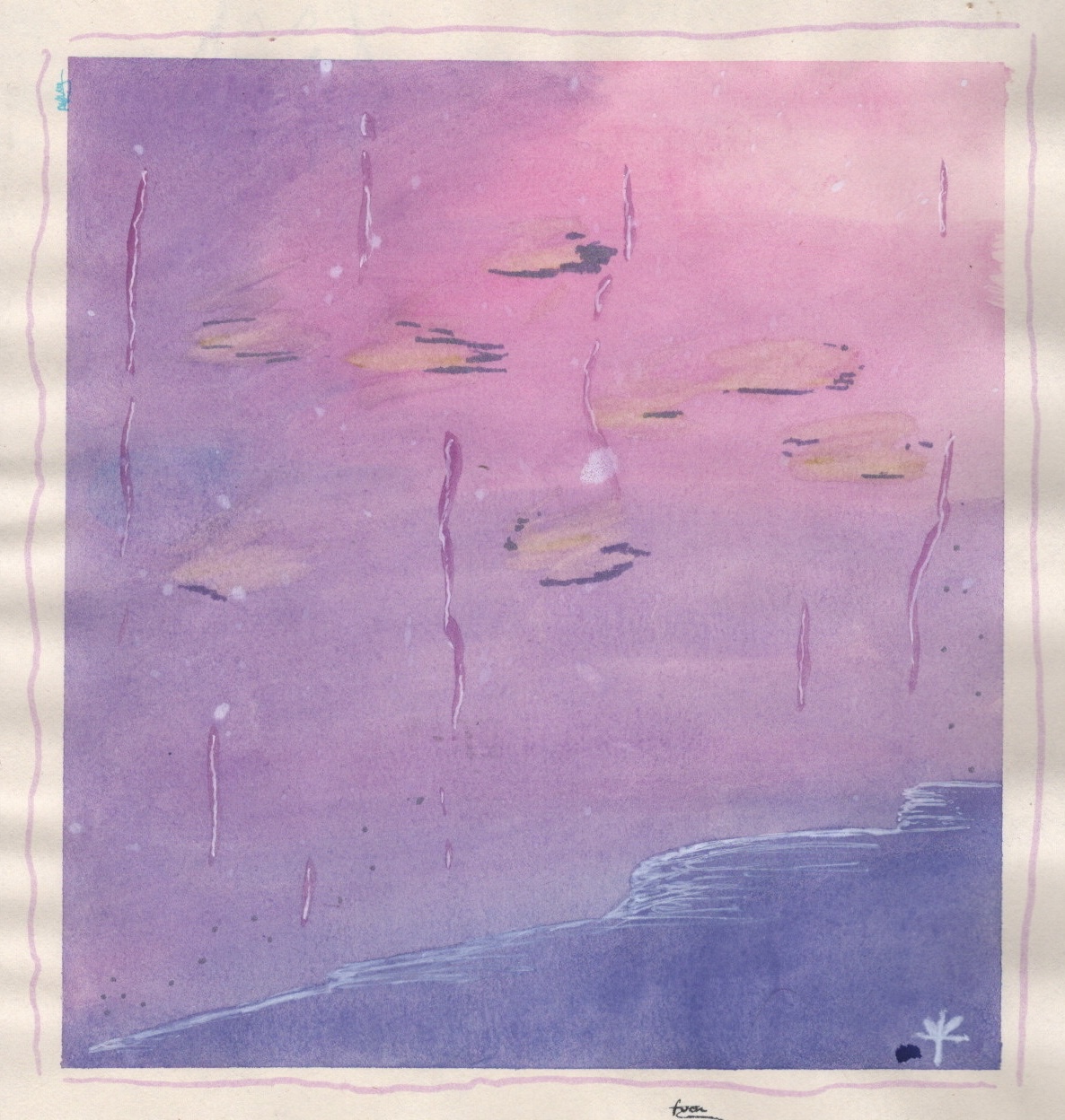
The song I picked is quite layered and is separated into several somewhat defined parts depending on which layers are involved and to what capacity. The first time I listened through to the song, I didn’t draw, I just focused on hearing these layers and figuring out how they worked together. I also paid attention to how the song made me feel. The second time I listened, I began mark making, focusing on just one layer of sound. I then repeated this process again, focusing on a different layer of sound each time. Once I felt I had captured what I wanted to, I closed my eyes and listened to the song once more, then went back to the piece and added hints of colour in places I felt they were needed.
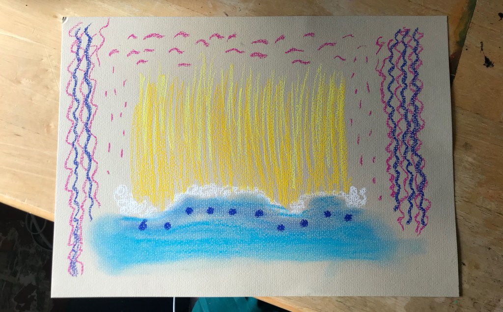
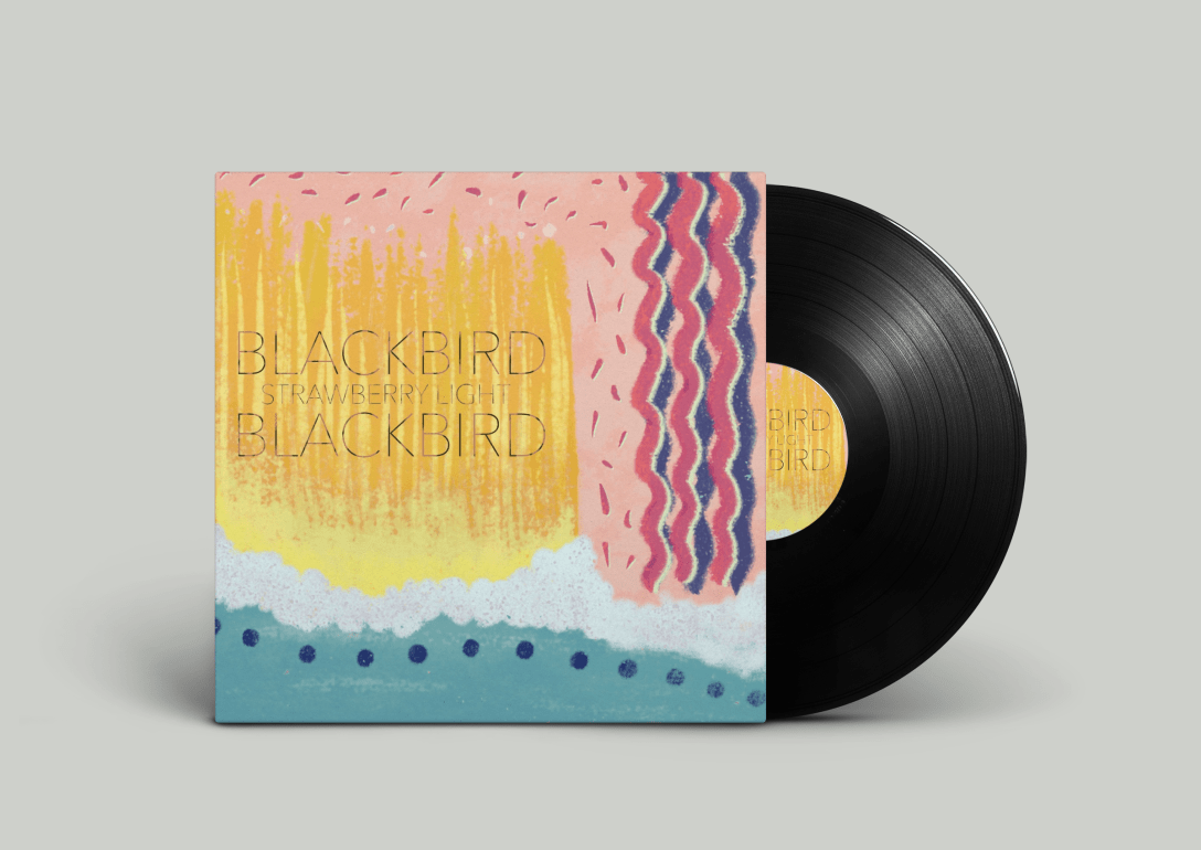
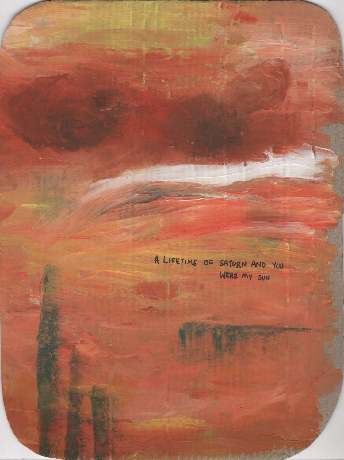
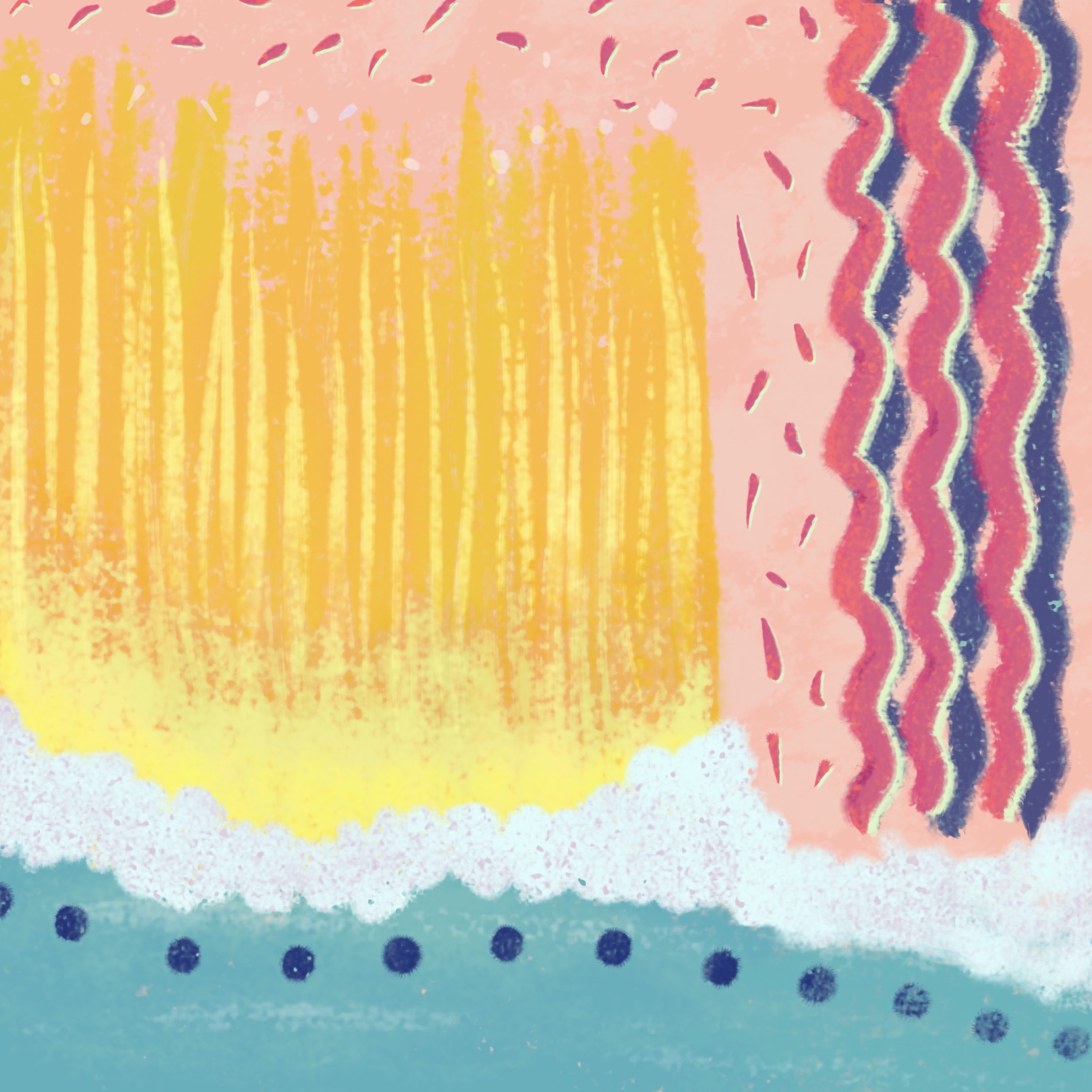
I stepped back from the piece and considered my feelings towards it and towards the song. The word that was extremely clear to me was ‘playful’. I felt it communicated the shapes, colours, and overall vibe of the song perfectly. I decided to scan the drawing and pick a square using the crop tool, then work on reproducing it in Procreate, as I have a wide range of texture options and blending modes to work with which I felt would enhance the piece. The square I picked featured snippets of all the elements in the piece, and felt very ‘playful’.
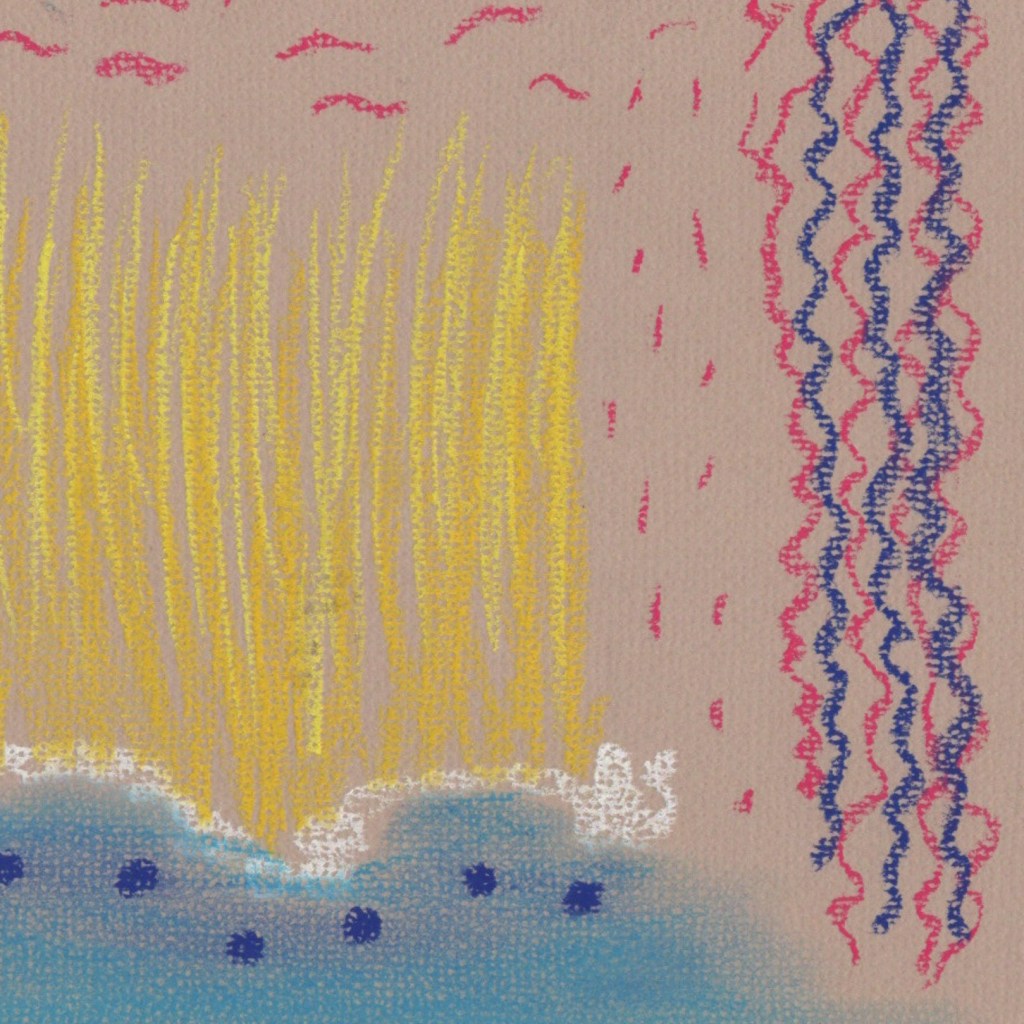
I opened the square in Procreate to use as a baseline reference for my reproduction. Then, using pastel brushes, I recreated all the elements of the piece. I extended the blue at the bottom of the square to fill the entirety of the bottom edge, added texture and some more colour to the piece, and changed the background colour. The pink I chose fit so much better in this piece than the brown of the pastel paper. It feels more playful, complements the colours perfectly, and ties in to the title of the song.
I love Procreate and other digital design software for abstract work. The ability to play around with blending modes and colour changes makes it so much easier to achieve a specific look. Changing the hue, saturation, and brightness of colours helped me achieve a super cohesive final illustration, and the ability to layer colours over each other without fearing that the work beneath will be destroyed creates even more freedom. I do naturally tend towards traditional mediums for my abstract work, but this exercise has made me realise what I might be missing out on by not using digital software in this way.
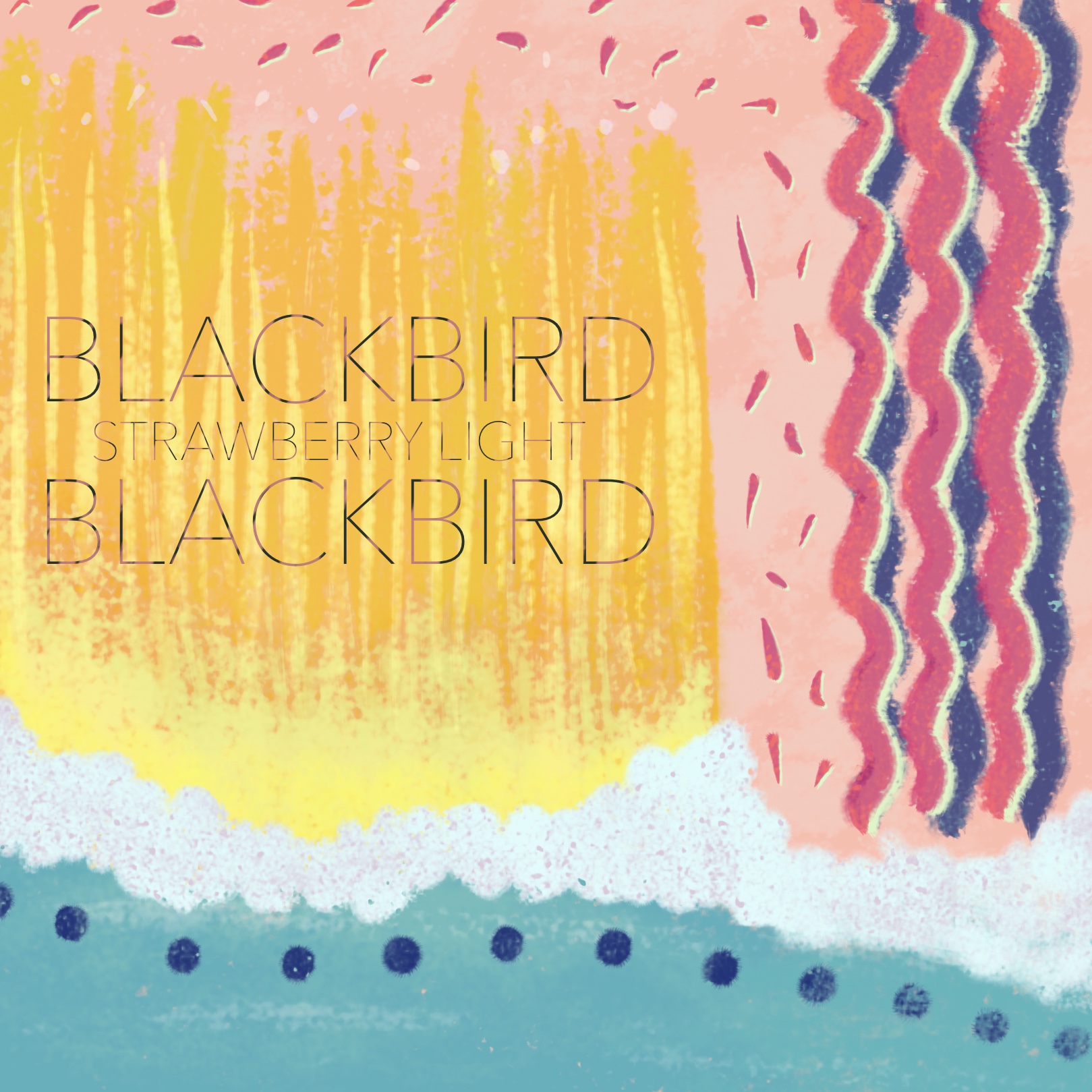
Whilst it was not required, I decided to add text to my illustration to see how it would look as an album cover. I picked a font that I thought was playful but still in line with the band’s general style and theming, and that fitted the song and image too. I then added some texture to it to help it blend into the illustration a little better. I then chose to do a mock-up of a vinyl cover rather than a CD cover, as I feel CDs are a little outdated now and vinyls are more likely to be released, especially by an artist like Blackbird Blackbird. I had to do this on my laptop as I don’t have compatible software on my iPad, and transferring the image to my laptop caused it to lose some quality.

I actually love how it turned out. The desaturation makes the vinyl cover look as though it’s matte, rather than gloss, which enhances the pastel textures. I think the text is readable but not too bold, and generally the illustration is cohesive. I really do think this illustration works as a vinyl cover, which shocked me as going into this exercise I was in total denial that any sort of random abstract art would look good for an album cover. There are certainly styles of abstract art that lend themselves to album covers, but I had never considered this to be one of them.
Personally I love abstract art, surrealism, and modern art movements. I love it when a piece of art could mean literally anything depending on how the person viewing it perceives it. Before COVID-19, one of my favourite things to do was visit modern art galleries and spend hours considering the art and how it made me feel, and figure out what interpretations of it I could apply. Realism has always disappointed me and I’ve always felt a pull towards the freedom of abstraction. This exercise was so much fun as it felt natural and within my comfort zone. I try to put this love of modern art movements into my illustrative work, particularly in my stylised drawings, but I think I need to consider more deeply how I can connect the two. I look forward to continuing to express this love of modern and interpretive art, and exploring the limitations of illustrative work.

[…] have made mock-ups before, notably in the Abstract Illustration exercise. I struggled a little at the time as I do not use Photoshop, but instead Affinity Designer […]
LikeLike