
I would like to preface this by saying that I am unlikely to work with clients in the future due to health issues, so at the time of completing this exercise I felt frustrated and saw little point in doing it. In hindsight, having used the knowledge from this exercise in Assignment 3, I can see how this step in the illustration process is valuable whether I am working for myself or for a client. It helped me see issues in my work in advance, and better plot out what my final piece would come to look like. Going forward, in client focused exercises, I intend to focus on how this benefits me as an artist outside of commercial work and try to get as much out of them as I did from this.
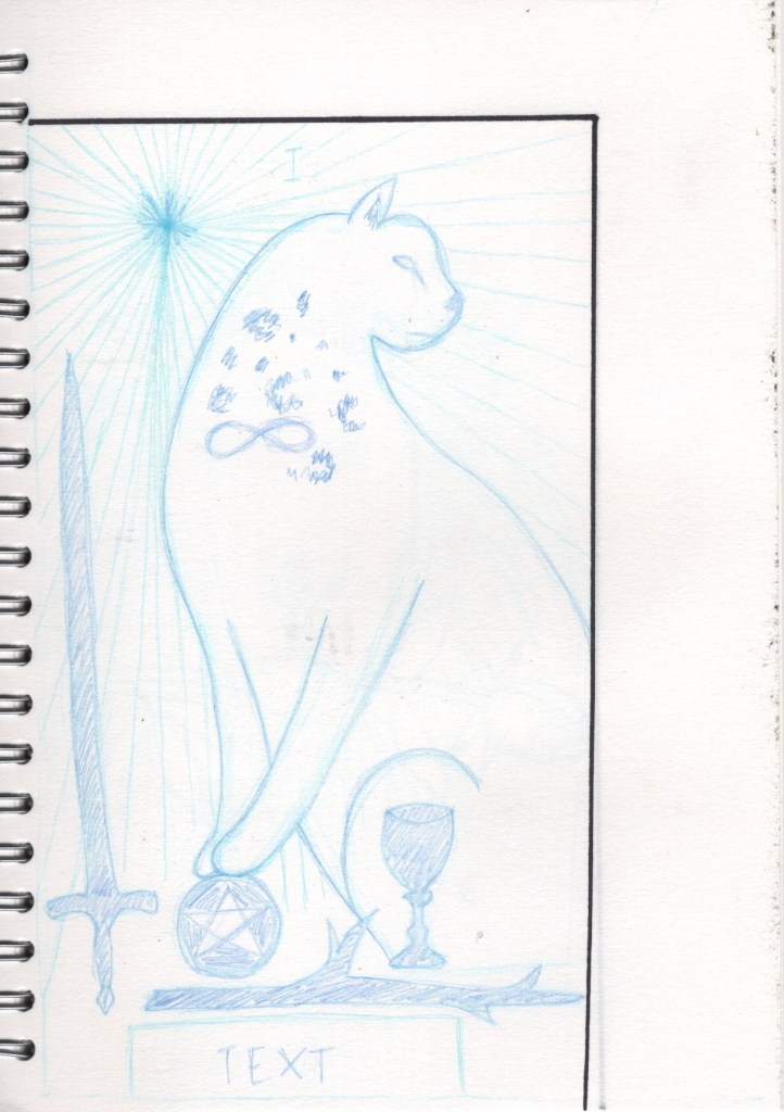
This exercise was intended to help me edit an image to its main structural form and to practice creating a clear visual. I had to pick two finished illustrations that contain a range of content, then reproduce them at least two and a half times larger and in proportion to the original illustrations. I had to create a line visual describing the content within the illustration without adding colour or detail.
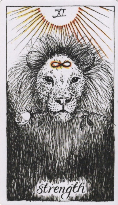
As the illustration had to be recreated at 2.5x the size of the original, I decided to pick a relatively small illustration to work with. I have a deck of tarot cards illustrated by Kim Krans that I felt suited the exercise well. They are printed at 7x12cm, so I worked at 17.5x30cm. I picked a handful of cards that I felt had a lot of content, and from that I created line visuals of two of the illustrations.
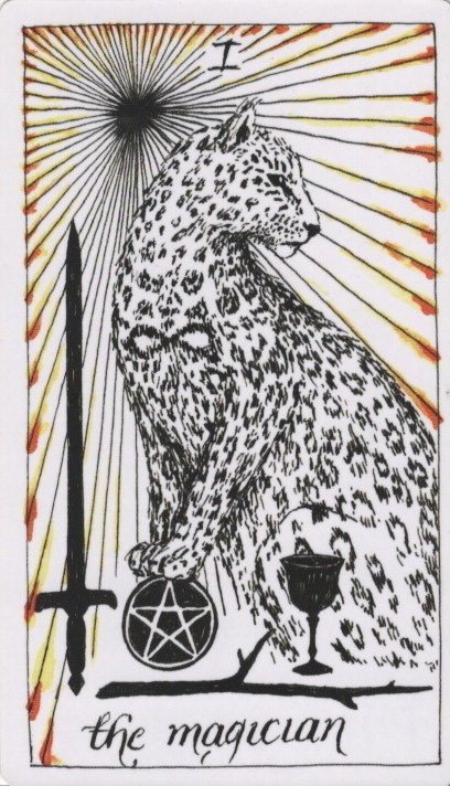
The first illustration was of a leopard surrounded by beams of light with the four suits of tarot – Swords, Pentacles, Wands, and Cups – at its feet. I began sketching with a light coloured pencil, marking out the shapes and general forms. I then used a darker colour to emphasise certain lines and indicate where detail should be. I chose to add a small area of pattern to the leopard to indicate that it would be covered in it. I also indicated where the text would go.
The second illustration was of a lion holding a rose in its mouth. I chose to be slightly less detailed and more indicative of general shapes in the line visual I created. I struggled with this, as it didn’t look great visually as I didn’t feel I’d created a good representation of the lion. I emphasised some lines around the rose to make it stand out against the lion’s mane, but otherwise left the line visual in the lighter base colour.
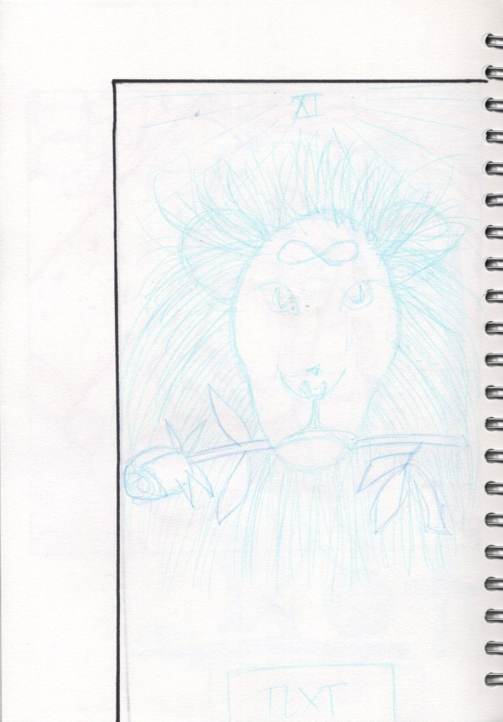
I feel like I could’ve explored this exercise more, but I was struggling with the nature of working backwards from a completed illustration, and I also had a hard time selecting illustrations to work from. I can see the importance in creating line visuals to show how final illustrations will look, especially in the context of working with a client, but I think I would get more use doing so in my own work rather than working from pre-existing designs.

[…] the importance of ‘rough’ in ‘colour rough’, and remembered that back in Exercise 20 I learned that you just need to indicate the general shape or concept of what will eventually be […]
LikeLike