
Assignment 3 required me to produce a poster for either an Early Music concert, a Jazz evening, or a pop group. The poster would be reproduced at A3 and would need to include the title of the event, the date, time, place, and any other appropriate information. I had to be sure to include thumbnails and visuals in my process, alongside research and idea development.
I decided to go with ‘pop group’ as I felt I could have the most fun with this brief. At first I was a little confused as to how to illustrate a poster for this context, as a photographed image of the artist performing is what comes to mind when I think of it. After some brief research however, I realised the possibilities were endless!
One of my favourite bands, Tame Impala, have a very distinctive style in their poster art. It appeals to me due to how colourful and playful it is. I decided I wanted to ultimately produce a poster for a Tame Impala concert based on this. However, I didn’t want to limit my research to art already created for Tame Impala, so I started out researching other posters out there, including for music festivals and other pop artists.
I listed some of my favourite bands and also looked through the current top 40 chart for pop music, making a list of various artists in order to see their promotional material. I found it interesting that most of the art produced for the artists whose music I enjoy were inspirational and the sort of art I enjoy looking at and creating. There was a lot of bold colour, fun typography, and texure. These posters were mostly illustrative and featured either surreal and abstract designs, or album covers from the current tour. Rarely was the band featured on the poster other than in name.
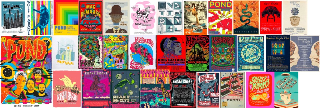
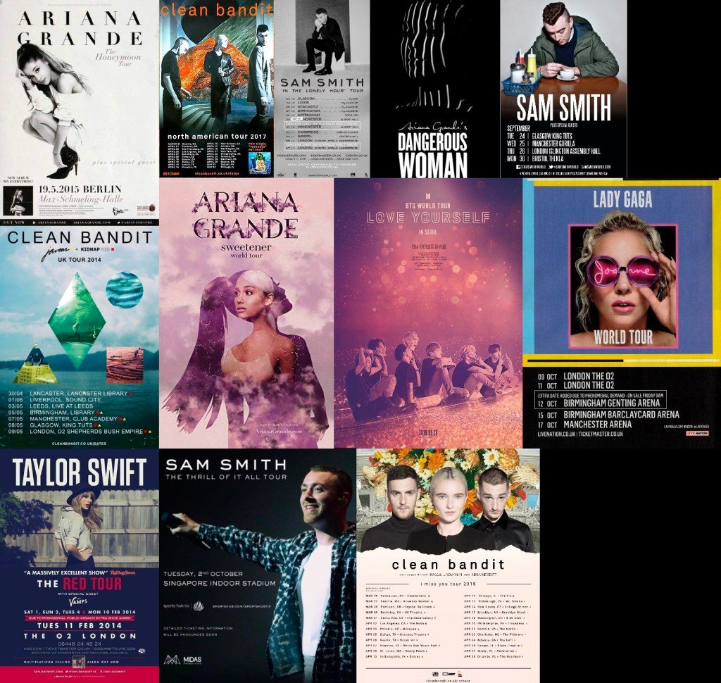
In contrast, the posters from mainstream pop artists almost all featured photographs of the artist, and very little illustrative elements. They typically had a great deal of text alongside a single image. I think this is probably because so often in mainstream pop contexts, the face of the artist is the brand. They are immediately recognisable and known to almost anyone, even if you dislike them musically. The only thing a poster promoting a large pop group’s tour needs is their faces. The illustrative posters I found for the artists I personally listen to are not for very well-known bands. Their brand is often connected to a specific creative movement, which lends itself to more illustrative and artistic designs.
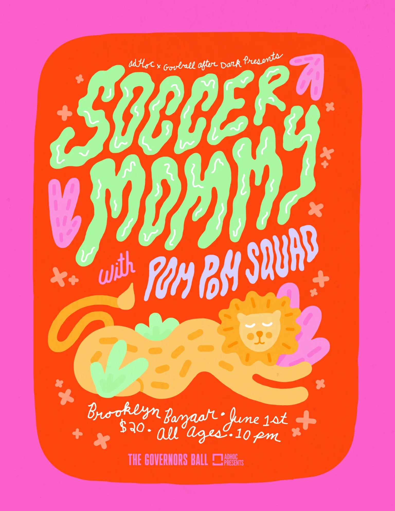
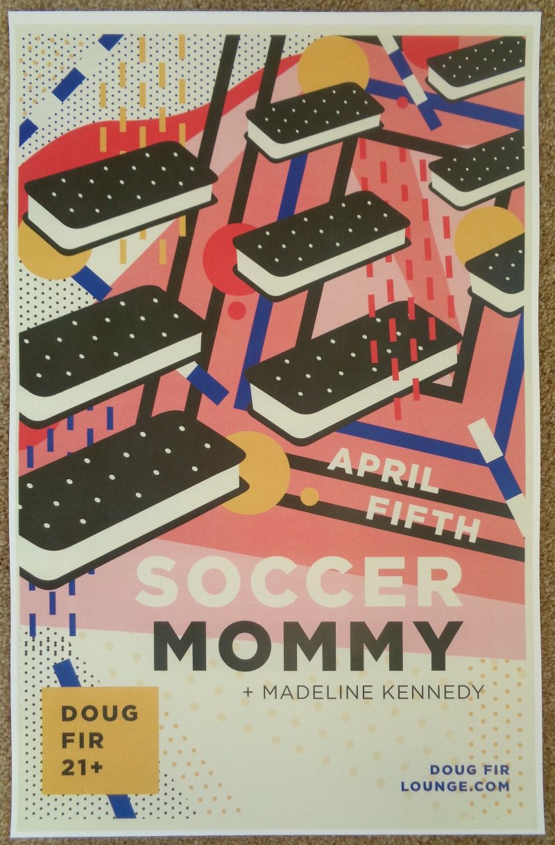
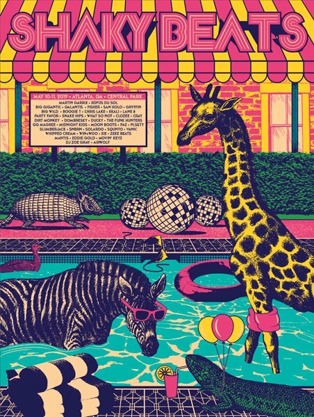
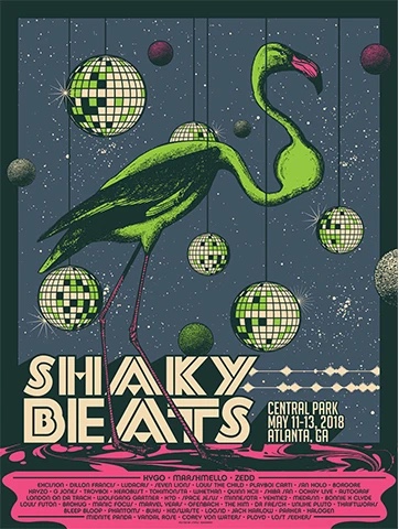
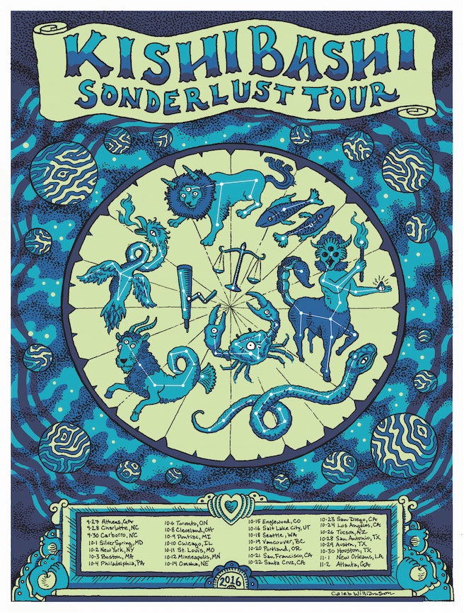
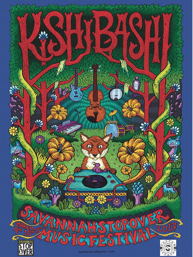
My favourite posters were from the first batch of research – the ones featuring more illustrative and colourful designs. The designs I liked the most were the ones for Soccer Mommy, Kishi Bashi, and a music festival I came across called Shaky Beats. I loved the usage of colour, contrast, and texture, plus the randomness of the content in the images. I especially appreciate how the typography has been illustrated to be a part of the image, rather than awkwardly alongside it.
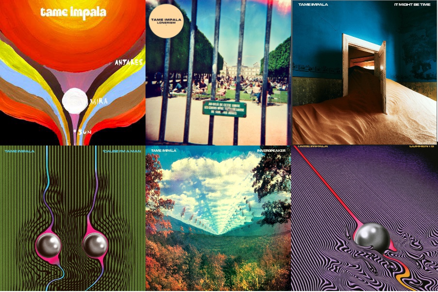
At this point in my research process I already had started thinking of ideas and ways I could explore the content I added to my final illustration. However, as I mentioned before, I’m aware that Tame Impala have a very specific style in their merchandise and promotional materials. I collected various posters from previous concerts and also some album art to reference them. I noticed similarities, for example borders were often added around the main illustration, a similar font – often the same one – is used throughout, the colour palettes are bold and striking, and a lot of patterns are incorporated into the designs.
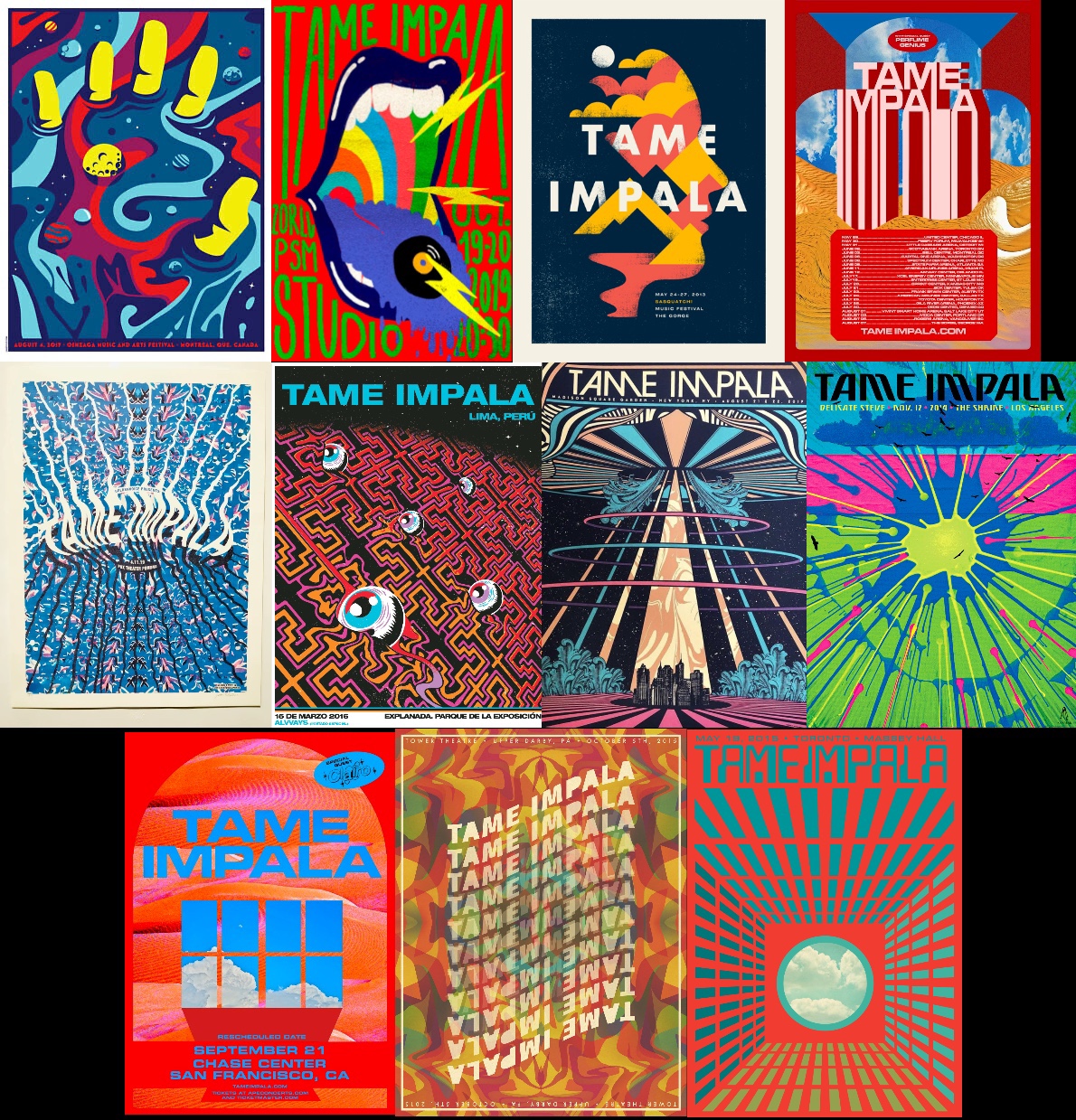
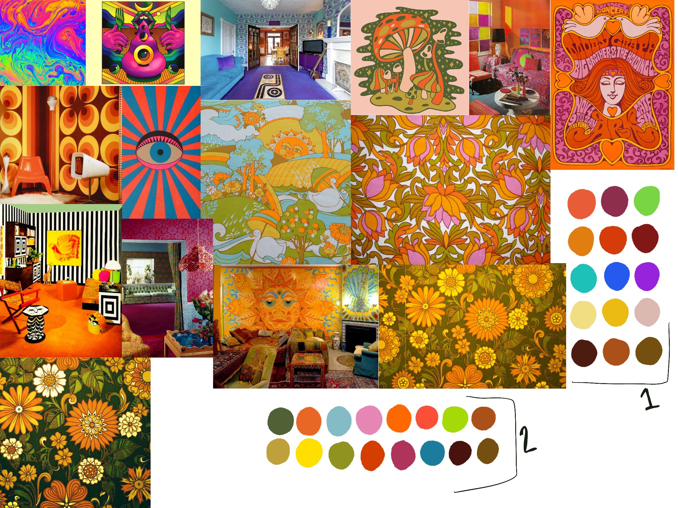
A consistent theme I found across both Tame Impala’s posters and the illustrative posters I had researched earlier is that they drew heavily from psychedelic imagery. Tame Impala musically can be best described as ‘Psychedelic Rock’ – and even those artists that aren’t musically psychedelic had a vintage 60s/70s era vibe to their posters. I decided my next step was to research the era in question and gather reference imagery to inspire both content and a colour palette.
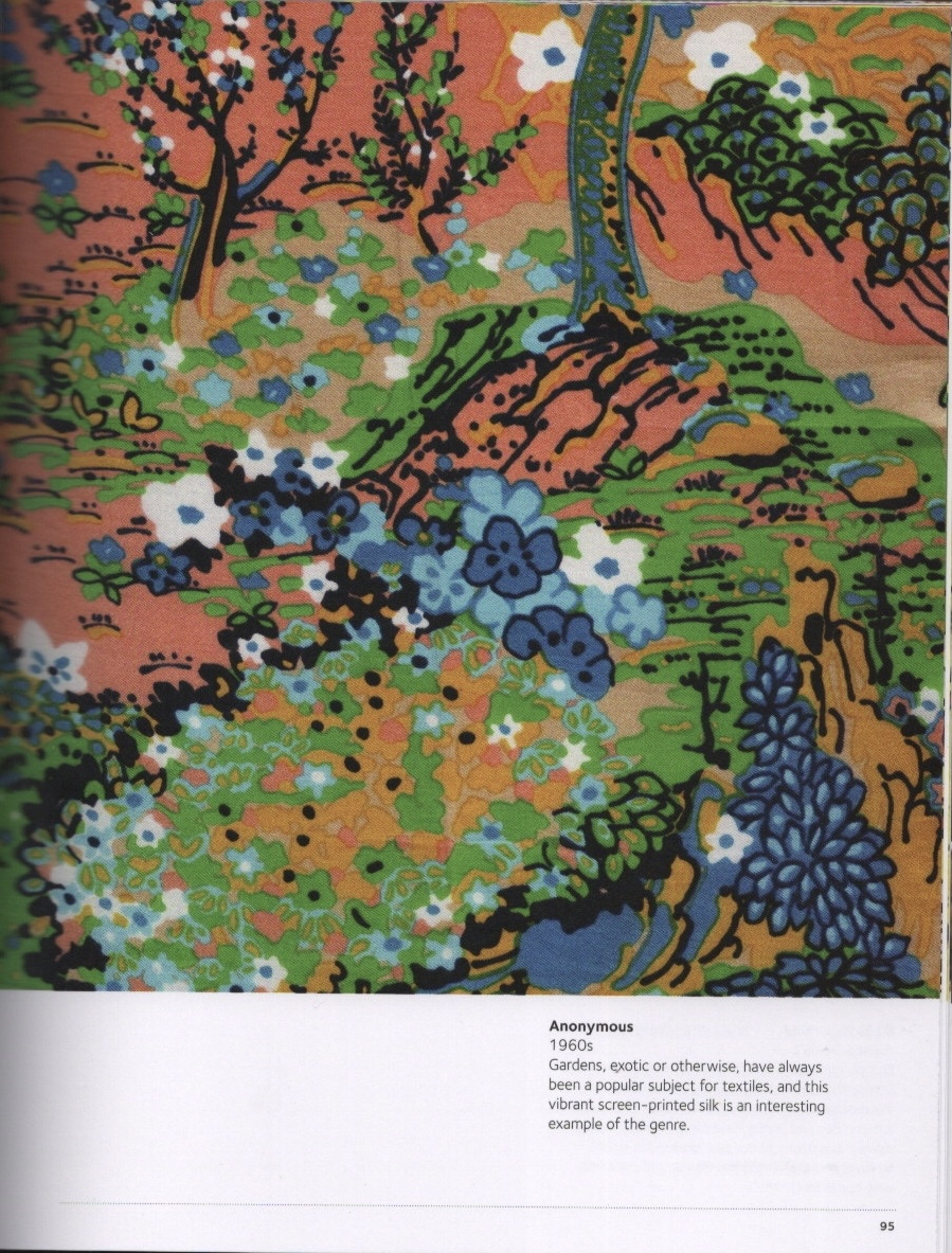
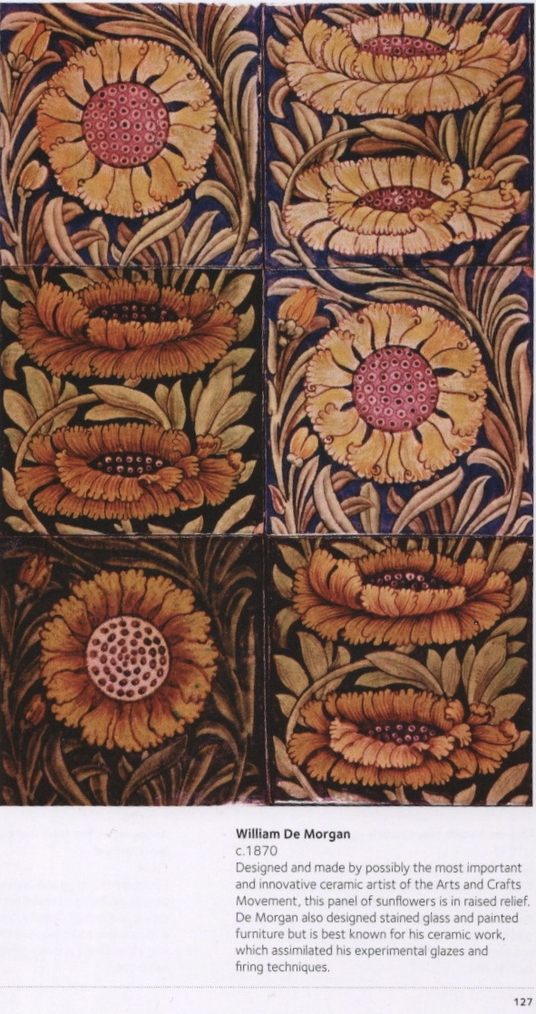
I started by looking at various patterns and illustrations available online. Some of them didn’t seem relevant as modern psychedelia leans towards bright, neon tones, whereas older colour palettes are more muted. I then researched interior furnishings and decor of the time period as I thought they would be useful in determining popular styles of the time. As I knew patterns would be used in my final design, I then used two books – The Pattern Sourcebook by Drusilla Cole, and The Pattern Base by Kristi O’Meara – to find further reference material. The Pattern Sourcebook contains a wide range of historical surface pattern designs, which was useful for gathering material direct from the time period. The Pattern Base, however, contains modern surface design. I used this book to find designs similar to those used in the posters I had collected.
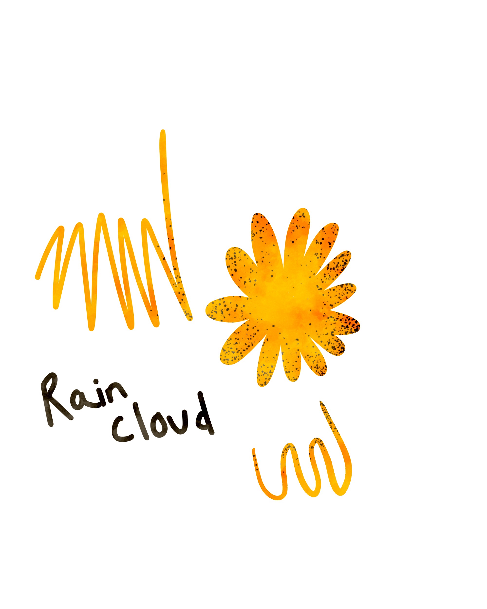
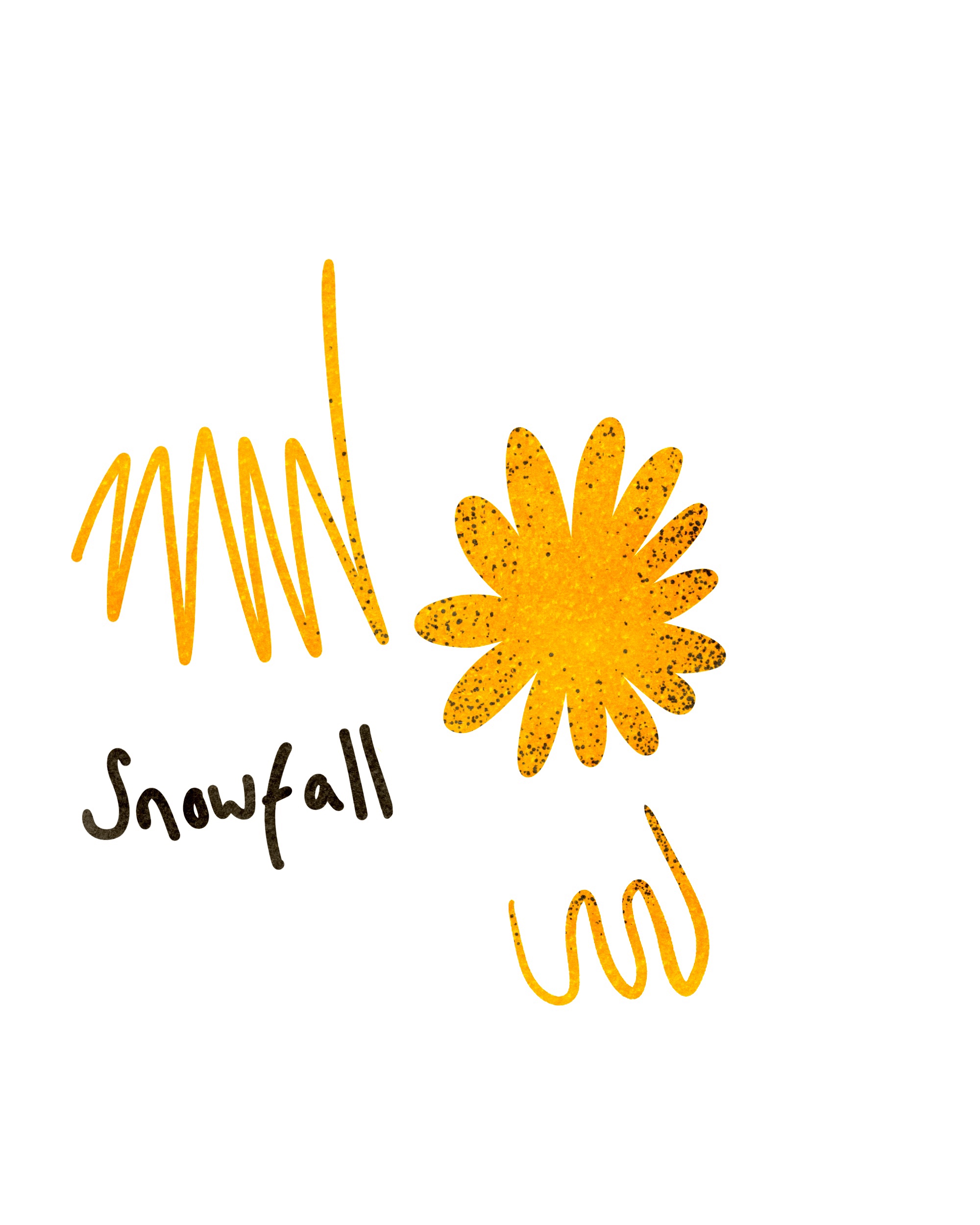
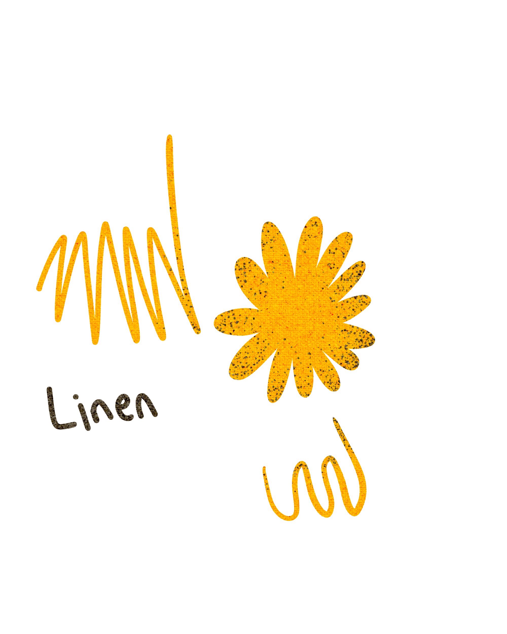
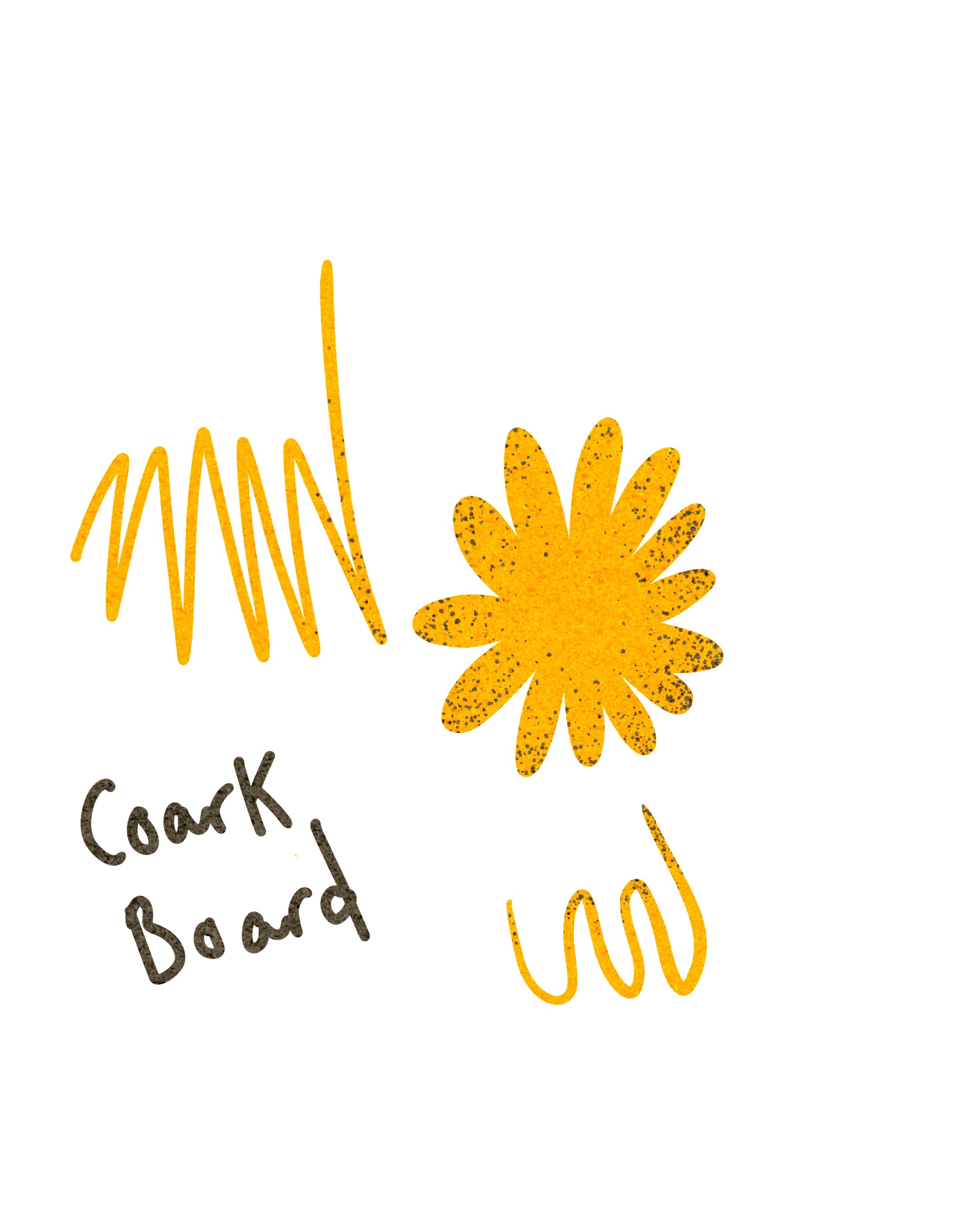
Using the reference imagery I had collected online, I created a basic moodboard to reference from. I then selected a range of colours that I felt stood out or were frequently used throughout. I also created a swatch sheet of colours selected from the Tame Impala posters to ensure I would remain within their creative style. At this point I had many ideas for the theming of my poster and jotted down some of them. I was drawn to the floral designs commonly seen in the reference I had gathered, the random abstract swirls, and the geometric patterns. The usage of orange tones seemed prevalent too, and I wanted to include this in my final piece.
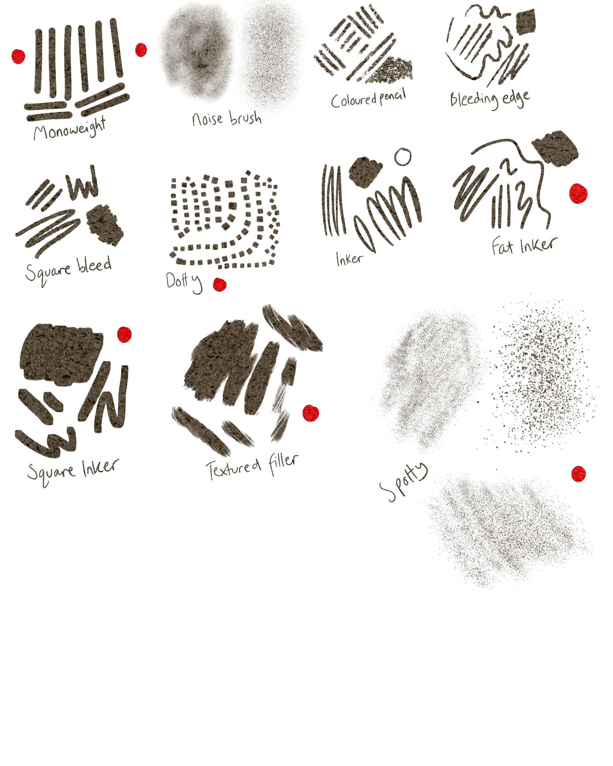
Ensuring my poster looked vintage was important to me. I own a set of ‘Magic Paper’ files for Procreate which add various textures to your entire illustration. I tested these out in order to find one I felt would work best. The ‘cork board’ paper texture provided a nice grainy effect to the canvas, and I decided to work with this. I also tested out some brushes as I felt the ones I typically use may not work best in this context. Another way I wanted to reference the psychedelic era was with how I used text – incorporating it into the illustration rather than laying it on top.
Besides a general ‘psychedelic vibe’, illustrative text, and pattern involvement, I wasn’t sure on the actual content of my poster. Many of Tame Impala’s existing posters don’t have specific content beyond this, so they were hard to draw inspiration from. I decided to begin sketching out any ideas I did have, however, in the hopes that it would produce more ideas and get my creative juices flowing.
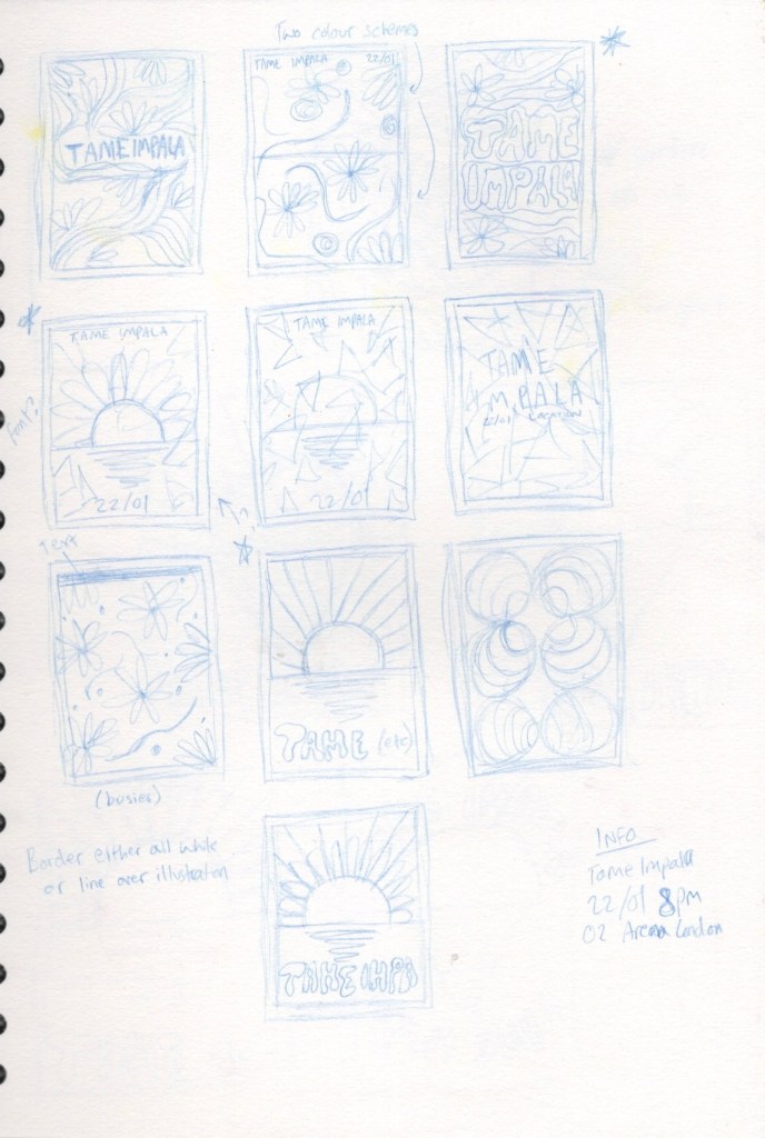
I began by sketching out some small thumbnails and filling them with various ideas. This did, as predicted, help me develop ideas even further. I also decided on what information needed to be included – the artists name, a date for the concert, and a location. I chose two of my favourite ideas and drew some larger thumbnails on a different page to develop them further. The first of my favourite ideas was quite set in my mind and difficult to develop at this point as it thrived of the randomness and abstract qualities it had. The second idea, however, I wasn’t totally happy with and wanted to work on further.
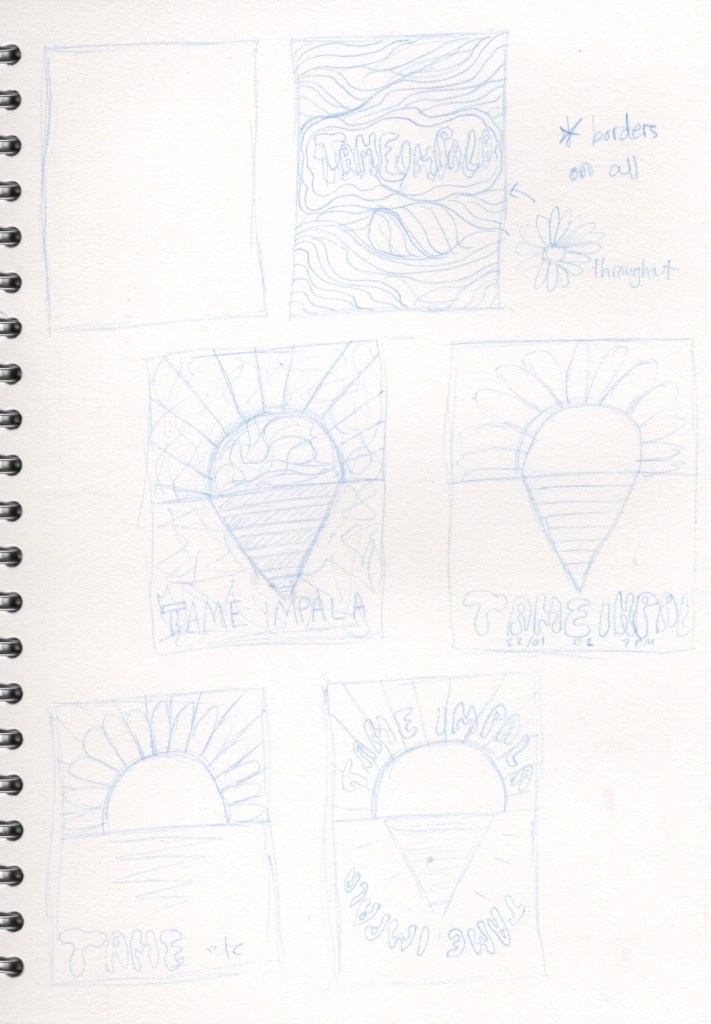
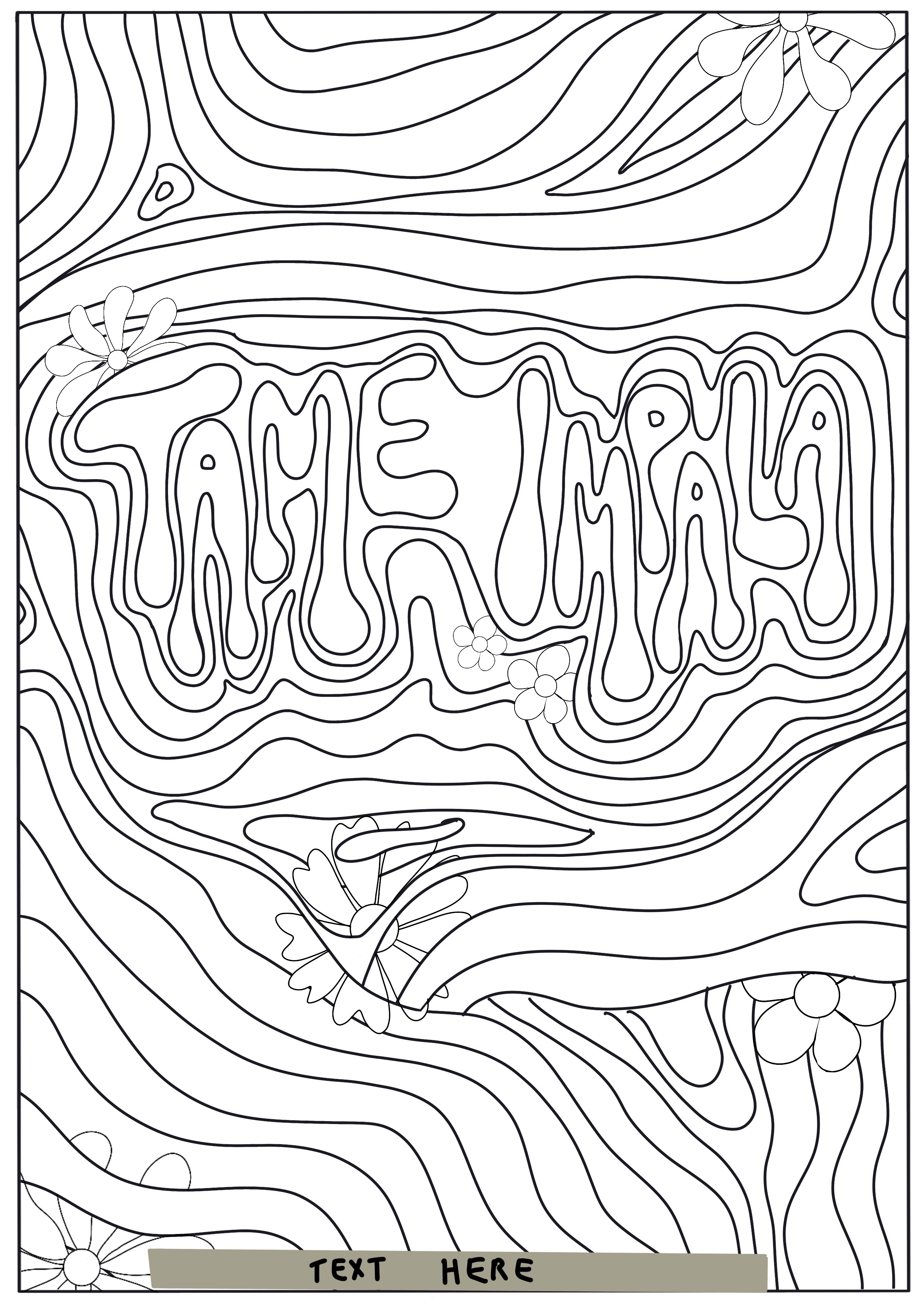
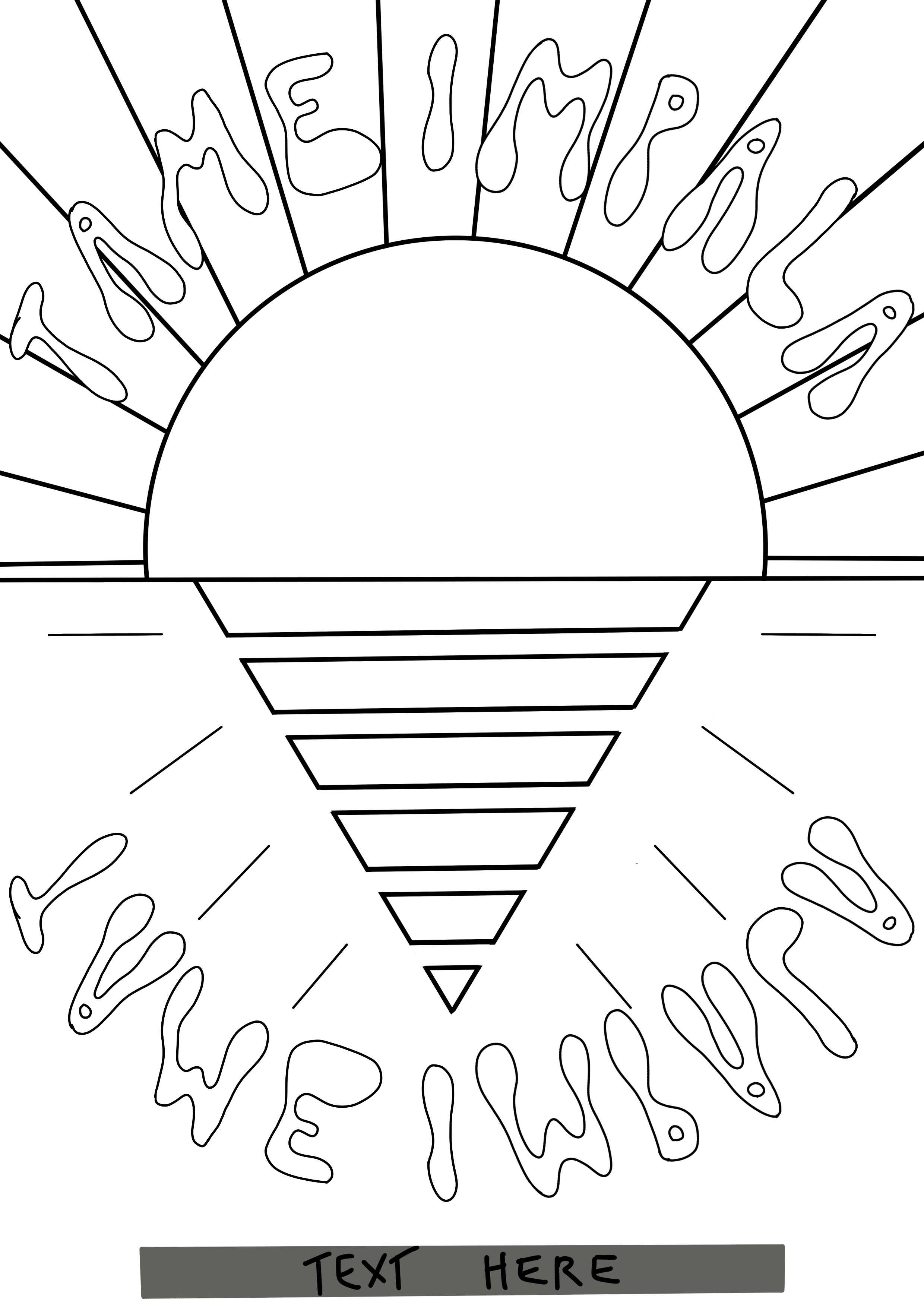
The final thumbnail I sketched out ended up being my favourite for this design. I opened an A4 canvas in Procreate and began sketching out the two poster designs I liked the most. I then created line visuals indicating where content would go in the finished illustration. For the first idea, I was still at a point of struggling with communicating it. The finished illustration would be quite complex and abstract, so planning it to this degree felt like ‘ruining’ the randomness of it. Instead of plotting out exactly where every flower and line would go, I added a few flowers to show that they would be included, and some rough line art to show the general concept.
The abstract floral design was my favourite of the two, and the one I was the most excited to develop further. However, looking at the pre-existing Tame Impala posters left me very uncertain. I didn’t feel like this design fit the same theme or worked alongside them. I decided to step away overnight and look back at it the next day to make sure I was choosing the correct design.
It was hard to give up on the design I was most excited about. I felt the second design was too boring and plain, whereas the first design had a lot of activity and movement within it. Ultimately, the second design did work better as a Tame Impala poster. I realised I could add patterns within the shapes and still meet my criteria on theming. The next step was to create colour visuals and figure out the direction I would be taking this piece in.
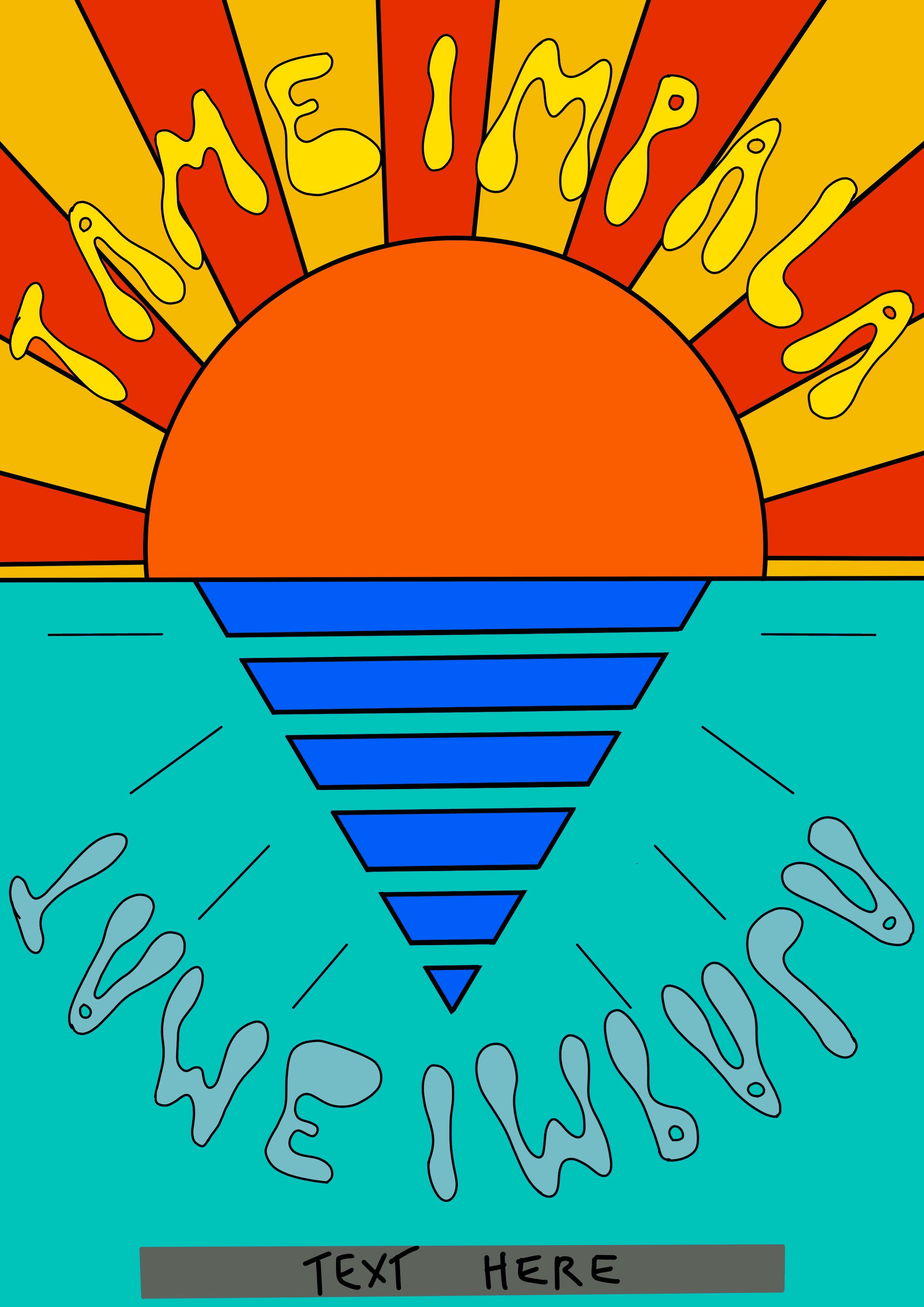
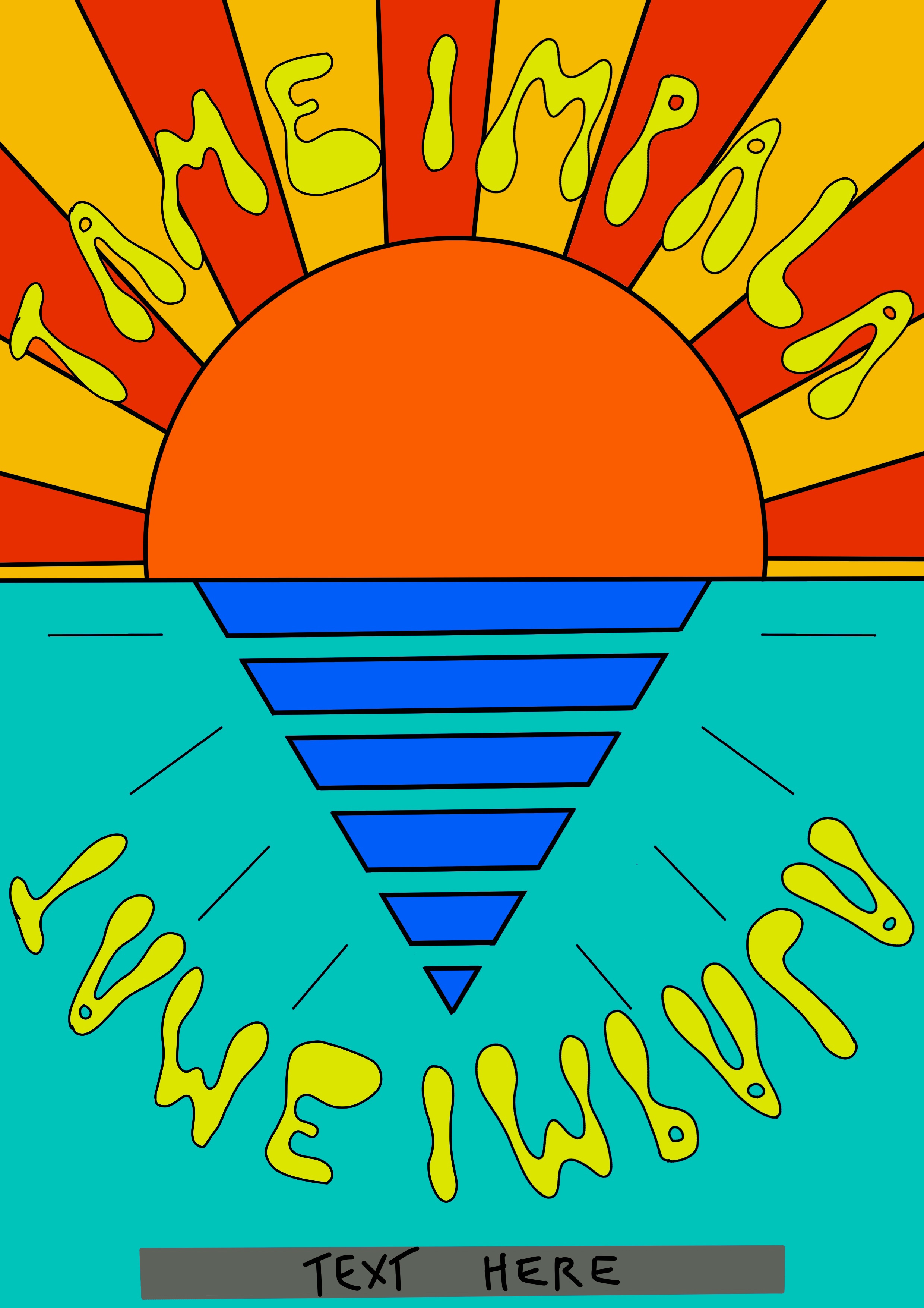
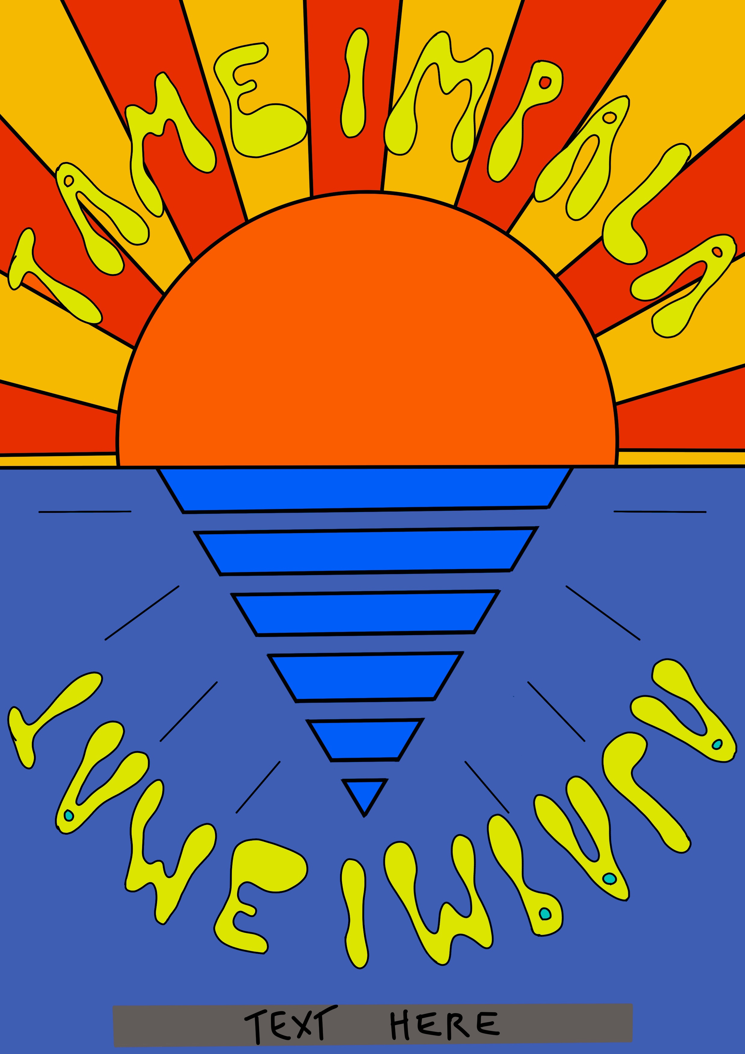
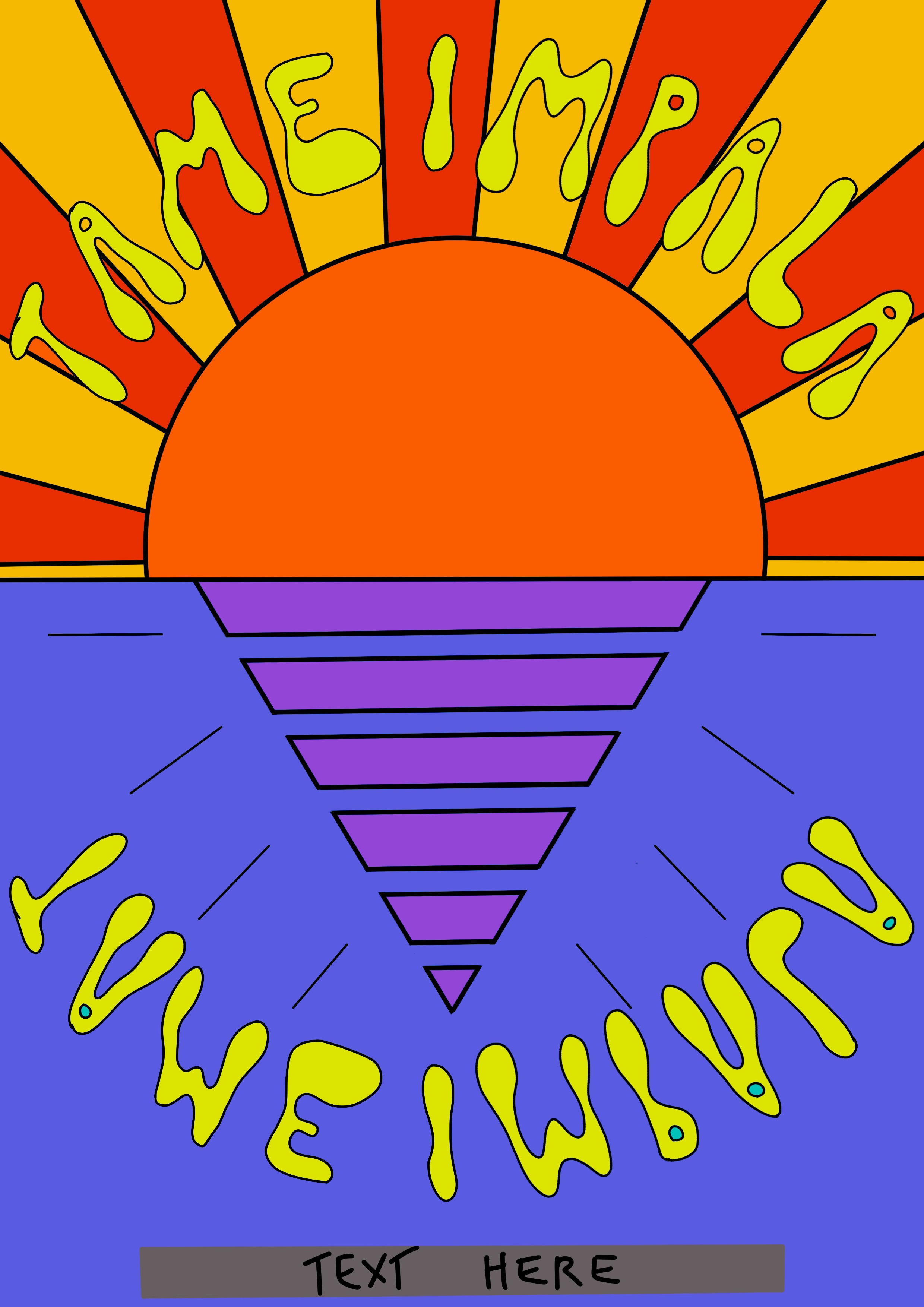
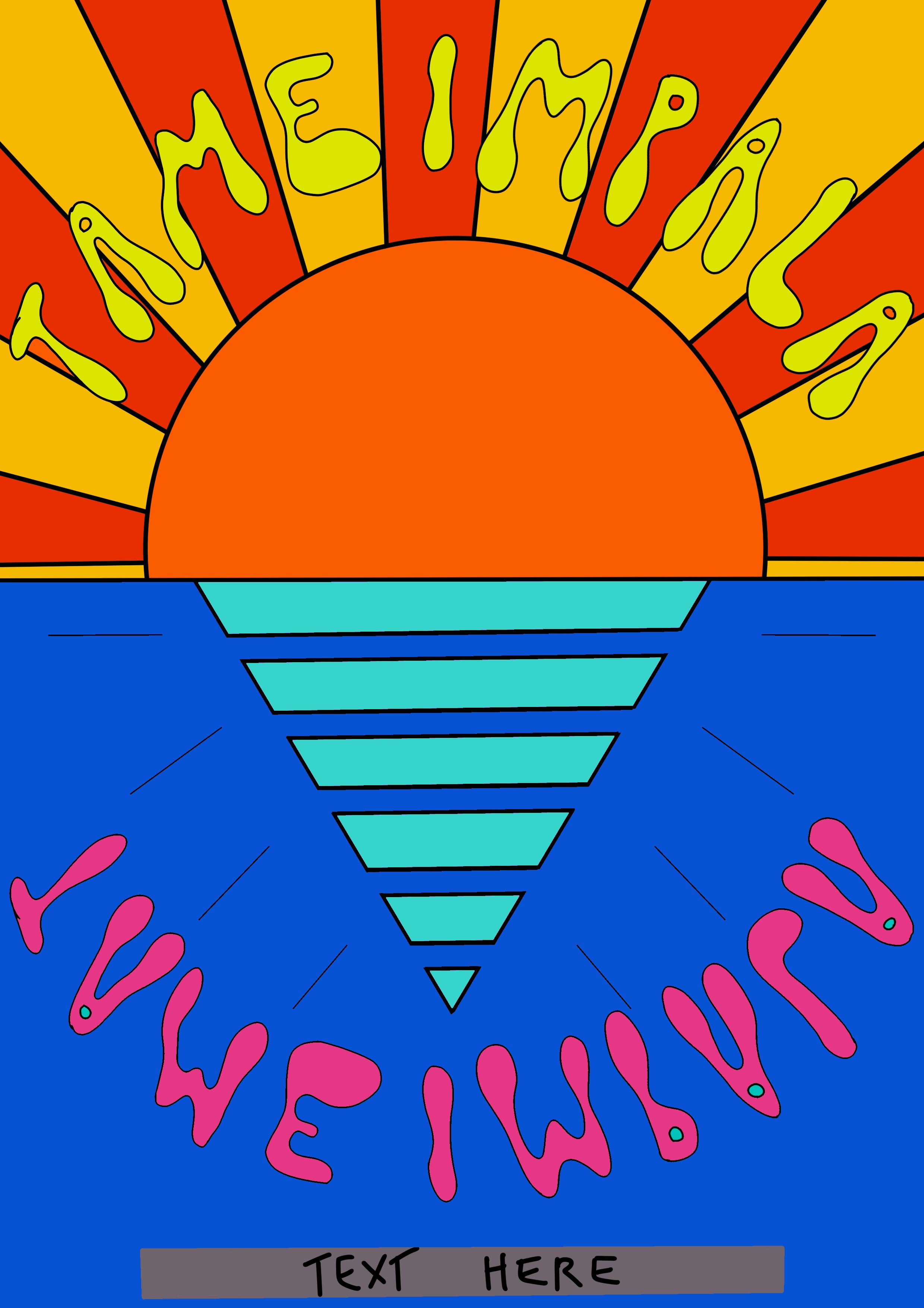
Incorporating the orange tones I initially wanted was easy with this piece, as the sun and rays coming from it lend themselves to those colours naturally. As my aim for this poster was for it to look like an abstract geometric sun rising over the sea, I chose to use blue tones for the lower half of the poster. Blue and orange are complimentary colours, so this worked well together. Finding the right shade of blue was tricky though, and I really struggled to find one that felt ‘right’.
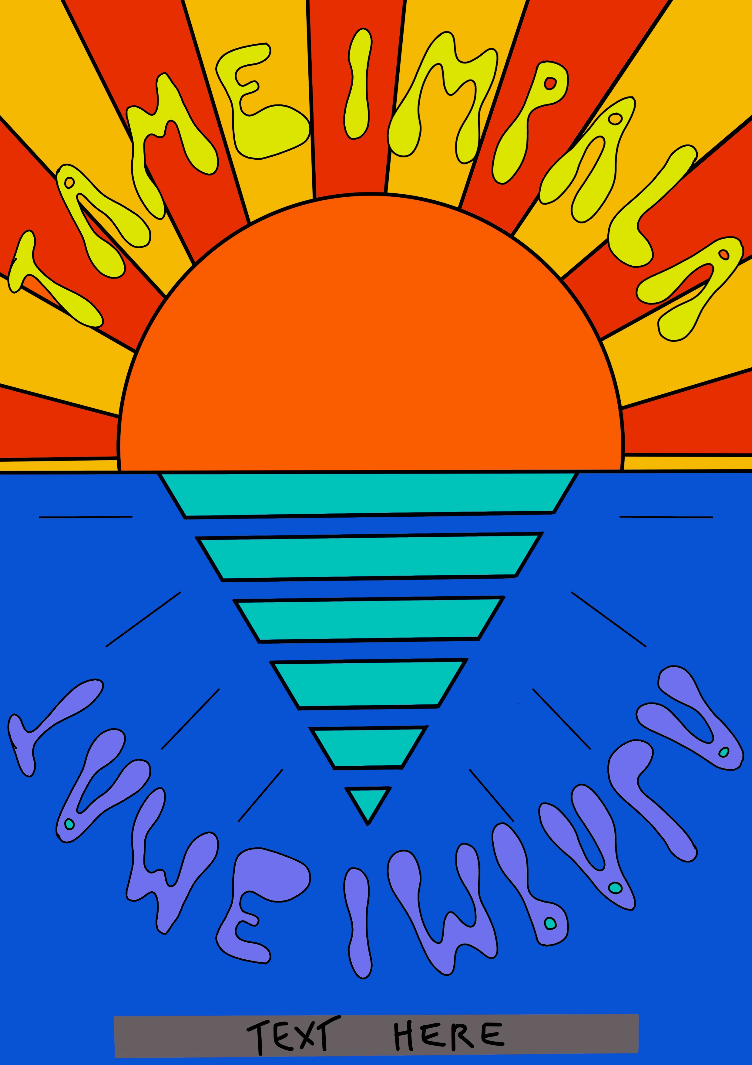
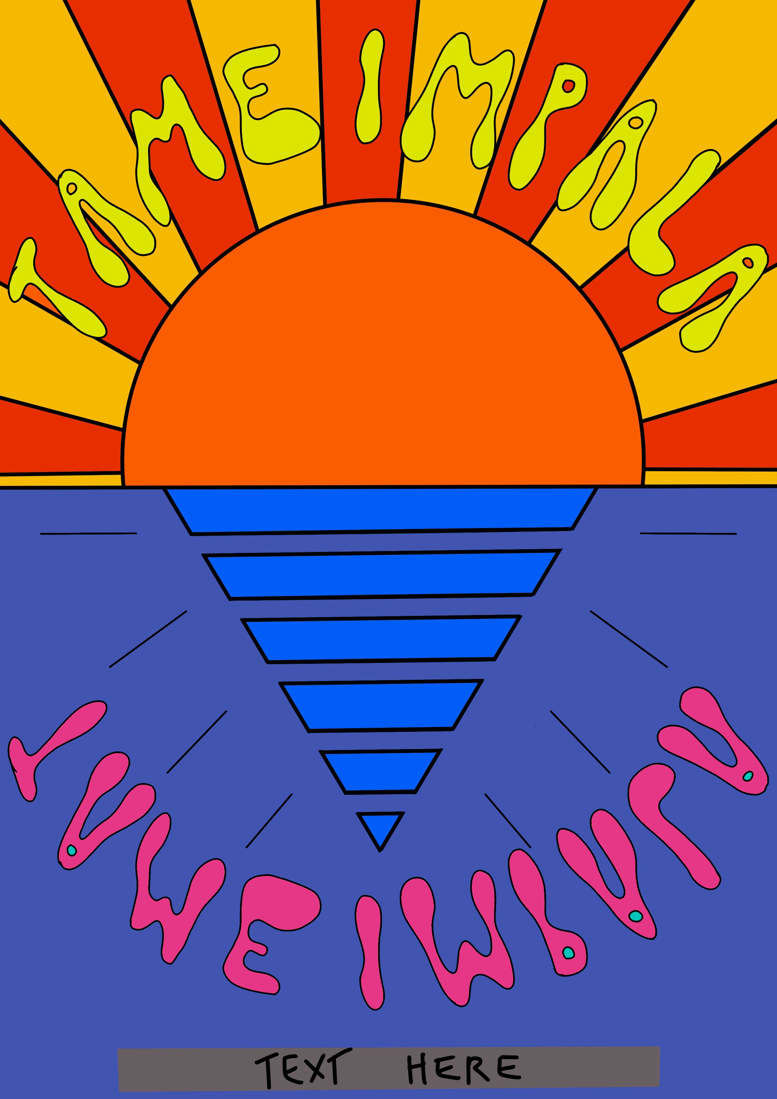
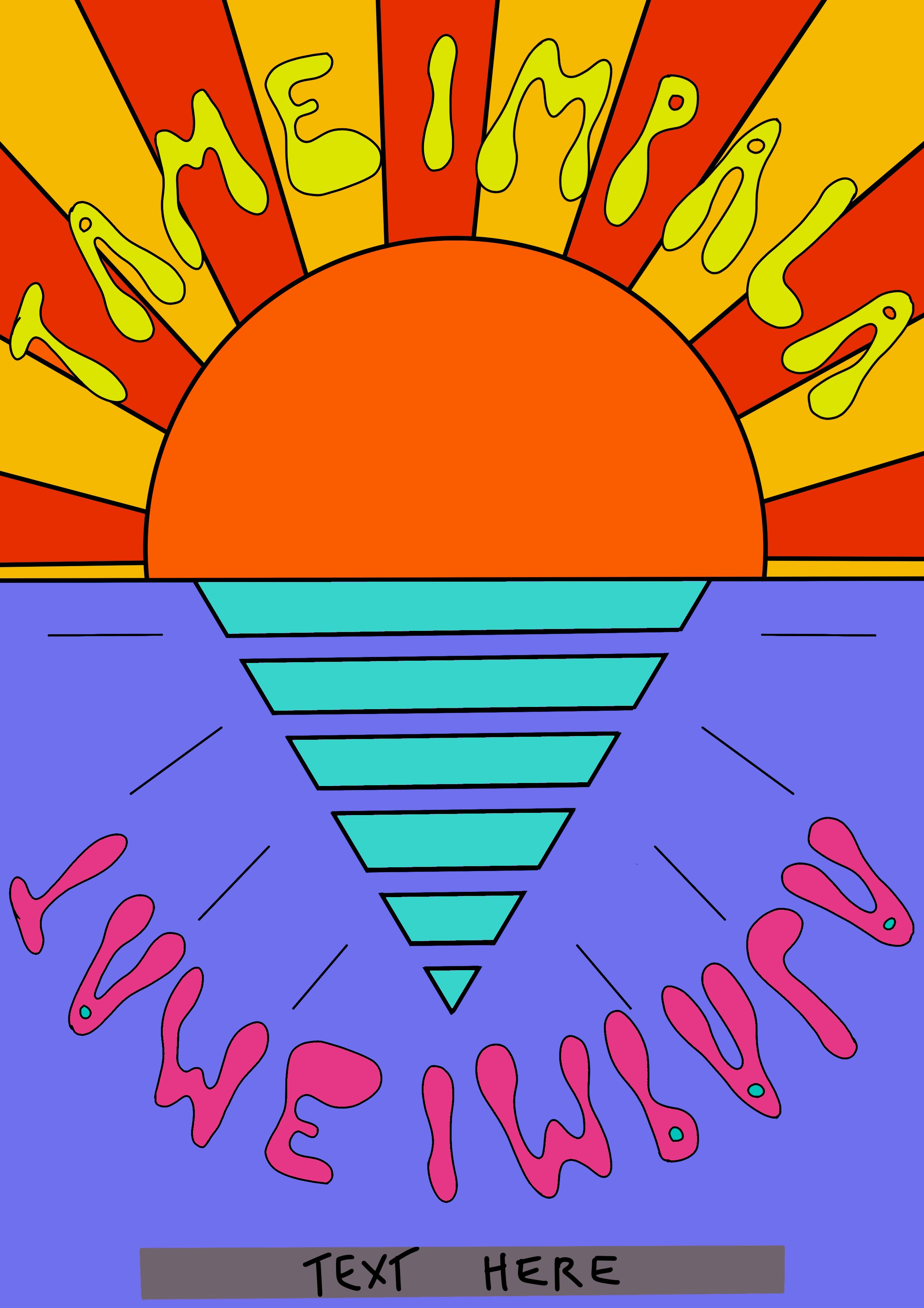
Trusting my ability to intuitively pick colours whilst working, I decided to begin the final illustration process and hope the right shade of blue would come naturally. The magic paper layers I was using altered the colours too, which meant the shades of blue looked differently in the final piece. I also knew I would be adding pattern to the piece and hoped this would make the colour choice work better.
Using my line visual as a base, I began outlining the elements of my illustration. I then added colour and pattern. I chose a marbling pattern similar to one used previously in Tame Impala’s posters. I added this to the sun and also to the blue background as I felt the contrast in placement of the pattern would look most visually appealing. The marbling improved the colour of the sea area as I had hoped it would. I also changed or removed the line art to better fit the theme. I decided to add a ‘shadow’ on the reflection in the sea, too, to add a little more content to the image.
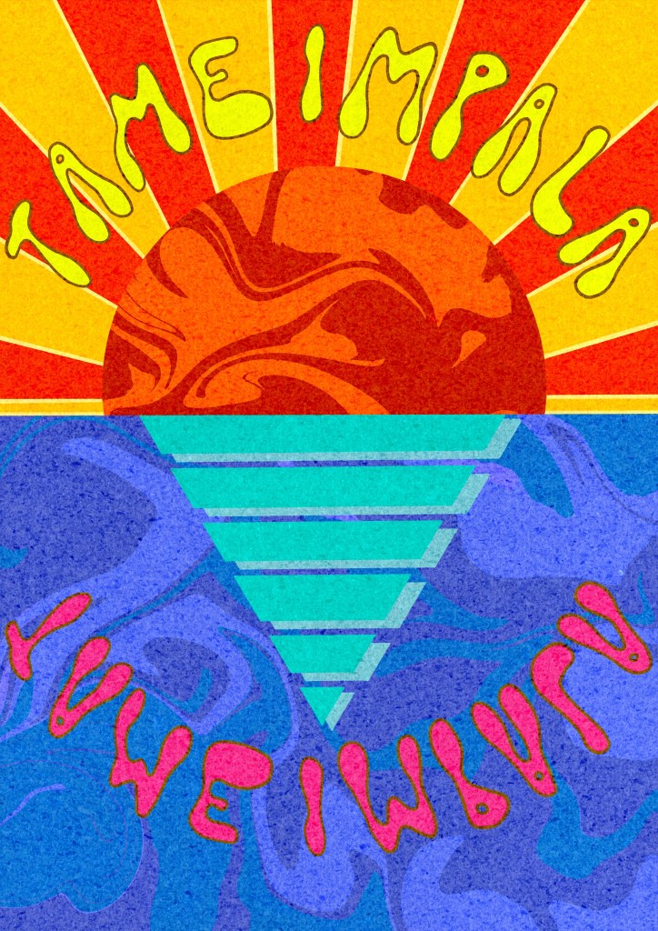
Next, I started considering how I would add text for the remaining information. I was keen to use Tame Impala’s signature font for this. Some research showed they use the font Microgramma which is requires a fee to obtain. I decided to look for a similar free font and found OPTIEdgar Bold which worked as a good substitute. I wasn’t sure where to position the text on the illustration, and I remembered that initially I wanted to add a border. I opened the completed illustration in a new A4 canvas and resized it in order to have a border displayed. I then added the date and location of the concert at the bottom of the poster, on the border.
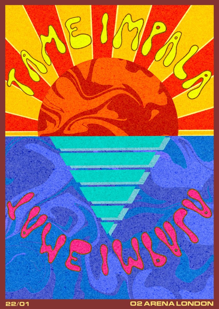
I played around with the colour of the border for a while before settling on this brown shade. The red undertones compliment the piece nicely and it feels very vintage. I’m not sure, however, if this font – or the border for that matter – works particularly well with this piece. I showed it to some friends who disagreed and said it was very appealing, but I think in general I am dissatisfied with this illustration. I’m impressed with my level of research, understanding of the brief, they way in which I have met my own criteria, and that the poster fits in with Tame Impala’s other designs – but visually as an illustration I preferred the concept of the other design idea I had so much more. That feeling has made it hard for me to feel satisfied and accomplished with this piece.
I decided to find some poster mock-up files in order to see how the illustration would look if used in real life. I hope that this would give me a chance to appreciate it more, or to see any glaring issues and alter them. It took a while for me to find some decent free mock-ups, but I ended up with three that really helped and took my poster to a whole new level.
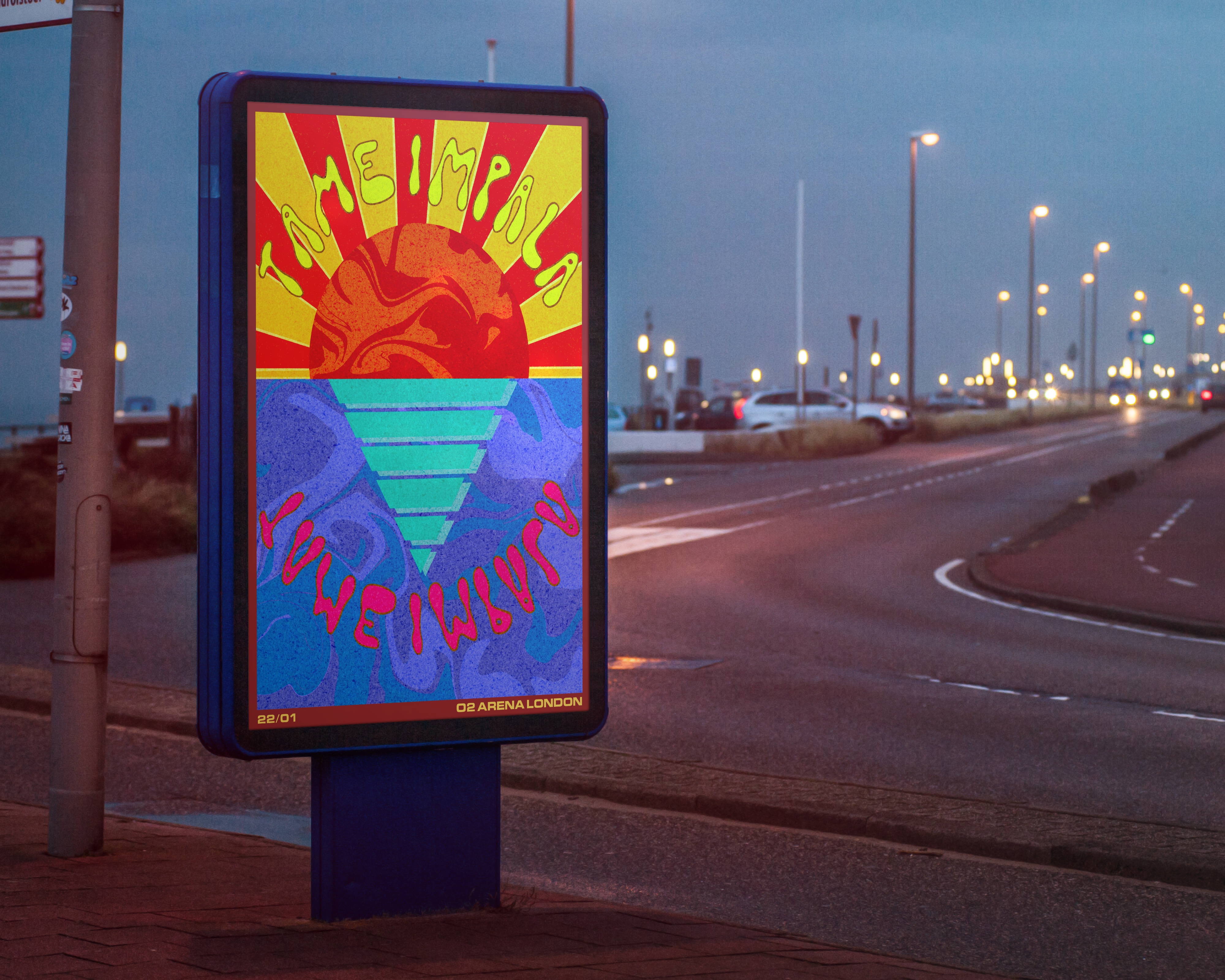
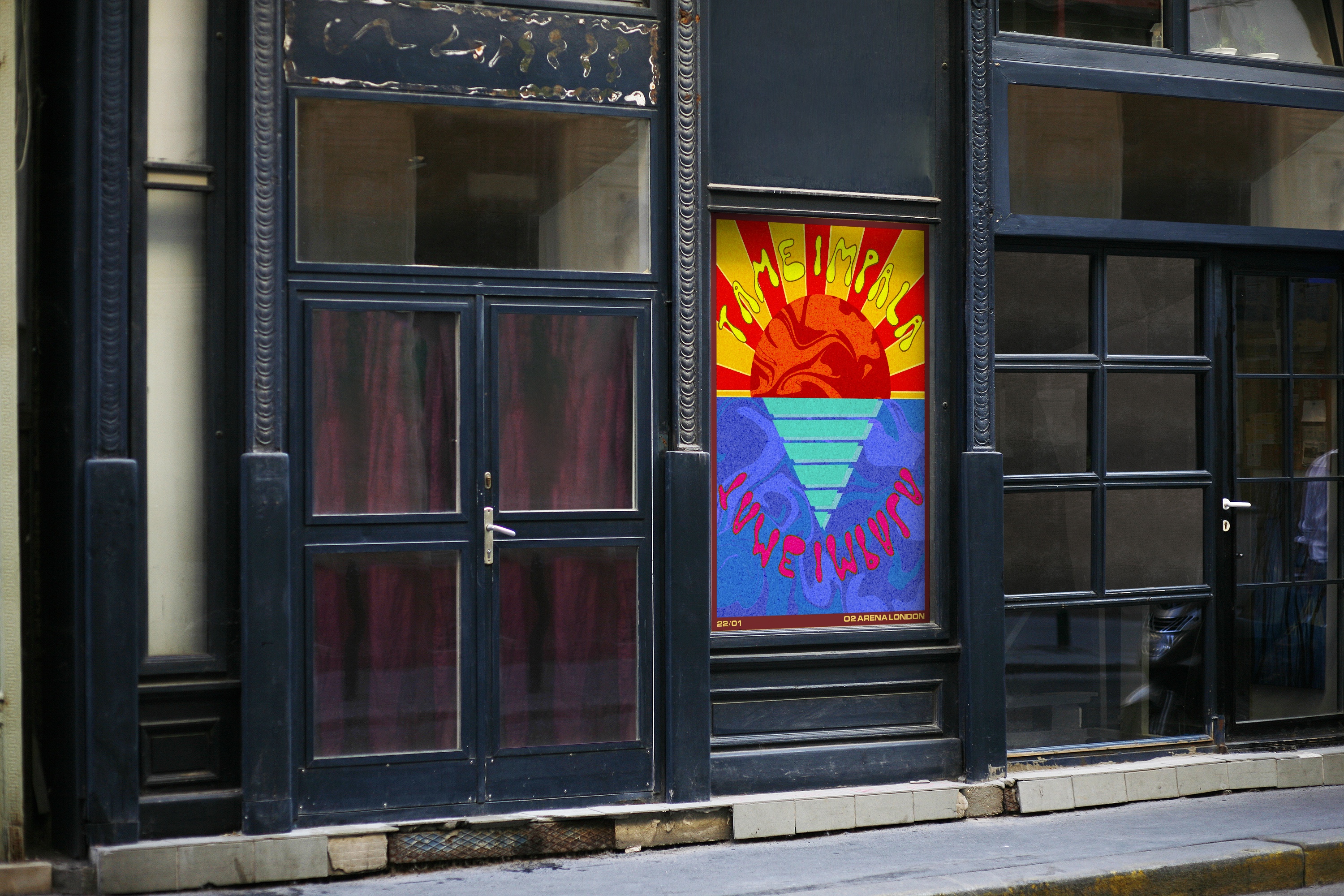
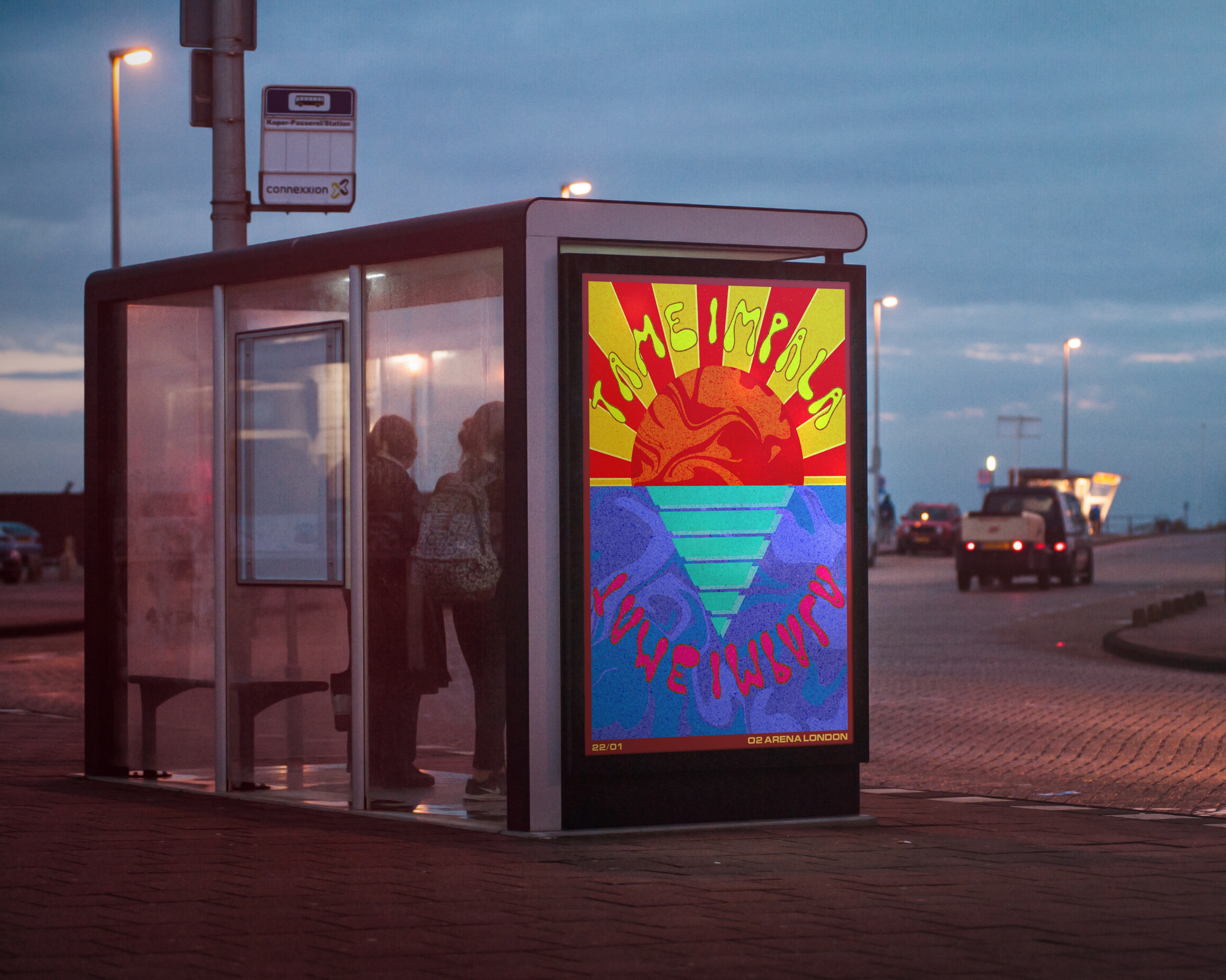
Seeing the poster in real life scenarios definitely made me feel like it did work as a concept. I would be excited to see this in person, and would definitely at least research the concert to see if I would enjoy going. I think it’s possible that I could’ve experimented with text placement more, but I also don’t think the final text placement looks bad.
I thoroughly enjoyed the process of this assignment. The research and idea development was a lot of fun, and it’s really exciting seeing ideas coming together. I also found it incredibly useful have line and colour visuals available, alongside references and research, as it made the final illustrating stage so much quicker and easier. I’m finding a lot of value in breaking down these stages into smaller, less stressful, self-contained activities, and seeing that the quality of my final work is improving due to this. The exercises in Part 3 have taught me a lot about the benefit of slowing down and taking time to repeat steps and iron out the kinks earlier on. I’m looking forward to taking this into the rest of my work throughout Part 4.

[…] my brief, but I was stumped as to how. I have explored the 1950s in Exercise 7, and the 1960-70s in Assignment 3, which left me wanting to investigate a new era not yet looked into. I understood how post-WWII […]
LikeLike
[…] brief. I also reflected on previous projects where I created posters, such as Exercise 23 and Assignment 3 – both from Key Steps in Illustration. I read through the learning logs for both and […]
LikeLike