For this research task, I was asked to explore the different non-alphanumeric characters that exist within typefaces. I was advised to use my keyboard and explore the options. Then, I was asked to choose a magazine and use the identifont website to figure out what fonts had been used throughout.
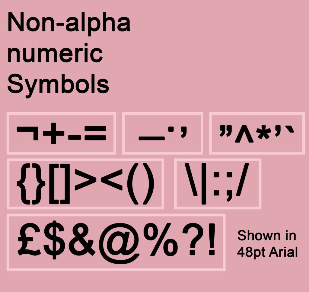
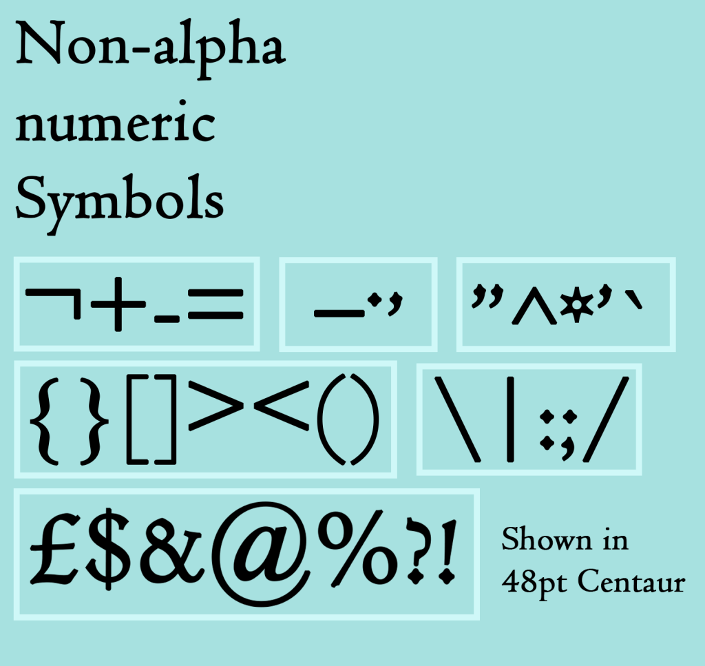
To start, I designed two graphics showcasing the non-alphanumeric symbols that I could find just using my keyboard. I chose a serif and a sans serif font for each, showing how they change between two very different typefaces. I really enjoyed this exercise, grouping each character based on similarities such as where it sits (on the baseline, above, below) or what sort of element it has, and then designing the layout. I enjoy working in space in this way very much!
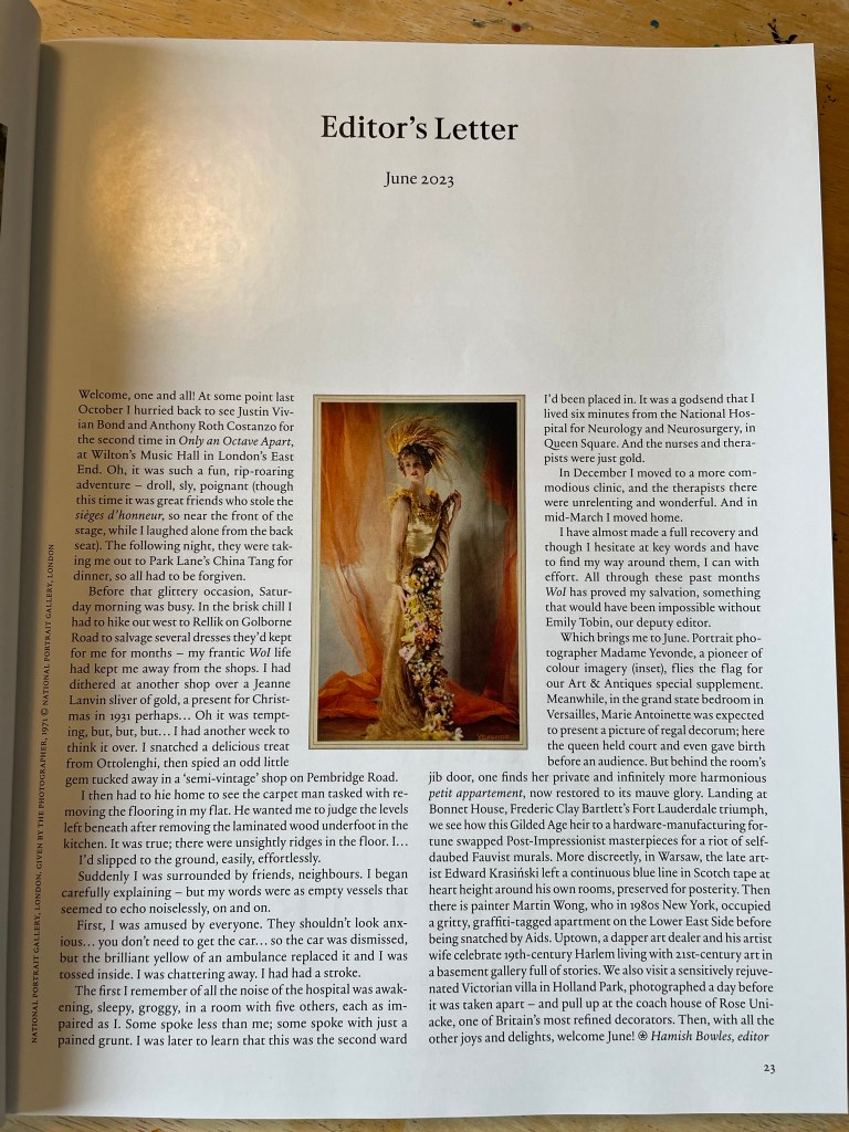
Next, I grabbed two magazines I had to hand – Private Eye and World of Interiors. They have very different markets and purposes, so I thought they’d be quite different in terms of design too. I was honestly quite hesitant about this part of the research task, I felt it would be really boring and tedious and identifying the font wouldn’t serve any purpose other than ticking a box to say I did it. I reluctantly began starting with the cover of Private Eye, trying to identify the logo font.
This was not easy, as the identifont system requires you to have much more than a handful of letters to pick from. I decided to try again using the fonts inside, trying to identify both the header font and the main body of text. Once in the swing of this, to my surprise, I was really enjoying myself! Looking for each letter and identifying its qualities was like a puzzle, and it was also teaching me quite a lot about what different letters could potentially look like, even if not used in the Private Eye font. I identified the body typeface first as Times New Roman – which honestly made me feel a bit silly as it’s such a famous font and I didn’t recognise it. I then identified the headers as Univers Bold, which I then realised was also used in the logo I was trying to identify originally.
Next, I tried to identify the body text from World of Interiors. Immediately I noticed this text was way easier to read than Times New Roman, especially at such a small size. I often find it harder to read serif typefaces – which might have something to do with my neurodivergence – and was shocked to learn it was designed specifically to be easier to read. The font used here was a pleasant surprise in this regard, and I had to strain a lot less when looking for each letter. I couldn’t pin down exactly what font this was, but figured out it was in the Garamond family.
This research task ended up being very enjoyable and teaching me a lot about typefaces in an unexpected way. I always think that I already have been appreciating something, but then throughout the exercises, I learn that it could be appreciated so much more. This exercise helped me to look a lot closer at each individual letter and really see the differences between them. I do wish I had a sans serif font to try this out with, to see the differences there! Maybe I’ll play around more in my spare time for fun.
For this exercise, I was asked to experiment with typographical representations of words – showing their meaning creatively through how the word is designed. I was asked to first print the words in 48pt Helvetica and work on paper, then to repeat the exercise digitally with some freedom in which fonts I could use.
There were 30 words on the list, and I chose to do this exercise for 10 of them, as based on my experience with Understanding Colour, I knew I would quickly become bored and stop actually learning from my work. I also did not have access to Helvetica, so chose to use Gill Sans, as I felt it was similar enough and the main idea was that each word was identical to challenge how you use space. I printed two copies of each word so I could explore alternative options, and I began working in my sketchbook.
I struggled a bit with Understanding Colour as my interpretation of words isn’t always the dictionary definition, and I find it hard to conceptualise things without a guide like this. To combat that in this exercise, I decided to use the Cambridge dictionary website to obtain a definition of each word, and then develop my ideas from this definition. I had a lot of fun with this part of the exercise. I think my work in Abstract Cities has softened my frustrations with cutting and sticking, and I could play a bit easier.
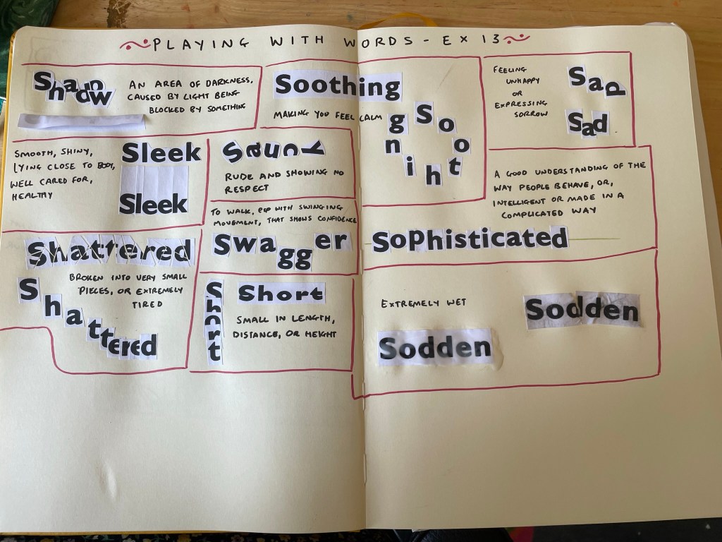
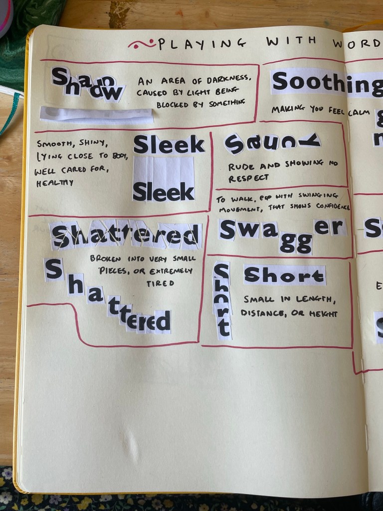
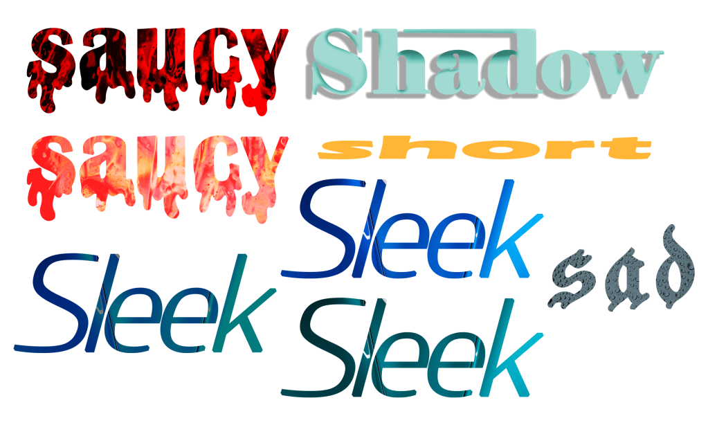
I began with shadow – overlapping each letter to block light from the others. It’s not quite a shadow, but I think it demonstrates the meaning of the word well. I then folded over the paper and stuck half of it down, so that the word itself creates a shadow. I really like this approach. Next, I moved on to sleek, which was tricky to work with in this format! I tried cutting the paper in a very smooth and rounded way, close to each letter, as the definition says, but it didn’t feel like it was emphasising the word. I then cut out each letter individually, very close to each letter, and leaving a lot of height above. I then stuck each piece very close to each other. I think this is much more effective.
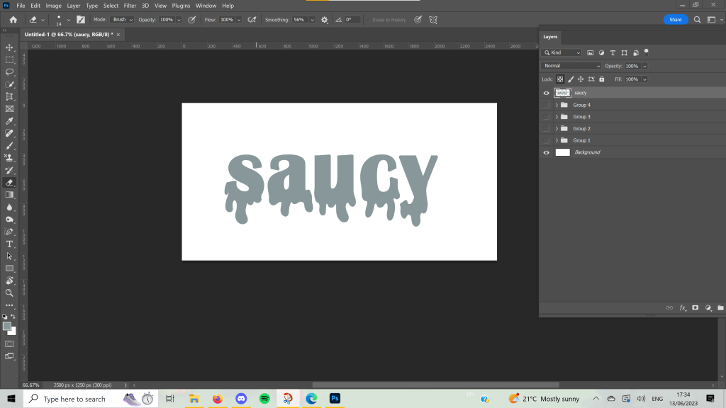
Saucy was another difficult word to work with in this format. There were a few definitions, one referring to sex in a humourous way, and another being covered in sauce, but I chose to go for ‘rude and showing no respect’ which was fun to show off with mismatched letters ignoring the rules of where they’re supposed to be. For swagger, I felt that having each letter slightly spread out and descending the g’s emphasised the confident ‘swinging movement’ of walking with swagger. I like how both of these turned out.
For shattered, I began by very roughly and absentmindedly chopping up the word. I regretted this immediately, as I had to piece it all back together like a very confusing jigsaw. In the process, I couldn’t figure out where a few pieces went and ended up with some gaps. I actually think this was for the better, as it really looks like a broken mirror someone tried to fix. Shattered can also mean extremely tired – and this is the definition my brain first goes to when I think of the word – I tried to represent this, too. I wanted it to look like the word was ‘crashing’ into sleep, and I liked the outcome a lot.
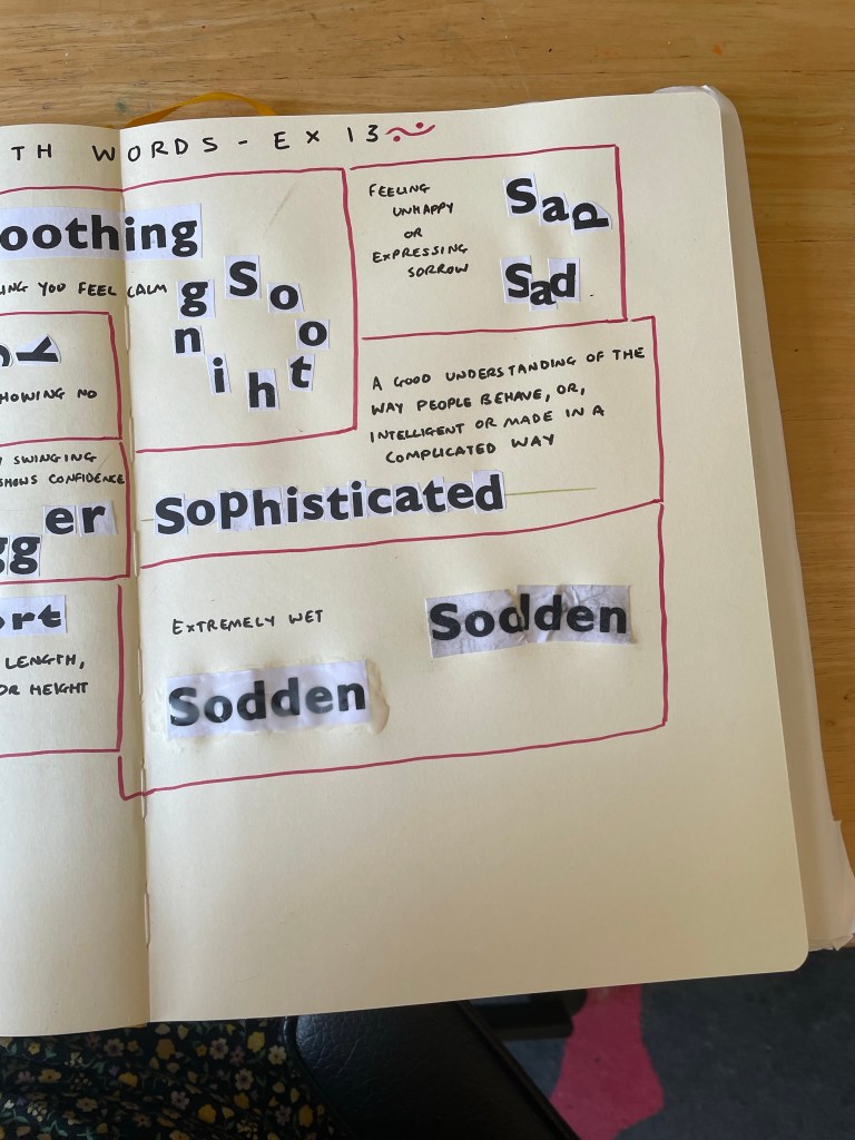
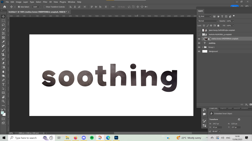
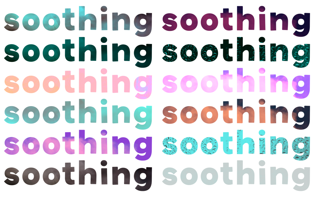
Short feels self-explanatory, and I really enjoy how it looks. I think I prefer the one cut horizontally to the vertical stacking, but I think this is likely due to the white bits on the paper blocking the letters. When I was trying to think of what to do for soothing, I struggled a bit. The definition was a bit abstract and simple. I began by just pasting the whole word in because looking at Gill Sans makes me feel calm. The font and word itself are soothing. I then arranged each letter into a circle, as this felt like another representation of something calming.
I tried to make the individual letters look like they were sad for the next word. I explored arranging them into a ‘sad face’ but this looked more happy, so I ended up with a ‘happy face’ and a depressed D. A friend said this represented the word well. Sophisticated was another tricky one, and I wish I’d explored it a bit further. I drew out a straight line and tried to place each letter on it so that it sat exactly in the centre. I felt this drew from the intelligent and complicated definition of the word.
And finally, for sodden, I simply dipped the paper in water and mushed it up until it really did feel soaked. I glued it down, then tried a second option, which was soaked in too much glue, both on top and underneath. I don’t think this is as effective as the one I dipped in water, which I think worked extremely well!
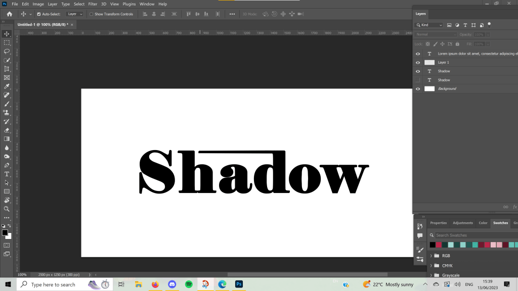
Once finished, I moved into Photoshop to design each word digitally. This had pros and cons. Currently, I’m trying to address an issue I have where I put far too much work into each individual exercise and burn myself out on repeat. As I’m less familiar with Photoshop, and have less capacity to work within it due to using a mouse vs. an Apple Pencil on my iPad, I was limited in what I could do. This helped me not overachieve, but it also made me feel really stressed and upset about the work I produced.
Going into this exercise, I anticipated creating beautiful illustrative designs for each word, and probably spending four times as long as needed. I repeatedly said ‘If I was using Procreate these would look so much better!!’ whilst designing for each word, and it’s true. They would. But I also would have spent two weeks perfecting them, which isn’t necessary. I am trying to push myself to use new software and also to let go of the need to produce professional standard work for every single thing I do.
I mostly experimented with different fonts, sizes, placements, and overlays for these designs. I played around with kerning and alignment and added embellishments to help tell the story of each word. I referenced my sketchbook work throughout, and despite feeling like I pretty much re-invented Wordart, I enjoy how some of these turned out.
I know I have the capacity to create something better than this if I use software I’m more familiar with and spend more time on each piece, so I’m trying to be gentle with myself on what I produced here. In Key Steps in Illustration, I got a lot of experience working with typefaces and illustrative type especially, which I enjoyed very much. A similar exercise asked me to explore how to represent type in various illustrative ways, and the work I produced there is some of my favourite from the unit. I also loved producing type for the biscuit exercise.
It was nice to revisit this exercise, and I especially got a lot out of the paper-based work. I’m also really enjoying how Part 4 is setting me up for Assignment 4 so far. I feel like I’m learning a lot and starting to question my relationship with typography and what I enjoy about it.
To start Part Four, I was asked to take a look at the history of typography along with writing, reading, and printing, and learn how they are intertwined. I was prompted to choose an area specifically to research – something that interests me or is relevant to my work – and to collect examples of ways type has been used in that area.
I found the introduction to the history of typography written in the unit to be very Eurocentric, despite mentioning that Europe and the West generally were not the first to develop new methods of producing type. I was quite disappointed to see this focus as typically, the OCA has been good at rejecting Eurocentric biases. I identified that this is an area I wanted to research for myself, to ensure I’m not ignoring that we are not responsible for modern typography.
Whilst Wikipedia is not necessarily the greatest resource for research, I find it a good starting place for large topics that you know very little about. I began reading through the page for Printing and was shocked by how differently the OCA PDF had portrayed the history of type. The PDF mentioned that woodblock printmaking goes back as far as 220 AD in China, but then skipped over hundreds of years to discuss Europe.
I learned that in the 7th Century, the Chinese woodblock printers started printing on paper, as well as fabric. The first printed book that we are aware of is from 868 AD, and by the 10th Century mass-produced books were widespread across Asia. Woodblock printing on paper was not common in Europe until the 1400s, 800 years after the first known paper prints were made in China. However, Europe is usually credited with the invention of movable type printing systems, specifically Johannes Gutenberg is known to be the person who ‘revolutionised’ print.
China created the first movable type system in 1040 using porcelain. It wasn’t as popular in China due to the sheer number of characters used in Chinese writing. Gutenberg was still not the first to use metal movable type, this being invented in Korea around 1230. Gutenberg’s ‘invention’ was brought to Europe almost 400 years after its initial invention in China. Historians now have confirmed he used the Chinese-Korean technique of printing, the only difference being its popularity with Latin alphabets.
Gutenberg may have enhanced printmaking by experimenting with varying inks, metals, and mechanical efficiency, but he certainly did not invent movable type. Europe was considerably immature in its development of print, and almost all of the systems we use originated in Asia. As usual, we took from them and acted like it was our own ideas, and the almost century-long gap in usage shocked me. How we don’t learn about this as a default is really surprising to me.
I felt quite frustrated that I had to go and look this up for myself to know about it, as I felt like it should be basic knowledge included in a design degree. I have increasingly wondered why all design history is Eurocentric in nature – Germany, the UK, Switzerland, and Russia dominating the industry – and would like to expand my understanding better. I spoke with some fellow students about this issue and got some fantastic book recommendations, some of which I have bought already and some of which I’ve added to a wishlist.
One book I purchased was Graphic Design: A History by Stephen Eskilson which unfortunately immediately skips over the history I described above, and begins with Gutenberg in Europe. I hope to read this further, however, and hopefully learn some more global design history. I’m looking forward to exploring more of the books recommended and challenging the narrative that Europe is responsible for modern-day design.
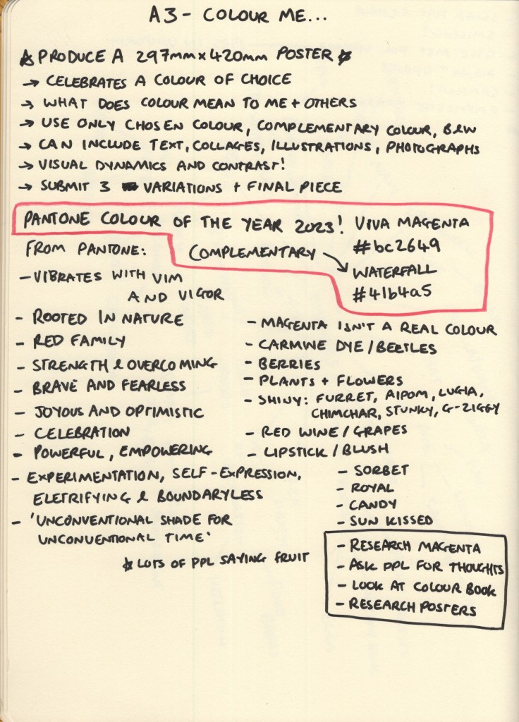
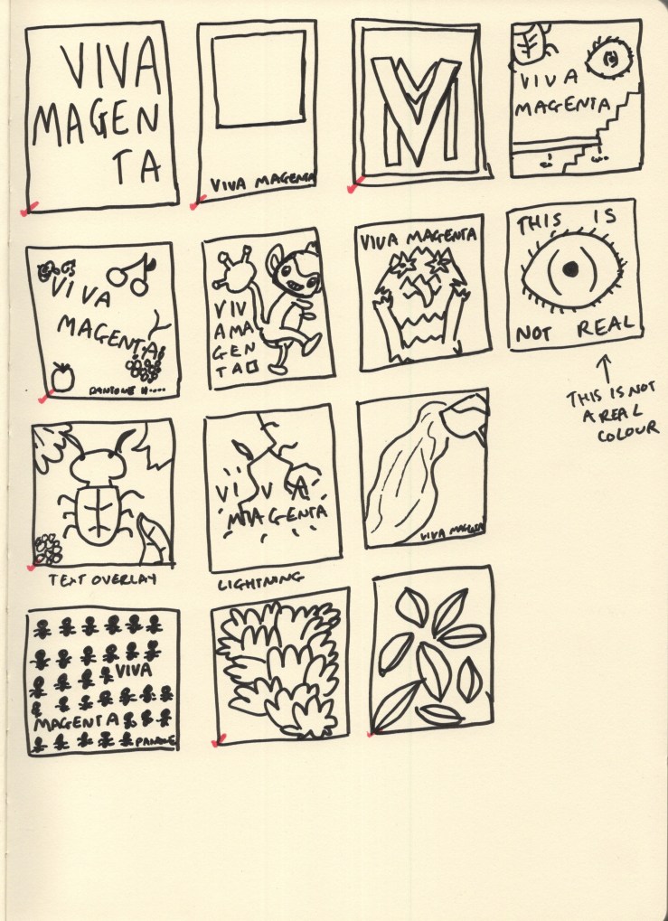
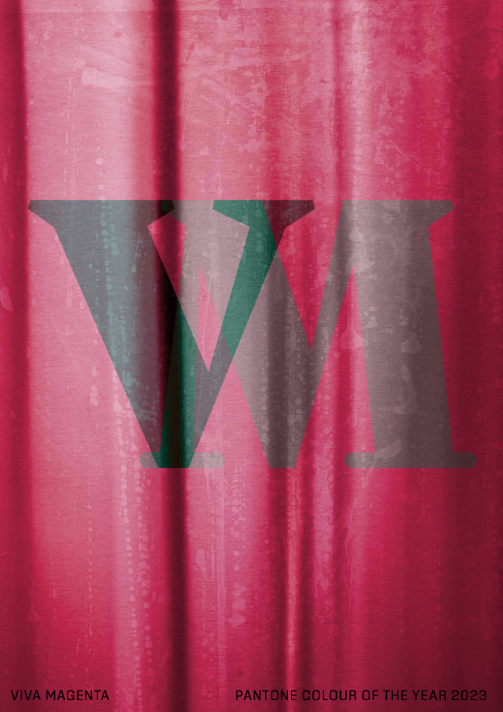
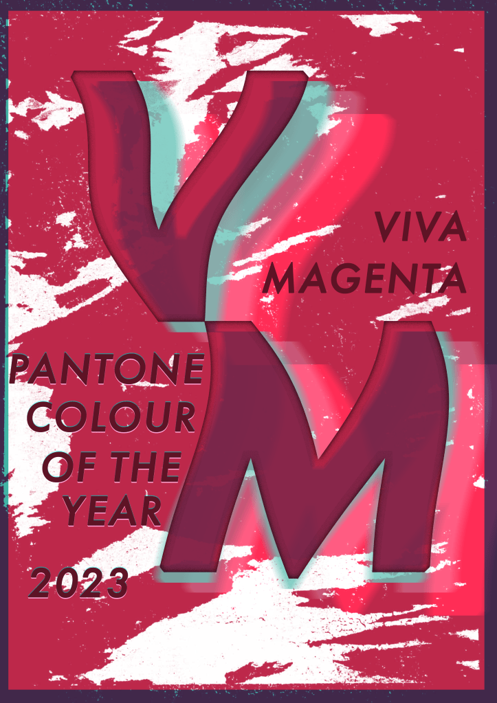
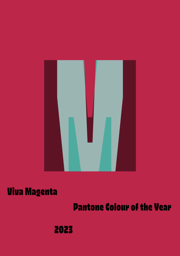
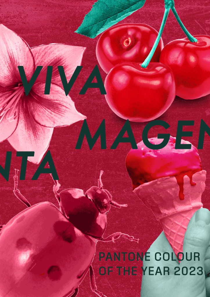
To finish off Part Three I was asked to put everything I have learned together – exploring composition, symbology, visual dynamics, and most importantly: colour. I had to create a poster that celebrated any colour of my choosing, using only tints and shades of that colour and its complementary colour. I could be creative with my design, using photographs, illustrations, text, and collages, if I wanted to. I needed to create at least three versions of the poster, and one final piece.
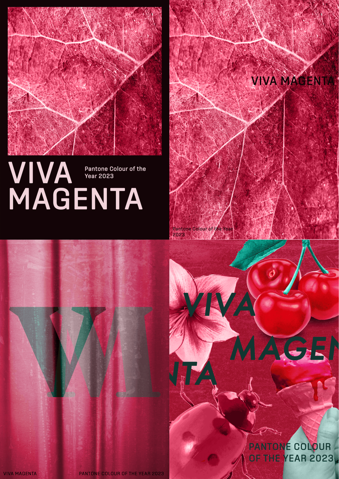
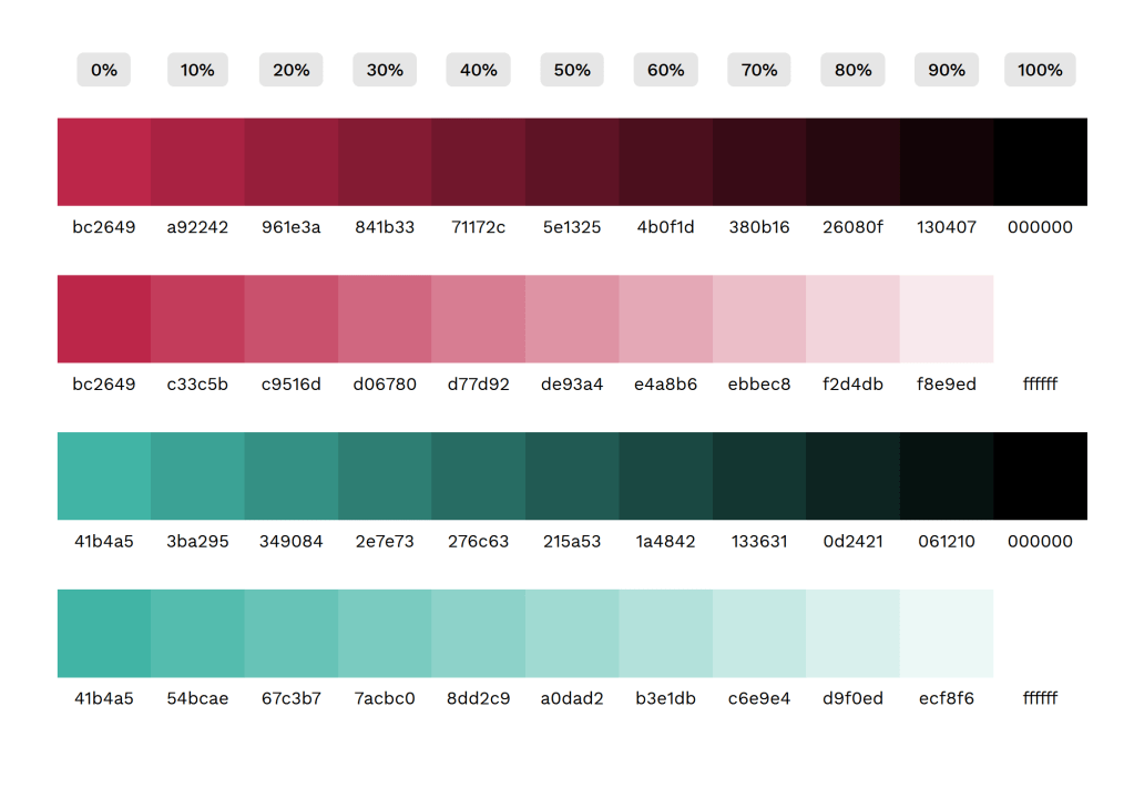
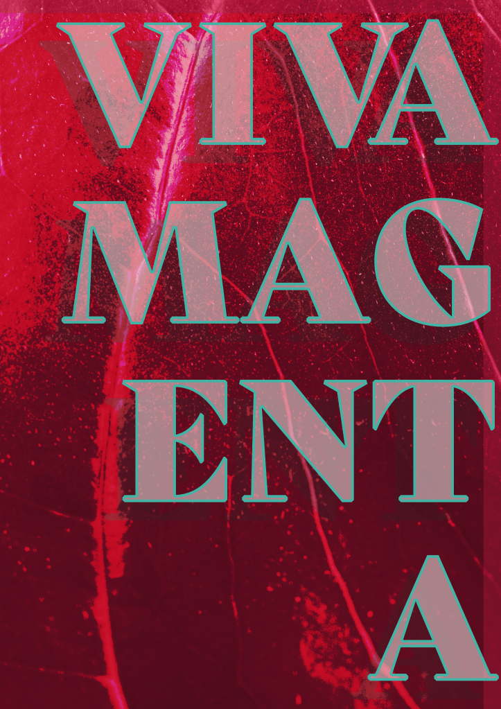
I had already decided on a colour for this assignment several weeks in advance when messing about in Photoshop. The software features some Pantone swatches which reminded me of the Pantone Colour of the Year for this year – Viva Magenta. This is a gorgeous, deep, bold pink-red shade, and I knew I wanted to explore it further for this brief. Before I began anything else, I jotted down the hex code for both it and its complementary Pantone shade – Waterfall – and used this website to create a colour palette.
Next, I began to do some research into the colour itself. Choosing the Colour of the Year felt a bit like cheating, as Pantone have already written a bunch of articles about why they chose the colour and what meaning it has, but this actually was extremely helpful, as there was a lot I probably wouldn’t have thought about. Later, when I asked friends and fellow students their thoughts, they had very different ideas about what the colour represents. Having both the professional perspective and the more generalised perspective helped me come up with more designs than I would have otherwise.
Pantone’s descriptions of the colour were very focused on its appearance in nature, that clothes dyed in similar colours often use carmine pigment, and that the colour represents strength, bravery, and a joyous overcoming of boundaries. It’s a celebratory colour in and of itself. My friends all said that it made them think of summer, of fruits and dresses and drinking wine. Make-up was referenced a lot, too, and that it felt like a very regal colour.
My own thoughts were similar to Pantone’s: I thought of flowers and of joy and celebration. But, I also thought about the fact that magenta isn’t even a colour at all. This is so fascinating to me, the science of colour and how we perceive it has always been mesmerising to me as an artist, and I was eager to explore how I could represent that what the viewer is looking at isn’t really even there. I also, unsurprisingly, thought about Pokemon, and how many of them share the colour scheme I chose.
I’ve been thinking a lot lately about why I am doing this degree and the purpose it holds for me. I saw a post aimed at student designers that said the most important thing you can do for your portfolio is to take every brief and make something you love, make it relevant to you and your interests and what you want to be doing in life. It resonated with me, and I felt like that was something I was already doing, but I’ve noticed more that I seem to mould myself and my work to each brief, changing my style and approaches depending on what is asked of me.
Whilst this is useful in order to explore what I enjoy and to learn how to be flexible in my design process, I have very little that I’d want to put in a portfolio from my three years of working. For this assignment, I really wanted to make something that excited me. I wanted to make something I would enjoy looking at, that I would enjoy making again and again, and that fit into the contexts I want to work in.
When it came to thumbnailing this was my main focus. I explored a lot of very different ideas, drawing from the huge variety of meanings I had collected in my research. I also took a look at The Designer’s Dictionary of Colour by Sean Adams, which unfortunately doesn’t have a section on magenta specifically. It does, however, have a chapter on fuchsia, which is close enough, and contains some great inspiration for minimal palette work.
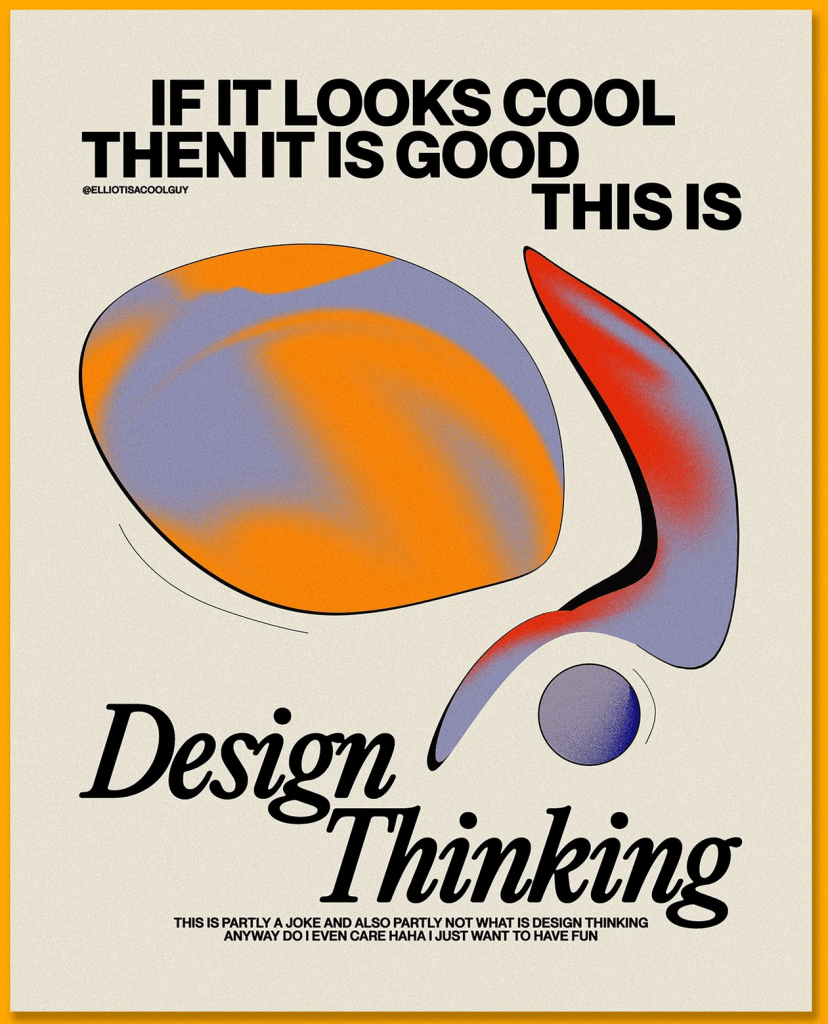
I’ve done a lot of work with posters over the years, and a lot of research on artists who specialised in the field, so I didn’t feel a strong need to research the area again. However, recently I’ve been really inspired by some of the work I’ve seen on Instagram from young designers such as Elliot Ulm (@elliotisacoolguy) and I wanted to collect some to reference for this assignment.
I love seeing designers in similar places to me sharing their experiences and work in a casual way. Often there feels a huge disconnect between me and ‘the design world’, but these designers make it feel a bit more real and closer to home. I also see a lot of themes and trends across their styles that are also present in my work, which always reminds me that I am a part of the current ‘era’ of design, even unconsciously. I would love to research the question of ‘what comes first, the trends or the articles calling them trends’ in my critical reviews at Level 2.
I really enjoyed Exercise 9 and how it made me think differently about my design work – mainly that it was so freeing and I produced so many varied design options that I wouldn’t have otherwise. I decided to start working in Photoshop without much of a plan for which of my thumbnails would be my final design in order to try this exercise again – just playing around without much of a goal and seeing what I came up with. Doing this always makes my work feel a lot more fun, which is a huge bonus, and I think I come up with some awesome designs in the process.
Thankfully, I figured out how to screen record my Photoshop process this time, and managed to capture some of my playing. Unfortunately, the screen recording doesn’t capture everything, and it was slowing down my laptop immensely, so I couldn’t record too much of the process. My designs felt a bit like pancakes, where the first one has to be awful in order for the rest to be fantastic, and I felt they got better the more I explored and questioned. I downloaded a bunch of fonts from Adobe Fonts to experiment with and tried to loosely follow my thumbnails similar to how I did in Exercise 9.
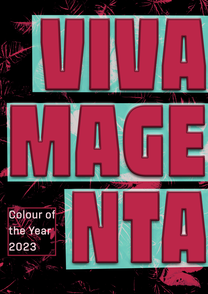
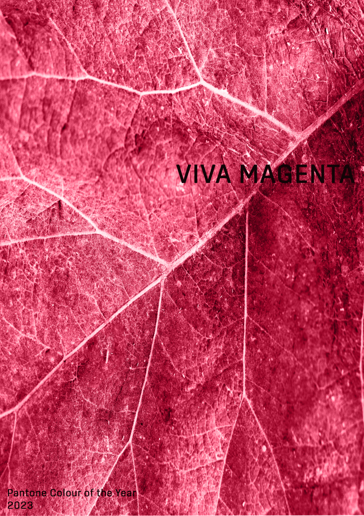
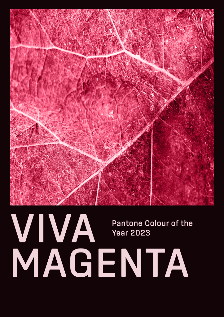
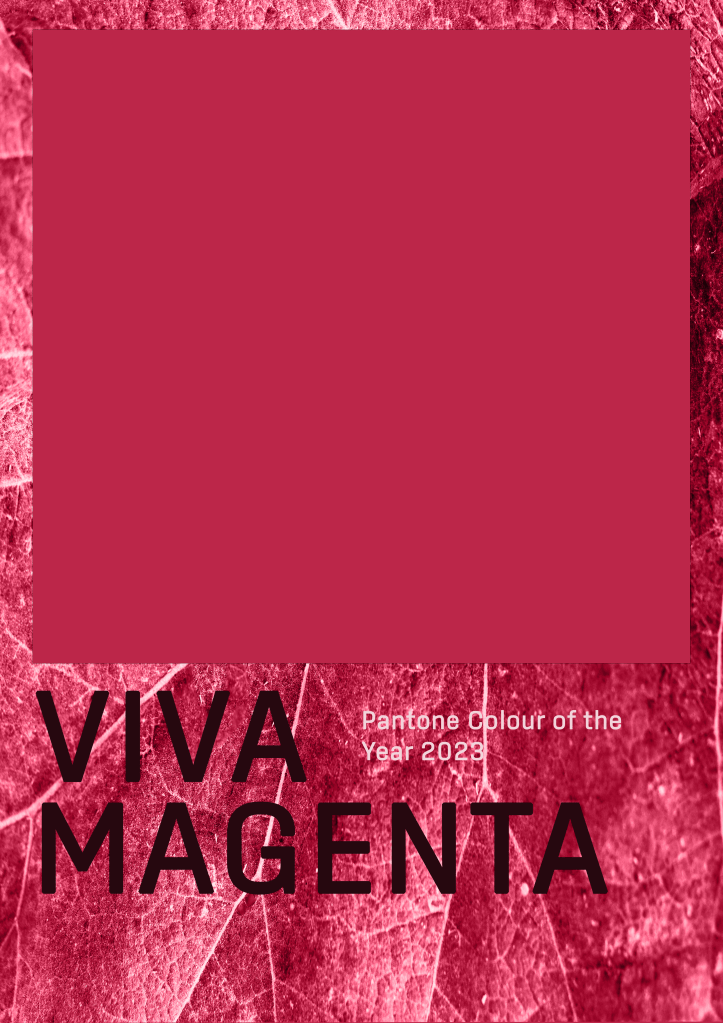
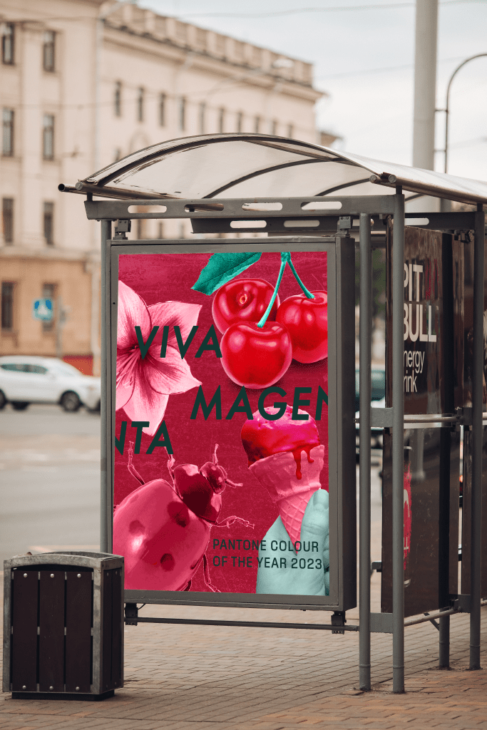
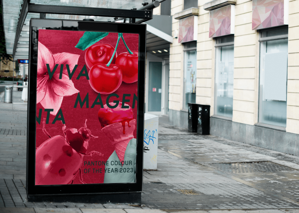
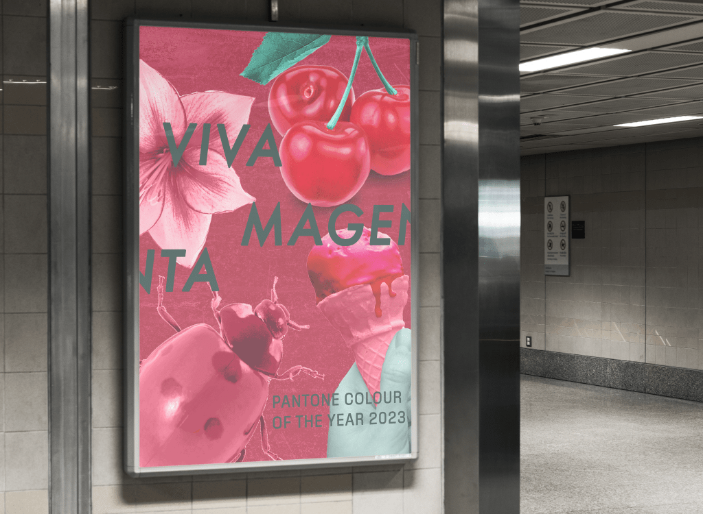
I produced 9 different versions of the poster, all of which had very different vibes and elements. I explored collaging with stock photos, manipulating text in various ways, and using textures and natural elements to create interesting backdrops. They are all very rough and unpolished as I didn’t want to spend too long perfecting each piece, knowing they weren’t all going to be officially used as my final piece.
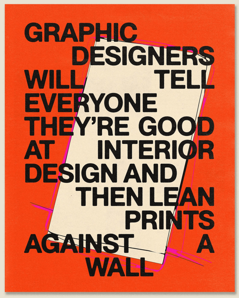
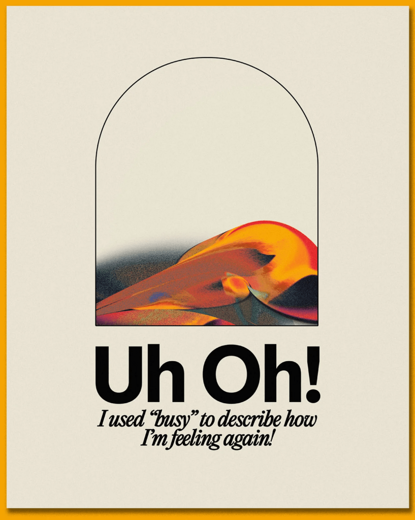
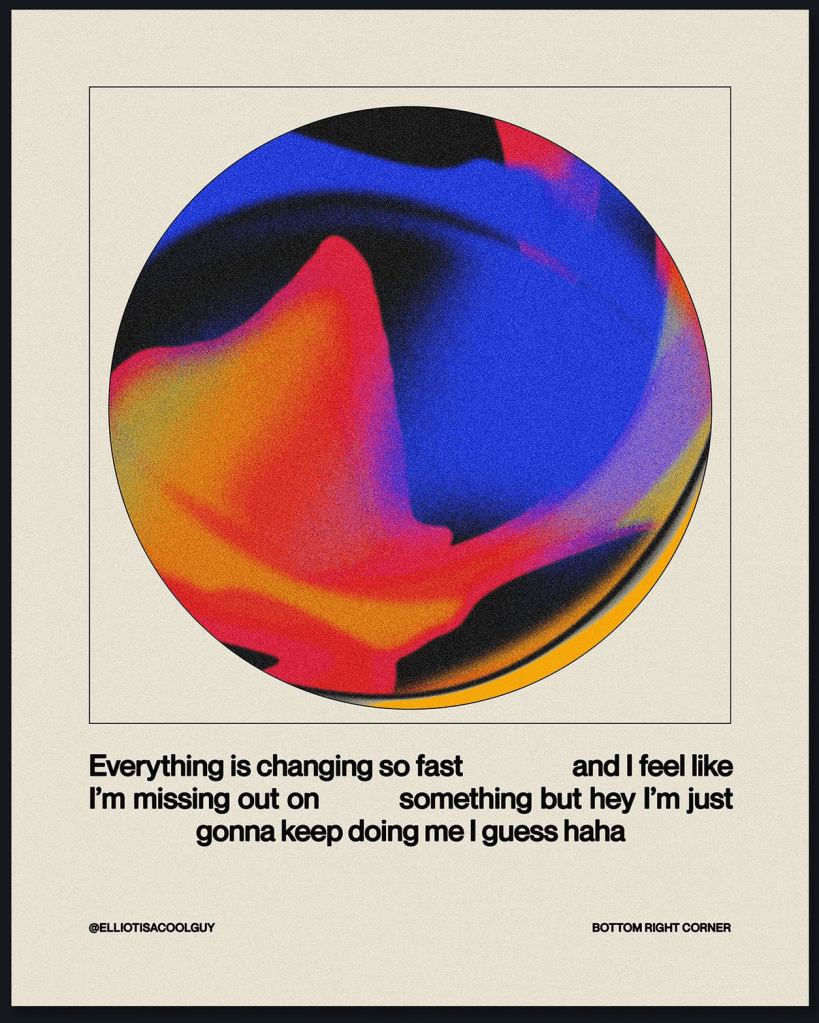
Once I felt I had enough ideas to work from, I took a step back from them to think about what it was I was trying to communicate. I really enjoyed so many of the posters, and narrowing them down to one piece was going to be a challenge. I put together my favourite four designs and sent them out to friends and other OCA students to ask for some feedback on them.
Feedback was very mixed, which made it even harder to figure out the strongest idea. However, one of my friends asked me a great question: who is your audience?
I had already decided my audience was myself. I wanted to create something that made me happy. But as I thought about this question, I realised that I had been subconsciously working for a very specific purpose: to advertise the colour. I was imagining in my head that there was a Pantone exhibition at a local art gallery showcasing work from the past 100+ years that featured this year’s Colour of the Year. A celebration of the colour, just as the brief described, but from a slightly different angle.
Advertising and marketing are where my passion lies. I love creating things that draw a passerby in. In my head, this was a poster for public transport, walked past on the daily commute, eye-catching in a way that makes you curious to find out what that is. I wanted people to be googling ‘viva magenta colour of the year 2023 pantone’, even if they weren’t going to visit the exhibition itself.
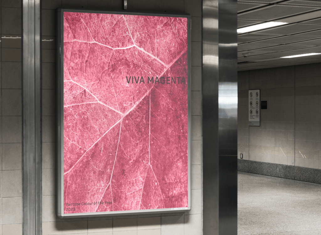
Another friend gave a breakdown of the vibes each piece gave them. They said the first felt chic, classy, and official, as did the second, however the second felt like it was for a design book about the colour. The third they felt was for a fashion collection – which I had previously said too – and that the fourth was perfect for social media and targeted the Young Adult demographic. This put me off the fourth design and made me favour the first two, as an upmarket gallery was what I had envisioned.
The fourth design, however, is probably the strongest at bringing together all the elements of Part Three in a powerful way. Colour, collage, composition, and an exploration of visual space have all been included. It’s striking and celebrates the colour without further explanation. I felt like it was an obvious winner, but I couldn’t stop myself thinking about the other three. They felt more ‘me’ as a designer, more like something I would see at a bus stop and not be able to stop thinking about.
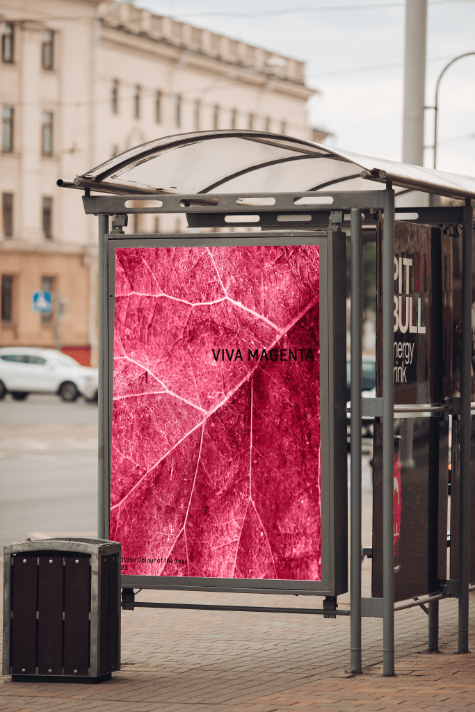
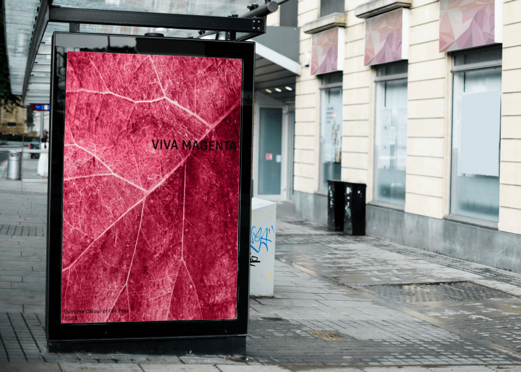
I managed to narrow down the three to one, and thought, Hey! Why not put them on bus stops and see how that changes my perspective. I always find that mocking up my work helps me see potential in it as it is brought into the real world. I found some really great mockups that fit my vision and put each poster in them. Doing this definitely improved my feelings about the fourth design, but it didn’t really change my love for the second design. There’s something about how minimalistic it is that feels so good for me.
Instead of polishing off one of these designs, I have decided to leave them in this unfinished state until I receive feedback from my tutor. I will then pick one of the two and tweak it a little – mainly improvements to the text legibility and placement – for it to be my final piece. Right now, however, I really can’t decide! I love all of the designs I came up with for this assignment and these two the most.
I had so much fun with this assignment, which is a huge difference from normal. Don’t get me wrong, I usually enjoy the work I do, but my approach has really shifted throughout Part Three. I’m starting to see the importance of making work I want to make, and especially the importance of letting go and really playing with what I’m doing. I feel like I try really hard to follow rules and meet expectations (one’s I set for myself!) rather than just following what’s interesting to me – despite constantly talking about wanting to break boundaries and let go.
I think it’s cool that Pantone’s perception of Viva Magenta – brave, empowering, experimental, and breaking down boundaries – are all things I have learned how to embody throughout the exercises and assignment. I really have celebrated the colour through both my work and my design process. I’m so excited to see how Parts Four & Five turn out with this newfound freedom in my work, and whether I’ll be able to maintain it through until the end.
For this exercise, I was asked to make a photomontage or collage focusing on a political message of my choice. The brief used the words ‘playful, imaginative, proactive, and humorous’ to describe how I should manipulate the images I collected to create my final piece. It suggested using Photoshop to do this and asked that I reflect on the original meanings of my images and my subsequent collage in a short evaluative statement.
Despite having grown up with access to the Adobe suite, I have avoided paying the costs to access it throughout my degree, sticking to my favourite software of Procreate for the most part. For a personal project a few weeks ago, I needed access to photo editing software and ended up paying the £16 student fee to access Lightroom. I decided I may as well continue, at least for now, in order to access Photoshop and Illustrator too. This turned out to be a great decision, I forgot how much I love Adobe!
To start, I dissected the brief and considered some points to research. I’ve been introduced to several collage artists throughout my degree who have inspired me, and I especially enjoy the constructivist era collages. I revisited the work of Hannah Hoch, as well as Herbert Bayer, and considered what sort of collage I wanted to create.
I also found a very interesting article discussing the constructivist era titled Rodchenko: aesthetics as politics. The concept of using aesthetics within political movements – and the way in which politics and art directly influence each other throughout history – has always been fascinating to me. This article was not specifically about collage or photomontage, but it did prompt me to reflect on how this medium can be used for political purposes.
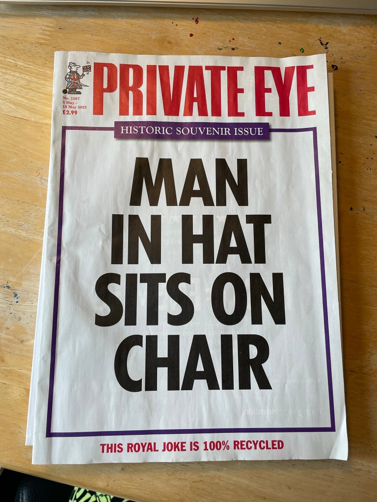
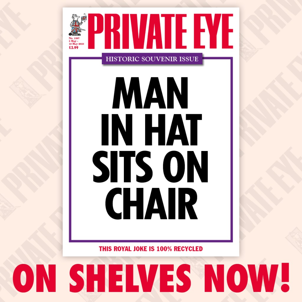
Private Eye front cover, 5 May 2023 edition. Taken from the official Private Eye Twitter account.
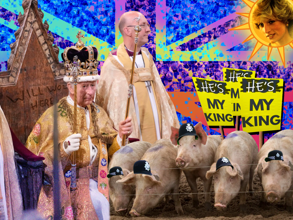
I didn’t think too hard about what political event to explore, and off the back of the King’s Coronation a week before, I was pretty inspired by the possibilities it could hold. I was especially inspired by the Private Eye cover for that week, which simply said ‘Man in hat sits on chair’. It felt like a wonderful way to use both text and visual dynamics to achieve a humourous outcome.
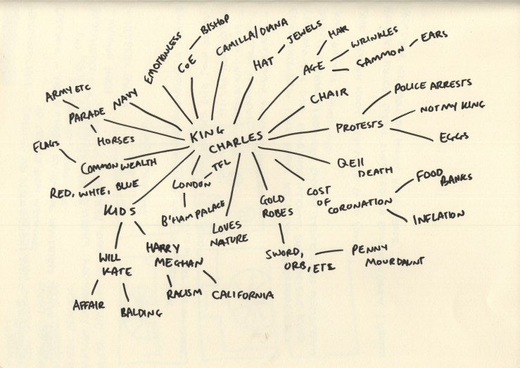
I don’t usually find mind maps helpful, but for this exercise, it felt like the obvious choice in order to thoroughly explore possible imagery I could use in my collage. I made sure to consider more abstract connections, as well as the more obvious ones.
I selected a few of the concepts from the mindmap to use as a basis for my collage: swapping the crown and thrown for a random hat and chair, having the King grinning, giving the metropolitan police crowns instead of hats, featuring Princess Diana somewhere or making Camilla look very sad, and emphasising the King’s ears. I then turned to Google to begin finding imagery to use.
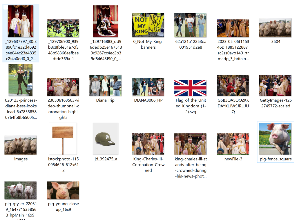
Imagery downloaded to potentially use in my photomontage.
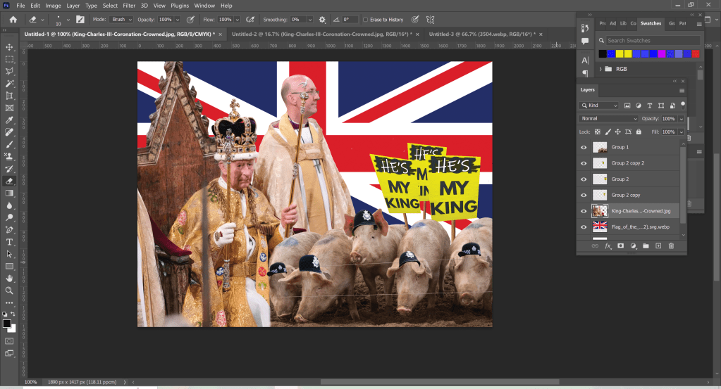
Once I felt I had a good range of images to experiment with, I began dissecting everything and fitting it together in Photoshop. I’m still not quite in the habit of documenting my work when not using Procreate, as I’m so used to the automatic screen record function, but I did manage to take a few screenshots.
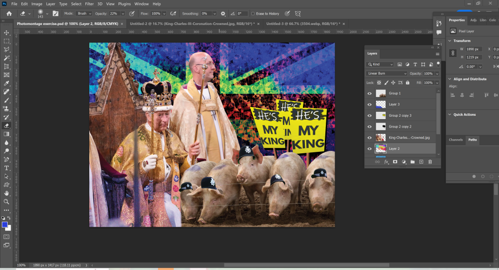
I started by adding a picture of the King on his throne, with some pigs wearing metropolitan police hats. I then edited the ‘Not My King’ placards that were confiscated by the police on the day of the coronation to say ‘He’s My King’, and arranged them in the background. I threw a Union Jack in as a backdrop, just to fill the space and see what it looked like.
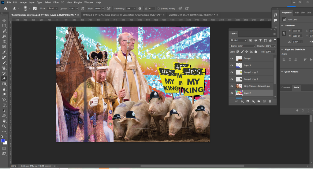
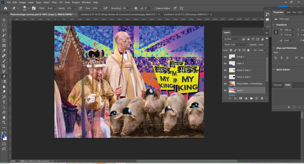
I felt the union jack was too basic and kind of jarringly placed, so I played around with some blend modes and texture layers. I added a water pattern and some spots of colours, warped everything, and then experimented with how to stack and blend each layer. I had a few different choices and chatted with a friend about which was strongest. We both agreed the third one was best, and I continued with this one.
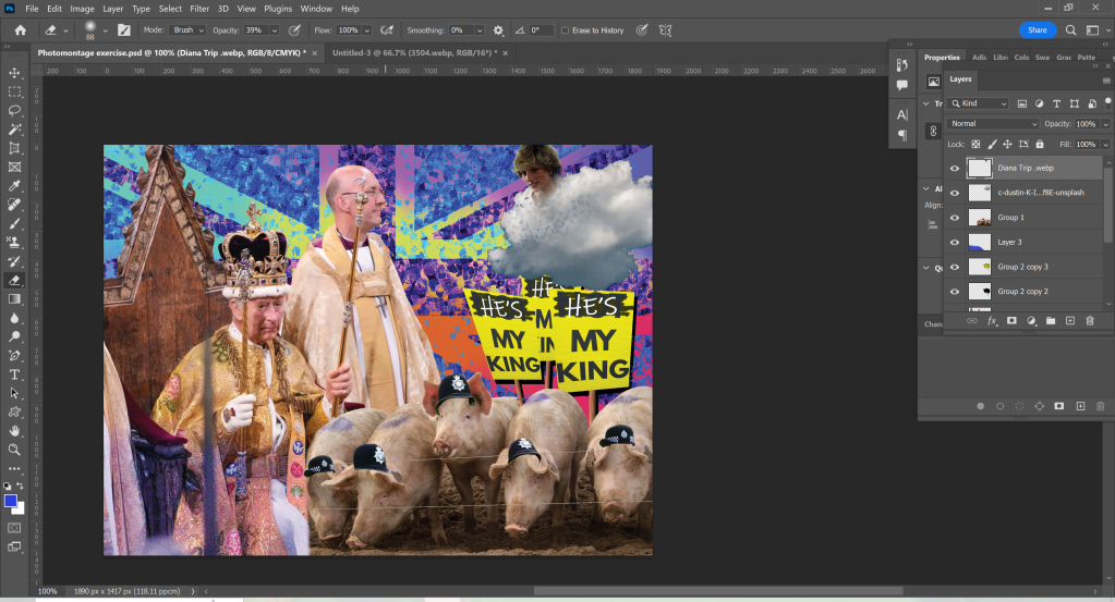
Originally I envisioned Princess Diana’s head popping out of a cloud with angel wings behind her, looking down on the coronation in progress, but I couldn’t quite figure out how to get it to work. My friend suggested I try having her face in the sun, like the Tellytubbies sun, and I loved the idea. I tried out a few different sun graphics as the background before settling for the one I chose and then added a glow using a couple of layers of Gaussian blur in different colours.
Finally, I added some noise to the image, smoothed out the harsh lines between different layers to make the transition between pictures a little easier on the eye, and enhanced the already existing graffiti on the throne with a ‘Will Woz Here’.
Once I was finished with my collage, I sent it to a few friends and family members to get their thoughts. The reception was very good, with several people saying it looked just like something they’d see on Facebook or on a parody news page. This made me feel like I had successfully fulfilled the brief! I definitely was aiming for over-the-top political satire, rather than subtle humour. It was a lot of fun just playing and seeing what I came up with, rather than trying to design something ‘perfect’.
The original image of King Charles being crowned is sombre, with very little emotion shown from any of the people involved. The backdrop of Westminster Abbey, along with the regal outfits worn (and of course the Crown itself), provide a sense of historical elegance. In contrast, the bright and garish edited Union Jack as a backdrop is reminiscent of council estate street parties and World Cup finals. The addition of Diana, poking fun at the drama between the King and his former wife, and the play on ‘cops are pigs’, further this working-class perception of the Monarchy and wider British systems.
I really enjoyed this exercise. It reminded me of the silly memes I would put together of inside jokes in my friend groups as a teenager. I also love a bit of political satire, so being able to explore this in my work was fun!
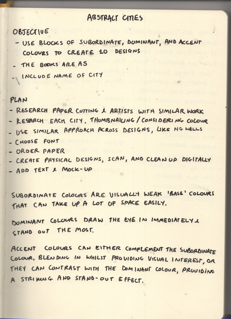
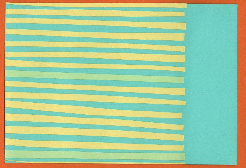
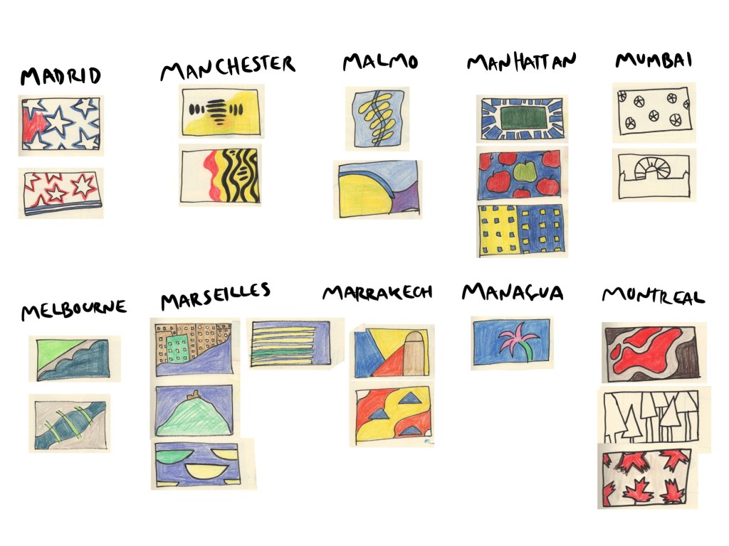
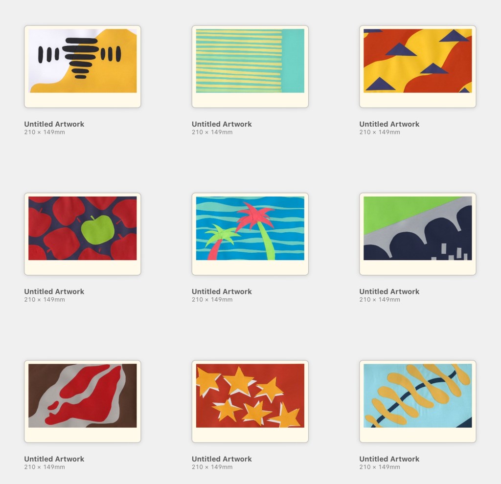
This exercise asked me to create 10 abstract designs to be used as book covers for travel guides. I was provided with 10 cities to design for and was asked to use blocks of subordinate, dominant, and accent colours. The books were to be printed in A5 landscape format, and the covers had to feature the name of the city alongside or incorporated into the design.
As an OCA Visual Communications student, this exercise is a little bit notorious – having a reputation for taking an enormous amount of time and driving everybody crazy in the process. I was looking forward to finally trying my hand at it! I could’ve made this really easy for myself, following my usual design approach and creating some really fun digital designs, but of course, I chose to make it excessively complicated and stepped way beyond my comfort zone.
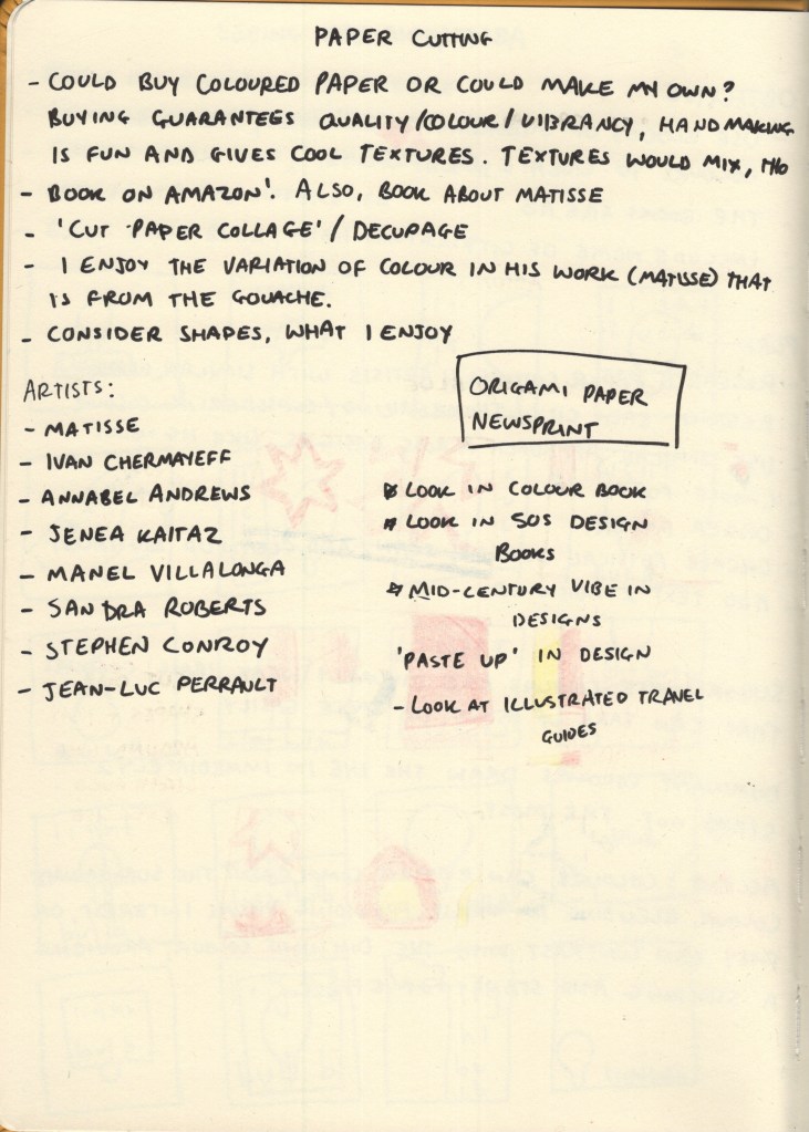
Throughout my research in this unit, I have seen many examples of paper cut-outs in graphic design, whether intentionally used for artistic effect, or simply used because that’s what technology allowed at the time. I’d like to branch out a bit in my design work and try to use more traditional mediums rather than grabbing my iPad every time I approach a brief, and thought this would be a great opportunity to explore the papercutting medium – especially as the work I’d previously seen screamed ‘abstract blocks of colour’.
Before researching each of the 10 cities, I began collecting some papercutting references, starting with Cezanne. My tutor had recommended his work to me and I found it particularly inspiring. I began adding his work to a Pinterest board to reference later, then expanded my research to other artists.
I ended up on the Saatchi Gallery website, where there was a huge collection of papercut artwork. These went onto the Pinterest board, too. I briefly had a look into paste-up in design, to see how I could emulate this today, but it felt like too much of a diversion, so I came back to explore graphic designers specifically.
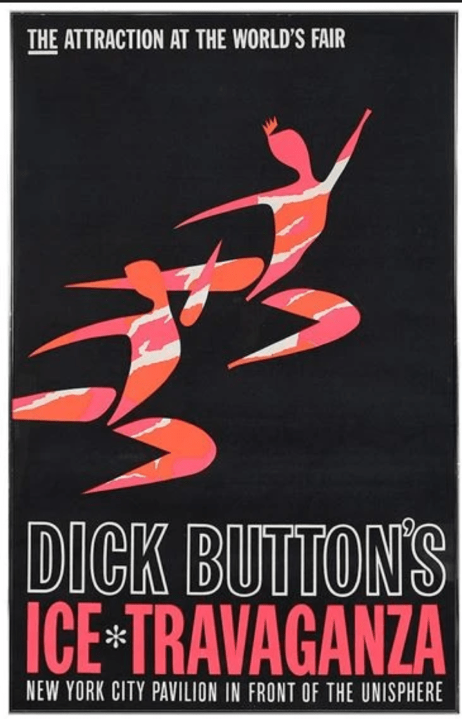
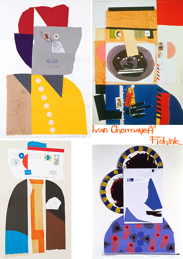
In a previous exercise, I had come across Ivan Chermayeff’s work and made a note of it to reference again in this project. He is most famously known for his logo work – specifically the CNN, PBS, and National Geographic logos – however he created a huge number of collages in his time, most of which are abstract collections of papers. I love the way each shape is haphazardly cut or torn, giving a childlike feeling to each piece. The positioning of the papers is recollective of Saul Bass’s work, especially in the Ice Travaganza poster below, but taken to a more abstract extreme.
Some of Ivan Chermayeff’s work
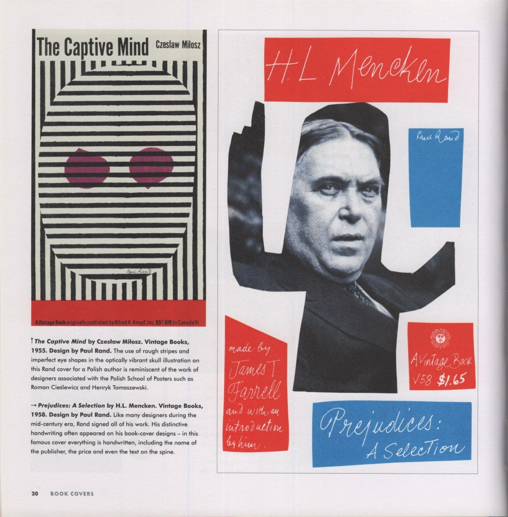
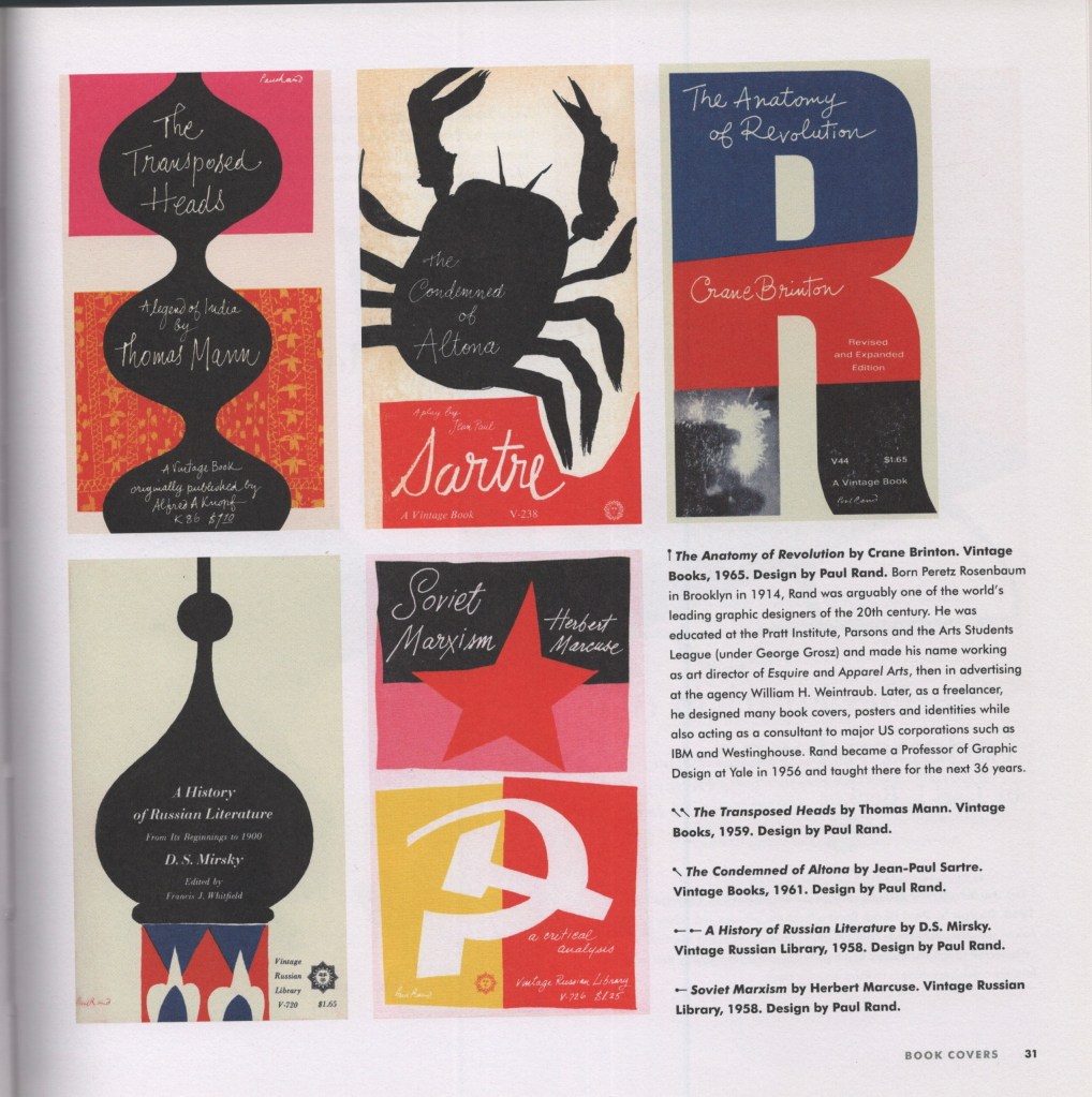
Next, I looked at one of my favourite books to reference, Mid-century Modern Graphic Design by Theo Inglis. I’ve found many examples here of this paper cut-out style, and wanted to find some book covers specifically, to see how the style translates for this purpose. Pages 30-31 were the strongest for me, showing many different covers from Paul Rand – another designer of today’s iconic logos – utilising this fun, messy, papercut style. The colours are very simple throughout, too, and got me thinking about how I would explore colour with my own designs.
I then wanted to explore some of the language used in the brief: subordinate, dominant, and accent colours. I wanted to have a better understanding of what these were, so I could effectively choose and arrange my paper. I found that subordinate colours are visually ‘weak’ and used as base colours – things like white, creams, browns, blacks – anything that easily fills space and is comfortable to look at in that context. Dominant colours, on the other hand, draw the eye in immediately and stand out against the subordinate colour. Accent colours can complement or contrast against the dominant colour, either blending in whilst still providing some visual interest, or standing out and leading the eye around the image.
This reminded me of an art lesson way back in primary school where we discussed a famous landscape painting where the artist had added a spot of blue in the centre in order to draw the eye to that location. It was fascinating having that pointed out, as it wasn’t noticeable until you really looked. It was so effective and blended in seamlessly with the rest of the painting. Unfortunately, despite a lot of searching and wracking my brain, I can’t remember the painting or artist. The colour theory has stuck with me through life, however!
As this medium is totally new to me, I had to identify my practical approach before beginning the designs. I don’t have a large stock of coloured paper to hand and needed to figure out what I would use to achieve the style. Cezanne painted large sheets with gouache, then cut them once they’d dried. Painting and intentionally adding texture to paper is popular throughout collage, as it creates visual interest and excitement within each individual cutting. It’s a lot more work, however, and would add additional issues such as the paper potentially bending from the paint, colours being inconsistent, and textures being incompatible or looking overdone.
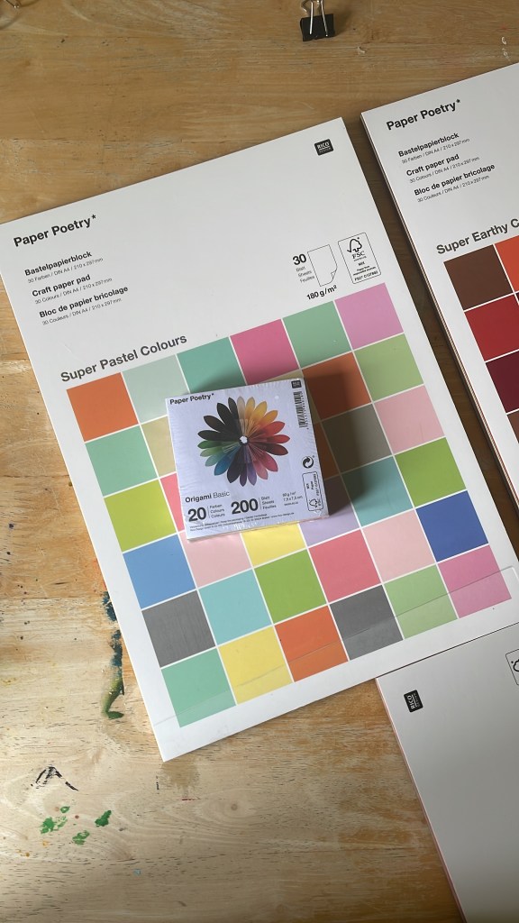
I initially wanted to go to an art or craft shop and pick out single sheets of paper once I knew my colour schemes and could match them, but there wasn’t anything like this near me. I was also struggling to find something that gave me what I wanted online – at least, one that was reasonably priced! My Mum recommended origami paper, which I was unsure of based on the size and weight of it, but I took the lead and ended up finding Rico Design, who have a huge amount of paper on offer. I bought 3 A4 pads of various paper, and two square origami packs, ensuring I had all bases covered.
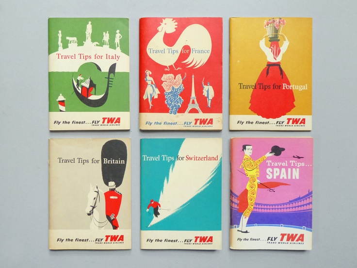
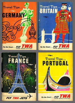
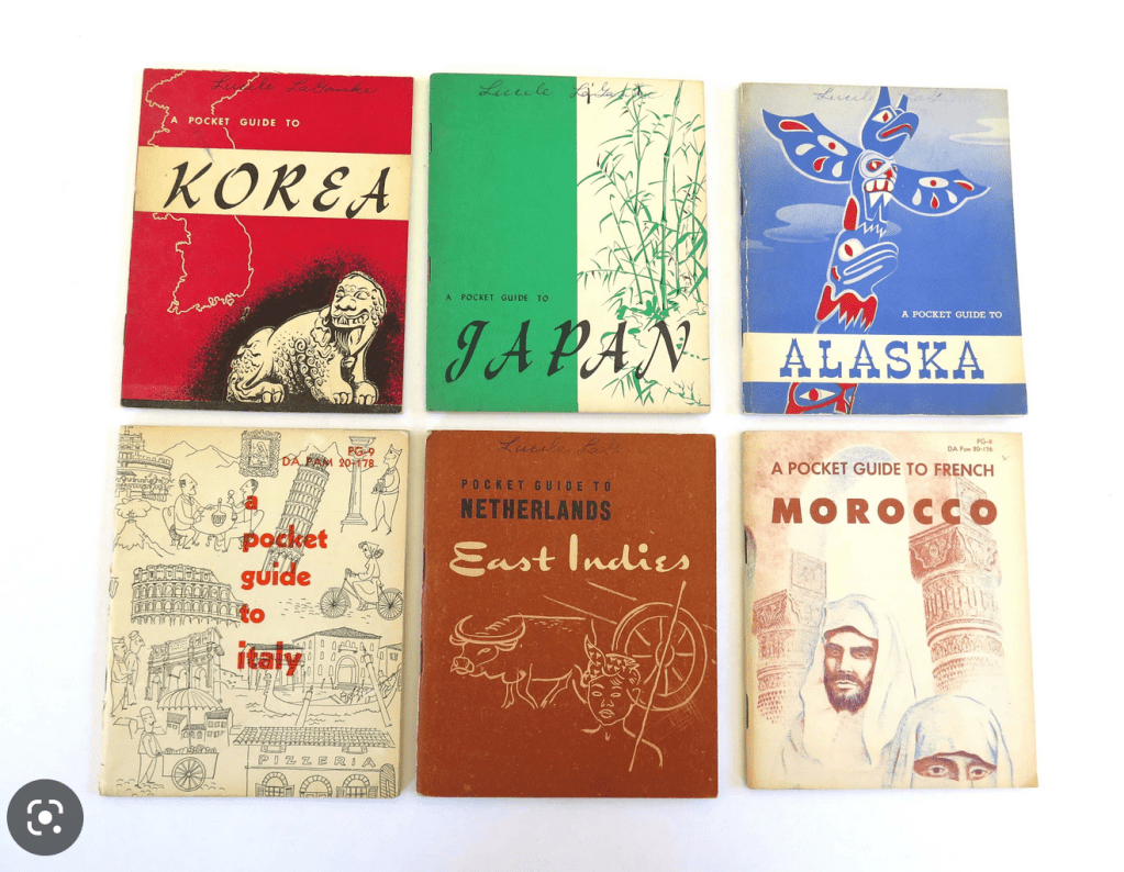
Back when I was designing travel guides for Key Steps in Illustration, I had a hard time finding reference material. Travel guides typically use photographic designs in their covers, showcasing the location and usually the most recognisable or popular tourist spot. Now, I feel like I have a better idea of what to look for, and luckily for me, the Mid-Century era was filled with illustrative travel guides! I mostly wanted to get a sense of the layouts of the covers, rather than looking at the designs themselves, so I could figure out where to place text, and what kinds of fonts to use. I collected some reference imagery for the covers, then separately collected references for typefaces I was interested in.
Reference imagery of vintage travel guides
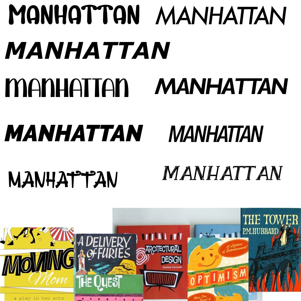
Exploring typefaces
I added the typeface inspiration to a Procreate file and started exploring some of my fonts. I grabbed a few new ones from 1001fonts that I felt fit the vibe, too. I was unsure at this stage which I liked best and decided to come back to it once all of my designs were finished as I’d have a clearer idea of how they fit together. I wanted to use the typeface to have uniformity and consistency throughout the collection of designs.
Now, finally, I could begin my research for each city.
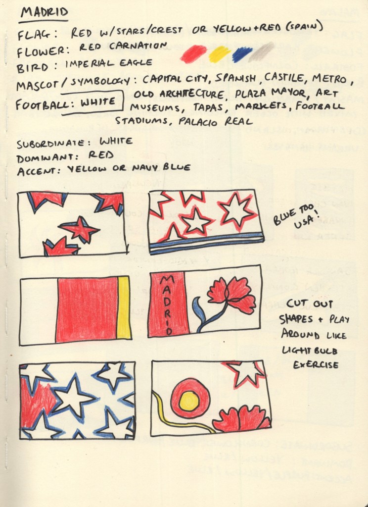
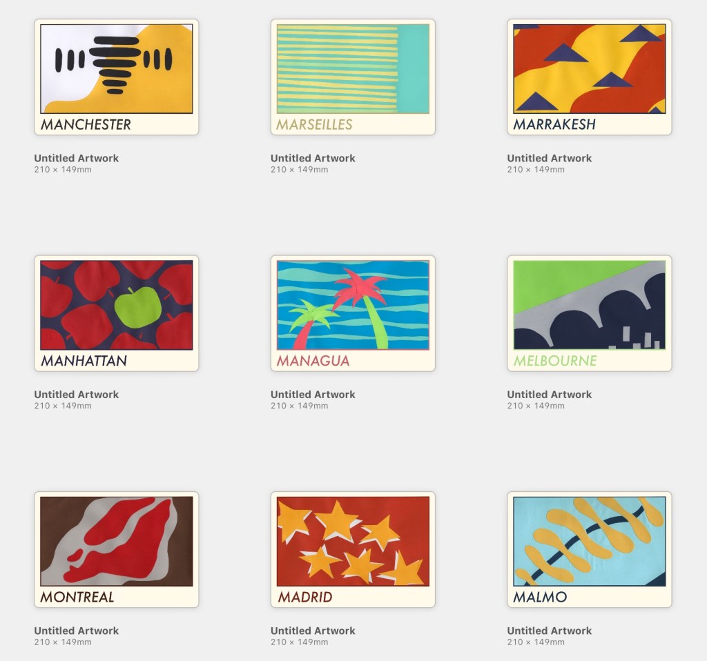
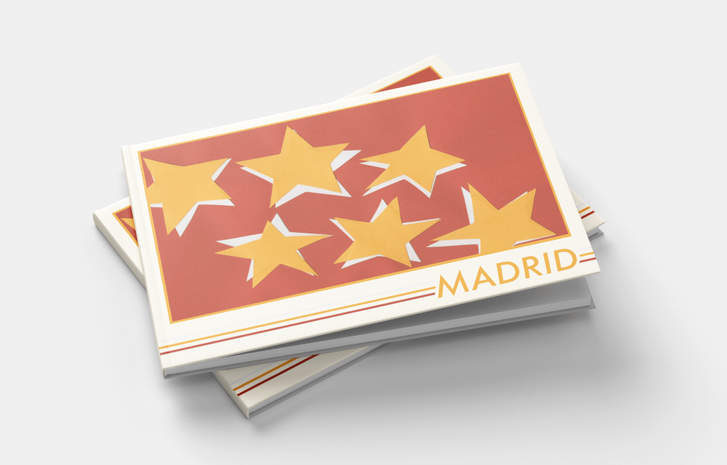
Madrid
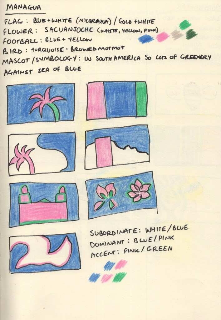
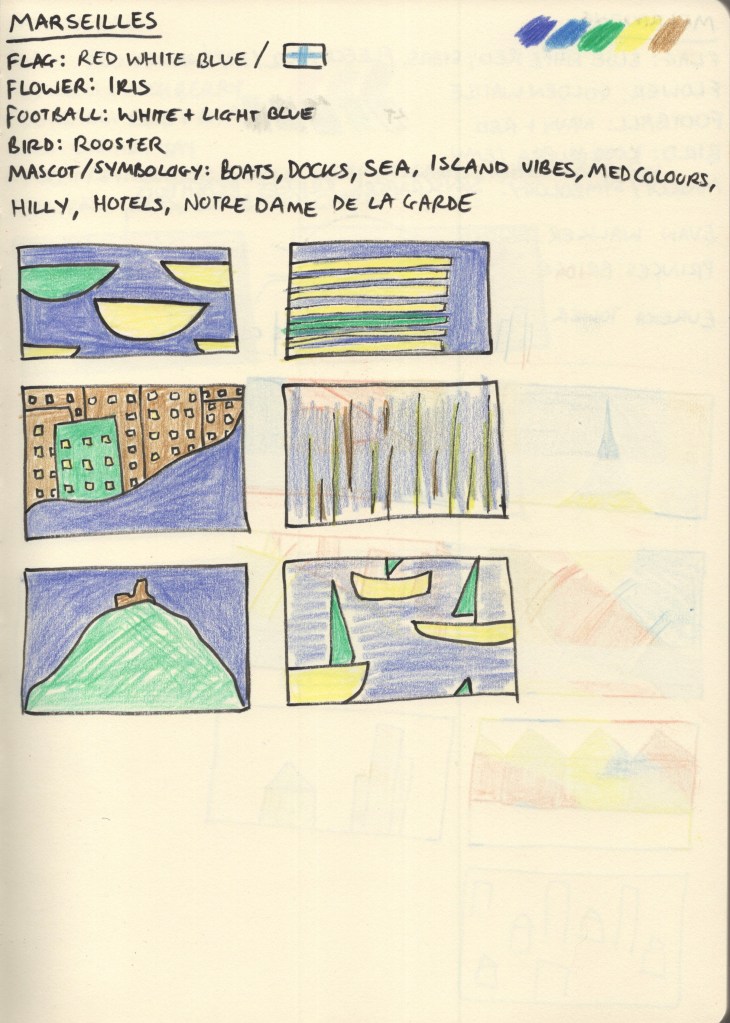
For each city, I started with 5 research points: the flag of the city or country if there wasn’t one, the national flower and bird, the local football team, and any famous mascots or symbology connected to the city. I chose these as I felt they’d give me a variety of colours and shapes to draw from during my thumbnailing process. I wanted to create as much visual interest as possible, whilst ensuring the colours I used were simplistic and recognisable for the city.
Madrid has its own flag, red with seven white stars, and the Spanish national flag is red with a yellow stripe through the middle. Its football team play in white, and the national flower is a red carnation. The national bird, the imperial eagle, has bright yellow feet and accents around its nose. I built a colour palette from this: red, yellow, and white being obvious choices. I added a dark/navy blue to the mix as I felt it complemented the existing palette nicely. I then began exploring thumbnails using coloured pencils.
Through thumbnailing it became clear to me that the blue combined with the red and white really felt like ‘USA’, not like Spain, especially where I’d tried to use stars. I changed up my colour palette a bit when the paper arrived, too. I ended up using red as the subordinate colour, yellow as the dominant colour, and white as the accent colour.
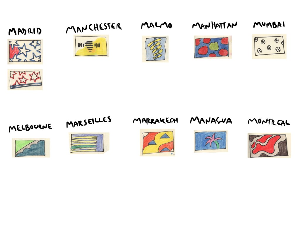
I finalised my designs once I had completed research for all 10 cities. However, due to the nature of this exercise, I wanted to keep each city contained within its own header. There were two ‘types’ of designs throughout my thumbnails: ones with the same thing repeating across the page, and ones with a landscape-adjacent design. My finalised designs consisted of 5 of each – and Madrid’s was the repeating star concept inspired by the flag of the Community of Madrid. I also felt this was one of the strongest designs I had sketched out.
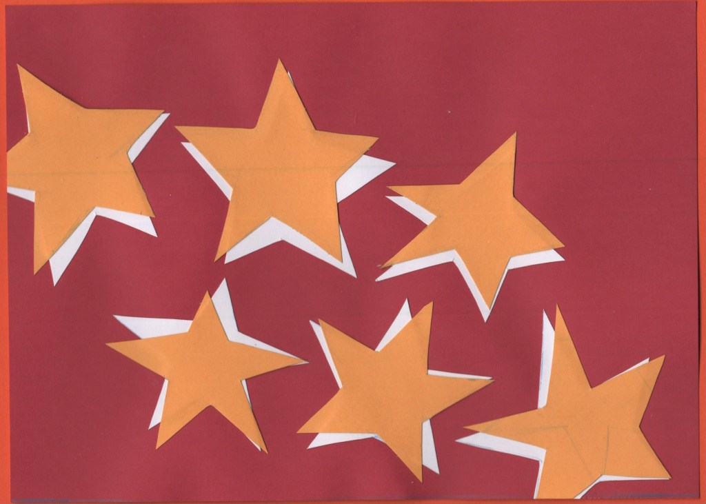
For the design, I cut out 6 stars, not trying hard to have them be even or equal, but also ensuring they were readable as stars. I then traced the stars onto white paper and cut out another 6. I placed the white stars on a red piece of paper cut to A5 size and then overlaid them with yellow stars. I wanted them to look disjointed and rough, not like a smooth and consistent drop shadow. This was actually one of the final pieces I worked on and I, unfortunately, forgot to add a 7th star, which I regret now. I think it’s a strong design, and I’m happy with it, but it would make more sense with a 7th!
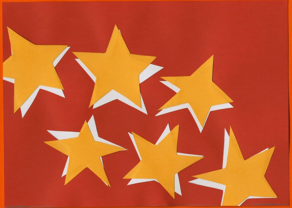
I then scanned the design and made edits in Photoshop to ensure the colours were correct and there were no blemishes or pencil lines left on the work.
Before and after editing digitally
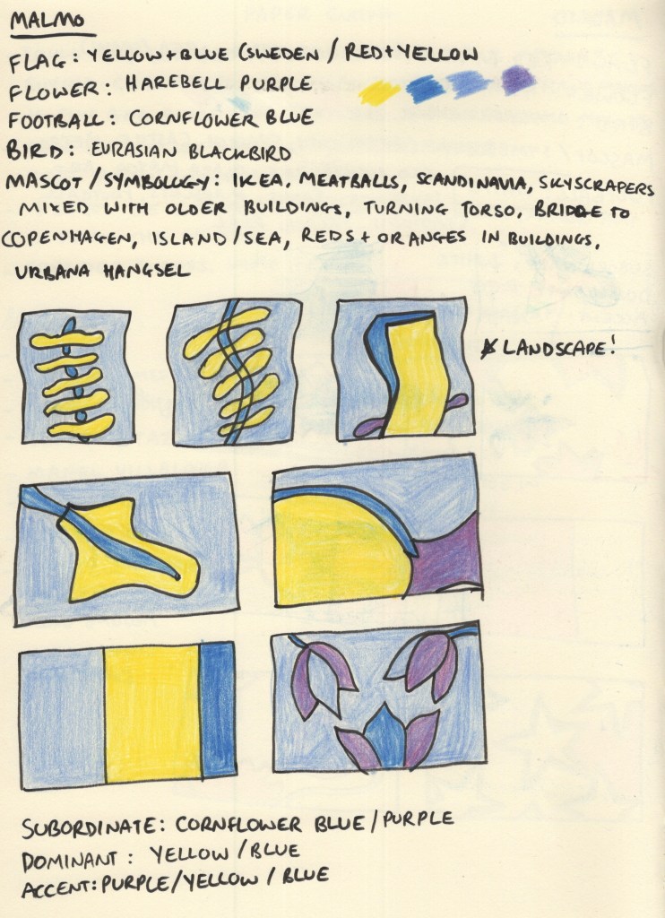
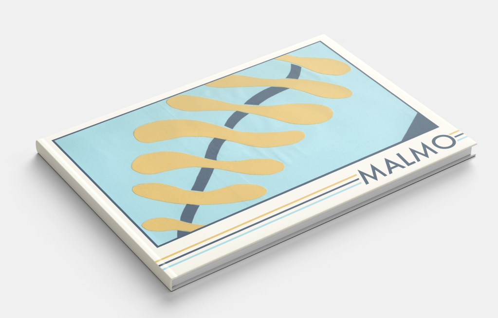
Malmo
Malmo does have a flag, but I had to dig for it. The Swedish flag is very well known and it’s the colour scheme used for Swedish brands such as Ikea for this very reason. Malmo’s football team play in a cornflower blue, which I felt complemented the Swedish flag colours perfectly. The national flower, the Harebell, is a purple shade similar in saturation to cornflower blue, so I noted it down in case I wanted to add it to the piece somewhere.
I was immediately drawn to the architecture of the ‘Turning Torso’ building, especially its name, and also to the shapes of the bridge to Copenhagen and the island where it becomes a tunnel. I explored how I could utilise these in my design compositions, though initially, I forgot that I was supposed to be designing in landscape. Harebells have a very interesting shape to them and were a flower that I had never seen or heard of before, so I tried throwing them in too.
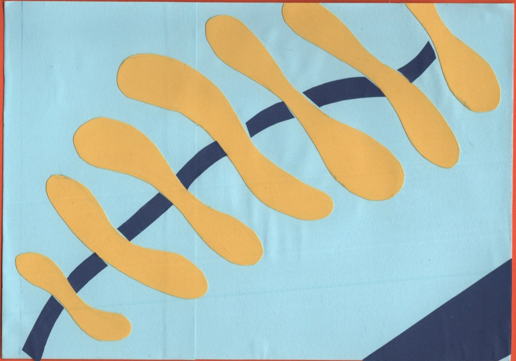
Ultimately, the wiggly spine-like design inspired by the Turning Torso was a clear winner. This might have been my favourite design at the thumbnail stage across all 10 cities. The colours, shapes, and concept all make my brain very happy! For the paper-cutting process, I layered squares of light blue paper onto an A5 piece of card to ensure they were the right size. Then, I cut out the spine pieces and added darker blue curves in between.
The blue is a bit darker than the standard Swedish flag, but I think it works nicely. I also added a triangle of darker blue in the bottom right corner just to break up some space a bit. I feel it really completes the piece. I then repeated the scanning and editing process as I did for Madrid, and I think it makes so much of a difference!
Before and after editing digitally
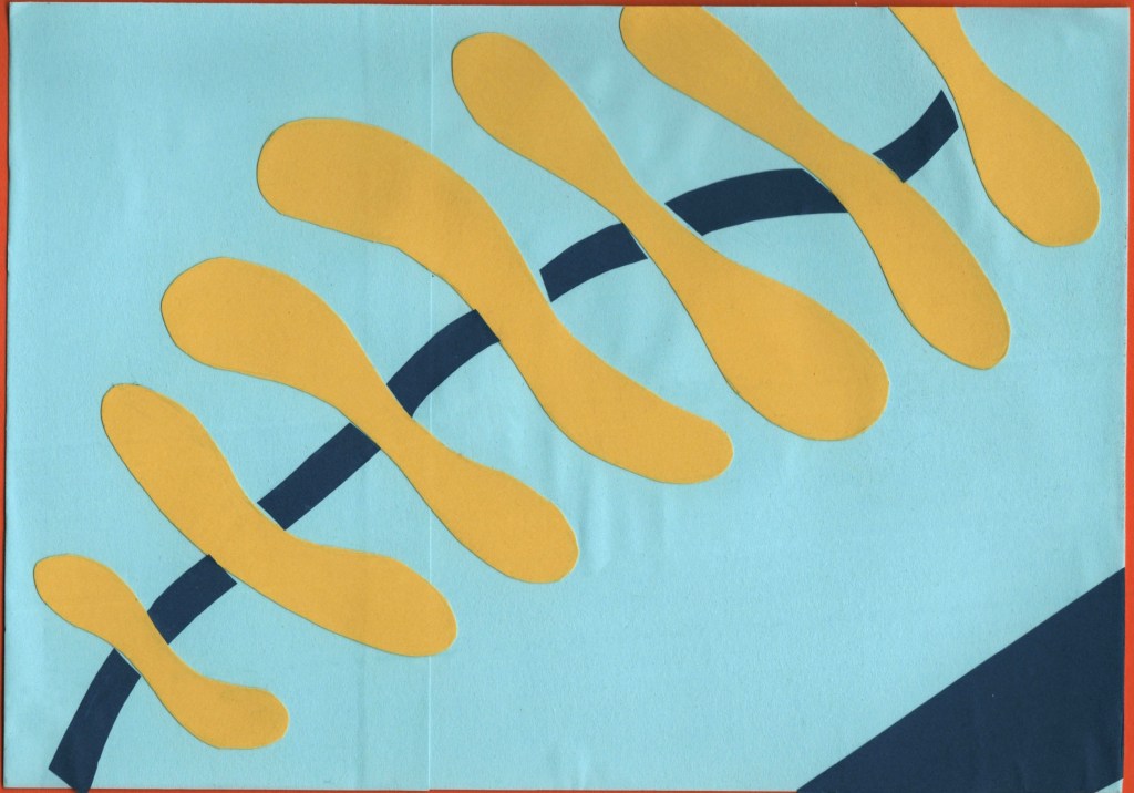
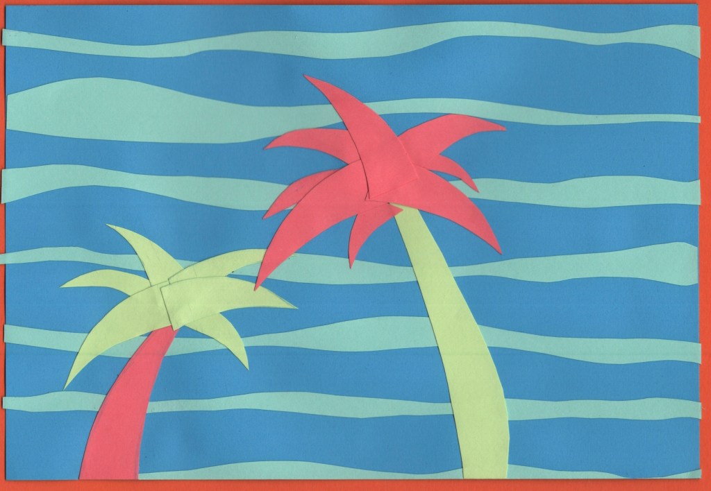
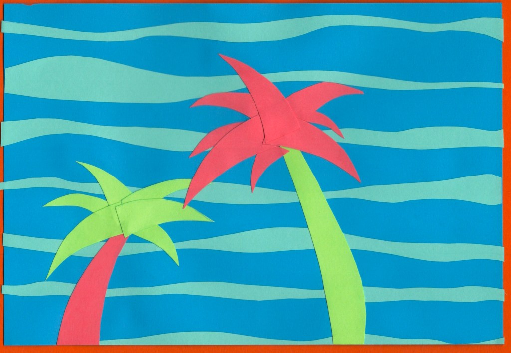
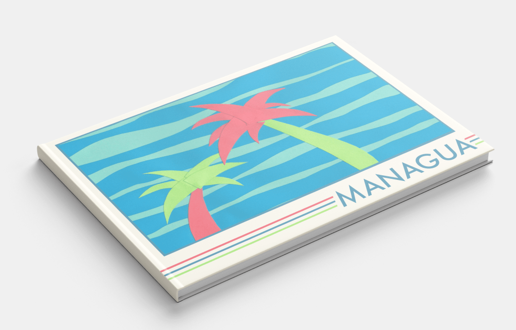
Managua
For the colour scheme of this design, I stepped away from flags and leaned more into the natural environment of Nicaragua. This stood out to me the most when I was looking at photos of Managua, and I was especially drawn to the beautiful pink colour of the Sacuanjoche flower. Combining this with a deep blue to reflect the sky and sea, and a vivid green shade to show the lush palm trees and jungle that stretches out into the city made for a really gorgeous colour palette.
I was unsure of the design of this piece to start with, as I felt like I was playing it too safe. Just having palm trees on the cover didn’t feel abstract enough. I didn’t feel as passionate about any of the other pieces, though, and I was excited to explore ways of organising the cut-out leaves. I also loved subverting the colours and using pink in this way.
There was a lot of trial and error that went into the actual cut-out stage, rearranging and re-cutting lots of the pieces. Eventually, I decided it needed something more to make it pop, and I added a second background colour. This really helped to tie it all together!
Before and after editing digitally
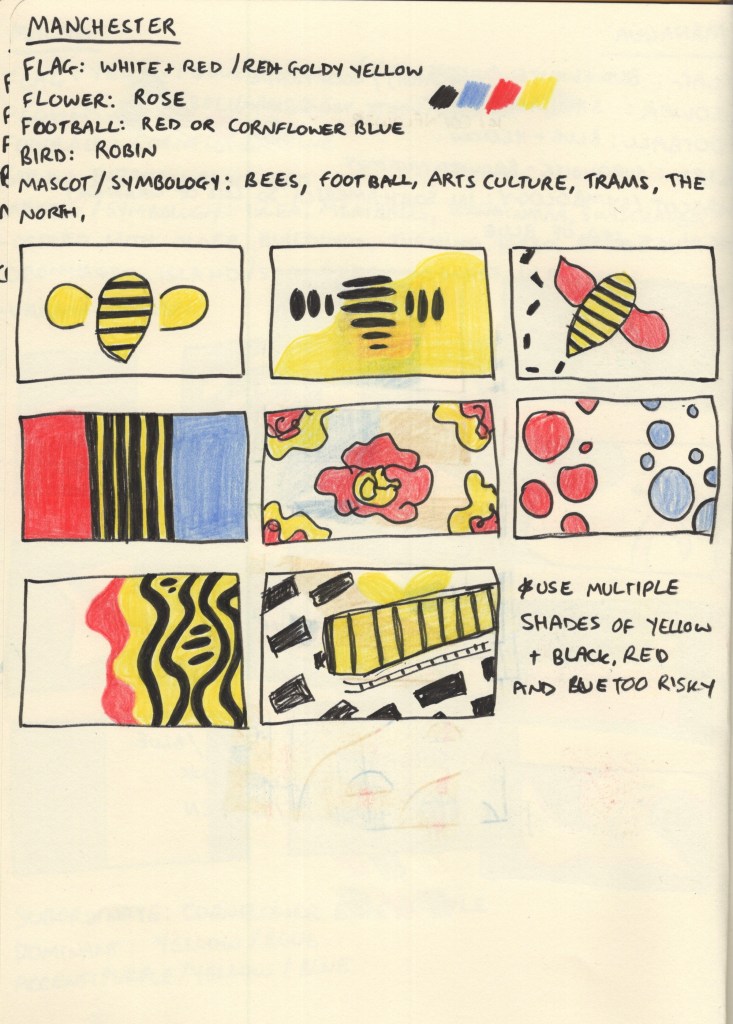
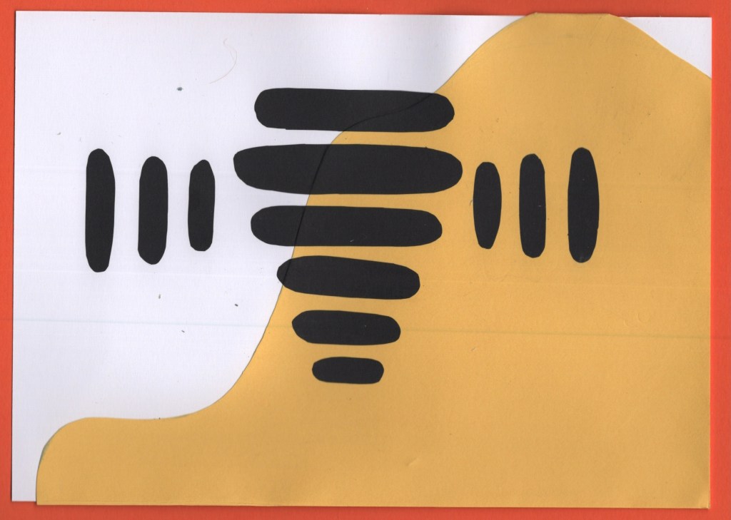
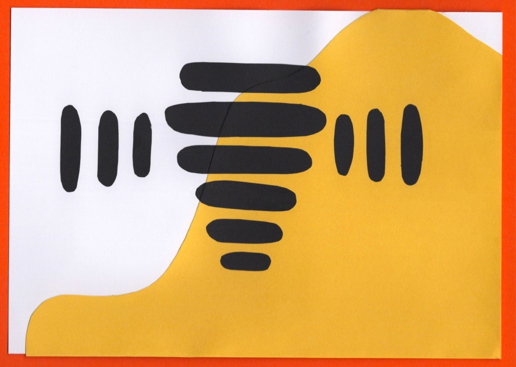
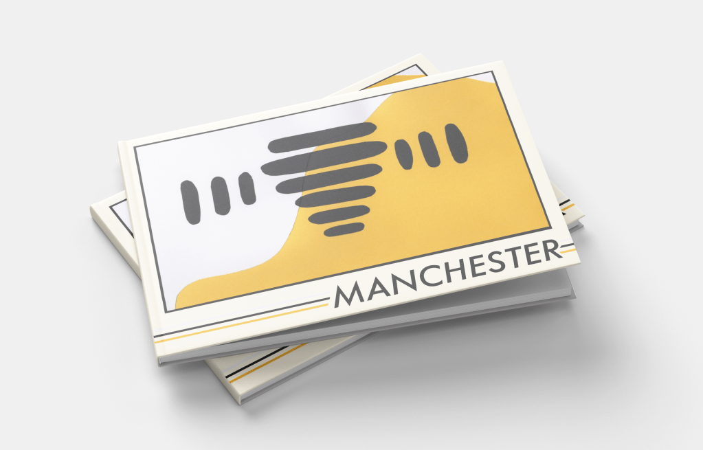
Manchester
As soon as I read Manchester on the brief, I knew I wanted to do something with bees. The worker bee is a very widely known mascot of Manchester, and after the arena bombing that happened in 2017, it was spread around the UK as a sign of solidarity to the city. I can’t think of Manchester now without thinking: bees.
Still, I went through the same research process as with the other cities and explored colour options. It was tough, as I’m very familiar with the rivalry between both football teams and wanted to avoid favouring either in my colour choices, but I wasn’t really sure where else to get colours from. The English flag doesn’t really scream Manchester specifically, and the red in that context just makes me think of Manchester United.
I tried out some different options throughout my thumbnails, looking at how I could use the colours and various shapes and inspiration I could pull from. The abstract bee thumbnail was my favourite, though, which was expected. This was a very simple design to cut out, which by the time I got to it (I think second last!) was a huge relief. I had a lot of fun organising all the bee bits, and feel really good about the final design.
Before and after editing digitally
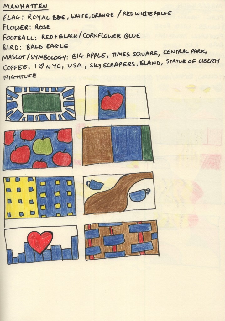
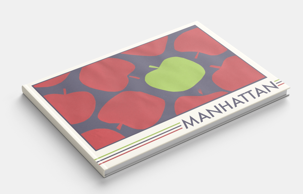
Manhattan
My colour-choosing process for this destination was similar to Managua. Manhattan has its own flag featuring horizontal blue, white, and orange stripes – though it’s not particularly well known. Football – or soccer as it’s known over there – is not particularly popular in the USA either, and there wasn’t a clear Manhattan football team. The red, white, and blue of the USA flag are iconic, so I noted them down as options, but the iconography that comes to mind when I think of Manhattan and the wider New York City area influenced my colour choices a lot more.
Manhattan really comes alive at night – the lights against the deep navy sky and waters around the island are very memorable. My thumbnails focused on colours I saw throughout images of Manhattan, and featured shapes inspired by its most famous symbols; the big apple, skyscraper apartment buildings, central park, and of course – coffee. This was probably the most fun city for me to explore as there’s a wealth of existing imagery to draw from and experiment with.
For my final design, I chose the apples, both as it fits my ‘same thing repeating across the page’ theme, and because I enjoyed the subtle nod to New York City. The central park and zoomed-in apartment buildings were close runners-up, however, and it was a tough decision! This was the first paper-cutting I did, and it was a great introduction. I especially enjoyed figuring out how to make each apple unique in shape, whilst still ensuring they looked like apples.
Before and after editing digitally
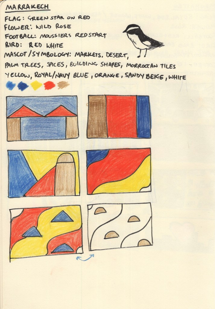
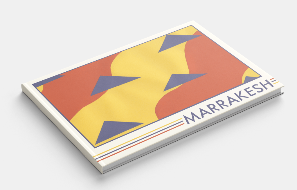
Marrakech
Choosing a colour palette for this city was very easy, Marrakech screams oranges, yellows, and blues from the second you imagine it! The Moroccan flag – a green star on red background – didn’t really have associations for me with the city itself, and the national flower, bird, and local football teams didn’t fit either. Though I thought the bird – moussier’s redstart – had a really cool colour distribution in its feathers and thought maybe I could do something inspired by that.
The vast market stalls filled with spices set against a backdrop of rich blue skies and expansive deserts are ultimately the inspiration for my colour scheme. The shapes and composition of my thumbnails, however, were trickier to explore. I didn’t have a lot of ideas and it took a lot of thinking, researching, and thumbnailing before I felt I had something I could work with. It’s hard when ideas don’t come immediately, but this is why I find thumbnailing so useful as it pushes me to explore things I probably wouldn’t have otherwise.
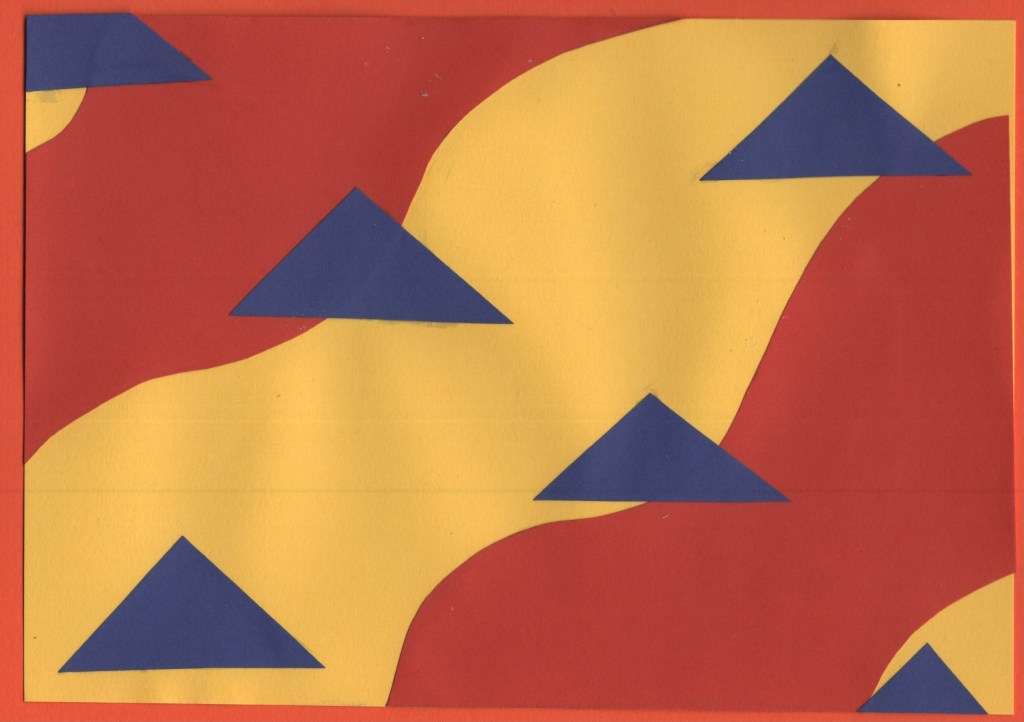
Sand against spices with the triangles of market stall roofs is the visual aim of my chosen design – and it fits into my theme of repeating items. This was a relatively easy piece to put together. I used a yellow A5 sheet for the background and cut two pieces of orange paper to go on top. Then, I cut and placed the triangles to represent the roofs. I’m really happy with how it turned out, it feels very true to the vibes of the city!
Before and after editing digitally
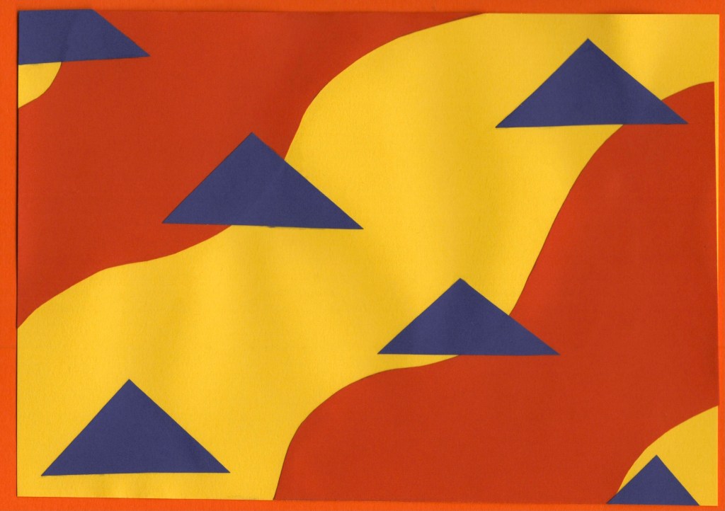
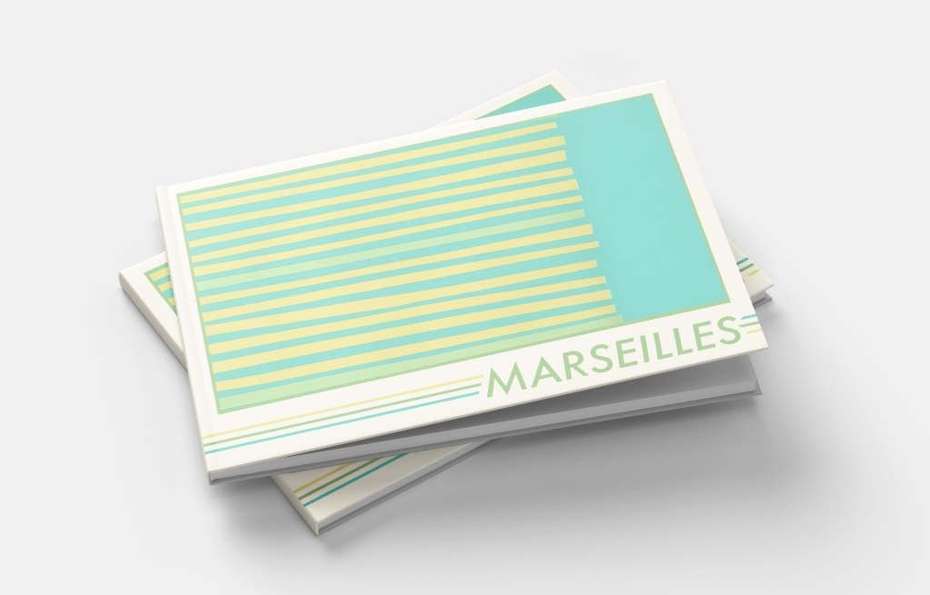
Marseilles
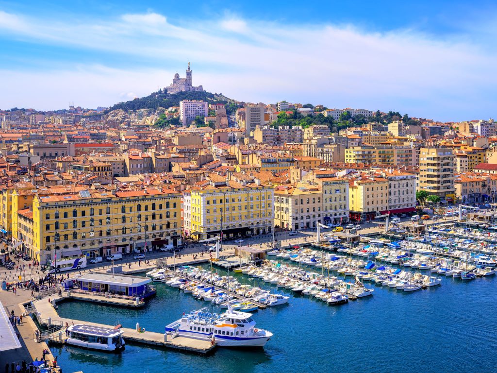
Both the flag of Marseilles and Olympique de Marseille, the local football club, share colour schemes of light blue on white. The city itself sits on the Mediterranean and boasts a huge harbour jam-packed with boats, mirroring this blue-and-white pairing. A large hill rises from the harbour to form the rest of the city, filled with greenery and dotted with sandstone buildings. The colour scheme for this design jumped out of the photographs with ease – pale yellows, greens, blues, and soft brown.
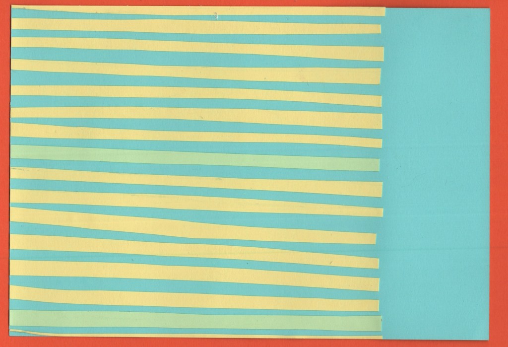
Coming up with ideas for this city was fun, there are a lot of unique shapes to play around with, and I especially enjoyed figuring out how to make recognisable objects look more abstract. The design I chose for my final piece is supposed to represent the harbour as seen from above – lines upon lines of boats docked and waiting. I am really happy with how I developed this idea, and I think the finished piece looks fantastic. I wanted each piece of paper to be slightly different in size and shape, and I think I struck a nice balance of ensuring it didn’t look too messy whilst still fitting that goal.
Before and after editing digitally
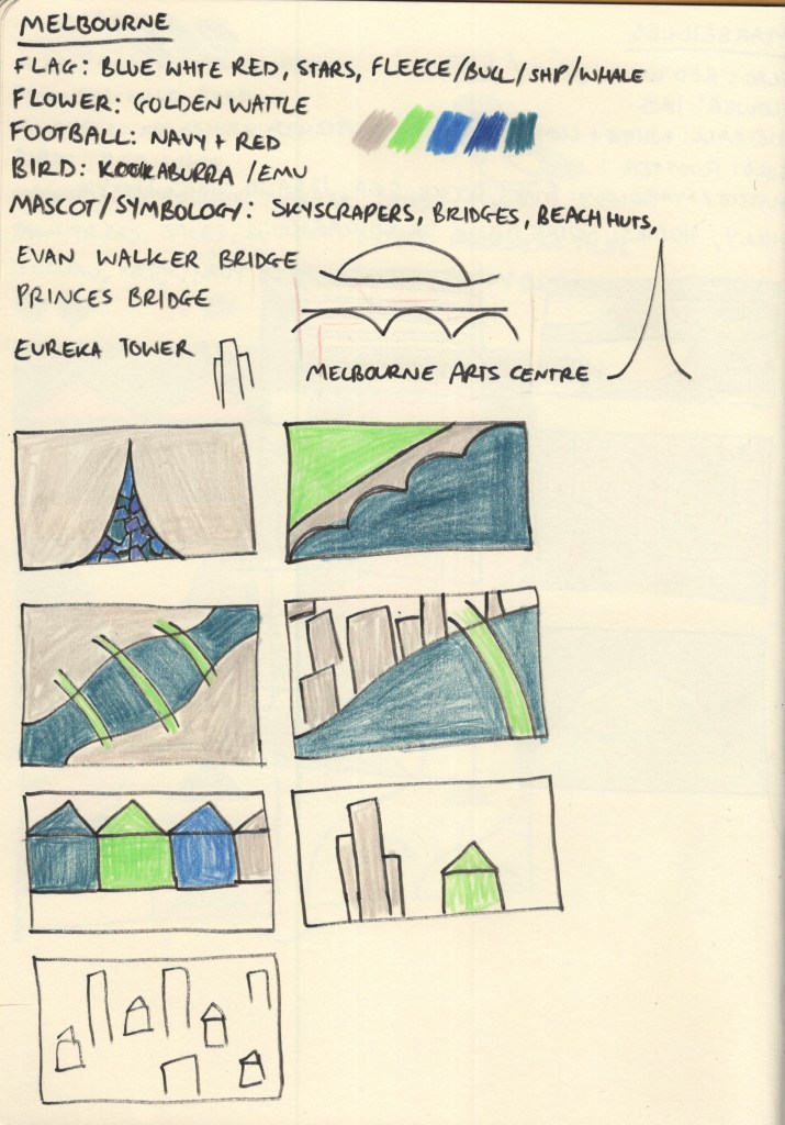
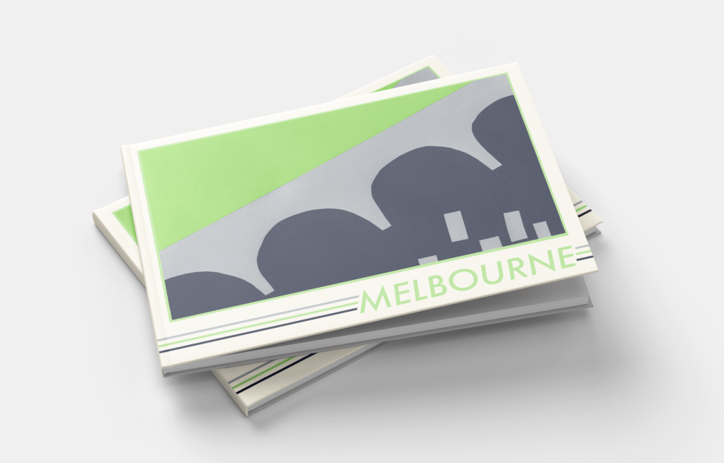
Melbourne
Melbourne was another tricky one to pick colours for. At first, nothing really jumped out at me. Australia’s national flag is another one featuring red, blue, and white, and whilst Melbourne has a locally recognisable flag of its own, it shared much of the same colour scheme with just a hint of yellow. I spent a long time scrolling through pictures of Melbourne from varying angles and trying to find a way to create a unique colour palette that wasn’t just a copy of Manhattan – as the city is very similar!
My colour scheme of deep blue to represent the rivers, grey to represent the skyscrapers, and bright green to show the beautiful parks and greenery within the city ended up working out well. I feel like this is more of a ‘daytime’ colour scheme, whereas Manhattan was very much a ‘nighttime’ colour scheme – almost every picture I found of Melbourne was bright, sunny, and during the day, so I think this reflects it really nicely.
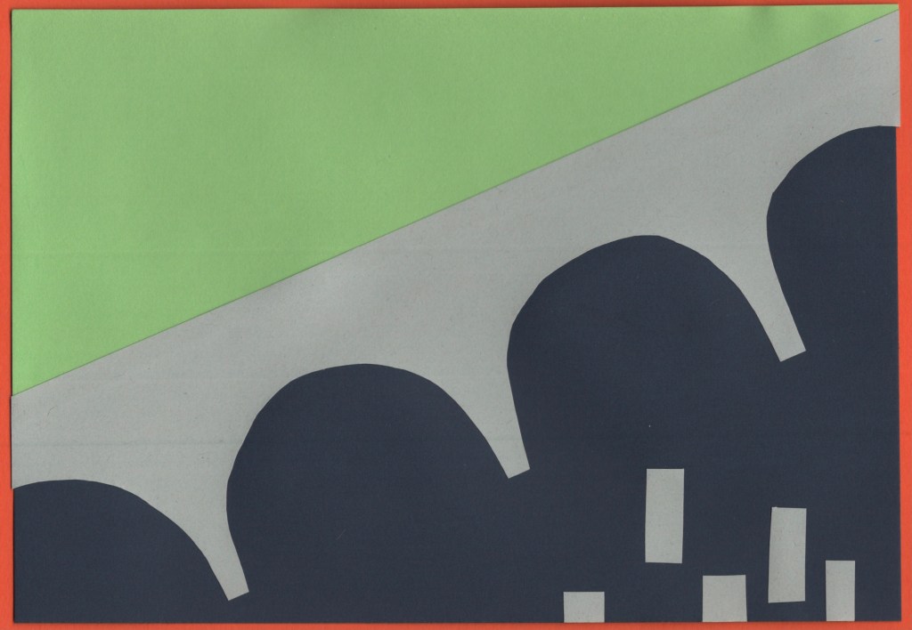
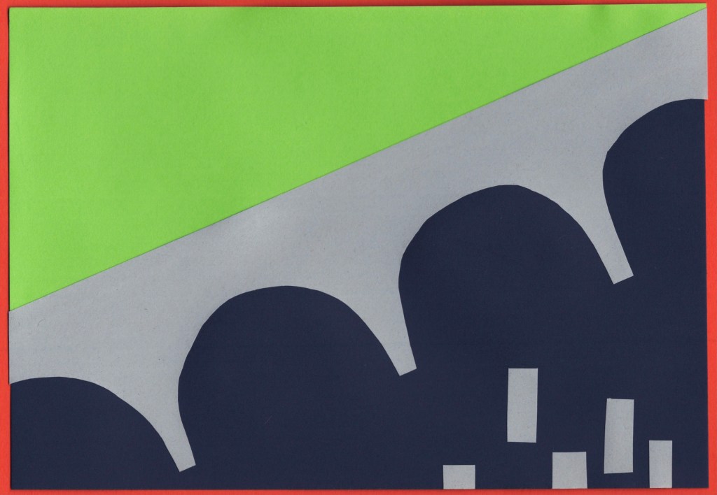
I also struggled to find inspiration for the designs for this piece. Melbourne has a lot of bridges across the Yarra River which runs straight through it, and I ended up focusing on this for my final piece. I used the Princes Bridge as inspiration and formed a divide between the built-up areas of skyscrapers, and the lush green parks that sit on the river banks. I didn’t feel confident about my colour palette or concept going into the final design stage for this piece, but I enjoy how it turned out.
Before and after editing digitally
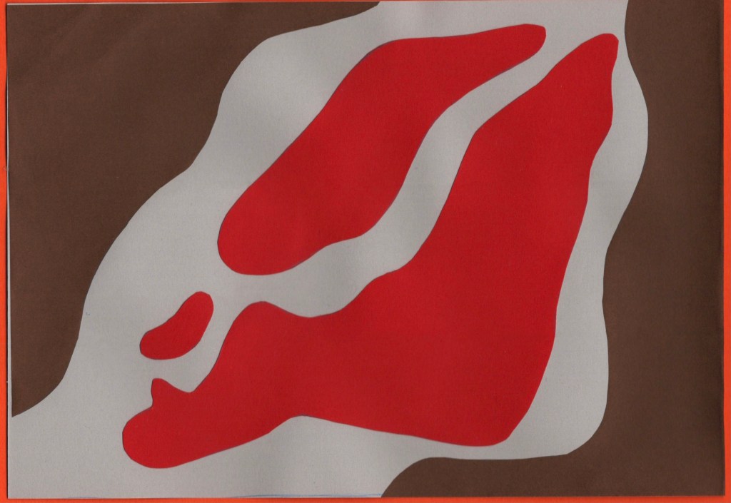
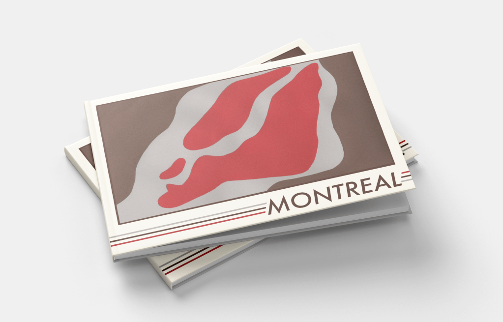
Montreal
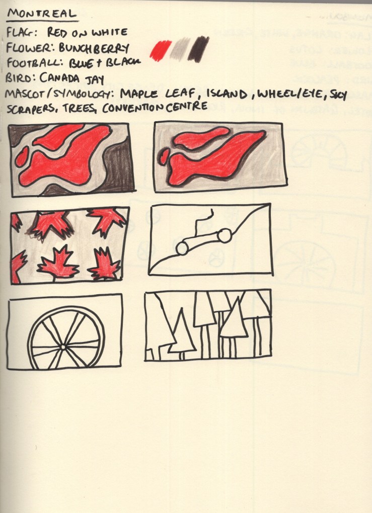
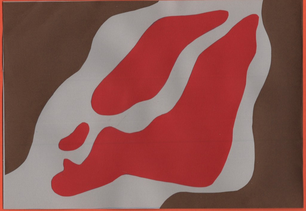
Montreal was another city that felt like it had an obvious colour scheme to me. The red maple leaf on the white background of the Canadian national flag is especially relevant, as the province of Quebec – where Montreal is located – shares 89% of Canada’s maple syrup production. This also made brown a very natural choice of colour for me, both as it complements red really nicely, and as it reflects the deep colour of maple syrup. A light grey was chosen as a nod to Montreal’s business district, once again filled with skyscrapers. It also softens the piece out nicer than a bright, bold, white.
I tried a few different thumbnails for this piece – though by this point in my research I was getting a bit fatigued with colouring, especially knowing I would be using slightly different colours when I had the paper. Montreal is an island in the Saint Lawrence River with quite a distinctive shape. I experimented with how to represent this, along with the iconography of the maple leaf and trees. I felt my top-down view of the island was the strongest concept, so developed this fully.
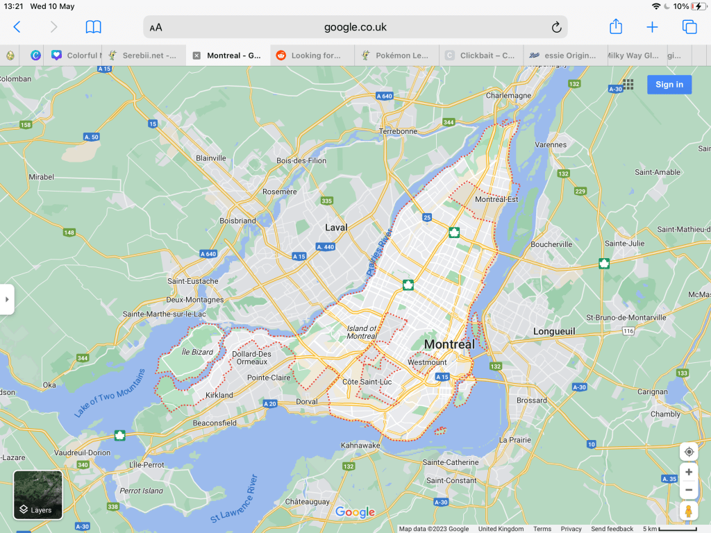
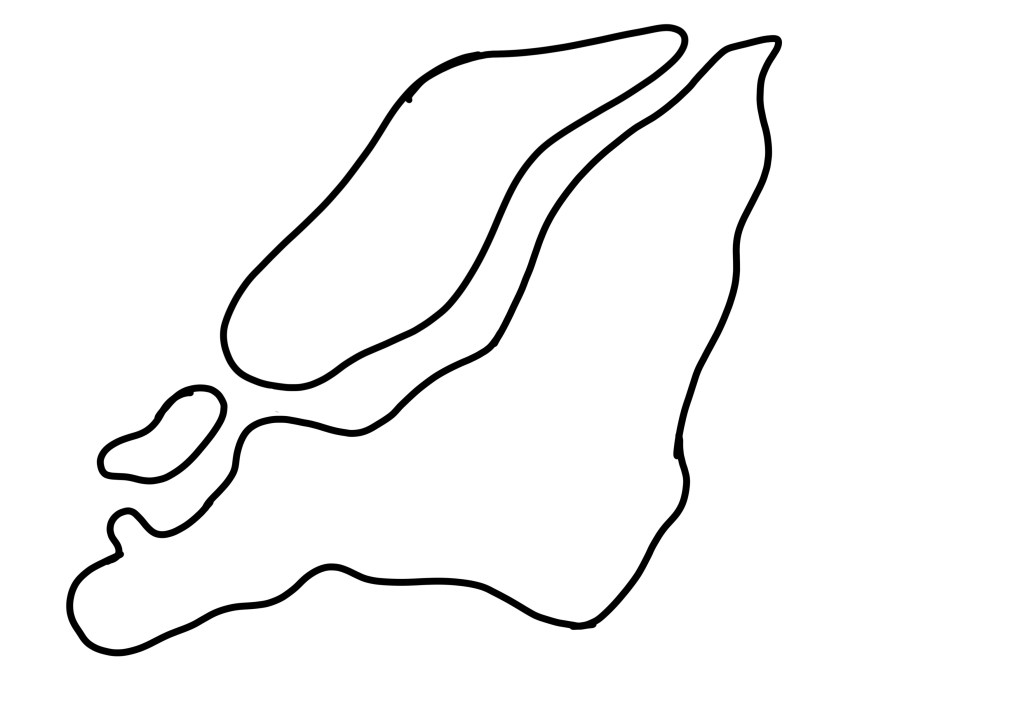
To capture the shape accurately, I took a zoomed-in screenshot of google maps and then traced this with a bold black line in Procreate. I was still aiming for rough, misshapen cut-outs, but I wanted to ensure it looked like Montreal. I then traced this onto a piece of printer paper and transferred it to my red paper to make cuttings. I’m glad I thought to do this instead of drawing from observation, as I think it would have only vaguely resembled the city!
Before and after editing digitally
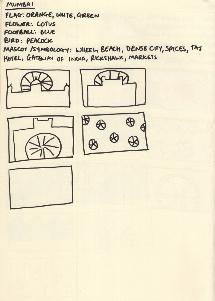
Mumbai
As the final city I researched, Mumbai really got the short end of the stick. I was quite bored of the repetitive process by this point and felt there was no point in adding colour. I then, frustratingly, forgot to set aside paper for this design, which meant it completely left my mind for the rest of the exercise. I did not create a final piece for this city, which I am disappointed in myself for. However, with such a huge task at hand, I feel it’s easier to forgive myself, knowing how much work went into the other 9 designs.
My colour scheme for Mumbai was taken from the flag of India and the buildings in the city – a sandy brown, orange, and green. My thumbnails were inspired by the Gateway of India, the Taj Hotel, and the wheel icon used on the Indian flag. In the process of choosing my final pieces, I picked the repeating wheel design and planned to play around with my paper choices to figure out which colours to use where.
Narrowing down my ideas
During the paper-cutting stage of this exercise, I decided to take some video footage showing my process. I found the medium quite difficult overall despite it being enjoyable. I’m not particularly good with my hands or working within 3D space and typically opt to do any exercise that requires cutting and sticking in digital software to avoid the issues that come with it. I also feel like no matter how ‘good’ at it I am, the process takes four times as long as it would if it was digital or even just drawing in a sketchbook. There’s a lot of waiting, fiddly bits, and patience required, and after prolonged exposure I get a bit fed up.
I really pushed myself beyond where I’m comfortable for this as I wanted to experience the medium and its possibilities properly. It’s easy enough to create a paper-cut effect digitally and mimic the designs I created here, but I wouldn’t have an appreciation for and understanding of the medium in the ways I do now otherwise.
I had a lot of limitations to work within when considering designs, which was a welcomed challenge. For example, too many colours used in each piece would have been extra work for me, so I aimed to use no more than 3. Using paper has limitations that digital software doesn’t, and if you cut something incorrectly, you have to scrap that and start again. I was really forced to slow down and consider thoroughly each step of this design process, which was beneficial in a lot of ways, though irritating in others.
I’m not sure if my designs reflect my papercut inspiration, but they do feel like they fit into my body of work well. If I’d created them digitally, I likely would have used more colours and added a lot of textures – which I did consider at the digital editing stage of each piece. However, I really appreciate the simplicity of the designs and I feel they meet the brief of ‘abstract blocks of colour’ perfectly.
Once I had scanned and edited each design, I began figuring out how to add text in Procreate, drawing from my previously collected references of travel guides. I began by adding a cream border to each design, framing it in the centre of the cover. Then I played around with adding different fonts, identifying which positioning looked best. I also added a border on the inside of the frame, using a colour from the collage to make it pop a little. I felt Futura looked best and modernised the pieces a little.
I felt the covers were lacking something, so I played around with motifs and additions until I settled on adding three lines along the base of the cover, one for each colour used in the collage. My text colours were pulled from the cut-outs and darkened slightly. I feel this makes each piece look cohesive whilst still tying all 9 together as a set. Finally, I tweaked all of the colours used until I felt each looked its best.
Finally, I found some A5 landscape book mockups and placed my designs on them to see how they’d look in reality. This is my favourite part of any design process, it brings the creation to life and reassures me that I know what I’m doing! I feel so proud of each piece and how they look, though I’m not sure if they fit the travel guide market. Maybe that’s because I’m still stuck on travel guides using photographic covers!
I feel relieved to be finished with this exercise, proud of myself for pushing myself through difficult and challenging processes, and excited about what I managed to produce despite that. There were many moments of ‘this is all terrible and I suck’ throughout this exercise, but I did it. Maybe my final designs would look more professional and polished if they were 100% digital, sure, but I’m really glad I chose to explore a medium I was unfamiliar with. Not sure if I’ll ever do this again, though…digital paper effects sound great right now.
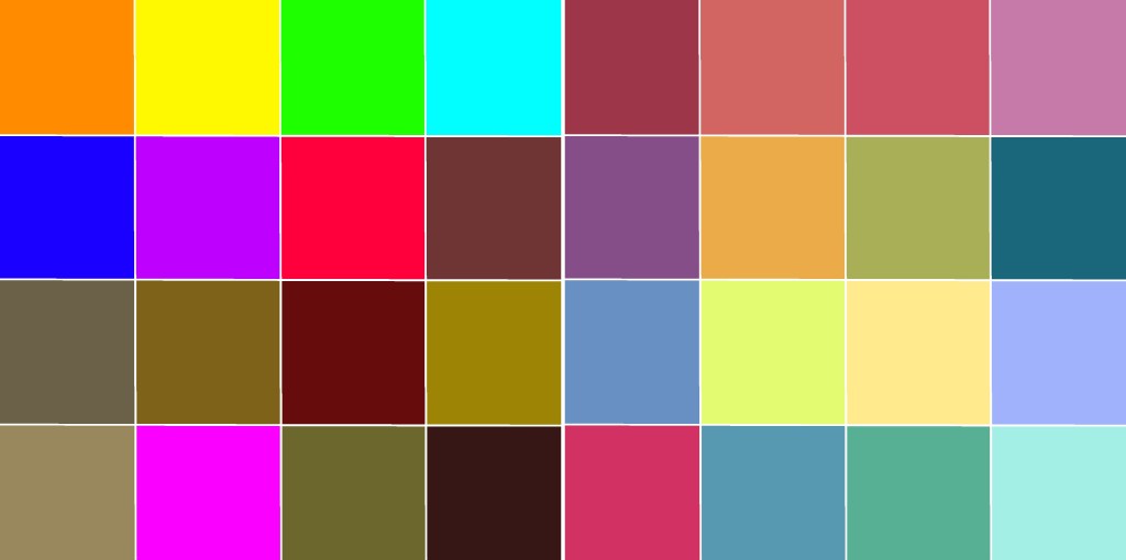
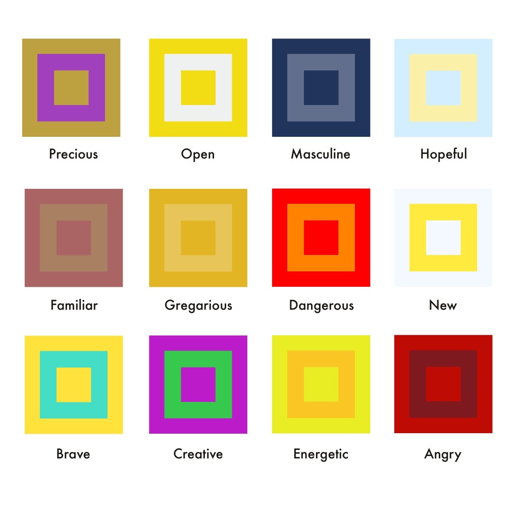
This exercise asked me to undergo one of Johannes Itten’s exercises exploring colour. I had to draw two grids of squares and fill one with colours I like, and the other with colours I dislike. Then, I had to emulate Itten’s style whilst exploring different combinations of colours to represent abstract ideas.
I was a little put off by this exercise as my understanding of colour theory is pretty solid at this point, and it felt like a box-ticking task. Picking colours I enjoy is easy, as I already have multiple palettes on Procreate that I’ve spent years curating. Picking the colours I don’t like was harder, as I’ve come to see all colours as useful and necessary within design work, as colours look different based on how they’re used and the colours used around them. A colour might look unpleasant when isolated, but look a lot nicer when part of a composition.
The colours I like (right) and dislike (left)
The exercise says that ‘we tend to pick bright colours as the colours we like’, and ‘the colours we think we don’t like as much are often more subtle’. I felt very conscious of this as I was picking my likes and dislikes, knowing my preferences are the opposite of this. I find bright, neon colours very garish and difficult to look at. They have their place in context, but they’re not colours I ever go for intuitively. I love softer, muted, vintage-inspired colours, and most of my work draws from these palettes. The exercise asks to compare the two and ask which looks better, and unsurprisingly, I much prefer my liked colours. Neon tones and muddy browns do not complement each other!
I moved on to exploring colour combinations for the abstract concepts listed in the exercise. This was a difficult task, as I struggled to identify colours that I hadn’t already used or that felt accurate to the concept. Some colour combinations just looked awful once I put them together, too. I also found I kept coming back to yellow for so many of the words – trying to push myself into other colours was tricky! I think it’s hard for my autistic brain to connect tangible things to abstract concepts in this way. I find researching and drawing from that to be a lot easier than having to think up this stuff for myself.
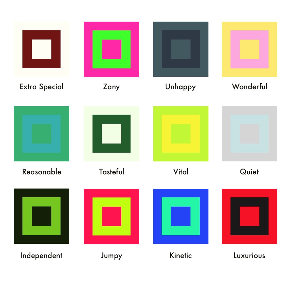
Colour compositions chosen for each of the words shown
I’m writing this learning log a few weeks after completing the exercise, and looking back, there are several of these colour combinations that I don’t feel work well. Familiar, Extra Special, Tasteful, and Energetic all could do with some tweaking (or whole new colours!). Some of these concepts – such as Extra Special – were difficult for me as it felt no different to Precious, or Luxurious, which I had already chosen colours for. So many concepts had a lot of overlap in meaning, and pulling them apart wasn’t easy.
Ultimately, this exercise did end up feeling like box-ticking, but it showed me where my weak points are. I rely a lot on research and experimentation to figure out how to use colour in a piece – and I’ve put in a lot of work identifying which colours I like and don’t like over the years. Finding a consistent colour scheme that shows up in my work was a focus of mine for some time, and I like that now it’s very instinctual for me. Maybe, I need to do some more work with muddy browns and neons, just to stretch myself a little bit!
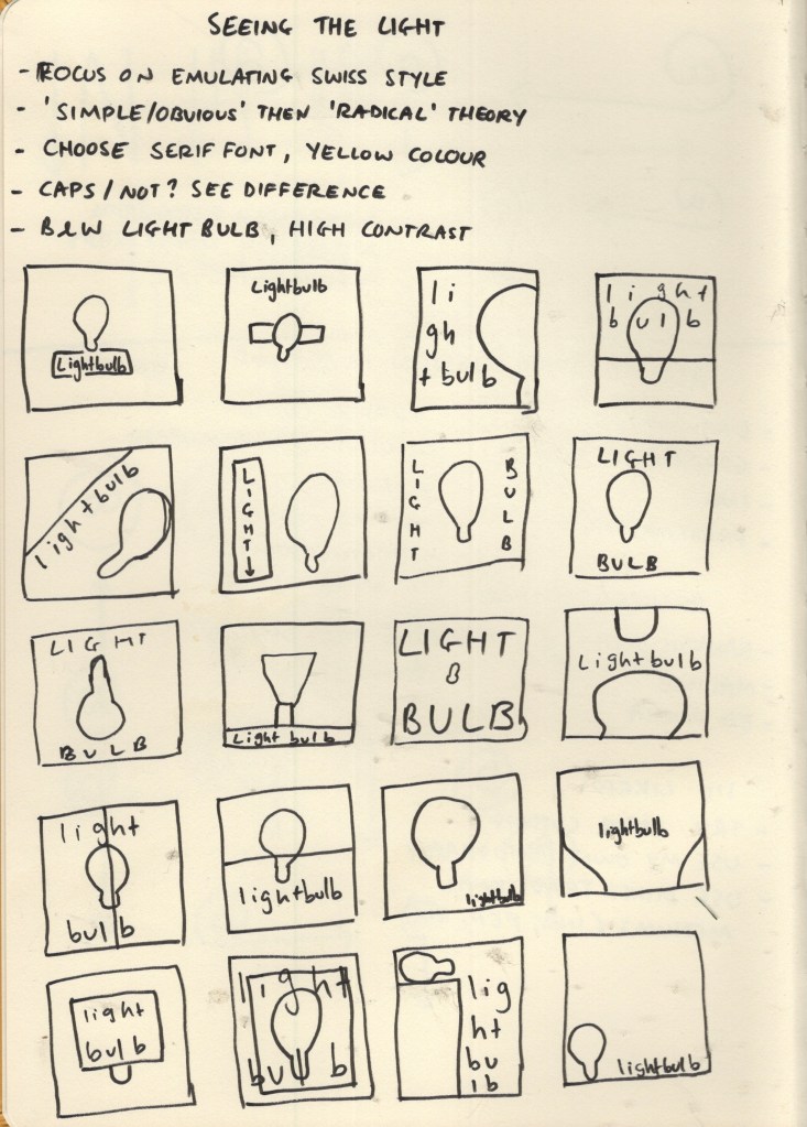
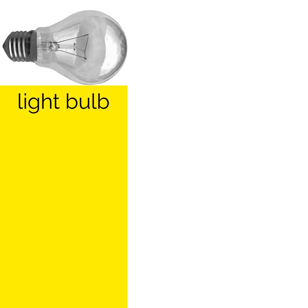
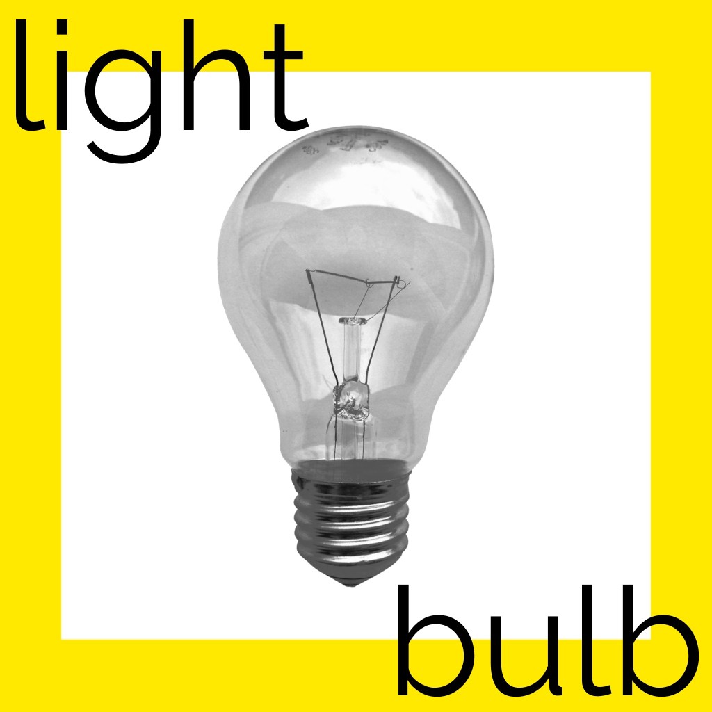
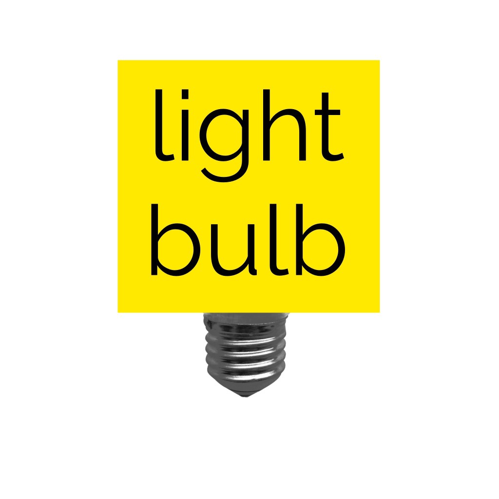
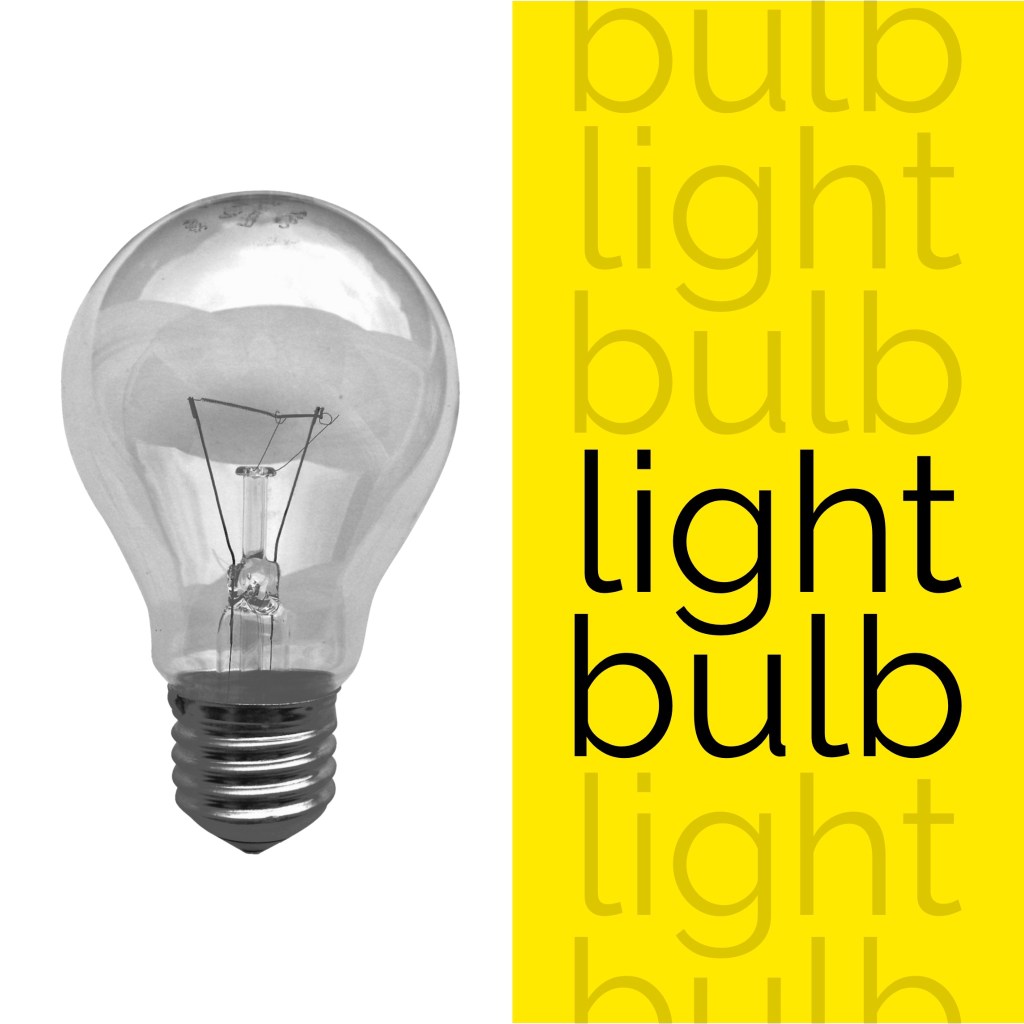
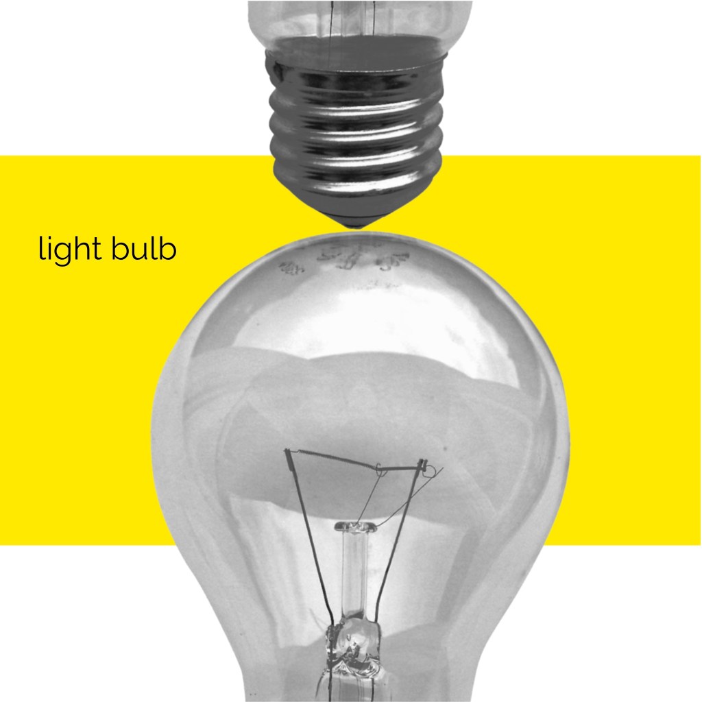
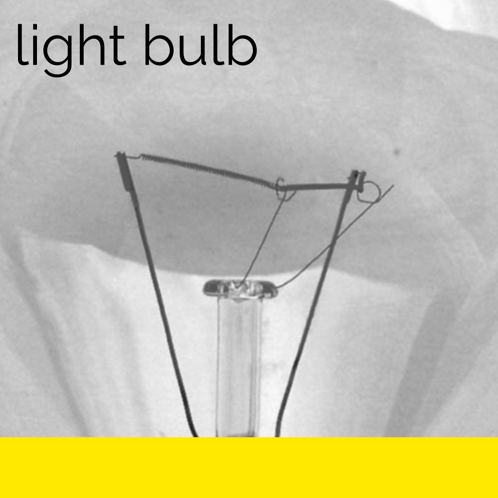
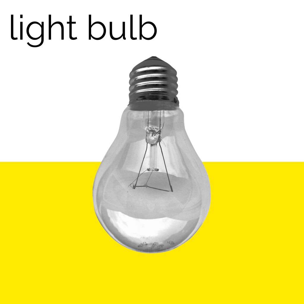
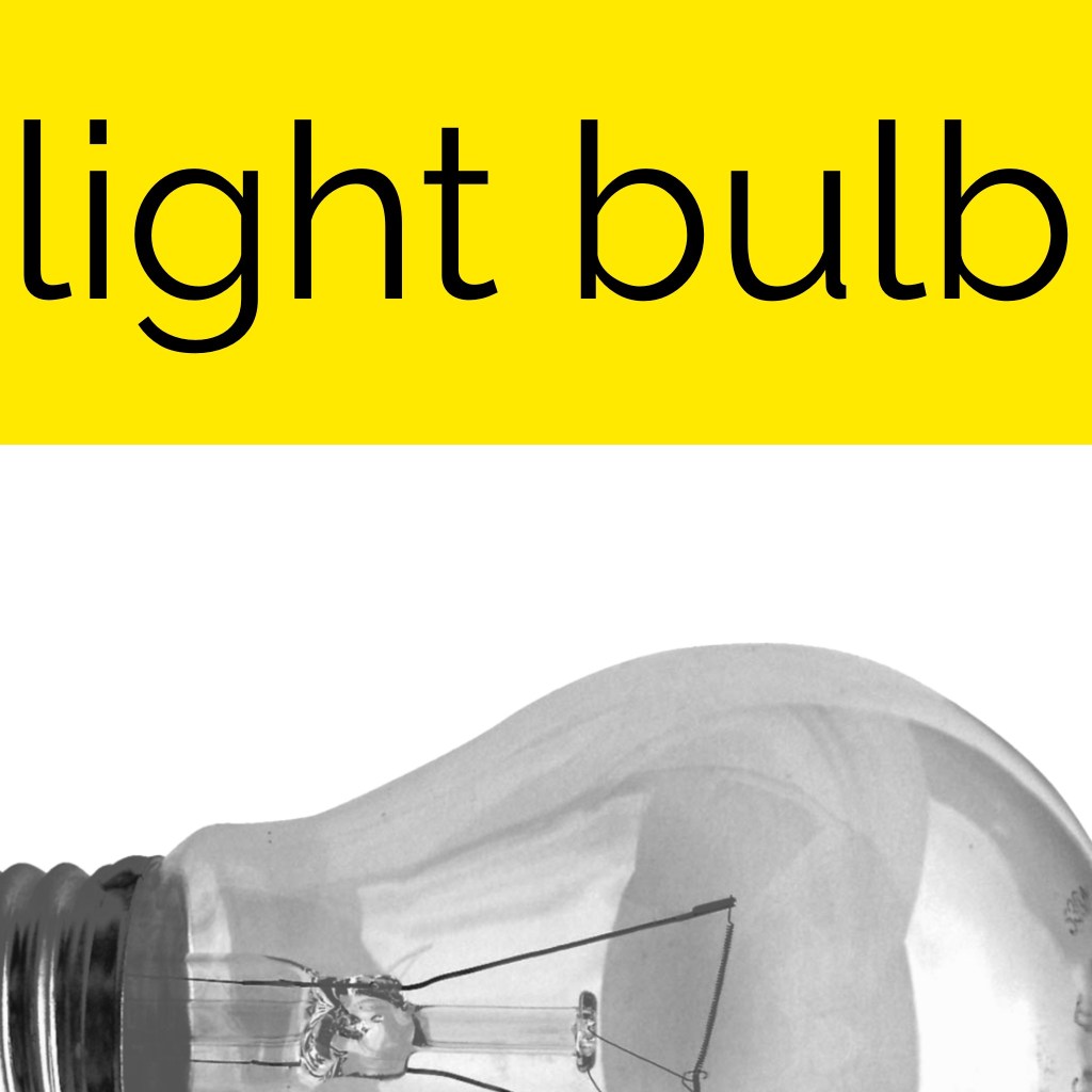
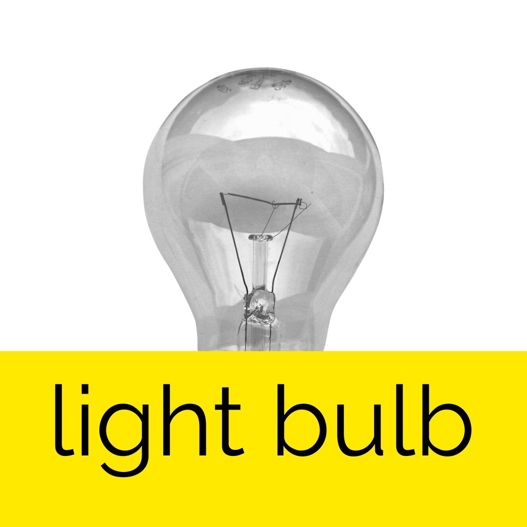
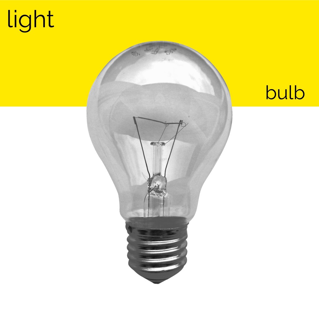
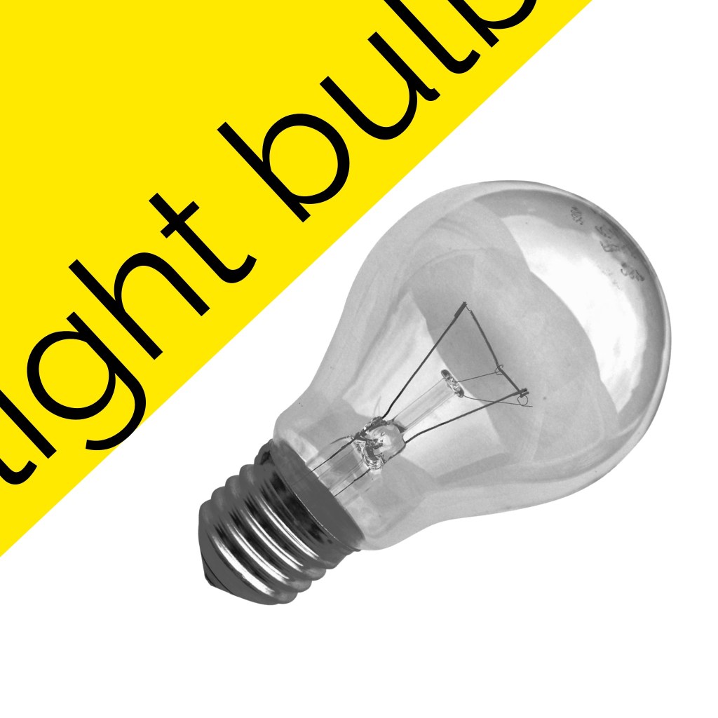
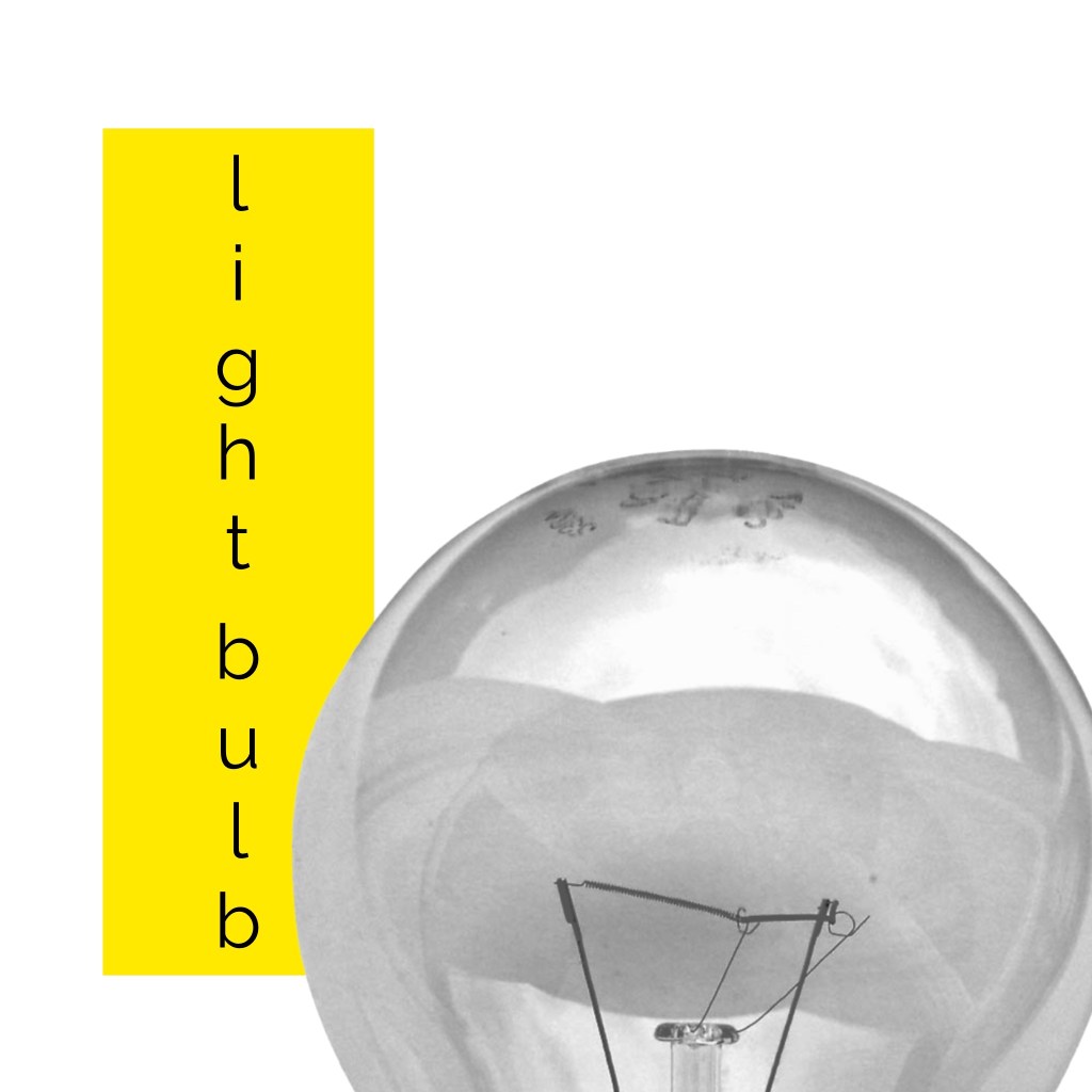
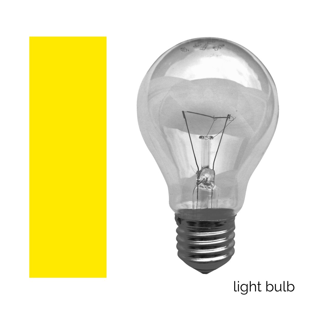
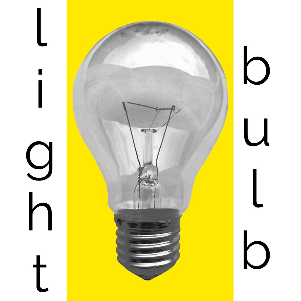
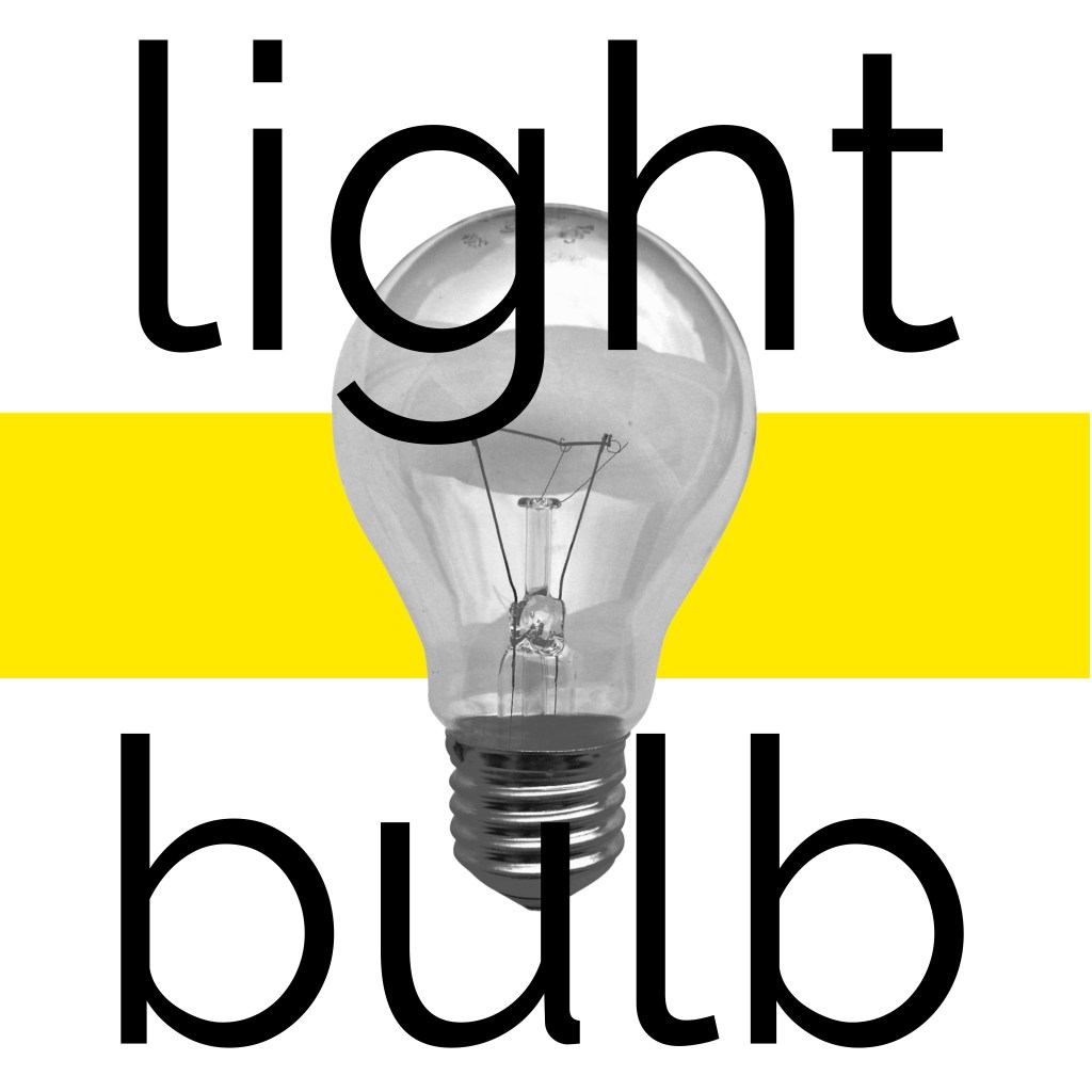
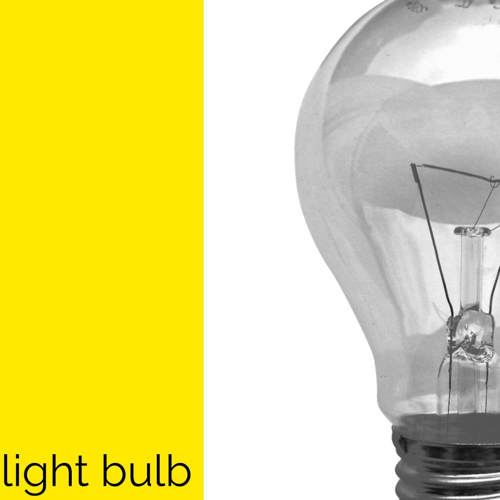
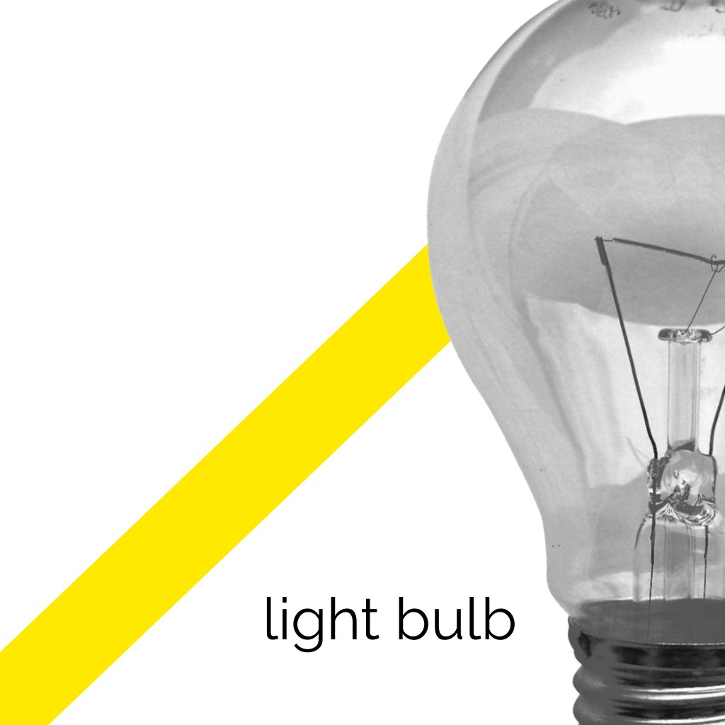
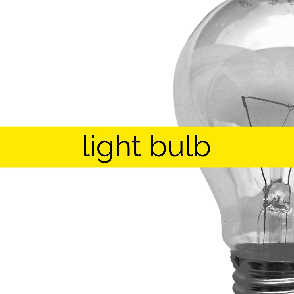
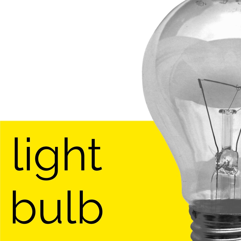
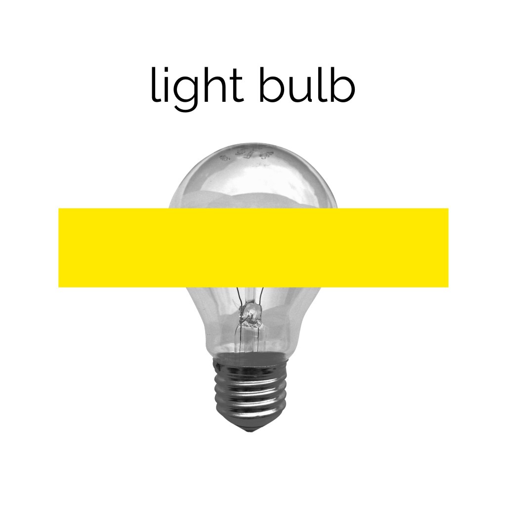
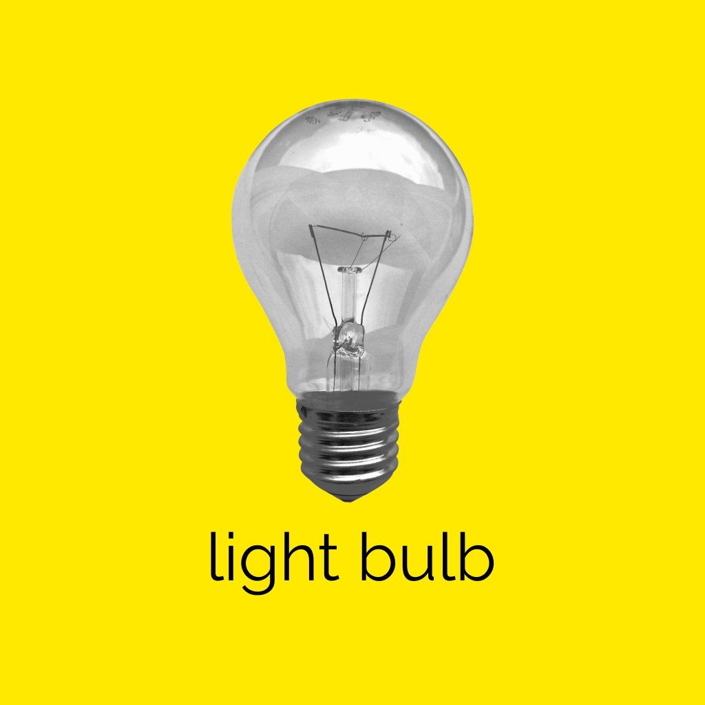
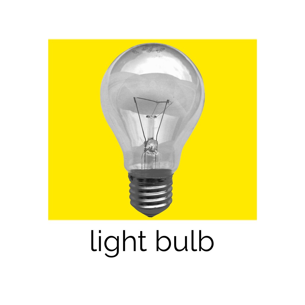
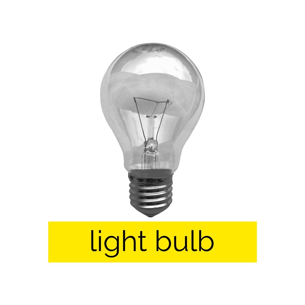
This exercise was focused on exploring composition to see how altering the placement of colour, text, and imagery changed the visual dynamics of a design. I was asked to use only an image of a light bulb, the words ‘light bulb’, and a block of colour of my choice. I had to develop as many arrangements of these three things as I could possibly think of, being playful and inventive in my choices. I was then asked to edit these arrangements down to about 20 designs that represent the different approaches I explored.
Through the exercises in Part Three I have started to develop a strong sense of the areas of design I want to branch out into more. When I researched Josef Muller-Brockmann for the Visual Literacy Research Point, I noted that I wanted to try out his black and white cut-out photos, so I decided to implement this here, and generally focus on emulating the Swiss design style. I began by making some notes on how I wanted to achieve this, then I sketched out 20 thumbnails of different starting points for my compositions. Creating these thumbnails was a lot of fun and helped get me into the right headspace for this exercise.
Sketchbook page exploring initial thumbnails and ideas
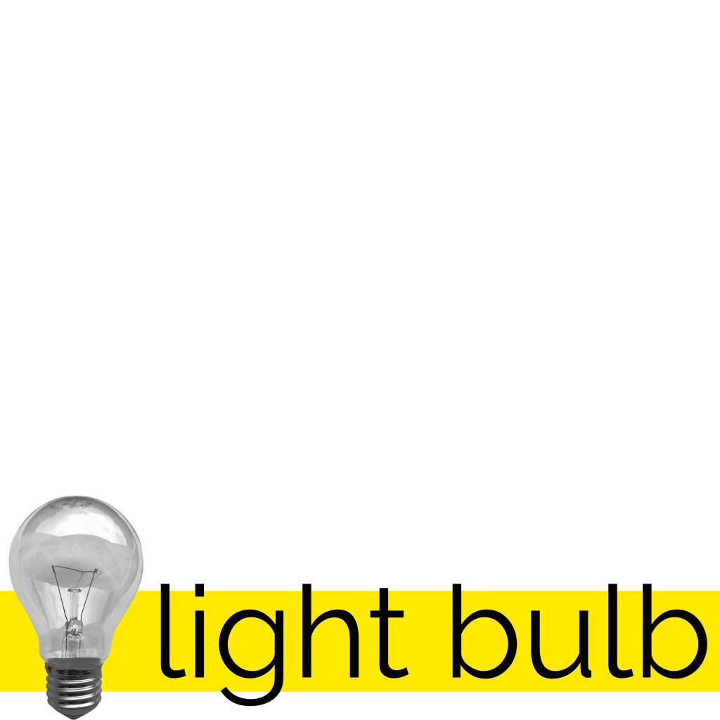
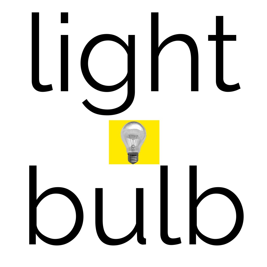
I decided to go with yellow as my colour, both because it’s representative of light, and because bright yellows were commonly used in Swiss design. I downloaded the image provided of a light bulb and reduced the saturation to make it a black-and-white image. I then played around with the contrast and levels to try to capture the harsher tones a photocopier gives, as was used around the time Muller-Brockmann worked. As for my font choice, I initially wanted to obtain a free or cheap personal-use license for Akzidenz-Groesk, the iconic Swiss style font, but this was proving hard to find. I researched for alternatives, and Helvetica came up several times.
I’m personally not a huge fan of Helvetica. It just doesn’t sit well with me in the same way other fonts do. I added the text ‘light bulb’ to my canvas in Helvetica, anyway, and pondered what other sans-serif fonts I had that gave a Swiss style vibe. I duplicated the text and tried a handful of fonts before settling on a modern sans-serif font – Raleway. I was actually introduced to this font by a fellow OCA student who used it in their design guide for the OCA Student Association, and I’ve become very fond of it.
Timelapse video showing experimenting with compositions
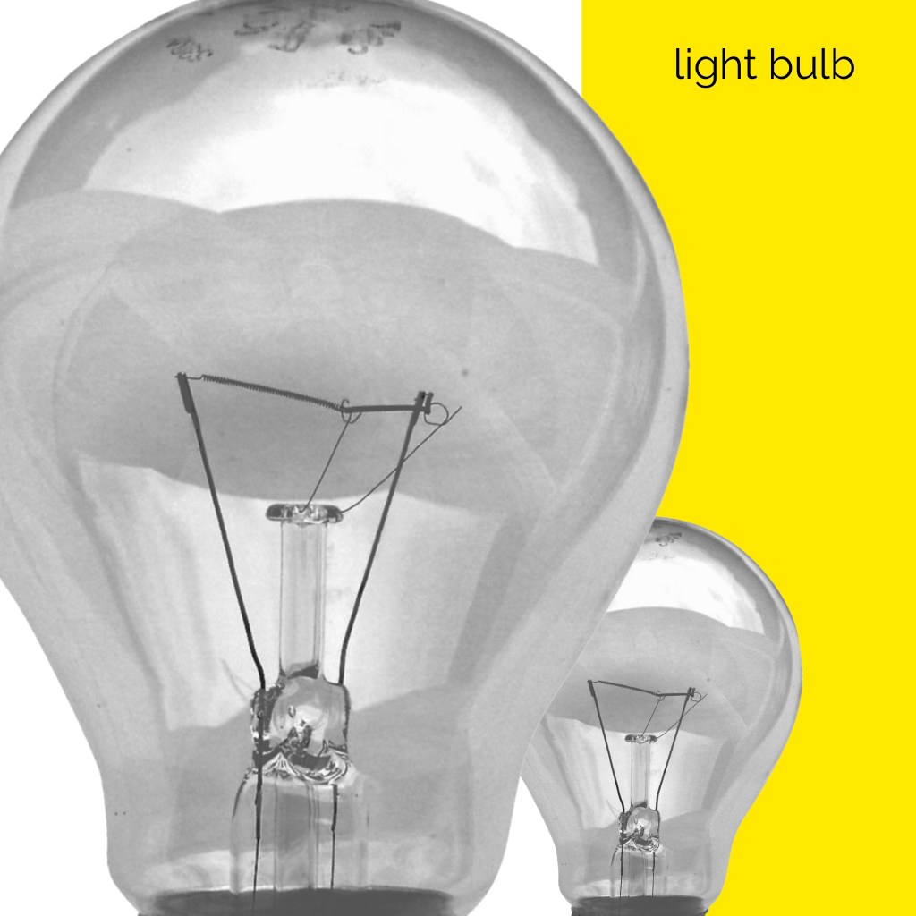
From there, I began experimenting. This whole experience was extremely fun. I very mindlessly moved around each object in as many ways as I could think, saving each rendition before quickly moving on to the next one. Approaching in this way made me feel removed from the design and more connected to the carefree, playful part of my brain. I wasn’t focusing on whether each image looked good or not, I was just creating for the sake of creating and the sake of exploration. This helped me push the limits and investigate new ways to organise the elements in question without worrying too much.
I used each of my initial thumbnails as starting points, then let my brain intuitively guide me to varying compositions, following whatever came up. If I found myself struggling a bit, I would move on to the next thumbnail and begin the process again. In the end, I came up with 149 compositions, which feels a lot less than I expected. If I had continued this exercise for several hours longer, I probably could create over 500!
Video showcasing each of the designs I saved
Stepping away from the experimentation process and viewing the results in a more concrete way, I can see immediately where certain compositions ‘work’, and where others don’t. I can also see quite clearly how different arrangements say very different things. Being detached from what looks ‘good’, however, helped so much with the ability to consider other compositions, and led to more options for a ‘final’ composition than I would have been able to achieve when stuck in my head. Loosening up and exploring in this way could really benefit my compositions and design choices.
26 of my designs displaying the variations in approaches to composition
Narrowing down my compositions to around 20 designs was difficult. I managed to whittle them down to 26 which I feel represent the different approaches I tried and experiments I did. Some designs I prefer more than others, and those that I do prefer, I feel could easily be an advertising campaign for somewhere like Ikea. I love using limited colours, imagery, and dramatic compositions, but never have I considered trying an exercise like this whilst designing a piece to push my work to its limits. I think it’s a very successful approach!
This exercise was fun, informative, and inspiring. I am glad I got an opportunity to explore more of the Swiss design style and find new ways to approach my design work. I hope to remember to incorporate more of this into future projects.
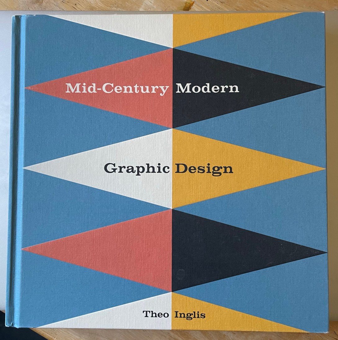
For this research exercise, I was asked to go back to my visual diary and consider how I perceive the visual dynamics in the pieces I had collected. I was asked what I look at first, where things contrasted in the pieces, and to focus on how the image is ‘read’. As I didn’t quite create a visual diary, I decided to instead look through one of the design books I have and try out this exercise with the images within.
I chose to use Mid-Century Modern Graphic Design by Theo Inglis. This book is a collection of book covers, record sleeves, posters, magazine covers, and illustrated books from around the mid-century period. It’s one of my favourites to reference when working as I find it really inspiring. I opened it to a random page and took note of my initial responses – my eyes were immediately drawn to the top left design, a record cover for Eroica, especially the word itself. The bold, upper-case text is extremely eye-catching. The white background and newspaper-clipping effect highlights this too. My eyes were then led to the red areas of the design, which made me aware of the rest of the text, and the logo in the top right corner. The usage of colour and font choice is clever!
The style of the record cover tells a story, too. The positioning of the colours and the collage effect that has been used makes me think this symphony is upbeat, jaunty, and fun. Out of curiosity, I listened to the symphony, and I feel it was captured very well. The design reminds me a little of an Exercise in Key Steps in Illustration where I was asked to listen to a song on repeat and create an abstract piece of work that represented it.
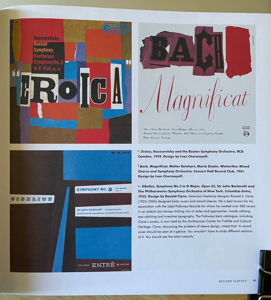
I flipped forwards to a new page and once again took note of my reactions. I was immediately drawn to the yellow, then the blue, then the green, and then finally the red. I think the yellow is the most vibrant and contrasting of the four, and the red is the least noticeable as its only use is in small text. The composition of these pages is really interesting to consider, and how my eyes went from poster to poster, rather than looking at the details of each poster.
The contrast of black and white imagery with blocks of colour in all four of these posters is really effective. Your eyes see the colour first, then the imagery when focusing. It’s interesting how the text within the designs seems least important, using relatively small point sizes and the placement almost ‘hiding’ the text. It’s the last thing your eyes notice in each piece – even where the red text is the only colour, my eyes saw the logo first, then the lamps, then the smaller text.
I enjoyed this exercise and considering how these designs have been created to capture attention in different ways. Exploring composition, contrast, and colour usage in my work – as well as testing out various typographical formatting – would help me to have better visual conversations with viewers. Mid-Century design especially is good at high contrast and bold imagery, which I hope to take on board more in my own work.
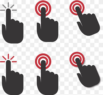
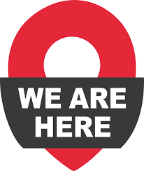
This exercise asked me to explore the concept of semiotics, and then try my hand at designing an original symbol for an abstract concept. I was asked to research existing representations for one of four concepts: Danger, Movement, Love, or Here – drawing from colour usage, similes, metaphors, and symbols that have already been designed. Using this research, I was then asked to develop a concept for a new symbol.
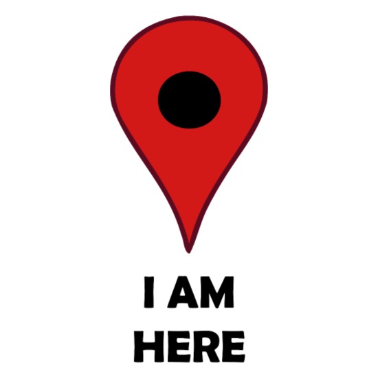
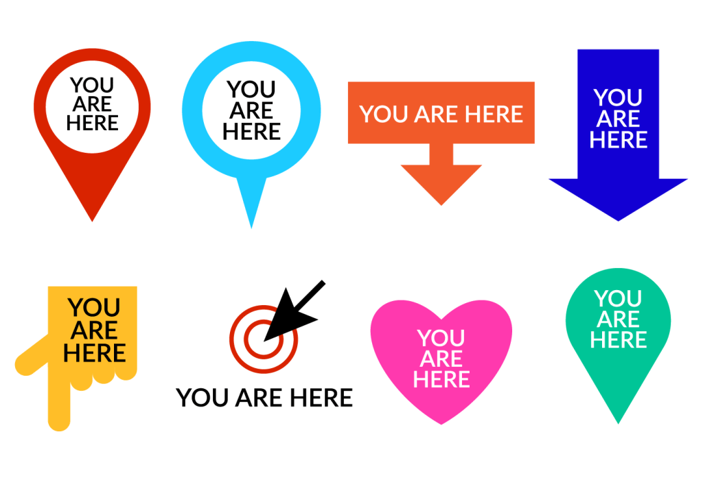
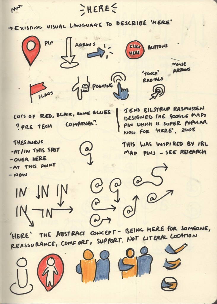
I decided to look further into the concept ‘Here’ as I felt it was the most interesting and had the least imagery conjure up in my mind when I thought about it. I used Google initially and searched to see what sort of designs were already out there. Pins, arrows, flags, pointing, and buttons were very commonly used throughout the images I found. The colour red was also most often used, with either no colour or blue second most common. Red makes sense, as it draws the eye in to the symbol, making it clear where ‘here’ is.
Examples of symbols used for ‘here’ – taken from Google
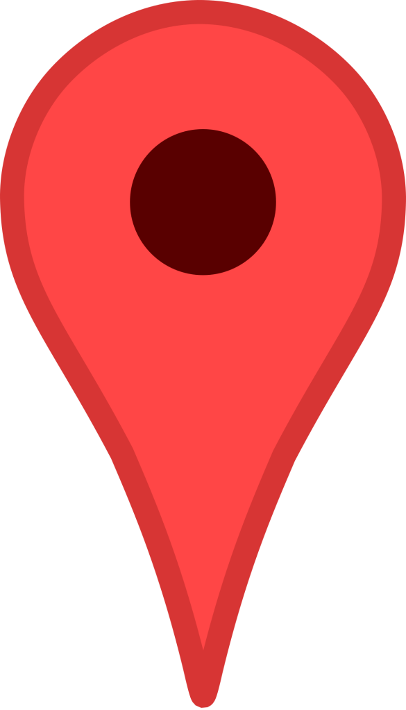
As pins and flags of various kinds were popping up so much, I was curious about the history of map pins and their transition to graphic design. I found this fascinating website on the history of map pins, which includes technical drawings of various styles of pins available for purchase. Graphic designers seem to have taken this centuries-old process of using pins, flags, and even buttons as map markers and translated them into digital-friendly, modernised versions.
The most famous of these is perhaps the Google Maps map marker. It’s recognisable globally and is widely seen as the norm now for digital map markers – with many other companies using the design in their own maps, and often just to represent the concept of ‘here’ or ‘a location’. Jens Eilstrup Rasmussen, a software engineer, designed the map pin for Google in 2005. He was inspired by these original map markers and wanted to ensure that the digital marker had a similar effect – showing the location clearly without obscuring any of the map.
The current version of the Google Map Marker featuring the Google brand colours, and the original design from 2005.
In 2014, the map marker was added to the MoMA permanent collection, which as a designer makes me feel pretty excited. I often don’t consider design to be ‘real’ art, so hearing that an institution like MoMA values the work that fellow designers do is pretty awesome. Learning this has also made me increasingly aware of how symbols and iconography we engage with on a day-to-day basis – without really thinking about it – are all parts of modern art history.
Following on from researching existing imagery, I began to consider similes and metaphors. I struggled to find any for ‘here’, as I think it’s more of a practical and tangible concept – so whilst being abstract, it isn’t really discussed in an abstract way. I ended up looking at a thesaurus to find synonyms for the word, something I learned to do in Key Steps in Illustration to help with idea generating – and wrote a few words down, as well as sketching out some initial concepts that came to mind.
I then asked a few friends what they thought of when they heard the word ‘here’. One friend discussed the less literal concept of ‘here’, ‘I’m here for you’, ‘here’ meaning support and comfort. I hadn’t considered this perspective and explored a few ideas for this too.
Sketchbook page showing initial research and ideas
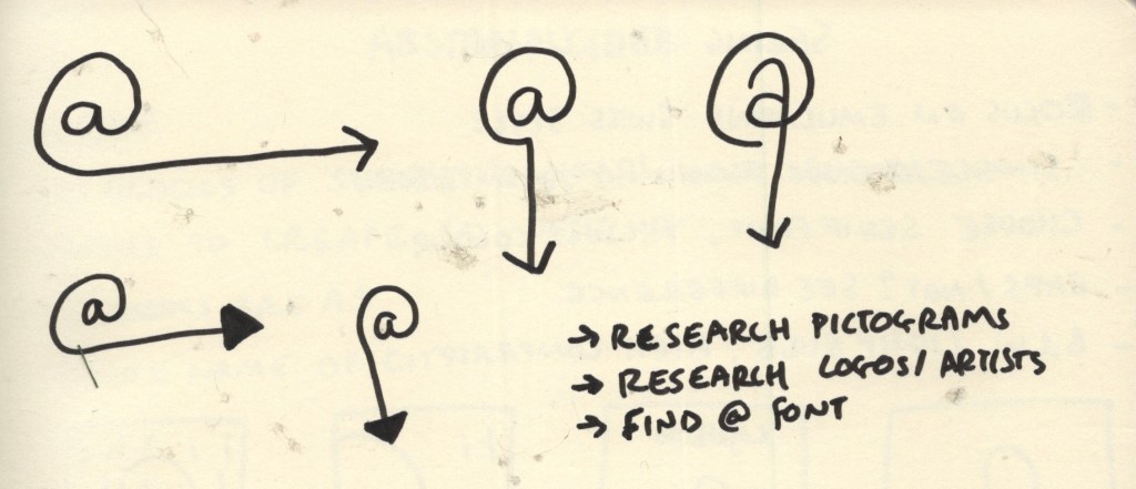
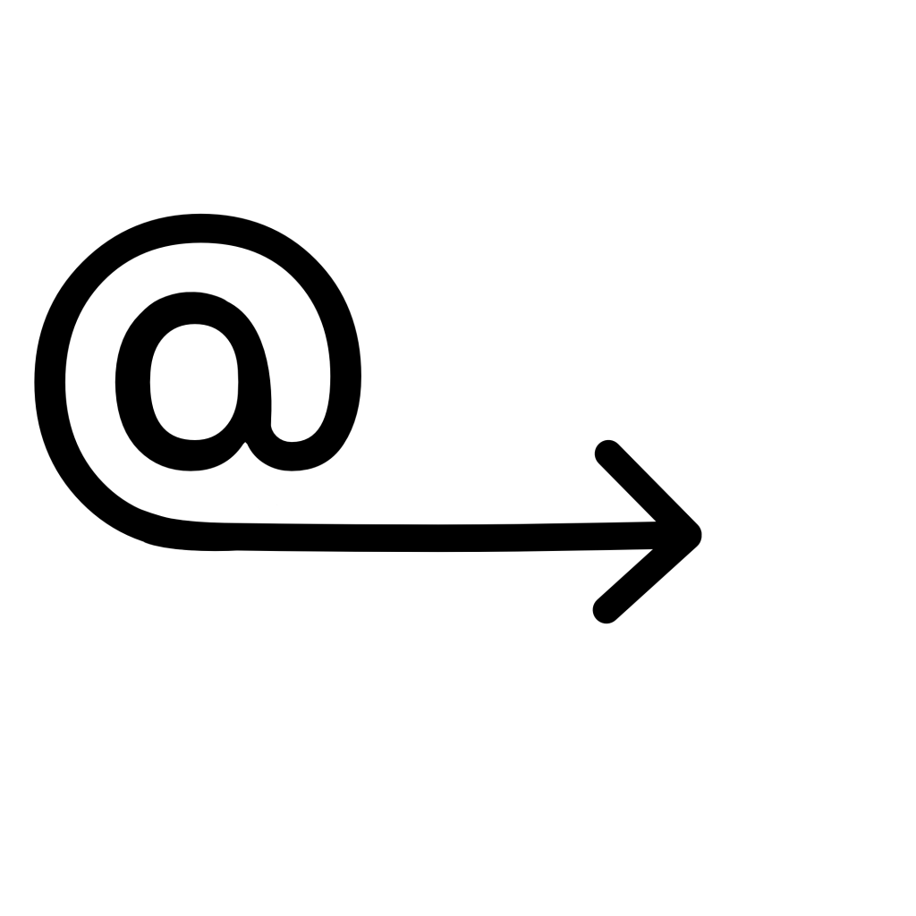
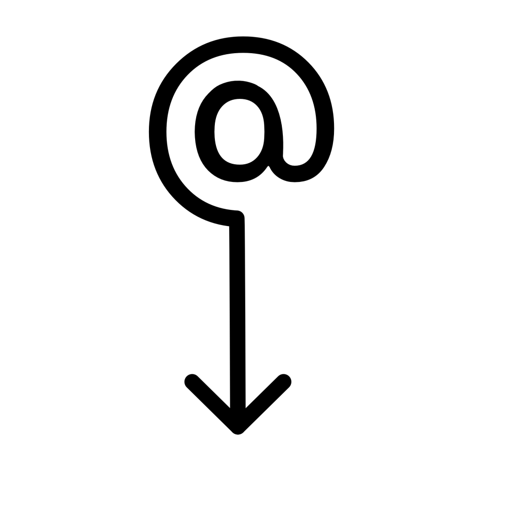
My three favourite designs from my initial research page were the At symbol with an arrow, the word ‘IN’ with an arrow, and the circular design with the two arms linked. After some deliberating, I realised the circular design was too vague as a general symbol for ‘here’, and it wasn’t clear what was actually happening in the image. It could work well as a logo, but maybe not as a more universal symbol. I further explored variations of the At and IN symbols and decided the At symbol was my favourite.
Sketchbook pages exploring design options for symbol
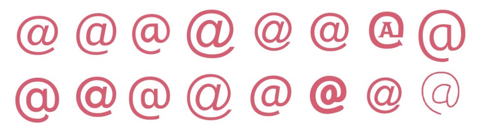
I decided to take an existing At symbol and add to it using Procreate. I began by exploring various fonts to see what sort of At symbol I wanted as a basis for my design. Many of the At symbols had italicised A’s in the centre of the symbol, which I didn’t like the look of. They also seemed to frequently be designed so that the tail of the loop is thinner than the start, which I wanted to avoid too, as the tail would end up becoming the arrow. I also found through my initial sketches that I preferred the A to be without a stem. None of the fonts I had quite fit this combination – but Fugue came pretty close. I just needed to remove the stem from the A.
Exploring various fonts to find an At symbol
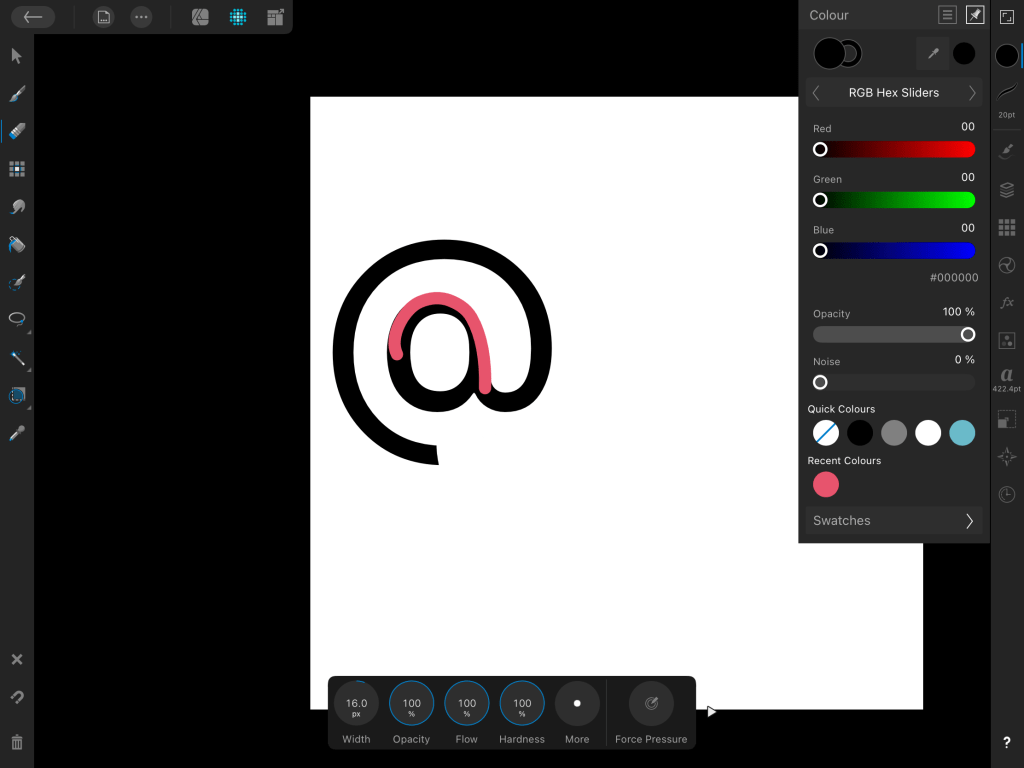
Designing the symbol using Procreate was hard. I had anticipated this would be the case, and that I would need to use a vector software instead, but I was reluctant to do so as it’s very new to me and I felt it would take more time than it was worth. I gave it a good shot in Procreate, but getting equally sized, proportioned, and smooth lines is quite tough within the app. My first attempt ended up serving as a basis for my vector design, which was helpful!
Timelapse footage showing my first attempt at designing my symbol in Procreate
My first attempt at the symbol – designed in Procreate
My vector app of choice is Affinity Designer – I have the iPad version which I much prefer to using my laptop and mouse, and you own it for life rather than Adobe software which must be paid on a subscription basis. I have a Udemy course explaining the ins and outs of the software and an in-depth guide to using vectors, but I just keep putting it off. Learning a whole new software is daunting, especially when you have an option that works 90% of the time already. Unfortunately, Affinity doesn’t automatically screen record like Procreate does, so I don’t have a timelapse of the design process. I’m glad I know this for the future and can make more of a conscious effort to take screenshots!
The only screenshot I managed to take using Affinity Designer – oops!
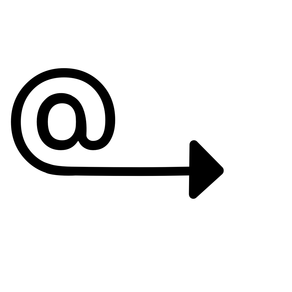
Despite being quite tricky and taking twice as long as it probably should have, I managed to produce two final designs. I felt the arrow pointing downwards would only be useful in some contexts, and there needed to be an alternative, so I also created one with the arrow pointing to the right. I tried the arrow filled in and also empty, and I prefer the arrow empty. Whilst I used the Procreate image as a starting point – I actually ended up starting from scratch, as the stem had been erased in such a way that made it pretty impossible to round out the A.
My final designs from Affinity Designer
I feel really happy with these two designs and I’m glad I pushed myself to use Affinity Designer rather than Procreate. Vectors help a lot with producing polished and professional-looking design work – especially when it comes to things like signs, symbols, logos, emotes, or anything that needs to work at multiple sizes. I hope I can find the time to complete my Affinity course, as it would be very useful for later in the unit when I have to design a font. Vectors would also generally be a good asset to have in my design toolkit.
As for the concept behind the design and how it represents ‘here’ – I feel very proud. When I was initially researching existing symbols I felt a bit lost on how I would possibly represent the concept in a new way, as I felt everything had already been done. I think the design is clear in meaning and in how it relates to ‘here’, and it isn’t something I’ve found anything like in existence. Simultaneously, it’s in line with existing symbology in that it is simple, clear, and can be widely used.
This exercise was a great challenge for my idea-generating skills, and for my creative abilities. I had a lot of fun with it!